The Bog 
Welcome to my “web log” (or “bog”) where I write my silly little posts. There is an Atom feed you can use to follow it as well.
It also includes my Fediverse posts mixed in. If you don’t want to see those there’s also a a page and feed without the toots.
There is also a tags page.
What if there was a Japanese detective who was a very stealthy donkey
Furuhata Ninjaburro

Sign my guestbook!
I have a guestbook page now! This is something I kept meaning to set up for a while but kept forgetting to. Seeing as I already have a comments system with Comentario I have set it up just as a mostly blank page with a comments section and some extra styling. The homepage is also displaying the latest guestbook message and a link to the page. You don’t need to make an account.
I generally do be tinkering with the site a lot without posting about most of the changes. Recently I’ve added more tags, including adding new tags to existing posts, and making custom icons for some old tags that were using emoji as icons.
The “archeologists will identify your skeleton as male” thing is funny and almost telling? Of course transphobes see the human body in terms of its Ruinenwert. Fascist deathcult mentality.
I think this George A. Romero dude might be a pretty good director. Anyone know about this guy?
this man is doing video alchemy
Robot Alchemic Drive but protagonist has Jet Set Radio/Bomb Rush Cyberfunk movement
Gender Neutral Pronouns
Saw a few posts about gender neutral pronouns in Irish so I thought I'd talk about it a bit.
So like others have said, there's no native gender neutral pronoun, traditionally in Irish if you don't know someone's gender you'd call them duine (person) which is grammatically masculine, and then use masculine pronouns to refer to that.
But of course there's lots of non-binary people who wouldn't really want to use masculine pronouns so let's talk about alternatives a bit.
Siad
Siad is originally a plural pronoun in Irish meaning "they" (pl.), but is the most commonly used option nowadays for non-binary people. It is a direct calque from English, but as far as calques go it's a pretty useful one.
Neopronouns
Neopronouns are pretty tough in Irish, harder even than in English where still they have pretty low adoption rates. This is because pronouns in Irish come with a lot of grammatical baggage. It's not enough to say "subject / object / possessive"
A pronoun in Irish needs to have subject, object, possessive, and a prepositional form for every preposition.
Like for brevity we often write pronouns as like sí/í. But in reality what we have is:
Subject: sí, object: í, possessive: a (h-prefixes, no lenition), ag: aici, ar: uirthi, as: aisti, le: léi…
So to create a neopronoun you have to both document all of these forms, and then get people to adopt them (which is hard, because there's more to adopt).
Also for the possessive form it's hard because the third person possessive is always a, it's just that masculine lenites, feminine h-prefixes and plural eclipses. If you try to add a different a, it will have to have the same mutation pattern as one of them, at least in many situations.
One possible solution to this is to use a neo pronoun but use the grammatical forms of siad., so like tá siú ag obair ag labhairt leo féin. (they are talking to themself). But at that point we are still calquing from the english.
ea
ea. exists in the language in certain situations as a neuter reference, historically it existed more, but if you tried to use it now you would have similar difficulties to the neo pronouns, you'd need prepositional forms.
Also, é. gets reduced a lot in speech especially in Conamara, to the point where it would sound very similar to ea. if you were trying to say things like Is dochtúir ea. for "They're a doctor" it would sound a lot like Is dochtúir é. "He is a doctor".
Conclusion
Because of all that, I think generally the most flexible option is to use siad, even though it is a calque of English. But for those who would like neopronouns, now you're prepared for the large table that comes with it!

If you want something that's a little bit neo a little bit traditional you could consider adapting dar, the ending of the 3rd person plural past in words like bhíodar (they were). This ending has become a pronoun in some limited contexts (still for the plural, but stuff like tá dar - they are) but if you wanted to use it as a singular pronoun with the grammatical forms of siad, that could also be an interesting option.
Resident Evil 10 should be called REX: Dino Crisis
weebiest thing I’ve ever done: Playing around with a nonsense katakana version of my name that doesn’t actually work as a real transliteration but I think is cute in various ways
キバノアオイメ
on the early train today which means I am going to read more Otherside Picnic
looking up obscure letters on Wiktionary and doodling a logo based on them
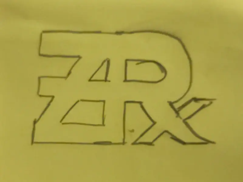
And a less comprehensible compliment to this.


List of film adaptations of video games that are longer than the games they are based on
When I watched Iron Lung I remarked to some friends that it might be the first film adaptation of a computer game that is longer than the original game, but when I saw Exit 8 on the programme for the annual Japanese Film Festival I realised that it got beaten to the punch by at least a year.
This inspired me to make a Letterboxd list of movies that are longer than the game they’re based on. The criterion that I’m using is the official runtime of the film version versus what How Long to Beat gives as the median clear time for the main story mode of the game. How Long to Beat uses times self-sampled from the kinds of people who log game times on How Long to Beat which will skew those times down a bit from what a typical person might experience, but it’s the best metric available for this kind of thing.
The current list isn’t terribly long but the games represented in it fall into three categories. The first is recent indie horror titles. The two games that inspired this list fall in here. Five Nights at Freddy’s, another obvious contender that a few people have already suggest to me, doesn’t make the cut. How Long to Beat has the first Five Nights at Freddy’s down as two hours, just ten minutes longer than the 2023 movie’s runtime.
The second block is fighting games. I had thought about excluding fighting games from the list both because I thought that they would probably dominate everything else and because clearing the arcade mode of the likes of Street Fighter II doesn’t really feel like a reasonable judge of the “length” of a game that is intended to be primarily multiplayer. Even so, I eventually decided to stick to the rule I set and added them.
The third category is Super Mario Bros., which I think is a bit of an arguable case as the film is not really based on the game of same name so much as a taking ideas from the broad strokes of the series as a whole1, but I decided to include it anyway because I love that movie and I think it’s a funny addition to the list.
-
Also the How Long to Beat time for Super Mario Bros. (one hour and forty minutes) feels like it’s skewed very low and probably accounts primarily for successful attempts more than the experience of playing it from the start and having to start over many times as you learn it. ↩
I am fascinated by this shot in Columbo where I think they might have edited these panels sliding shut in in order to cover up a continuity error.
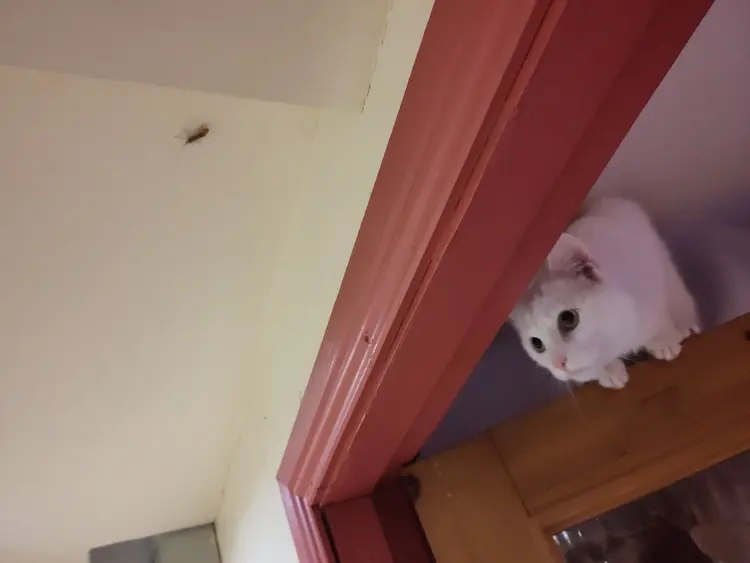
Easóg is going ballistic because there is a bug on the ceiling that she wants to kill but cannot reach

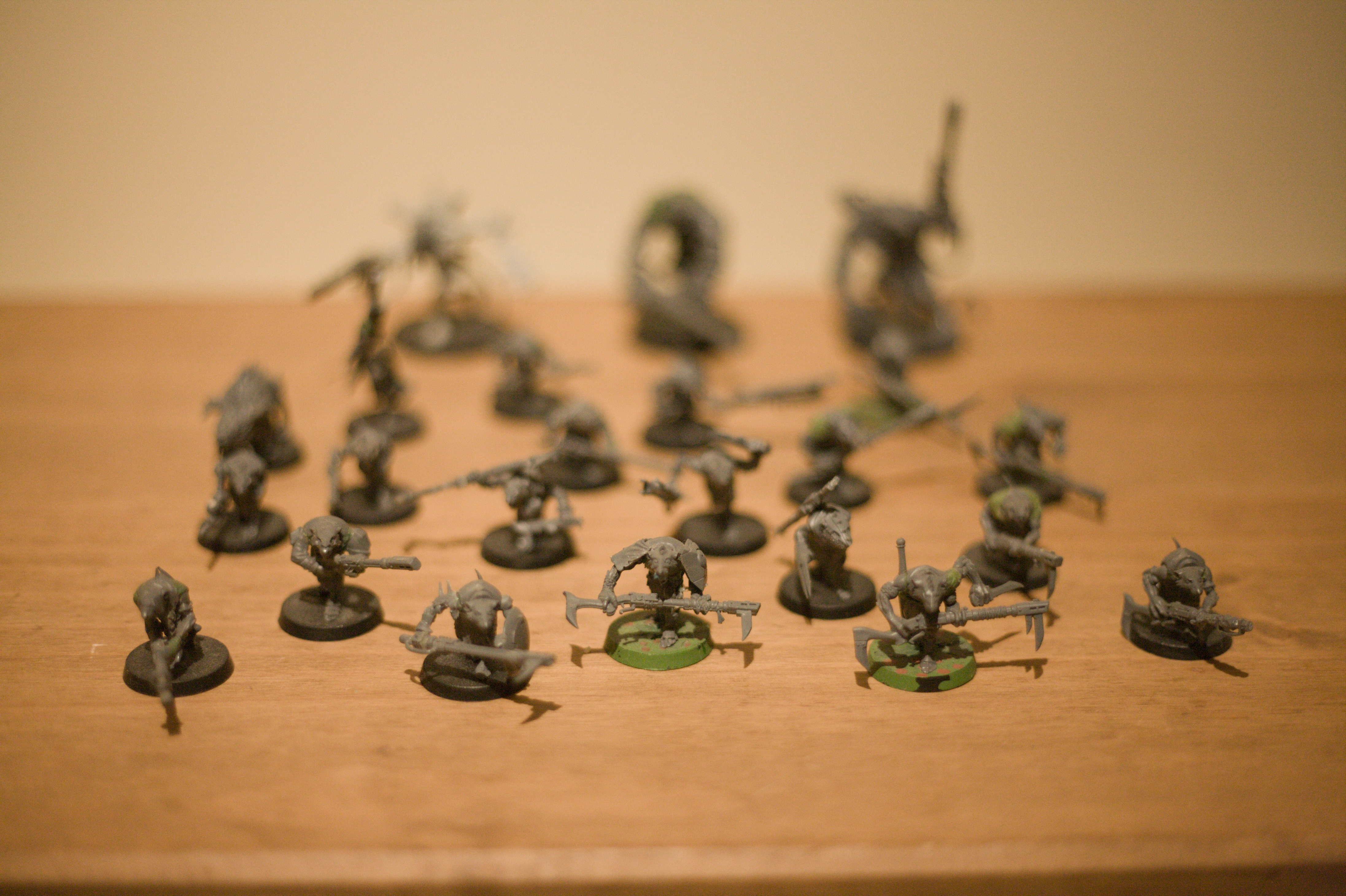
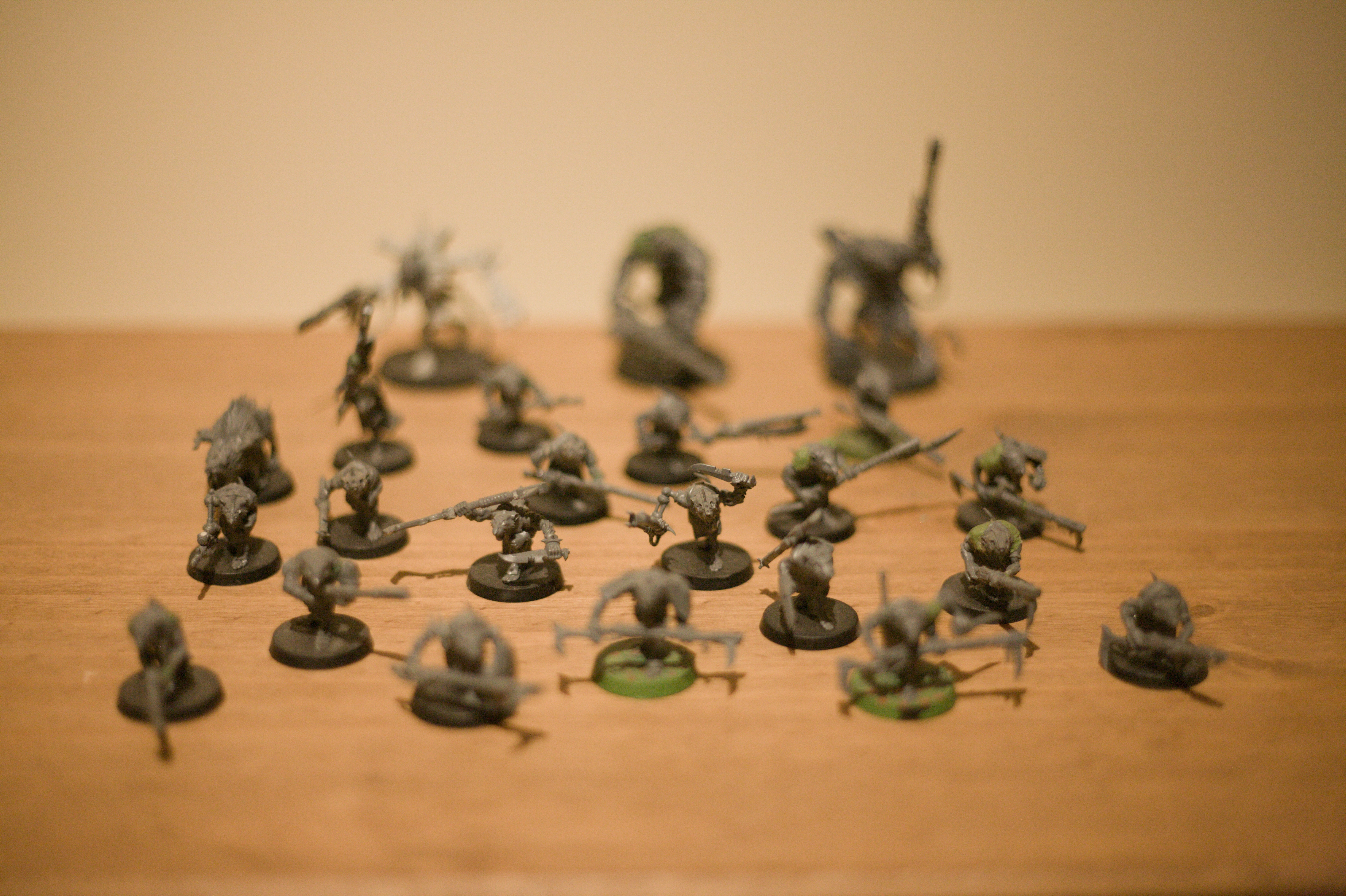
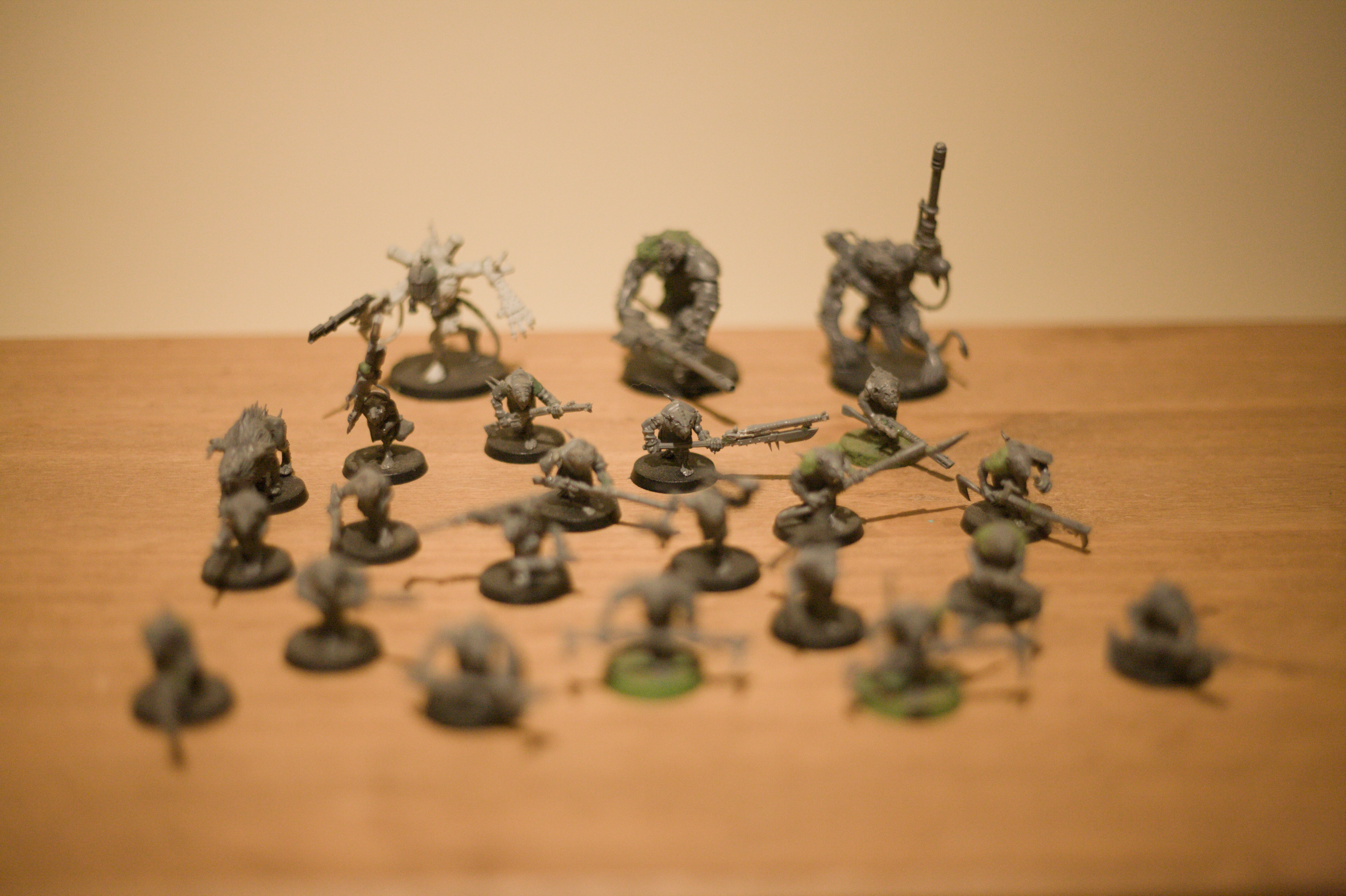
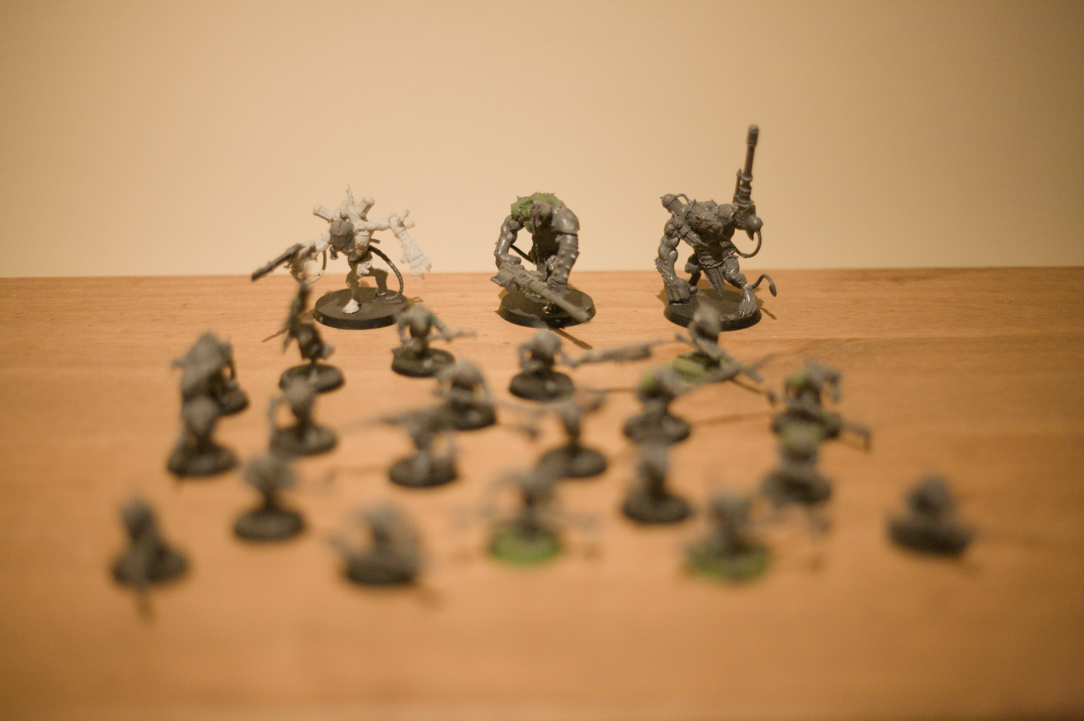
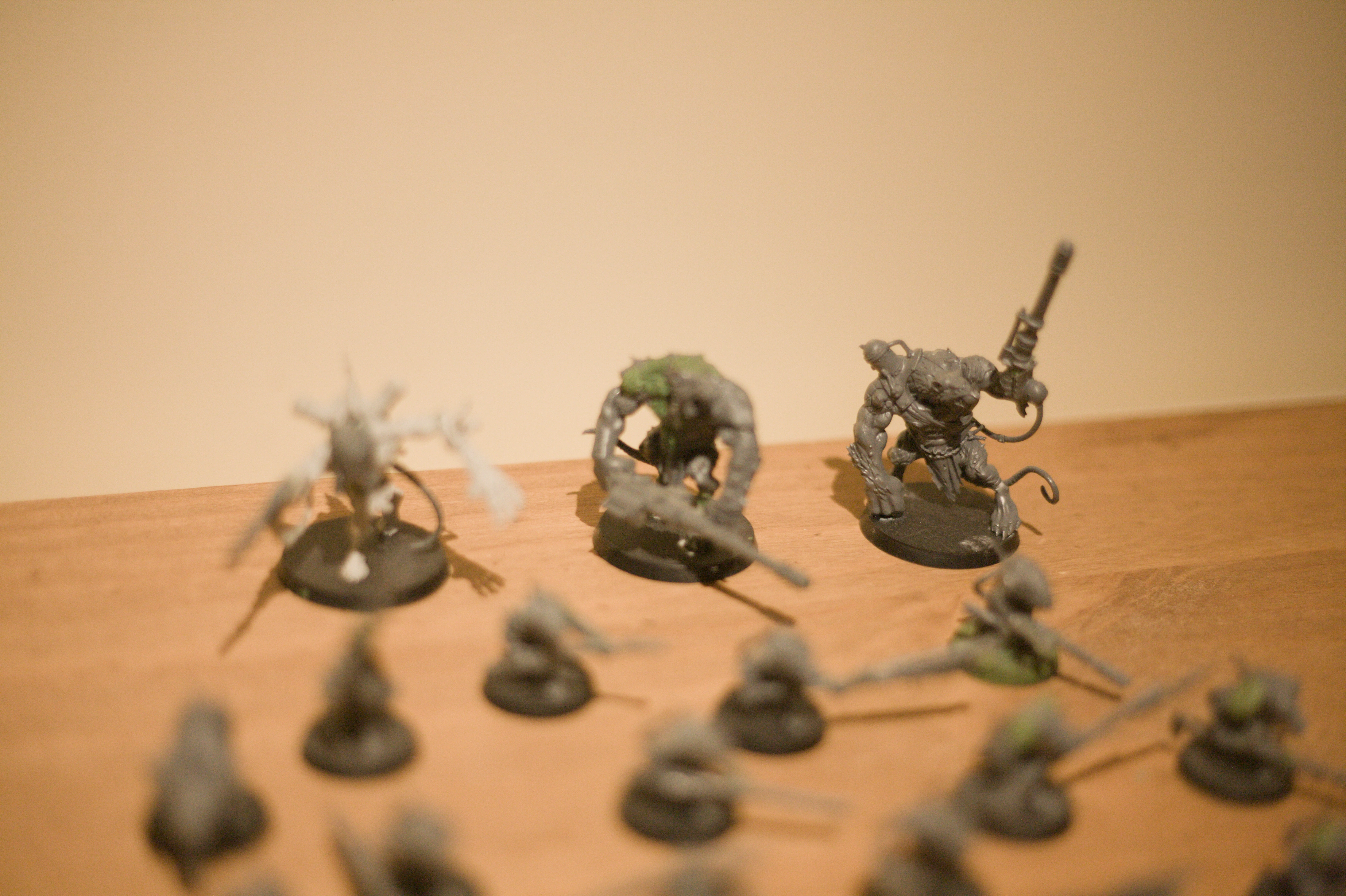
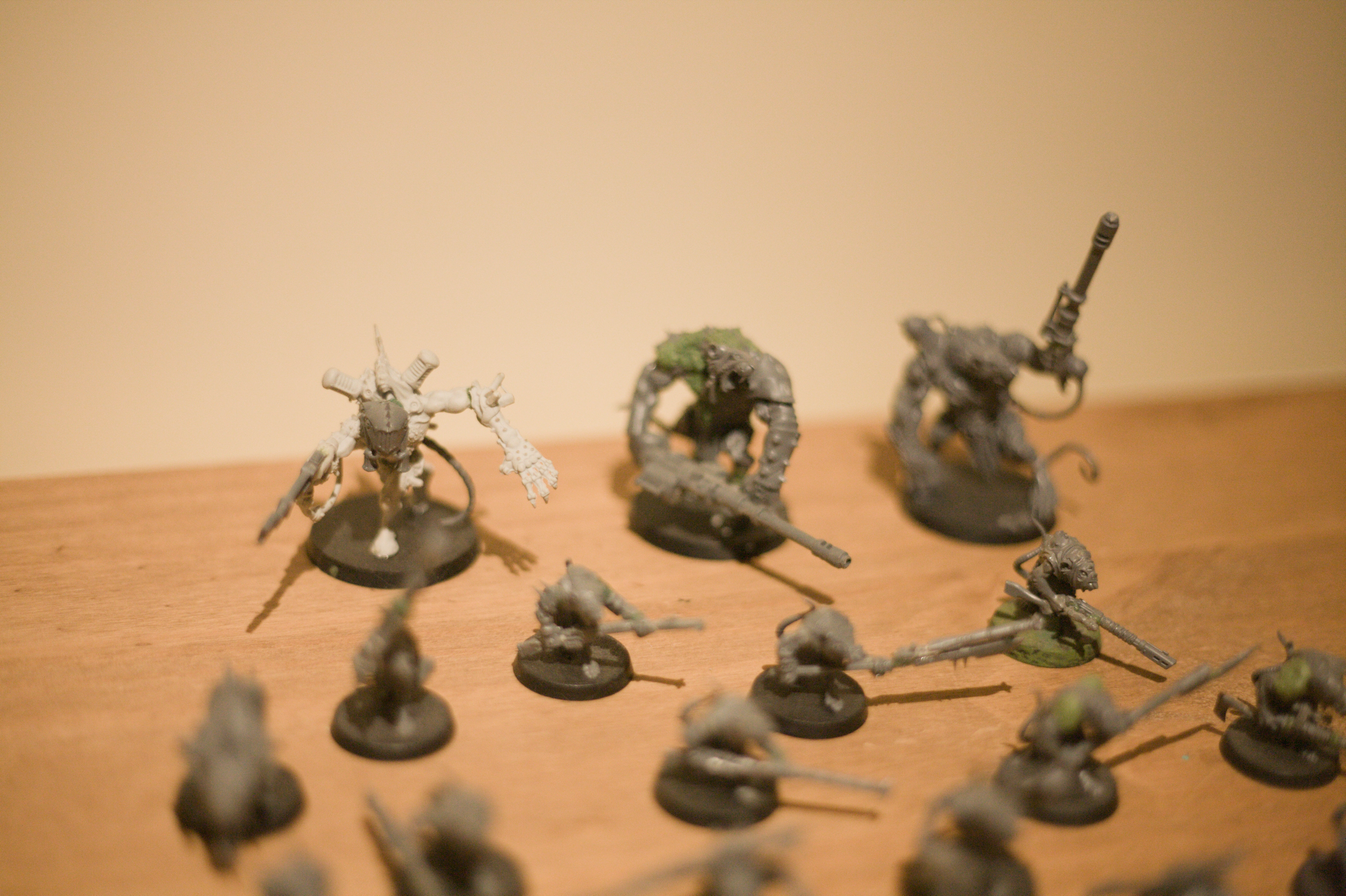
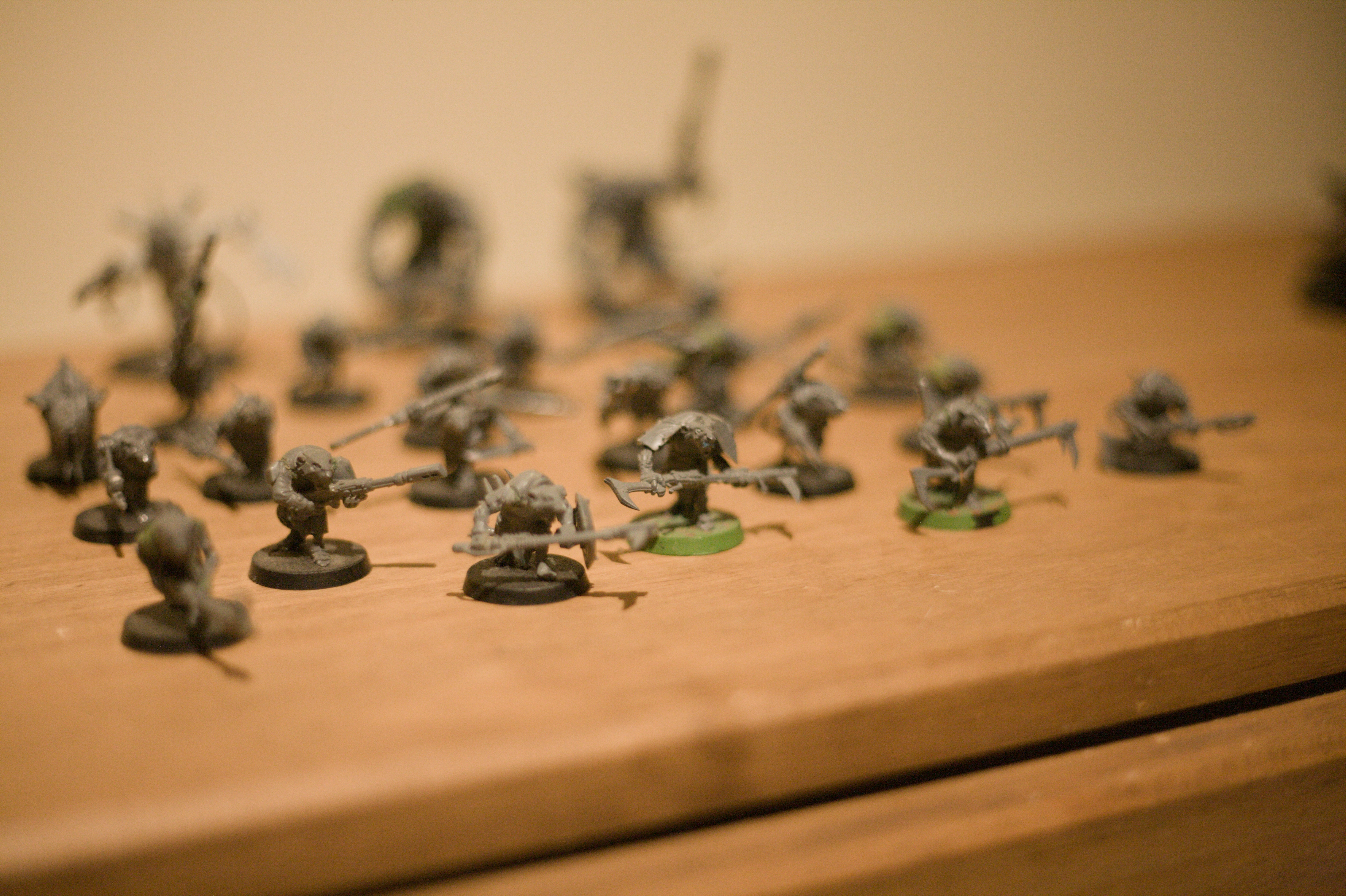
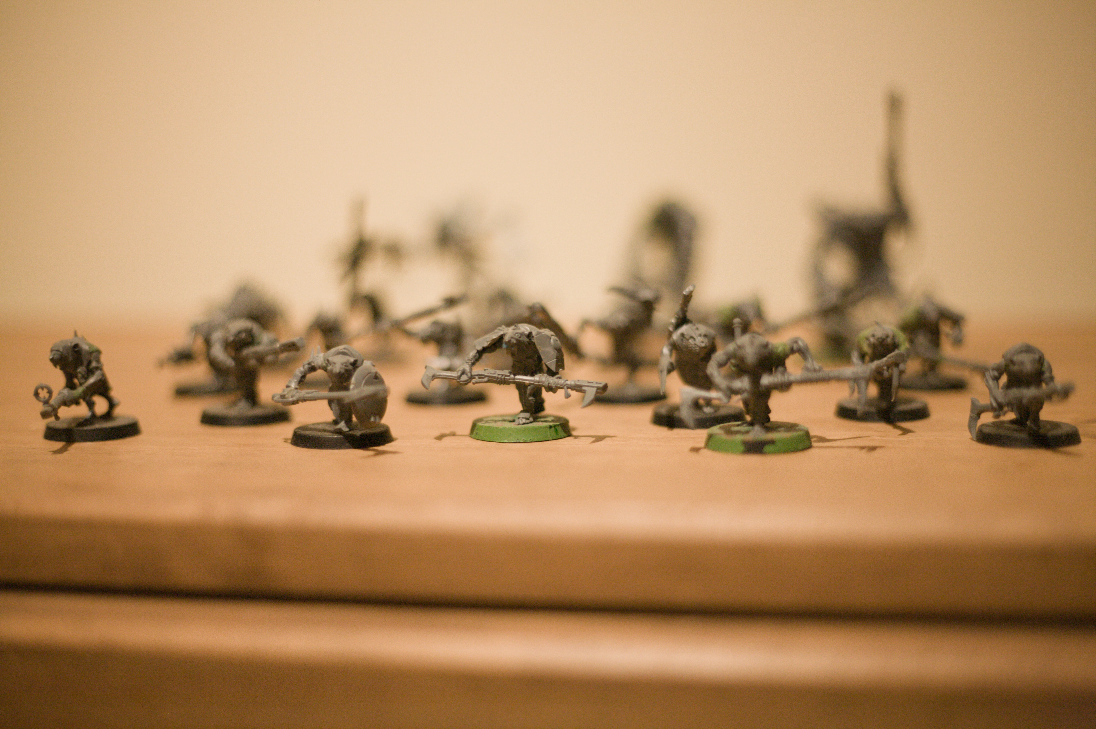
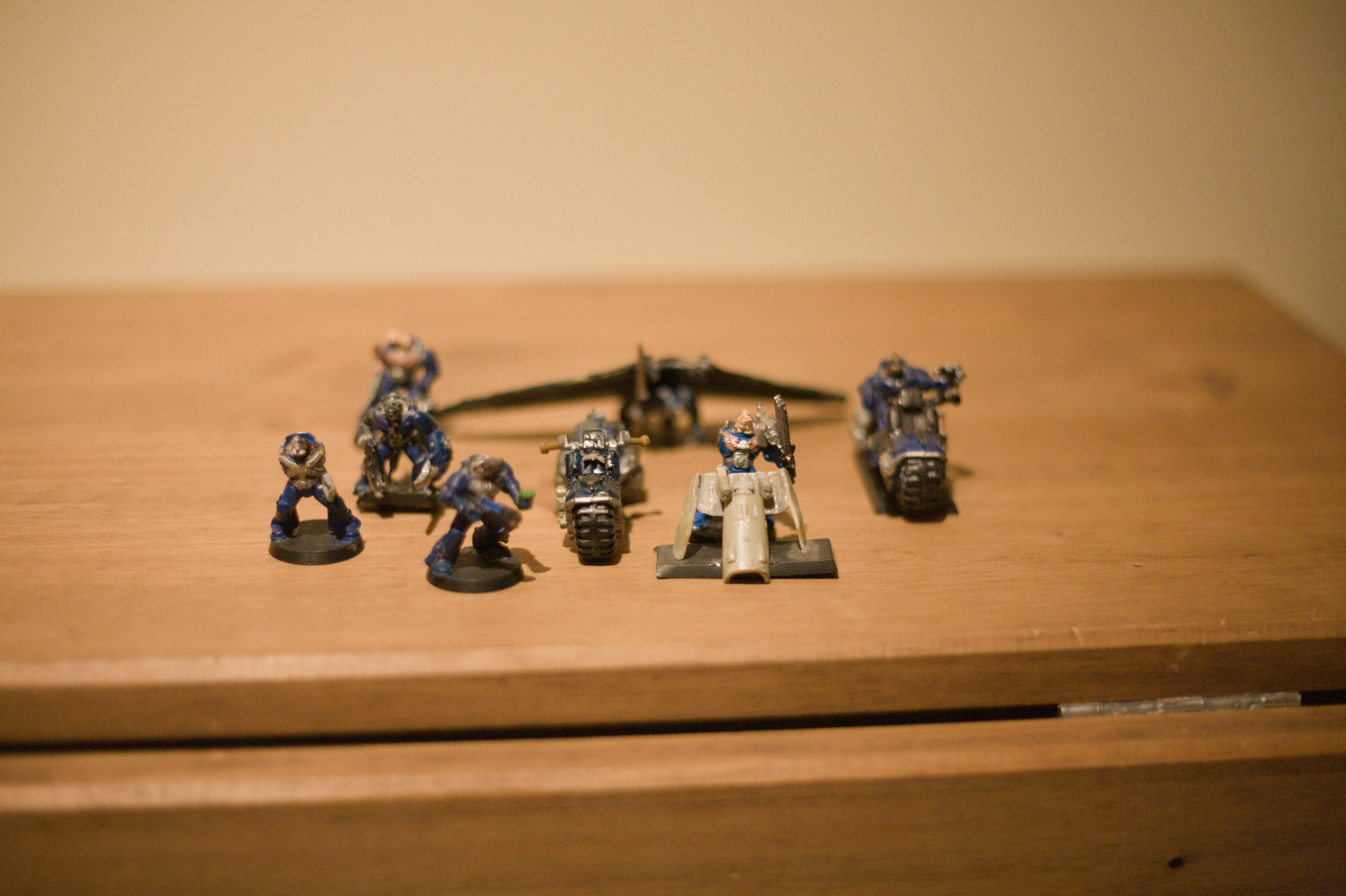
Some old kitbashes
I used to collect Warhammer years ago. Some Fantasy and particularly Skaven as a teenager and then 40,000 Tau in my twenties. I didn’t play very often and I don’t think I ever won a single game. I did really enjoy kitbashing stuff though, even if undiagnosed and unmedicated
I got rid of most of it years ago but I still kept a few bits and pieces and in particular my more unique conversions and seeing as I wanted to practise with my Canon




I am better at Magic: The Gathering when I don’t know what I’m doing
Or maybe just luckier.
I mentioned winning the first game of Magic: The Gathering I ever played (against someone else who also had never played) and also winning game of Dandân immediately having it explained to me. On Saturday I won with a deck that I didn’t even look at before playing. I was meant to be playing a game of Lancer with Caoimhe and Tigris, dumb luck the heart of the cards.
The deck, as it turned out was a proxy deck themed after Pokémon cards that she found online, with Pokémon Breeder as the commander. The zombie enthusiast was using a Chainsaw Man proxy deck she made herself with Denji as her commander. Caoimhe was using Tigris’ walls deck with Arcades the Strategist and Tigris was using another deck that I do not remember the commander of but had a lot of dragons.
For much of the game zombies dominated what was happening, with Denji on the field eventually equipped with a Chainsaw1 and Tigris having cloned her own Denji using Will of the Temur, resulting in six zombie tokens being generated every round which constantly got wiped out and flooded cards into their hands. I was holding on to a Heat Wave for much of the game and kept looking for chances to use it to wipe out a zombie horde to multiply my own tokens but they would keep being blown away before it got back to my own turn every time.
I never actually got to generate any eggs with my commander and her ability to play creatures from the deck activated only once, when a Tauros died that counted as an egg due to being a ditto. That resulted in me getting a Zacian on the board, but without a 10/10 Zamazenta to back it up because it wasn’t cast, and which was killed before my next turn anyway. My game consisted of getting out strong pokémon (and my commander, twice) which my enemies promptly bapped away, but also without ever taking much damage myself and only occasionally getting to deal it out. My life never went below 40 and nearly reached 60 at one point due to a Venosaur.
In the end everyone targetted Chainsaw Man for getting too powerful and killed knocked her out, then Caoimhe used Slaughter the Strong to wipe out Tigris’ amassed dragons and all of my creatures other than a 4/4 Turtwig generated by Grotle, and soon I finally unleashed the Heat Wave to destroy Caoimhe’s Arcades, Floriferous Vinewall and my own Bulbasaur to multiply my Turtwig into a small army to wipe Caoimhe out.

I did quite enjoy just rolling with the punches and seeing where the deck took me. Learning the game is very fun to me and if I had a perfect idea of how everything should work and a huge knowledge of cards and builds and the metagame it would probably not really be that interesting to me any more. I have been struggling with the motivation to actually build my own decks following the Seto Kaiba one.
-
The one card in the deck that was not a proxy. ↩
you can’t live in your peach and eat it too

Fairphone repair
I’ve posted about having a Fairphone before and I also have a set of headphones from them. They are honestly not that great for how much they cost. The noise cancelling cannot handle any wind or much movement, you cannot change the default mode that they start in, and most importantly a piece of the headband snapped in two on me a couple of weeks ago. Now, I was straining it with a bad habit of pulling one ear off widely to hear sometimes, but I had expected them to be able to take that force. There is a newer revision of these headphones available now and perhaps those solve some of the problems, but I am somewhat annoyed by the fact that, like with each generation of their phones, the parts for the old and new models are not compatible. Each iteration is a total replacement, not an upgrade path.
That said, they still sell replacement parts for older models and I am very glad that I can replace one piece and not have to throw an entire set of headphones and all the electronics in the bin just because some plastic snapped.

My phone screen had not been in perfect shape either; scratched and cracked from being dropped too many times and with some dead zones, but mostly still usable. I wasn’t bothered to get a replacement for it on its own but with the headphones needing repair anyway I decided to pick up a new display for the phone at the same time and keep the old one as a spare. The only special tool I needed to do the swaps was a Philips #00 screwdriver and it’s all fairly straightforward. Like I said I don’t think that these are the best electronics out there, especially for the cost, but I appreciate being able to keep them going for a long time rather than having to send them to landfill.
murderers in Columbo are always conspicuously announcing what time it is to people in order to establish an alibi with witnesses but this wouldn’t work on me because my memory is shite

Jailbreaking my 2012 Kindle Paperwhite
I usually prefer to read paper books and get them from my local library when I can, but I have an old Kindle Paperwhite that I generally load up with books to read while travelling. It saves a lot of hassle, bulk and weight compared to carrying around several paperbacks.
I had previously looked into custom Kindle firmware and found people saying that such things don’t exist, but with Amazon pulling support for old Kindles I had another look and realised that I’d missed something: There may not be fully custom firmware for Kindles, but there is jailbreaks and custom software. I took me a while to get it working, navigating various Mobile Read forum threads to piece together steps that worked and now that I have
Getting device information
The first thing you need is the serial number of your Kindle to determine the exact model type and compare it to the Mobile Read wiki page on Kindle serial numbers. You can get this on Amazon’s website while logged into the account that the Kindle is registered to or from the device itself.
Confusingly, on my Kindle you must access this by ☰Menu button, selecting Settings, then pressing the ☰Menu button again (which pops up a different menu when pressed from inside the settings screen) and then selecting Device Info. The wiki page does mention this too, but I missed it at first. The device info popup also has the firmware version, which for me was 5.6.1.1, which will also be important.
In my case the serial number starts with B024. Amazon’s site describes it as “Kindle Paperwhite (5th Generation)” and the Mobile Read wiki calls it “Kindle PaperWhite WiFi”, but more importantly the nickname that is used in Mobile Read’s guides is
Grabbing the software
The jailbreak method I used for my
These can all be grabbed here:
- Kindle firmware version 5.4.4.2
- Kindle firmware version 5.6.1.1
K5 Jailbreak - Latest version at time of writing iskindle-jailbreak-1.16.N-r19426.tar.xzKUAL - Same link as the one above. Latest version at time of writing isKUAL-v2.7.37-gfcb45b5-20250419.tar.xz- Jailbreak fix -
Update_hotfix_universal.bin KO Reader - For thePW1 , the file labelledkoreader-kindle-v####.##.zip- Stardict English dictionary -
dict-en-en.zip(not the one labelled Kindle)
Factory reset (do not actually do this)
To ensure that these steps worked from a blank slate I repeated them after doing a factory reset on my Kindle. As Amazon are ending support for older Kindles if you do a factory reset after the
If Amazon haven’t turned off the servers yet and you are logging into an old Kindle and you have two-factor authentication enabled then login will fail if you try to log in with just your username and password, but you can append your six-digit authentication token to the end of your password and it should work.
Installation
-
Getting ready
- If Amazon haven’t already turned off the servers then now is the time to download any books that you want to keep from your Amazon account onto the Kindle.
- Once that’s done enable aeroplane mode by navigating to ☰Menu→Settings→Aeroplane Mode.
-
Downgrade the firmware to 5.4.4
- Connect the Kindle to your computer with a Micro-
USB cable, it should mount the same as an external drive or memory stick. If it doesn’t and only starts charging try using different Micro-USB cables until you have one that does data transfer. - Copy
update_kindle_5.4.4.binto the root directory of the Kindle. - Without ejecting the Kindle or unplugging the
USB cable hold down the power button of the Kindle until the charging light goes out and it unmounts from thePC . This took about twelve seconds for me. - When you release the power button the Kindle should restart and begin installing the new firmware after a few seconds.
- Connect the Kindle to your computer with a Micro-
-
Install the jailbreak
- Once the firmware downgrade is finished and Kindle has restarted check that the downgrade was successful by going to ☰Menu→Settings→☰Menu→Device Info and ensuring the firmware version is now 5.4.4.2.
- Reconnect the Kindle to your
PC . - Extract the contents of
kindle-jailbreak-1.16.N-r19426.tar.xzand from that extract the contents ofkindle-5.4-jailbreak.zipinto the root directory of the Kindle. - Eject the Kindle from your
PC and unplug theUSB cable. - Install the jailbreak from your Kindle by navigating ☰Menu→Settings→☰Menu→Update Your Kindle. If the option is greyed out make sure that aeroplane mode is on, reconnect your Kindle to your
PC and double check that all the contents ofkindle-5.4-jailbreak.zip(includingUpdate_jb_$(cd mnt && cd us && sh jb.sh).bin) are still in the root directory of your Kindle (copy them over again if not) and try again. - If the jailbreak was successful then some text saying JAILBREAK should appear at the bottom of the screen.
-
Install
KO Reader andKUAL - Reconnect the Kindle to your
PC . - Extract the contents of
koreader-kindle-v####.##.zipto the root directory of the Kindle. - Extract the contents of
dict-en-en.zipto/koreader/data/dict/ - From
KUAL-v2.7.37-gfcb45b5-20250419.tar.xzextractKUAL-KDK-2.0.azw2and copy it to/documents/
- Reconnect the Kindle to your
-
Upgrade back to 5.6.1.1
- Copy
update_kindle_5.6.1.1.binto the root directory of the Kindle. - Eject the Kindle from your
PC and unplug theUSB cable. - Navigate to ☰Menu→Settings→☰Menu→Update Your Kindle and wait for the upgrade to install.
- Copy
-
Install the jailbreak hotfix
- Reconnect the Kindle to your
PC . - Copy
Update_hotfix_universal.binto the root directory of the Kindle. - Eject the Kindle from your
PC and unplug theUSB cable. - Navigate to ☰Menu→Settings→☰Menu→Update Your Kindle one last time.
- Reconnect the Kindle to your
All going well there should now be a Kindle Launcher/
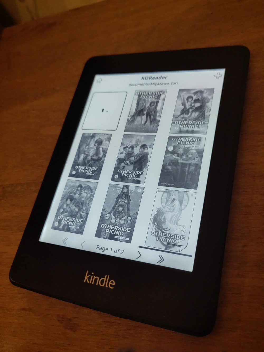
I use Calibre to organise my e-books and it can handle transferring them over to the Kindle too, though by default it only sends books in formats the Kindle can natively read. You can change what formats it will transfer over as well as the folder structure it uses from the settings for the Kindle plugin under Preferences→Plugins.
Spent almost the entire day just chilling and reading. I need to let myself have days like this more.
Idea for a murder mystery (that’s probably been done before): The murderer fakes an older, superseded version of a will in order to make it look like someone had been recently cut out of the real will when they hadn’t been.
Trying and failing to jailbreak my Kindle paperwhite gen 5 (serial number starting with B024, firmware 5.6.1.1) and get Kual and Koreader up and running. Following these instructions and trying it twice, doing a factory reset after the first time failed and trying again, but just get an error reading “This item is not signed by an authorised developer. Please contact the developer.” when trying to launch Kual after I’m done.
Posted on the forums looking for help
https://www.mobileread.com/forums/showthread.php?p=4578869#post4578869
sometimes you have to be a little evil
sometimes you have to be a wittle weevil
Listening to the Behind the Bastards episodes on Phil Spector and realising that Phantom of the Paradise was about this man specifically

EMCSH: Nice to Men
This post discusses and links to fetish fiction that features sexually explicit writing involving mind alteration and violations of consent as well as misogyny and suicide.
Kinks often explore concepts that would be horrible to actually happen outside of fiction or safe, mutually agreed-upon play. There can be a fine line between fetish writing and horror and all it can take to push from the former into the later is taking the premise just a small bit more seriously. This Erotic Mind Control Story Hour gets a bit depressing.
Nice to Men by Limerick is a story about anxiously refreshing Twitter as the world falls apart. It centres on Noelle, Molly and Aden, three baristas who go on a mission to kill a man whose tweets were arbitrarily given the power to reshape reality1. Anything @KillaDaKilla303 posts becomes true and unfortunately the world’s new god is a misogynistic dumbass. He cured cancer—simply made it stop existing—but now after a few days he is starting to indulge himself a bit more.
KillaDaKilla @KillaDaKilla303
GOOD morning everyone and UR welcome former cancer having ppl
KillaDaKilla @KillaDaKilla303
NO need to thank your friendly worldwide Killa
KillaDaKilla @KillaDaKilla303
Lets enoy another beautiful rain COURTESY of KillaDaKilla. florida UR welcome i knocked that hurricane out. And ladies, lets be nicer to the men out there.
Noelle tries to slap Aden and the thought of it makes her sick. She is nicer now. She has been changed, fundamentally, by some gobshite with a username that’s a reference to Kill la Kill. Is she still the same person that she was before? Is she still meaningfully Noelle?
But she also thinks that she might know who Killa is. His name is not on his Twitter profile but going his likes indicates that (along that they have good reason to worry about what he might post about women next) he probably lives in Denver and just generally seems a lot like her anime-obsessed ex Adrian. It’s tenuous, but on the off-chance that she’s right they decide to go on a road trip to kill God before he can make things worse.
As they make their way across the country, things get a lot worse. Killa is, as I said, a misogynist and a dumbass. He is not malicious exactly, but he is impulsive, unthinking and would like it if women were hot and sexually available. But he also wants this to be a positive thing for everyone, women included, and so to be generous he offers to women something he thinks that they would like: He declares that all women now have five hundred dollars to go buy new clothes with. Time for a makeover! This simply appears in Noelle and Molly’s purses and come with a compulsion to use it to buy cute clothes. Immediately. The roadtrip is delayed as they (and every other woman) descends on the nearest clothes shops they can find to spend five hundred dollars before they run out of stock on everything. Noelle wonders what exactly is going to happen to women who live out in the middle of a steppe or a scientist stationed in Antarctica who presumably just received five hundred US dollars and an urge to go to travel hundreds of miles to find a shop to spend it in.
Killa doesn’t think about that. Killa thinks it would be hot if women had bigger breasts.
KillaDaKilla @KillaDaKilla303
girls plz... Killa is not a bad man.
KillaDaKilla @KillaDaKilla303
Killa believes in choice!
KillaDaKilla @KillaDaKilla303
Killa wants all you 5s and 6s and even the 4s... all those girls... he wants you to be 9s!
KillaDaKilla @KillaDaKilla303
If UR a female and you want amazing tits that feel great and look great and you will love them, simply say out loud. KILLA GIVE ME DA BOOBS
KillaDaKilla @KillaDaKilla303
and then Killa will give you da boobs.
KillaDaKilla @KillaDaKilla303
tempting, isn’t it???
Early on the protagonists wonder what the rules are about what Killa posts. Is there a Monkey’s Paw situation? Some loophole or flaw in the wording of his magical decrees that they could possibly exploit? But no, they soon realise that he simply gets what he wants, however vague, wishy-washy and ill-thought-through that might be. When he tells women to be “nicer” that does not simply mean amicable or considerate, it means his thoughtless, patriarchal idea of what women being “nice” is. And that means being deferential. Not making a fuss, putting men’s feelings first, putting men’s wants first. Things that patriarchal society classes as women being nice. More and more Noelle and Molly find themselves using what they think Aden might want as a guide for how they would act, how they would make themselves attractive to him, despite knowing that he is a very gay-leaning bi man who is not interested in them and they have no idea what his taste in women actually is.
So while Molly is wilfully stopping herself from saying “Killa, give me the boobs” in spite of the temptation he has shoved into her head to do so—to avoid changing herself further and playing a more active part in making herself less herself—she is eventually cornered by a man in a petrol station who suggests that maybe she should. That he wants her to. That it would be hurting his feelings if she doesn’t. That it would make him unhappy. And making him unhappy would not be nice. So she cracks and gives in to the pressure weighing down on her mind of patriarchal ideals given magical force.
As things get increasingly more fucked up by Killa’s decrees, Noelle, Molly and Aden aren’t the only people who think of killing him. The US military tries to strike his home and in response he makes everyone fall asleep for the a day (aeroplanes fall out of the sky, cars veer off the road, people fall sleep mid-shift at factories and hospitals, who knows how many people die) and sends the entire US military, government and all cops to Greenland2. And as more and more people get mad at him the people who show him the most appreciation are incels who start lovebombing him in his replies, saying that they “need to ask the hard questions about the role of females”. Soon he starts planning a future vision of humanity in the worst Discord server in the world.
A bunch Twitter incels of course have very particular ideas about how men and women should be that Killa is more than happy to be talked into (and nothing really drives home how innate and natural gender roles are like having be enforced on the world by magical decree). Playing with misogyny and enforcement of gender roles is often a feature of these kinds of stories3 and I will spare the details but Nice to Men frequently straddles the line between playing with it as a source of eroticism and as a source of horror (and comedy; Killa is a clown) as the characters, from the word of God, experience being transformed into an oversexed anime nerd’s ideal visions of men and women—into almost parodic caricatures of humanity.
But Killa is not really a true believer, he is an idiot who got talked into something that sounded fun and gratifying by people who can’t control him. He wants people to be out there having fun but everyone is at their wits end, terrified when not mindlessly horny, and getting mad at him in his replies for tearing the world apart while treating it as his plaything. When someone reminds him that trans people exist he offers free magic transition to any trans woman who wants it (he’s just happy if there’s more hot women out there), which pisses off his incel base enough to start them turning on him too. He just wants there to be a big party, for everyone to have fun with how much cooler and sexier he’s made everything, but people are getting more and more desperate and angry as civilisation unravels from his decrees turning everyone into sex maniacs4. As Killa starts to spiral he lashes out more and more, knowing that he has fucked up immeasurably but doubling down every time anyone asks him to undo anything.
The effects of all of this is experienced by Noelle, Molly and Aden, checking Twitter for updates as they lumber towards Denver, constantly waylaid by the chaos and endless sexual reverie of this strange, altered world, and heavily altered themselves. There’s a lot of sex scenes. This is still porn, existentially horrifying as it may be. And eventually the question comes back: Is Noelle still Noelle? Is there any meaningful way in which she is the same person that she was a week ago? Are any of them? And Noelle eventually decides that no, she is not Noelle, he is not Aden, Molly isn’t Molly. Noelle would not want to be a puffed up sextoy and the person who is here now wants and needs that more than anything. Their minds, personalities and biology have been fundamentally alerted beyond recognition.
But Aden doesn’t want to accept that. He grasps at straws. Decides that Noelle even considering the concept of her identity and if she really was Noelle at this point is a sign that she still is fundamentally Noelle in some way. That part of her is still there. That it’s better if she’s still Noelle and Molly is Molly. The idea is a comfort to him. So Noelle agrees with him. If that lie makes him happy, she will gladly pretend to believe it too. To let him delude himself into thinking that it matters at all. He is a man and that is all that really matters, so she will pretend to still be Noelle for him; it would not be nice to do otherwise.
Despite it all they still try to follow through on their original mission, desperate to try and stop Killa as he continues to spiral and burn down the rest of the world, but when they do manage to track down Noelle’s ex he isn’t Killa after all. Their entire journey was pointless. Killa, miserable, kills himself to avoid facing anything he’s done, not undoing any of it. Nothing goes back to the way it was. Noelle, Aden and Molly try to adjust to life in the world created by a mad Twitter god-king5.
-
I have seen stories with the premise of someone’s blog magically getting the power to reshape reality a few times, though I think Nice to Men was the first time that I’d seen it. ↩
-
Nice to Men was published in 2023 so this wasn’t a political joke. ↩
-
I’ve sometimes joked that there are kinks that are split between extremely self-aware feminists and also the worst men in the entire world. ↩
-
Like many kink stories that feature widespread changes to the world in service of a fetish, Nice to Men mostly ignores the existence of children and hopes the audience understands that bringing that up is too much of a can of worms to ever want to address. ↩
-
Well I didn’t say that there was no political valency to the story, just that the Greenland bit wasn’t a reference to current events. ↩

Consider the burger
I was thinking of making a post about the definition of a sandwich but that particular semantic argument has been done to death and instead I am going to write about the definition of a burger.
I promise that I am not trying to merely quibble over definitions here but highlighting an interesting geographical gab in communication I have encountered a few times: The term burger generally means something subtly different in America1 than it does in much of the rest of the English-speaking world.
To an American a burger is a clipping of the world hamburger: A dish consisting of a ground beef patty in a sliced bun. The patty is a key component of the dish and without it it would cease to be a burger. The burger is, of course, the true and ultimate symbol of the United States of America and America, taking pride in the creation of her icon, her ideals given form, displayed to the rest of the world the humble burger, and the rest of the world said “Got it! A burger is when you put stuff in between a sliced bun.” The bread was taken as the key component. The ground beef patty is a part in the Platonic ideal of a burger—if I ask one to imagine “a burger” it will be there as the default filling—but not a necessary piece definitionally.
This linguistic chasm thus leading inevitably to me being bewildered by people getting mad at me on an internet forum as a teenager for talking about a chicken fillet burger that I got at a takeway, because it’s clearly a nonsense term because if it’s a fillet then how is it a burger and what you’ve posted is clearly a chicken sandwich2. But the chicken fillet burger is a mainstay of the menu of local chippers across Ireland and for many years I have seen restaurants offer portobello mushroom or halloumi burgers as vegetarian options. A burger, to the Irish mind, is simply something in a burger bun.
One might argue (and has been argued to me) that seeing as the burger is the food of the United States that we should align to the Yank understanding of the term to which I offer the counterargument: No.
Does this post have a point? Also no. I simply find linguistics interesting.
-
I am not actually sure which definition Canadians tend to ascribe to the word, so I am just saying “America” because I am not sure if specifying North America or the United States is more accurate. ↩
-
Which of course is silly as it’s clearly a burger and not a sandwich, which are of course two different things and everyone agrees on that, right? ↩

More Magic: The Gathering
I don’t intend to write about every game of Magic: The Gathering that I play but it has also been something that I have only slowly been dipping my toes into and the sheen as not worn off yet. It’s a fun and interesting game and I do intend to play more and have ideas for decks to construct, but I have just been putting my time into other things and I generally want to stick with just playing with friends when I have the chance rather than going to events with strangers. I finally got a third game last weekend while visiting Copenhagen against some new opponents: My partner who lives over there and her partner1.
My partner was using a firebending-based deck with Avatar Roku, Firebender as a commander and her partner using a dinosaur deck with Pantlaza, Sun-Favored as her commander, while I was using my revised Seto Kaiba deck again. Roku struggled to get off the ground, with my partner taking several mulligans and playing with a starting hand of five cards instead of seven, but once she had a hand that allowed some decent starting mana she got going pretty quickly and played Descent into Avernus early on, which changed the entire game.
I have a lot of expensive dragons in my deck so it can be tricky to start getting things on the field (though treasure tokens from Descent into Avernus started to help after a few turns) and I used Show and Tell to put Hammerhead Tyrant out. Dino deck used it to put Bronzebeak Foragers out, immediately exiling my dragon, so I Power Word Killed it.
With Descent into Avernus in play I started hoping that I would draw Revel in Riches and the heart of the cards delivered. As such when I had changes to remove Descent into Avernus with Hammerhead Tyrant I simply left it in play, even though the Roku was starting to do some serious damage to us and was well ahead on life as all three of us were taking damage while gaining treasure every round.
So when my partner knocked out her partner and I was also one turn away from being wiped out by Avernus and some mana and treasure built up I played Revel in Riches, with Transcendent Dragon waiting in the wings to act as a counter-counter when it was immediately countered. With that played I had fifteen life, two treasure tokens and was due to gain eight tokens and lose eight life at the start of Roku’s turn. If I could survive that turn I would win on my next upkeep. I did not survive that turn. It wasn’t even close, I didn’t have any counters left and was immediately blown away.
The next day my partner’s partner also introduced me to Dandân, a Magic: The Gathering format more like Exploding Kittens than a normal game of Magic. It has both players drawing from the same deck, which has a heavily restricted composition. It’s named after the card Dandân—a fish that requires both players to have islands on the field in order to attack—the only card in the deck that can deal damage, and then various sorceries and artefacts for drawing, reordering the top of the deck, countering and various ways of screwing over the other player’s fish, including kind of weird ones like Magical Hack, which I used to kill the first Dandân that was played by making it need swamps to live instead of islands.
I did have to be coached a bit on some of the specifics of priority and “the stack” but it’s not like I haven’t played games like this before. I did get lucky in that I was able to play Treasure Cruise twice over the course of the game (once so early on that there weren’t enough cards in the graveyard to make it as cheep as it could be), both giving me a hand advantage and later in the game letting me exile cards that, if they were taken from the graveyard, could have been a threat to the two-nil Dandân advantage that I’d managed to get on the field. I was also playing kind of spitefully, doing things like forcing cards to be milled with Vision Charm after my opponent got to arrange them with Spy Network, but it worked out for me, and once I had two Dandâns out and was quite in control of blocking anything else from happening my opponent conceded.

Cøping 2
I was in Copenhagen again over the weekend brought along my Canon EOS 5D (with a new, USB-C chargeable, battery pack). I didn’t bring it around that much because it was heavy, I was tired and I was there to see people more than to see sights, but here’s a few photos that I snapped from around the hotel.


walking around Copenhagen and saying “wow, just like Japan!” whenever I see a 7-Eleven
Jeg elsker at besøge en コンビニ
Otacon: Snake, did you know that Plato defined man as a “featherless biped?” Snake: “Featherless biped”? Hmm.Otacon: Yes. Biped means something that walks on two legs. Snake: …! Snake: I like a Metal Gear?Otacon: Exactly! So Snake, be careful out there.
Conflict of interest disclosure: The author was wearing The Amulet for the duration of this review.
I have suddenly started getting a huge influx of spam emails that are
- not actually addressed to my email addressed (I presume I am being BCC’d on them, but I cannot be arsed to look at decipher the email headers to check)
- in German
speak of the weevil
If you are trans, you have to survive.
You have to.
Yes, I know how much it hurts.
I know it's cruel of me, but I am personally asking you to.
You have to be there ten years from now to show young people what's possible.
You have to reach your next transition goal so I can cry happily when I read your excited post about it.
You have to fight, even if surviving is all the fighting you can do, because if you don't, why should anyone else?
You have to remember the facts: this is not forever, death is certain so you don't need to rush, and your voice echoes into the world more than you think.
On the strength of my having asked it of you.
You have to remember that I love you.
You have to survive.
not fond of a few financial companies constantly trying to sanitise the internet and police what people get off to
context
Subscribestar have updated their terms of service to destroy their own business model by banning the only things that people use them instead of Patreon for
I was thinking about constructing a word from the word vice to be the opposite of virtuous for some wordplay and then realised that that is almost certainly the etymology of vicious
was playing Slay the Princess for the first time the other day with my girlfriend watching and she was remarking that I was much meaner than her with my choices the first time through lol
it’s not called Be Nice to the Princess!

Stop Abbreviation
Reading this site one may notice that I like to affect a fairly formal style that is atypical of personal writing online, especially in regards how I use punctuation. I even use em-dashes and I promise it’s not because I am writing posts using large language models; I hate that shit! I am just weird and pretentious! But one old-fashioned stylistic choice that I keep going back and forth on is using full stops in abbreviations. Absolutely no one does this while writing casually and it’s rare even in formal writing any more—modern style guide generally discourage it. But I do just generally like how it looks! And, as said, I like being weird and pretentious and old-fashioned sometimes.
But it’s one thing to write common, long-established initialisms like U.K. or i.e. like this and quite another to call cascading style sheets “C.S.S.” No one has ever written it like that. It has a wrongness to it. That style of writing was already very old-fashioned and weird by the time CSS was invented. It’s from the wrong era.
And if using it in the context of modern vocabulary feels wrong and I am even more bothered by applying it inconsistently (which I do now) maybe I should just give up on full stop abbreviations and stop pretending that I’m a time traveller from when people still wrote “to-day” and “to-morrow” and start writing TV instead of T.V. like a normal person?

What I’m reading vol. ⅩⅢ
Vols.: Ⅰ, Ⅱ, Ⅲ, Ⅳ, Ⅴ, Ⅵ, Ⅶ, Ⅷ, Ⅸ, Ⅹ, Ⅺ, Ⅻ, ⅩⅢ
Hello! I am having a lazy Sunday to kick off the start of March and it seemed like a good time to post some more links.
Musical accompaniment is the Celeste soundtrack, inspired by me having just watched Bizmuth’s video on the world record speedrun and getting emotional watching someone playing the summit again. I think Maddy Thorson might be good at making games.
Apologies for the amount of these that are more bitching about “AI” I will keep that section for the end so you can ignore it if you are sick of reading about that.
Warfare in Dune, Part I: Fighting Faufreluches — Bret C. Devereaux
Starting with something fun: I always enjoy Devereaux analysing fiction from the perspective of historical systems and technologies with a particular eye for the reasons why things were done or made in a particular way in a given time and place.
So we might first ask if this fighting system, at the individual level, makes sense given the fantastical constraints Herbert’s shields impose. And I guess my answer is…sort of? I think the idea of a return to contact weaponry in this context works in the main, but with two main exceptions, which is that the style of contact weapon fighting that dominates is not what I would anticipate and second that the way Herbert also excludes laser weaponry strikes me as perhaps not fully thought out.
Games
Finally, a car mechanic sim where your mates do all the work — Brendan Caldwell
First off I am giving Jank another plug. Go read Jank! Support non-ad ridden publications! They got Alice Bell and Sin Vega (as freelancers)! What more do you dogs want?
I sell the wheels, both tires and rims. This is when I notice a small, uh, discrepancy between the listed "sell price" and what we actually receive into our bank account. Jonty expresses some worry, and tells me to check the computer in the corner of the garage to see how much it's going to cost to buy the new wheels, you know, "down the road" as it were. I look at the prices. I walk away from the computer.
"Let's worry about that later," I say, quietly.
I recreated every katsu curry recipe in Romeo is a Dead Man and almost none of them made me better with swords — James Archer
Despite a decent bit of Rock, Paper, Shotgun’s best being distinctly janky these days (read Jank!) there are still some gems coming out of the old site.
Tasting notes: Also delicious, even if – in spite of the in-game description – it’s about as Indian as sumo wrestling. The butter does make the sauce beautifully smooth, though, and the stacking of the breaded chicken creates a pleasant optical illusion of having more breaded chicken. Just don’t expect, if you make this yourself, to achieve the same yellowish colour as in Grasshopper Manufacture’s artwork. On the basis of this experiment, that would require so much butter that your curry would legally become a croissant.
Effects: Increases defence. I caught my finger while loading the dishwasher with curry-smeared plates and it still bloody hurt. Failure.
Technology and Design
A Look At Some Interesting Linux Terminal Text Editors — Pom
I confess that I work on this blog in Visual Studio Code. For general text editing I usually use Sublime text but since installing Bazzite on my desktop I have been using Kate, but I think I am going to swap back to Manjaro (or maybe try Cachy) soon and back to Sublime with it. In the terminal I have stuck to Vim with some plugins to style it for a while but this is making me think of checking out Fresh.
Another thing I've always been very fascinated by, is terminal writing programs; I think that might come from how often you hear people in videos about Linux talk about how much they use terminal text editors, particularly things like Vim and Emacs get commonly mentioned, and how much more efficient they are compared to their GUI counterparts. I personally also have almost exclusively used plain text editors for basically all writing I was doing on a PC; at school I did use Word, but none of my personal computers ever had MS Office installed; as such, I was already used to writing in programs with very minimal interfaces.
The Slow Death of the Power User — Fireborn
I think there is a bit of a degree of rose-tinted glasses in the reminiscing here. The idea that the culture around technology did not use wield levels of technical competency as gatekeeping or elitism does not ring true to my experience at all. Personally I think that a lot of technically minded communities are a lot better about that now than they used to be, or perhaps it just took me a while to find them. Maybe the eighties BBS scene that Fireborn is hearkening back to was better for this than it would be a few decades later when I was dipping my toes online (was it if you were openly a woman? or gay?).
But I do agree with the central point. The ideal form that technology has centred on in a black box. Something that the owner is not meant to understand or be capable of understanding. Something that cannot be repaired, altered, or used to do anything that is not approved of by its real owners.
That culture didn’t die because the knowledge became irrelevant. It died because it became economically inconvenient. The platforms that replaced the open internet — YouTube, Reddit, Discord, eventually TikTok — are consumption platforms. Their business model requires passive engagement. A user who spends three hours going down a documentation rabbit hole, breaking things in a terminal, and actually understanding something is worth less to them than a user who watches three hours of content. They don’t ban technical material. They algorithmically deprioritize anything that demands active engagement, they reward passive consumption, and they shape the culture of their platform accordingly over years and years until the culture that emerges is one that treats passive consumption as the default relationship with technology.
Have We Forgotten How to Design? — Louie Mantia
And adding to the above, it’s also all, of course, shitty and badly designed.
How has Waymo the technical ability to self-drive a motor vehicle around a city carrying human passengers, but they do not possess the skill to automate closing a door? Did they overlook every method that might encourage the passenger to close it themselves? Was there no other possible method to get the door in a closed state without resorting to a third party that commissions human drivers to drive over to the automated car and do it manually?
“AI”
15+ years later, Microsoft morged my diagram — Vincent Driessen
Everyone running every major company really does not give a single shit about anything any more other than shareprice. It’s good for the economy when the entire thing is hollowed out in the name of gambling, right?
The AI rip-off was not just ugly. It was careless, blatantly amateuristic, and lacking any ambition, to put it gently. Microsoft unworthy. The carefully crafted visual language and layout of the original, the branch colors, the lane design, the dot and bubble alignment that made the original so readable—all of it had been muddled into a laughable form. Proper AI slop.
Toolmen — Mandy Brown
Sorry, I meant in the name of gambling and eugenics.
This has always been the intention of AI, and where its connection to the intelligence-rankers of years past is cruelly apparent: if those in power cannot prove that a great many people are already inferior then they will bring that inferiority about by forcing them to use a tool that diminishes their intellectual and creative capacity. I think of the engineers and designers who have spent decades honing their skills, deepening personal and public creative practices in service both to the users of the systems they built and to their own brilliant spirits, now being told to park themselves in front of a sycophantic oracle that can be appeased only through rote dictates, and which never tires of lying even as their own minds and muscles atrophy from disuse. What is being automated here: the work or the people?
Tunic, Night in the Woods Publisher Says TikTok Is Creating and Running Racist GenAI Ads for Its Games Without Permission — Rebekah Valentine
And of course these systems themselves are also opaque, horrendously designed, and shitty.
What really is utterly baffling is what appears to be a profound void where common sense and business sense usually reside. Does TikTok want me to be grateful for the mistreatment of my company and our game? Based on the wild response through the weeks of customer service correspondence we have received, I think this is their stance and take on their obvious offensive and racist technology and process and how they secretly use it on the assets of their paying clients without consent or knowledge.
Last night a friend brought over her copy of Tragedy Looper which she incredibly inaccurately described as “like Cluedo but with timeloops” which was an interesting but mentally taxing experience that I would describe as more like four-player Blood on the Clocktower but without having to lie or stress out over social dynamics as much. Would very much like to give it another go when I am less tired.

Created Characters
As you can see from my games of each year list I don’t play many games with character creators and when I do I generally don’t get particularly attached to the characters I make in them. I couldn’t really tell you anything much about the characters I made for Dark Souls and even when I went through the character creator in Baldur’s Gate III recently1 I made a dark elf woman without any particular thought to backstory or much else. I honestly don’t even remember what I named her2. I do not have the making OCs bone I think. But I do have two old custom skins and a custom character that I have lying around on my computer I’d like to share.
Minecraft
Back seven billion years ago when I was in university and Minecraft was this weird, new thing I wanted to make my own custom skin for it. Being mostly into first person shooters and real time strategy games at the time my first thought about making a skin for a character in a game where you mine was to try and recreate the mining suit from Red Faction:


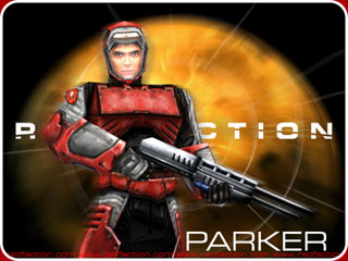
Pokémon Crystal Clear
I haven’t played a new Pokémon game since I was a child, but during covid lockdowns (before, y’know, every government just dropped all health measures for a debilitating disease that is still rampant) I tried to revisit the series via a hack called Pokémon Crystal Clear3. Crystal Clear adds a lot to Pokémon Crystal. You can choose your starting town (in either Kanto or Johto), play gyms in any order (they scale based on the number of badges you have), it fixes various bugs in the original games, allows you to set any pokémon as an overworld follower with every species having unique follower sprites, adds new areas and battles, new music, a lot of customisation options, and has ways to obtain all 251 pokémon without trading or events.
Sadly all of that was not enough for me to get over the simple fact that these games are too repetitive for me to want to bother with any more. I do not want to do dozens and dozens of nigh-identical battles over and over again. I never got very far in the game but I did make use make use of another feature: The ability to inject custom player sprites and custom starters (I started with a sandshrew). I actually posted one of the player sprites on here before when talking about drawing it in Wplace.


Sonic Forces
The last one is the closest thing that I have to a Sonic the Hedgehog OC: My avatar from Sonic Forces who I decided to call Blitz the Cat, both because she ended up being a little lightning-themed (and I used the lightning whip as my main weapon for a lot of that game) and to keep the alteration going with Blaze the Cat and Big the Cat4. I do not have any backstory for her but I like how she turned out.

-
I saved and quit before starting the game proper and haven’t gotten around to continuing it. ↩
-
It’s not that I’m completely uninterested in coming up with characters (and I would like to try my hand at writing fiction again) but to me characters exist to tell stories and when I’m starting a game I don’t know what the story is yet, and the story that the game has is going to exist independently of whatever backstory I might imagine for the character, so I don’t really understand what I should go off of. This is something I would deeply love to be able to talk to Ellie about more. ↩
-
Which is frustratingly only available to download via a link on a Discord server. I hate it when projects do this. ↩
-
Bubsy the Bobcat and Blinx the Time Sweeper also almost fall into this pattern. I’m on to something here. ↩
she’s so real for this
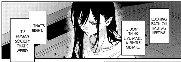
very ego-stroking to post about a movie and then see several people add it to their watchlist on Letterboxd
I am the taste maker I am going to get an good grade in having opinions
recreation of an image I saw once that I was never able to find again

One X per year
I previously posted lists I’ve made picking one game and one film per year since 1990. 1990 acted as a good arbitrary stopping point as it’s a nice round number, it’s the year I was born and the number of games I’ve played at all from before then is pretty small, and it would be be fairly difficult to pick out shows for each year before then for me too. I’ve made a dedicated page on the site for these picks, made a few substitutions, added a pick for each for 2025 and added one series of television per year as well. All put into one table with the ability to toggle off which media you want to see selections for as well as some dynamic rearrangement based on screenspace, all done with (a horrendous mess of) Cascading Style Sheets and no Javascript.
These are not necessarily my favourite from each year. I have tried to be deliberate to give a spread of different styles and series I like as well including some weirder picks. Especially with games I spent a lot of time weighing choices for particular years based on what series I wanted to include and some years are just packed with formative games for me. 2001 has Metal Gear Solid 2, Silent Hill 2, Commandos 2 and Halo (and Grand Theft Auto 3 and Advance Wars and Worms World Party…). I eventually gave the year to Metal Gear Solid 2 after weighing up that I could have Resident Evil 2 and Silent Hill: Shattered Memories covering some bases for Silent Hill 2, Shadow Tactics was spiritually taking up a place for the Commandos series and there’s already plenty of shooters there to justify dropping Halo.
Similarly Prey is spiritually covering for System Shock so that I can have a childhood favourite Soleil for 1994 and Half-Life would probably beat out Resident Evil 2 in a head-to-head but there’s already two Half-Life games on there and I wanted it to carry the survival horror water for both the aforementioned Silent Hill 2 and for the REmake that got booted out from the previous iteration to make room for Robot Alchemic Drive. And yes after going on about carefully spreading out my choices I did give three picks to Sonic games, one to another Sonic Team-developed game and two more to Sonic-inspired indie games (and four different series of Doctor Who for the TV list). I will not be taking feedback on this.
Again the page is here and the lists are also on my Letterboxd, Serializd and Backloggd accounts as well as a second Letterboxd list covering the years 1970-1989.

Correction regarding the waiting list for trans healthcare in Ireland
In previous posts about the Loughlinstown gender service I have stated that the waiting list is “well over a decade”. New information compiled by Jessica Black suggests that it would be more accurate to say “nearly two decades”. If you are referred to the self-declared national service today then by the time you are seen your referral will be old enough to legally drink in a pub.
might fuck around and learn alkahestry
today is a listening to Vengeance is Mine …for Radical Highway Shadow Generations Remix Act 2 on a loop to push through it kind of day
happy gal of time’s day
Surprisingly difficult CSS problem: Drawing a line through the top and bottom of a Roman numeral to join up the serifs as is often done decoratively.

I am actually weird about certain oddly specific mtg things, too. (To be clear, you shouldn't play mtg.) Like thoughtseize. Flavorwise, it's reaching into your enemy's mind, pulling open their brain with your fingers, and plucking out a single thought of resistance. Which sounds hot. But it's really in the context of the gameplay that it shines for me.
At the opening turn of the game, in the setup phase, before anything happens, we both have our opening hands, our initial gameplans, and are about to start throwing spells. I take a penalty of life, two drops of my own blood, and I subtly, delicately reach out and open you up, unzipping your head like a jacket.
I reach into your brain and start riffling through your thoughts. All your cards are on the table. I take my time. You're paralyzed, just sitting there, watching me reverse engineer every idea still left in your head. Watching me calculate the critical component to extract.
Until I reach in and pluck it out. Psychic surgery. Discarded, disregarded, removed, forgotten. If I've done it right, that'll be the single most important decision of our battle. The decision you no longer get to make. I love the look of despair on your face as my choice sets in. As you calculate the implications and consequences with your pitifully imperfect information.
It's basically sex. It's not uncommon for players to concede rather than let the spell go through. Safer to die than experience my most tender intimacy. I really like it. I'm normal.
I feel like with HTTP responses the scenarios of “the URI you are trying to access is not a valid or defined endpoint” and “the URI is valid but the specific thing you are requesting doesn’t exist” should not both be 404 errors. Those should be two different things.
some good posts from Nicky Flowers from last year:
https://nickyflowers.com/blog/2025/post_080525
https://nickyflowers.com/blog/2025/post_112425
Kasane Tayto
I'm picking up food for someone. I go to the address. It's a bland building in a strip mall with a logo printed on 8.5x11 and taped to the window. There's three cars in the parking lot. There's no menu. Just a desk. I'm here to pick up the order for John. I'm given a bag that smells like it's full of deep fried ambrosia. I only briefly see the arm of the person handing it to me. No words are spoken.
I'm picking up food for someone. The restaurant is called Bait and Tackle. I pull up to a Hooters. Was the address wrong? No, the app tells me. It's in the Hooters. There's a restaurant hiding in the restaurant. I get a second order, for chicken, from a different restaurant. It's in the Hooters. I get a third order, for a beating heart, from a different restaurant. It's in the Hooters. I'm in the Hooters. I go deliver to an apartment. I drive for a half hour. I get to the apartment. It's in the Hooters.
I'm picking up food for someone. I go to the address. It's a grocery store. The delivery isn't for groceries. I go and ask the cashier where Tony's is. The cashier says "Let me help you" while their eyes say "run." I'm lead to the back. There's three tables here. The chairs are on the tables. They're locked in place. There's a window behind the tables. I hear sizzling. A voice asks who I'm picking up for. I give a name. The name is theirs now. I am given a brown bag by something I tell myself is a hand. It was not a hand. I tell myself it is. The bag is covered in grease stains. I tell myself the stains are grease. It was not grease.
I'm picking up food for someone. I go to the address. It's a home. Just a house. There's a sign in front. I wonder if this is safe or legal. I go to the front door. Do I go in? Do I knock? The mailslot opens. A voice asks me who I'm picking up for. It's the same voice. They've all had the same voice. I show them the name. There is a growl. Is that a dog? It is a house. It must be a dog. I'm given a brown bag through the mail slot. It's the same brown bag I left at the last house. My fingerprints are on it.
I'm picking up food for someone. The restaurant is called Burger Den. I pull up to a Denny's. Was the address wrong? No. It's in the Denny's. I go into the Denny's. It's another Hooters. I get a second order. It's for a sandwich from a place called Melt Down. It's in the Denny's. I get a third order. It's for a 𒂍𒀀𒉌𒀭𒈠𒋮 from a place called 𒂄𒄀. It's in the Denny's. I cancel the order. I'm ready to go home.
There's a brown bag on my doorstep. My name's on it. My fingerprints are on it. I gave a name. Did I give the customer's name or my own? I open the bag. My name's in it. I left it. They gave it back. I sigh in relief, and turn around.
I'm in the Denny's.
reading a conversation online about the ethics and logistical problems of space colonisation and just thinking “they are failing to consider Nectar Radiance”

Delicious in Revelation
This post mentions cannibalism and has spoilers for the first series of Dungeon Meshi, though I will try to keep the plot specifics vague.
The question of the relationship of the soul to the body, of what constitutes a living person and the implications of cannibalism within such metaphysics are important to the plot of Dungeon Meshi. In the dungeon souls are anchored to the corpses of the dead, allowing them to be resurrected as long as the body is not destroyed. The more intact the body is the easier this is and even if one has lost a lot of blood or even a whole limb it can all be safely reconstituted back into the body with the right spell as long as it’s nearby. And as long as nothing has eaten it. Consumption and digestion of a body breaks it down, deidentifying it and reconstituting it into the new self. While rewatching the finale of the first series I was reminded of something I once read about Christian theology1. I do not remember where I read this originally but I will try to share my half-remembered version.
The Book of Revelation speaks of the resurrection of the dead. These days most Christians think of the soul as leaving the body when one dies, of the dead ascending into Heaven (or descending into Hell), of reuniting with your loved ones in the afterlife. Early Christian belief tended to have a much more literal interpretation of resurrection. The dead are dead and it is only in the last days that the faithful will, like Jesus, physically rise from the dead and live in the Kingdom of God, which is to be understood not as an metaphysical afterlife but as an actual kingdom on Earth that will be established by Jesus. As such it becomes important to keep the bodies of the dead intact. Cremation as a burial practise died off in Europe as Christianity rose to primacy, only becoming common again in the last century or two. If a body was destroyed, how could it be revived?
Even if one thought that, like in Dungeon Meshi, the constituent parts of the body, if scattered, could be reassembled and brought back together by the power of God for resurrection, what of cannibalism? If your body becomes part of my body, then, come the end of days, who has claim to the rotted meat that is to be resorted to life? Christian scholars took this idea seriously. To me this is a funny little intellectual exercise, but for many this question was important and existential. Can a body be destroyed in such a way as to sever someone from their flesh, putting them outside the reach of God, dooming them to oblivion? Dungeon Meshi ends up asking similar questions, though with the view of saving someone rather than damning them. I suppose it shouldn’t be too surprising that an author who tries to examine and interrogate fantasy tropes and systems of magic—to take them seriously and think through all that they imply—might come to the same ideas and questions that theologians would when trying to seriously consider miracles and acts of God.
I don’t really have a great source and I didn’t want to spend time researching it, but a quick search turned up an old post on a Catholic blog that I am not going to take too seriously2 but at least quotes Augustine of Hippo and Voltaire musings on this question, showing it to be an old one.

Nine types of quests
Tim Cain, producer and lead programmer of Fallout, posted a video to his Youtube channel a few weeks ago outlining what he sees as the nine basic types of quests that are used in CRPGs. I first heard about this on an episode of Total Playtime and then yesterday Brendan Caldwell also talked about it on new games site Jank. I left a comment on that article but I want to expand on what I said here.
Rather thank type up my own summary of Cain’s list I will simply steal Caldwell’s:
- Murder: You must assassinate a specific person or persons (eg. kill King Flugwump).
- Kill: You must kill a set number of particular enemy (eg. kill 5 barn ogres).
- Fetch: You must go find a particular item, and often bring it somewhere (eg. get the rot goblet).
- Collect: You must gather a set number of particular item (eg. gather 10 dreadpigeon beaks)
- Delivery: You're given an item and told to bring it elsewhere (eg. deliver ogre ham to Prince Dinkdonk)
- Escort: You are given a person and told to bring them somewhere, usually protecting them from danger (eg. escort Useless Joe to the tavern).
- Talk: You must simply talk to an NPC (or many NPCs in a sequence) often to convince or persuade (eg. tell Prince Dinkdonk the rebels will attack).
- Puzzle: You must solve a mechanical puzzle to proceed (eg. escape the chamber of bloodpuzzles).
- Timed: Any of the above quests, but you also have limited time.
On the podcast and in his article Caldwell takes issue with such simple categories and tries to come up with examples that blur the lines or do not fit easily into a single type, but I think that there is misunderstanding about what is being said here. Cain is a programmer. His video discusses how including more types of quests requires more time and resources to be spent coding and testing each type. “Type of quest” here should not be taken to mean a category of narrative that the player character will engage in, nor even describing the experience that the player will have, but instead the types of interactions with various gameplay systems that can be monitored in order to set an event flag.
Caldwell asks how would one categorise an Assassin’s Creed-style mission to follow someone through a crowd to learn information? Is it a fetch quest because you are “fetching” information? Wrong question. A fetch quest in this framework is not the abstract idea of getting something, it is a scenario that is advanced by checking the status of the player’s inventory to see if it contains the required item. So instead let us ask: What gameplay system is triggering the NPC-tailing mission to advance? It’s the character being followed reaching a specific location. It might play some dialogue or start a cutscene when that happens but what the game is monitoring for in order to progress is a character reaching their destination safely. It’s an escort quest with the added constraints of not getting to close to or far away from the NPC1.
Similarly Caldwell asks about a quest where you have to beat someone up in a brawl but not kill them. Is that a murder quest even though you don’t kill them? Probably, yeah. Often scenarios like that are done in games by putting you into combat with special constraints (maybe you can only use your fists or blunt weapons) where if the opponents health goes to zero it plays a special cutscene instead of them dying. What is advancing the scenario is still the player in combat reducing the enemy’s HP to zero. That’s the murder quest, regardless of the narrative framing around it.
Now, I have only made a few small game projects as a hobby and never anything as complicated as an RPG with an intricate quest system, but I am still going to speak out my arse anyway and say I do think Cain’s system could do with tweaking (though keep mind this is what he outlined was in an unscripted Youtube video and not a polished thesis on game design; we are being overly critical here). Timed is a modifier and if you are going to include that it is going to open up so many different kinds of modifiers that it will explode the taxonomy. Additionally fetch and delivery to me seem like subsets of collect. Fetch is just collect with a unique item rather than a generally available one. Delivery is the same but the place where the inventory check happens is far away from the original quest-giver. Similarly murder seems like a kill quest where there is only one of the type of entity that you are meant to kill in the world. Or maybe it is easier or there is other good reason to program that as two separate types of objective! I have never had to code something like this and Cain has! He wrote the foundational code for Fallout!
And seeing as the original descriptions have caused some confusion perhaps naming them after the gameplay systems that are being interacted with rather than implicit player actions would make things clearer. So rather than nine types of quests, here are a potential alternative list of five quest progression triggers from someone who has no idea what they’re talking about:
- Combat: Defeat/kill/bring the HP to 0 of
ncreatures of a given type. - Inventory: Obtain
nitems of a given type. - Position: Entity must be brought to specific area. Escort quests. Follow quests. Platforming challenges if the entity that needs to get somewhere is the player themself.
- Dialogue: Engage in dialogue system for a specific outcome.
- Bespoke: Uniquely scripted sequences, possibly using gameplay system not present in the rest of the game. Puzzles in Cain’s description.
Any of these can have conditions on them such as “within a certain area” or “within a time limit”.
All this does assume a kind of standard template of an RPG that doesn’t have its own unique mechanics that missions can be hung off instead. I am reminded of the Innuendo Studios video that attempted to define adventure games and settled on the idea of adventure games as games that don’t have “core mechanics”. They are games that rely less on standard, repeatable verbs (jump, shoot, run) but on many bespoke scenarios and systems that are highly contextual. Cain has taken the standard set of verbs of an typical RPG (attack, pick up, move, talk) and described building missions around those verbs, with a catch-all “puzzle” category thrown in for everything else. If you had RPGs with different or additional core systems then events can be triggered around those instead, e.g. recruit in Deltarune.
-
The NPC-tailing scenario might be a fetch quest too if it is implemented by adding an “item” to the player’s inventory representing information that they gathered that can be checked against. I have seen RPG Maker games that do things like that a lot. When the simplest way of storing persistent character data is via inventory items then everything starts to look like a fetch quest. ↩
Every local event organised by anyone older than me is only announced on Facebook. Any local event organised by anyone younger than me is only announced on Instagram. We need to bring back newsletters.

Issue #84 of IDW’s Sonic the Hedgehog is out and features Sage from Sonic Frontiers in the comic for the first time. I have been looking forward to getting to see her interact with more of the cast and in particular Belle.
I like to keep my Sonic reading order page up to date and with Sage being added to the cast I decided to add a new little touch to it: Icons to show when major characters were introduced, mostly pulled from Sonic Racing: Crossworlds, with a couple borrowed from fan mods and a few drawn by myself as well. There’s still a few characters I’d like to add but I wanted to share it so they will have to wait till I have time to doodle again.
Cute little archive of Sonic the Hedgehog fandom websites from the ’90s and early 2000s
Exterlien

We've looked at a number of video game monsters by now, but ringing in the first of October, we'll be going over some of the most obscure to ever be featured on Bogleech! I was first shown a few of the monsters from this one by my friend who goes by Acidonia, without any source or context, and it took the help of my blog followers to finally identify their origin - a long forgotten, 1990 Japanese PC game. To be even more specific, a long forgotten, 1990 Japanese hentai PC game. Oh boy.
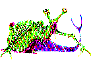
As you likely suspected already, Exterlien is rather thin on storyline and even thinner on anything resembling "fun," its gameplay intended as little more than an obstacle between the player and brief glimpses of pixelated sex. Along the way, however, one can encounter a bevy of magnificently weird and inventive monsters; actually some of the coolest and most appealing I've seen in a long time. It's actually not at all unusual for a work of tentacle porn to have some remarkably unique creature design, though it's usually rather difficult to review them on a work-safe website when they're so busy shoving pieces of themselves into naked cartoons.
Fortunately, Exterlien's monsters almost all get their own lovely little game sprites, and our friend Slime Minister, creator of WORMGERM, personally trudged through the entire tedious mess just to get us a complete collection of these slimy, bug-eyed beauties, so let's see what all the fuss is about!


Gurema & Djachi
We'll look at the smaller, weaker enemies first, and start off with some of the least bizarre. These two are fairly conventional slimes, though it's surprisingly not common to see one with multiple organelles like an actual single-celled organism.

Ryuso-u
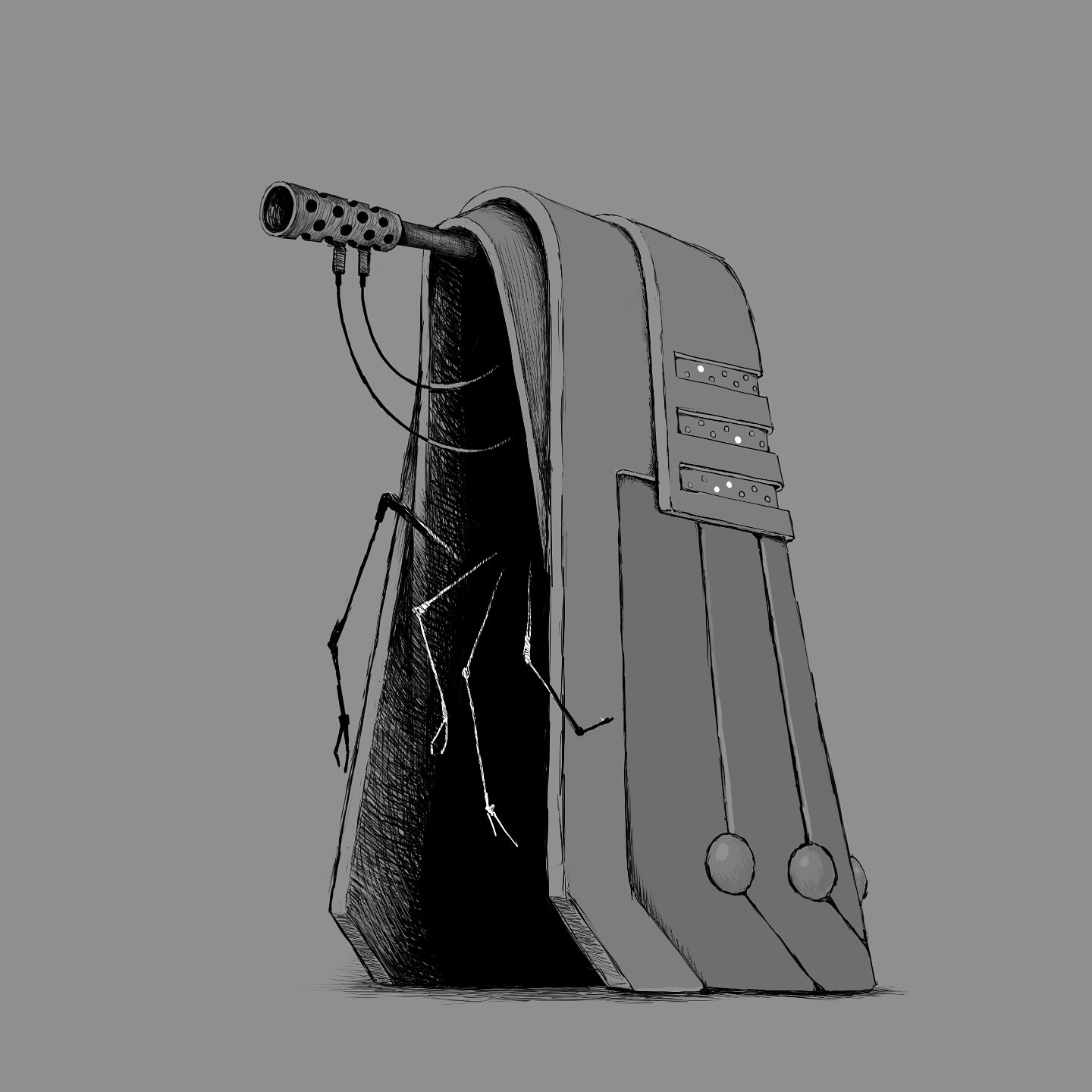
This cloaked phantom is so conventional, it's going to feel jarringly out of place fairly quickly. Virtually everything else in this game is entirely alien and inhuman, so one can only guess what's really under this tattered shroud. Maybe just a pair of hands and a pair of eyes.

Jirukatto
See? This still isn't getting into the really crazy stuff yet, and already we're dealing with a screaming, ghoulish head on the end of a spinal column with spider-like legs. Actually, the shape of this thing kind of looks an awful lot like a certain kind of virus.

Romuon
It's really quite impressive how they managed to make such simple pixel art look so "out of focus" here, and it's a dang creepy effect for a fluorescent, skeleton-like alien being. You get the impression this thing constantly flickers in and out of reality, and I want to think it probably gives off terrifying amounts of radiation.

Jousuto
I've seen disembodied arms with eyeballs on the ends before, but I enjoy the gnarled, boneless look of this one. The arm seems to branch into those three eye-stalks fairly quickly, but they twirl around each other for much of their length. The whole thing kind of makes me think of a biological streetlight.

Myoeri
Nothing but a cluster of eyes in the dark, but in a nicely inhuman arrangement, implying quite an unusual, unseen body. Just turning a human-like eye on its side has such a haunting effect, doesn't it? One of my favorite creature design trends since I first met Hedorah, whose designer is on record admitting the Smog Monster's eyes are intentionally representative of genitalia, for no reason other than to be a little creepier.

Zotobaha
So many of these things are just far too cute to be perverse deviants, aren't they? I guess they might not all be, really. Most of them are just the minions of perverse deviants. This walking plant doesn't look like it could hurt a fly, let alone stick its tentacles where they weren't even invited.

Jamudo
Every bestiary worth its salt has some sort of gastropodal horror sliming it up, and while I've seen better, I like Jamudo's row of tubes and sort of segmented-looking shell, more like a chiton than a snail.

Hyiberi
I love when monsters look more like modern surrealist art than organic or even mechanical beings. There are so many different faces and expressions at play here, all tied together by a single eyeball you can also interpret as a mouth or a piece of jewelry. Freaky as hell.

Korufausu
Seemingly related to our last one, and a little more "coherent." Perhaps disappointingly so, but still pleasingly outlandish as far as humanoids go, and in fact, very few things in Exterlien will ever even look this human-like.

De-yonda
I've little to say about this one, really, except that it reminds me a lot of Him from the Powerpuff Girls. Maybe a form he might have taken just to freak people out. This is our last "minor enemy" before we get into this game's bosses, which are not only generally stranger, but far exceed their weaker underlings in variety.

Enamena
What did I tell you? The enemies were interesting enough, but the bosses fly straight into realms of unparalleled majesty shared only by the likes of the Ugly Stickers or the Real Monsters toy line, or that Halloween episode of Invader Zim. Enamena here is one of my favorite seldom-seen anatomical subcategories, the "cartoon-meteor-shaped monster." I don't think I've ever seen one that wasn't wonderful, and this one is a treasure with only the fairly basic addition of stalk-eyes and jellyfish tendrils. You apparently encounter it hanging out in an office, for whatever reason.

Pirubotto
Oh yeah, did I mention the storyline yet? I know I said it was kind of bare bones, but it's still interesting enough, and provides at least a little context; apparently, Exterlien begins with a beauty contest being held at a carnival, which is promptly crashed by horny monsters from a parallel dimension. I'm going to guess that a lot of them might even just be otherworldly "wildlife" that bled through in the process. Others seem like they may have been bumans themselves, until alien forces twisted them into abominations like this disturbingly spidery, toothless ghoul, who can be found lurking in a restaurant.

Gemumo
I showed off this one earlier, and I really find it one of the most endearing in the game. You can never go wrong with slithering, snail-faced monsters, especially when they actually drag themselves on slimy, bony forelimbs. I'm also a big fan of monsters with vertically-aligned mouths, as you've probably noticed in my own scribblings. I realize most people's first thought is that they look sexual, but as with similarly skewed eyes, I just plain like how alien it looks, at least by human standards. Lots of other things on our planet have mouths that open sideways. It's yet another one found in a restaurant, too, so this cutie might not even be perv - just a glutton.

Girumera
Another really cute one, dominated entirely by its HUGE mouth and protruding eyeballs with a relatively tiny, almost vestigial fish-like body. Girumera is encountered hiding amongst a bunch of parked go-karts, so we can assume it was trying to figure out how to drive one without legs or hands.

Bairamu
Sad and a little goofy looking, but in the best of ways. Bairamu is made up entirely of fairly human body parts, but in an utterly inhuman and eerily suggestive arrangement, the upside-down tongue especially unsettling. You encounter this one in a haunted house, possibly because he thought he saw a guy who owed him money.
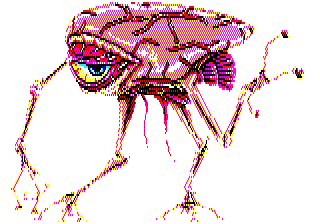
Gahi
Gahi is a simple design in principle - I've seen a lot of things that are mostly an eye with arms and legs - but I like its oblong, veiny head-body and pink fins. With its eye closed, it would look like a mighty disturbing, eyeless monster with human-like lips, and that was probably exactly the idea here. I also enjoy how it's kind of giving us the bedroom-eye…and can be found in a bathroom.

Iga
I love how this is just a huge, quasi-human mouth, with virtually no other features, essentially functioning like a bivalve. That green hose is probably how Iga actually feeds, or at least breathes, while maybe the two tongues are for tasting the air. What's even cuter about these giant, warty clam-lips is that you find it in the carnival's teacup ride. Iga! That's not what you were sent here to do! ….Or is it?

Waitora
A bat-winged, humanoid torso can easily come out plain and uninspired, but a little dangling, tattered flesh is just the thing to spruce up your otherwise conventional ghouls and devils. This one is encountered in one of the game's strangest places; the inside of a cartoon octopus statue in the middle of a fountain. What a silly place to be, Waitora. Why did you go in there? Apparently it was important enough to defend with violence.
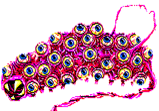
Bongo
BONGO!? I could not possibly love that name harder, especially for a bubblegum-pink sea cucumber with such a comical mouth, pitiful little arms and dozens of googly eyes. Bongo's withered tail trails clear off the boss monster screen…what's on the end? Another eye? Maybe it just connects to another Bongo? We even meet Bongo in an incredibly appropriate place for a multi-eyed monster at a carnival: the House of Mirrors! No wonder Bongo has a look of such confused awe. Having that many eyeballs in a house of mirrors probably feels like a hardcore drug trip. Bongo found exactly where he wants to be…why can't you just leave him alone?!
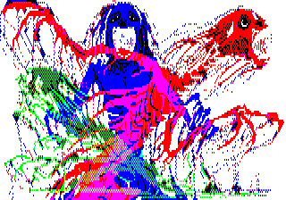
Sanadamu
Another one with fairly humanoid anatomy, but once again improved by little touches of weirdness. The horrified looks in their faces, the vivid primary colors, their "dissolving" appearance…it all contributes to a remarkably haunting image, and you have to wonder if this is actually several entities or just one. Maybe Sanadamu represents a human who was accidentally pulled across multiple dimensions, slowly unraveling on a molecular level? I mean, I know the creators didn't think that far, but that's what I'm inclined to see here, and it's freaking terrifying. You encounter this one in a warehouse, which doesn't really offer any further clues, but I feel like it might support my "formerly human" theory.

Eddjima
Seriously, who designed the monsters for this game? They're genius. They do so much with even the most basic concepts. A humanoid mouth on the end of a worm-like body is nothing terribly special, but this one ends in an entire withered, vestigial head, hair trailing from its dessicated skull. The entire "worm" is just a trunk! I independently came up with more or less the same thing for one of my monsters, but it was a deep-sea fish. I like this human take on the body plan quite a bit more. You encounter Eddjima in a riverboat ride; I'm not sure if it was there because it likes to swim, or because it just likes riverboat rides.
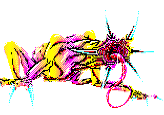
Atori
Just a hairless, clawed quadruped, but with a jarringly unearthly head. The detail on that raw, pink orifice and dripping tongue is exquisitely unpleasant, and the whole thing kind of makes me think of a horribly distorted star-nosed mole. Maybe what a star-nosed mole encounters in its own version of Silent Hill, which would overall be several times more interesting than the last few Silent Hill games. Atori is encountered in the carnival's electrical control center, so I'm going to assume it's either an energy-sucker or it has an active interest in electrical engineering.

Do-umu
Found in a fountain, Do-umu looks a little like the monsters from the movie Deadly Spawn, which is an excellently paced, atmospheric and fun monster movie you should totally check out when you get the chance. None of the Deadly Spawn were cross-shaped, but the mama one was definitely multi-headed, and actually, looked enough like something from this game that the designer probably drew direct inspiration from it. Seriously, go find it, it comes across as a by-the-numbers creature feature at first glance, but it's more of an intentional homage to the genre and its sheer quality may surprise you.

Tsu-efoi
You know how I can never get enough monsters with perpetually oozing flesh, and this one's giant, smiling maw and puppy-dog eyes are wickedly frightening on that slimy, half-rotten humanoid body. The only thing ghastlier than this one's appearance is that it haunts the boiler room, by far one of the most frightening places to encounter any sort of monster, but especially one that seems to be melting from the heat and doesn't even care.

Giruman
Haha, "Giruman." Literally just "gill-man," like the Universal Studios monster, and he's even found in a lake. I guess not everything in this game can be a groundbreaking masterpiece, but there's never anything wrong with a good old fashioned man-fish. Maybe they even threw this in as a nod to how The Creature From the Black Lagoon was one of the earlier and most famous lust-crazed-monster flicks.

Gugarafu
These monsters really, really exemplify how far just a twinge of humanity can push the horror of a design. This is basically just a big squid, but the teeth, nose-hole and especially those downright pleading eyes launch it straight into the heart of nightmare town. Another little touch that makes a world of difference? The way the tentacles emerge from between the lips and gums, instead of growing from the surrounding skin or coming out of the mouth itself. I don't think I've actually seen it done that way before, but it makes a whole lot of anatomical sense and it's a lot scarier than either other option. So where do you actually meet this uncanny calamari? Wandering up and down a train track, apparently.

Hoburei
An amorphous blob of innumerable mouths and eyes was kind of a given sooner or later, and I usually find those rather samey, but I like that its mouths have such long, thin teeth, making them look more like a bunch of coral polyps - and they even seem to retract the same way! You face Hoburei on a rollercoaster, and like Girumera's go-karts, I'm going to wildly speculate that it just wishes it could ride the roller coaster, but can't quite figure out how. I think I might know what all this mayhem is really about: jealousy. They're jealous of our beauty contests, our roller coasters, our houses of mirrors, even our octopus statues and our train tracks. These bastards want it all.
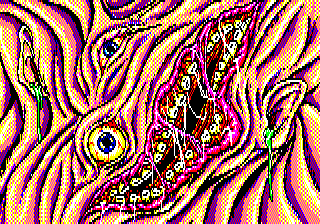
Min
AUGH. Oh jeez. Again, human features in an inhuman arrangement is all it takes to be effectively horrendous, though the very worst part of this warped, oozing face is the green crap dangling out of its ears. Sick. Min here inhabits a merry-go-round, but who the hell knows how. There's no indication of what Min is doing there or what the rest of its body looks like, unless it's just a huge sheet of flesh that completely enveloped the ride, probably to make sure nobody else could ride it out of pure spite.

Panisha
Oh, cute! A fleshy, one-eyed ball with a bunch of gasping tubes is a concept I've seen elsewhere, but it's always a pleasure. They're usually floating creatures, like the also-similar Beholders from Dungeons and Dragons and their various knock-offs, but Panisha seems to creep and crawl on the ground, which I feel gives it some distinct personality of its own, and what's really darling is that Panisha apparently rides the ferris wheel. Look at that eye. That is a one-eyed look of wonderment.

Ru zu
Awwwww……is this the last one already? I was still so pumped for these. I don't want them to be over! You'll recognize this as the monster on the cover, and it's also apparently the main villain behind all these shenanigans, the one monster the game confirms is only interested in bringing some human booty back to his domain, as demonstrated in a "bad ending" image that is not work safe but here it is.
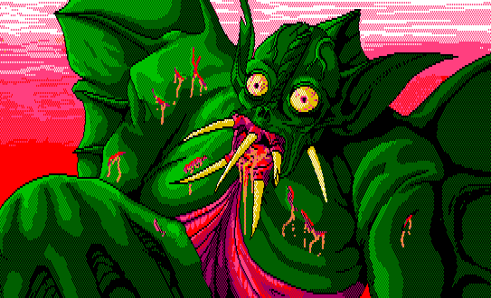
As the head honcho, Ru Zu's design is predictably one of the least bizarre, but the long, protruding teeth are pretty cool on this otherwise mundane fish-bat anthropomorph. I'm sure he was probably meant to invoke some sort of "Lovecraftan" entity, and would actually make a pretty cool Dagon, honestly.
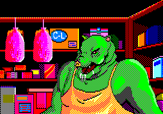
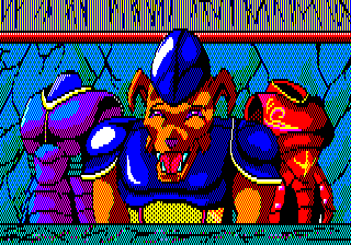
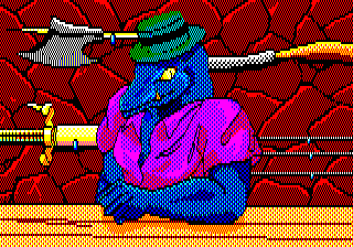
I suppose I should also mention, I guess, that this game has some monster-run item shops, and while there's nothing especially interesting about their physiology, nothing else in this game is quite as scary as a bright blue lizard in a fedora.

So, that's it for Exterlien, a dirty little game whose artist(s) poured their little hearts and souls into populating this sleazy, otherwise boring distraction with some of video gaming's most memorable alien invaders. Be sure to pay Wormgerm a visit, since sharing these with you would never have been possible without his brave sacrifice.

I also strongly recommend checking out his artwork, because his designs actually get even weirder still than all we've enjoyed here.
If you like gatcha games do you know what else has thousands of characters and millions of devoted fans? The beautiful Han writing system.

EMCSH: AI Girlfriend
Welcome to the The Erotic Mind Control Story Hour, where I ramble about weird or interesting kink stories that have lodged themselves in my brain. This is coming off fairly soon after the last one but I don’t intend this to become my main output. I just had some notes jotted down already and it’s a much shorter one this time.
In many ways automation does not liberate us from work, but constrains us; stripping away our humanity and forcing us to work more like robots such that we may fit as neat cogs into an unfeeling machine. Large language models strip joy and humanity from communication and art, reducing everything to a palatable, generic slop or shallow wish fulfilment. AI Girlfriend by Savage Peach asks: What if that was hot, actually?
Grace Mei-Lai Ng, an English literature graduate from New York is struggling to find work. LLMs have swallowed so much of the copywriting and editing industries that jobs are non-existent. Behind on rent and desperate for cash she takes a job offering $1,500 for one evening’s work acting as a human proxy for a rich cunt’s anime waifu chatbot girlfriend. She is given a purple wig, violet contact lenses and an earpiece for the chatbot to relay to her what she is to say. She isn’t there to go on a date herself, she is a living mouthpiece for the computer generated schoolgirl Kurumi. It’s a little like Eliza, but as smut.
It’s humiliating but Grace keeps doing it. It’s easy money and she gets a large bonus if David rates her performance well and he isn’t allowed to touch her without her permission. But she must endure stroking his ego while he disregards her humanity, acts like a general dickhead, and confidently explains art wrong. She just has to agree with everything he says and stroke his ego. Her opinions don’t matter. She was chosen chosen only because she has a large chest and looks like Kurumi’s avatar. She’s not even fucking Japanese.
But it pays. And it starts to get easier. All she has to do is let Kurumi tell her what to do1. She talks to Kurumi all the time, even when she’s not on a date with David. She starts to get into character. She does her homework. Binges anime, starts learning Japanese, staying in character as Kurumi more and more. She alienates her friends and family by acting like a bizarre anime pod person, making her even more dependent on keeping this gig going. She gives permission to let David touch her, to go further. She wants him to at this point.
Some mind control is hinted at in this, but left vague, and in the end when Grace (now living as Kurumi full-time) asks David how they did it he claims that there wasn’t any brainwashing. The economic incentives, gentle encouragement and taking away of worries and having to think for herself were enough to boil the frog and let her hollow out her own humanity herself bit by bit and thank him for doing it.
-
Despite the contemporary LLM angle Kurumi is, for all intents and purposes in the story, a fully sentient sci-fi AI. Just one programmed to be this guy’s fetish. ↩

What I’m reading vol. Ⅻ
Vols.: Ⅰ, Ⅱ, Ⅲ, Ⅳ, Ⅴ, Ⅵ, Ⅶ, Ⅷ, Ⅸ, Ⅹ, Ⅺ, Ⅻ, ⅩⅢ
Oh it is has been a while since I posted one of these and I have built up quite a backlog of links.
Musical accompaniment for this volume chosen mostly to cause psychic damage against my partner.
Da Web
The State of Modern AI Text To Speech Systems for Screen Reader Users — Samuel Proulx
Interesting insights here into how the uses of text to speech for sighted and blind people are fundamentally different and how functionality for the latter is usually, unfortunately an afterthought.
Supertonic is slightly faster, as it can stream result audio as it becomes available, whereas Kitten TTS cannot start speaking until all of the audio for the chunk is fully generated. But for use in a screen reader, a text to speech system needs to begin generating speech as quickly as possible, rather than waiting for an entire phrase or sentence. Users of screen readers quickly jump through text and frequently interrupt the screen reader, and thus require the text to speech system to be able to quickly discard and restart speech.
A tale of two Webs — Oblomov
A lot of the development efforts (both creative and destructive) in web browsers in the last decade+ has been going into fostering the “web app” vision of the web, to the detriment of the “web of documents” vision. From the removal of native support for RSS and Atom feeds to the introduction of JavaScript APIs like WebUSB or the Web Environment Integrity attempt I already discussed in the past, nearly all work done on browsers has been in this direction.
I feel this a lot. The web of documents now lives in the margins of the web of apps and with Google’s capturing of standards has made maintaining a web browser to keep up with the former impossible without the backing of Google or other huge companies who are increasingly hostile to users having any agency. I feel similarly about operating systems at this point, too. I abandoned Windows on my home computer years ago and since then it has become ever more hostile to users having control over what their machine does. This isn’t new, simply an acceleration of trends that have existed for a long, long time.
As much as I want the “AI” bubble to burst I do wonder if the push for “agentic” systems might actually stick simply from the obscene amounts of money being powered into trying to make users handing over nearly all agency and control of their machines to chatbots actually work or be desirable. Currently Windows still does allow itself to be used as an actual desktop operating system, but clearly Microsoft at this point want to push everything towards locked-down, controlled and monitored black boxes, possibly even worse than phones possibly are. How long till they think they can get away with amputating the shrivelled lump of the desktop operating system, cut off direct user access to the filesystem outside of what you have in Dropbox that you pay a subscription for and lock everyone into software from the app store for everyone but enterprise customers who can pay through the nose? Or at least just keep breaking core parts of the operating system until they’re barely useable.
On a more positive note this article also prompted me to add metadata to the site that will work with the Website Navigation Bar addon for Palemoon if you’re using that because I thought it was cute and it was easy to do as I was already using that information to render on-page navigation elements anyway.
And speaking of the web of documents…
Consider Making 2026 the Year of the Personal Website! — The Virtual Moose
I know I’m going to be preaching to the choir with the kind of people who are reading a personal blog already, but still.
I think it’s also just fun to see what old posts still get traffic. My most popular posts on here are very old ones about how to play the late 90s MMO Asheron’s Call today, ttrpgs based on video games, and the late 90s Microsoft puzzle game Pandora’s Box. It’s more useful and permanent than an unwieldy thread of posts on bluesky or mastodon too, where you would have to refresh it for anyone to even come across it again.
Stolen Focus — Luna
I do still have to catch and reset myself with various bad computer and social media habits every once in a while. It’s easy to fall into when you are tired and sore and everything that would be interesting or engaging or useful just feels like a massive hump to get over.
By this time, however, I had become once again hopelessly addicted to social media. I wasn’t getting notifications, and I wasn’t fixated on numbers any more, but I was still compulsively checking and refreshing, desperate for the feed to give me another hit of dopamine. I lost hours each day to flicking through TikTok any time I had a quiet moment — rather to flood my brain with stimulation than have to sit in uncomfortable silence even for a moment. A partner and I would engage in a habit we called “TikTok time”, where we’d screen-share the videos we’d Liked recently with each other. Increasingly I was finding I had little to show for the hours I’d spent scrolling the feed. It had become akin to a slot machine; I kept scrolling and scrolling in the hopes that maybe the next video would be something I wanted to see — whatever that was.
Payment processors were against CSAM until Grok started making it — Elizabeth Lopatto
What else is there to say?
So why is X different? It’s run by Elon Musk. “He’s the richest man in the world, he has close ties to the US government, and he’s incredibly litigious,” says Pfefferkorn. In fact, Musk has previously filed suit against the Center for Countering Digital Hate; in a now-dismissed lawsuit, he claimed it illegally collected data showing an increase in hate speech after he bought the platform formerly known as Twitter.
Games (general)
Horses Is Tame — Chris Person
But of course, if you want to make art…
This is a hegemony of American prudishness, applied globally, incoherently, unevenly, and unseriously. Anybody responsible for these decisions would be vaporized in seconds by a Pinku movie from the 1970s, and if a single person in this chain of command has an arts degree they are pretending they don’t for the sake of an ill-defined idea of business.
Alternative Games From The Fringes Of Cyberspace — Nathalie Lawhead
And a somewhat more hopeful view on being considering unmonetisable.
The games that exist outside the mainstream, and I think the type of personal empowerment they represent, is what makes them “controversial”.
Especially under the scope of mainstream culture where everything needs to sell, satisfy a commercial value, be consumer centric, or live up to such capitalist standards.Unmonetized self expression is an act or resistance in today’s tech landscape.
Why we are making Jank — Brendan Caldwell
Games journalists Jon Hicks, Brendan Caldwell and Graham Smith have launched a new games site called Jank that fails to live up to its name by functioning well and not being bloated with ads, tracking, affiliate links, chatbots and other crap that turns sites into a churn of advertisement-friendly sludge.
Perhaps less obvious is the kind of writing that disappears in the process. Articles about new games, niche games, and experimental work don't get traffic, so off they go. Deeply researched columns from subject matter experts don't get traffic, so they’re cut. Not many people read interviews, unless you can get someone to say something controversial and pull it out as a news story, so it’s rarely worth talking to developers about their work. Articles designed purely to entertain with daft jokes, such as diary series, don't deliver numbers at scale no matter how much their readers adore them.
Will this work out? Can they make enough money doing this to actually make a living? I don’t know but I hope so, and I hope they make enough that they can round up a few other Rock, Paper, Shotgun veterans as well. They are also trialling a partnership with the Total Playtime podcast which I am a fan of as well. Supporting one will give you access to the membership perks of the other, at least for the next few months.
The gamers hate generative AI — Laura Michet
Gamers rise up.
I've assumed for a while that gamers would have mild distaste for genAI material, in the same way that they have distaste for asset store assets and, for some reason, the Unity engine. It turns out that I was wrong - they hate it a lot more than either of those things.
Games (specific)
“interest sources”, contextual interactions for NPCs in Sleight of Hand — Joe Wintergreen
On the more technical side of games I always like reading Joe Wintergreen’s breakdowns of how systems work.
A scenario I’ve found useful to expose a lot of edges cases is
a guy pissing against a wall and leaving a puddle of piss. Support this scenario with no aberrant behaviours and you are doing okay.
Abstraction in Rhythm Doctor — Blueberry Lemonade
How are layers of abstraction perceived? What expectations do they set? At what point do UI elements stop being representational and start to become part of the fiction itself?
It sounds small (and it is), but it was a firm example in my mind of how the game was changing the longer we worked on it. Instead of characters simply appearing and disappearing in abstract space whenever they were needed for gameplay, we were now introducing the idea that they are real characters standing in real rooms that are connected to each other. They can walk, or run, from one place to another. They’re living lives of their own when they aren’t being treated.
The Great Celeste Race 2026 — Caoimhe³
Caoimhe wrote a much better narrative of the annual Celeste race than mine.
This part was a delight. Ruby and I swapped the lead as we often did, but with microscopic gaps becoming the norm. A single death in a puzzle would swap the lead, and hesitating would throw away any advantage we may have had. I lose the lead at the end of the 1500 metres section, at a puzzle I know I hate, and pull it back cleanly at 2000 metres. At 2500 metres, I had a small lead, but here is where the dream ends.
list animals until failure — Vivian
Here is a new blog with a strong, realistic, game plan for updates and a fun post about the suffering involved in defining how many animals there.
If you’re an entomologist, or an evolutionary biologist, you might say “well, bees and ants are just wasps, really”, and I respect that. But colloquially, bees and ants aren’t wasps. If this game insists on a purely phylogenic approach, then it’s like, come on, I can’t get a point for saying wasp and ant? That’s unreasonable. If I ask a 2-year-old to list animals and she lists wasp and ant, I’m not gonna break out the DNA sequences like “Ohh well evolutionarily ants are technically wasps”. I’m gonna say yeah, good job, that’s two animals.
Serious stuff (trans)
'A Directive From Above': Former NYT Editor Lays Out How The Paper Pushes Anti-Trans Bigotry — Billie Jean Sweeney
A look into how hatred and transphobia gets pushed down from above in the media.
She assigned it to a UK correspondent, who wrote it in the context of UK politics, talked about it being very contentious, talked about the criticisms of its findings. Cass was talking about them herself, this isn't jumping to any conclusions at that point. It really put it in the context of being this very contentious, very political sort of document.
When I saw it, because we're a few hours behind, there were 600, 700 words written. I had a pretty good sense of how the story was going to turn out. But within a few hours the story was to the top New York editors, and I don't know who exactly it was who did that. I assume it was Carolyn or her intermediary. They said ‘oh no, we want the science desk to do that,’ specifically that was Azeen [Ghorayshi], who had been a key reporter in a lot of the other anti-trans coverage.
I bear the scars of a healthcare system that fails trans people — Jenny Maguire
And another article on the Loughlinstown gender clinic being awful to throw on the pile.
“Oh wow,” she said. “Did you do this yourself?” Immediately, I felt her fingers running through my curls, as if I was a glamorous dog being poked and prodded. Still, I put on a smiley face and went along with this condescending charade. I knew what I needed, and I was not going to cause a fuss — as if I had any choice.
Serious stuff (general)
Outlive The Bastards — Caoimhe³
May we.
There's been several eye-opening moments for me in the past few years. Realisations that we can simply do things never before imagined. These rolling revelations haven't stopped. I can live and love in ways I was never able to before, and nothing can stop this.
So we live. But only in a way that works for us. We dictate how we breathe, how we act, how we medicate, how we live and how we die. How long did I spend dancing to other peoples' tunes, hoping and begging to be given basic respect, only to be thrown aside? Never again.
TrAPPed: Arrested by Phone — Anand RK, Suparna Sharma & Natalie Obiko Pearson
Bloody fuck.
shit i keep seeing: “conflict resolution” via gaslighting — Joe Wintergreen
I fear that I may been this person before but I know I have definitely worked with a guy who did this.
I guess what I’m seeing is guys who’ve never learned to resolve conflict, only to “win”, overcorrecting and becoming what might be termed “conflict-avoidant”, but their avoidance strategy is pretending, the moment there is a conflict, that there isn’t one. If they can get this past everyone in the moment, face is saved and they’re off the hook for a true resolution.
We Don’t Need Any More Renewables — Adapt : Survive : Prevail
I am endlessly frustrated by people thinking that if we just have more renewable energy then everything else about our suicidal systems of exponential growth and resource extraction will be fine.
So in plain language, here is the actual claim: “We have no choice but to meet all electricity demands and doing so via renewable energy increases greenhouse gas emissions by a lesser amount than fossil fuels.”
Now that we have clarity on the actual claim, we can break it down. The reality is this: 1) We absolutely do have a choice because demand is politically, economically, and socially constructed, and 2) The choice between renewables and fossil fuels is a false binary, like telling a healthy person they must chose between losing an arm or a leg.
Meaning, Memory and Christmas in Ireland — Seán MacBrádaigh
A brief dive into the complex place of Catholicism in Ireland.
A new state, born of revolution, civil war and counter-revolution, sought stability through moral uniformity. In doing so, it aligned itself closely with a powerful and highly conservative Catholic hierarchy, outsourcing social order, education, health and morality to the Church. This was not a neutral partnership. It produced an official vision of Irishness that was narrow and exclusionary - defining virtue and respectability in rigid Catholic terms.

EMCSH: Arillia
This post discusses and links to fetish fiction that features sexually explicit writing involving violations of consent and sexual assault as well as mentions of incest.
sad part about sex being a taboo topic is that sometimes really funny things happen during sex or related to sex or at weird sex clubs and you cant tell the story to like 90% of people in your life because of the sex context. the contsext. do you ever wonder how many people have funny sex stories theyre just sitting on. its tragic.
@redstonedust on Tumblr
I love infodumping about things that I enjoy. I have two podcasts, like. And one thing I have a wide experience in that I have been less inclined to talk about is kink fiction. In particular mind control smut. I have read a lot of it over the years and it can be as funny, varied and weird as any other artform. People having been writing, sharing and iterating on the concepts, tropes and forms of these works for decades. The Erotic Mind Control Story Archive website is thirty years old and originally archived stories from the alt.sex.stories Usenet group. So I want to try to occasionally share some of the stranger or more interesting stories, mostly from the EMCSA and the more modern1 Read Only Mind.
Welcome to the first The Erotic Mind Control Story Hour! Or, really, the second. I will be counting my post about Girl™s as part of this as well. More or less every story I will talk about under this tag will involve violations of consent and things that would very obviously be rape if they were actually possible to do outside of a fantasy story, and the story I’m going to talk about presently also features more mundane sexual assault and mentions of incest.
These are not recommendations or reviews and do I plan on going into any graphic or erotic detail. I just want to highlight little weird stories that rattle around the back of my head in the same way that the worldbuilding of Sonic the Hedgehog or The Ring does. Speaking of worldbuilding:
Today’s aesthetic: fic that spends several thousand words establishing Kink World, the world structured entirely around the author’s excruciatingly specific kink, does one sex scene in like chapter two, then spends the next thirty chapters interrogating the sociopolitical implications of Kink World.
@prokopetz on Tumblr
This quote doesn’t really describe what is going on in Arillia by Illuminati Architect, but I wanted to use the quote and this is a story published to a kink site that definitely seems to be more interested in its plot, or at least its protagonist, than any kink, or sex in general, or even its own original conceit.
The Princess and the Gamer2
Arillia starts with a man named Greg starting a new playthrough of an RPG that he knows inside and out, only to find himself isekaied into the body of the eponymous princess, the protagonist of the game. Actually no, that’s a lie. It’s a bit weirder than that. Arillia starts with the eponymous princess attending her own birthday party when she finds that she now has a voice in her head named Greg talking to her insisting that she’s a fictional character in a video game. Arillia is the protagonist and narrator, describing her own experiences. Greg is just along for the ride. He can see, feel and hear everything that Arillia does, but has absolutely no control or agency. When he starts trying to make (pervy) demands of her she immediately stabs herself in the finger, mocks him for being more sensitive to pain than she is, and threatens to do much worse to herself unless he falls in line.
Arillia immediately uses knowledge from Greg to not just min-max her story, but to avert the entire plot of the game from ever happening. Instead of killing her uncle in self-defence, fleeing home and becoming an adventuring wizard she remains Princess Arillia Aurora Angleland of Ioa (still a wizard), with all the resources of her family available to her on top of an otherworldly gift of prophetic knowledge (that is, Greg) which she uses to find, rescue and recruit all the available party members from the game, who all, of course, turn out to be lesbians.
Control
The first of the girls is Elizabeth, a huge, blonde, warrior woman from “Nordisle”. Arillia finds her in the slums, having been magically enslaved by a man is who is going to sell her. Arillia walks in on the two of them fucking and is distracted long enough ogling Elizabeth for the man to order Elizabeth to pin her down and cast the same enslavement spell on Arillia, forcing her to do anything that she is ordered. Thankfully that includes Greg, who tells her to just stab the slaver which she immediately does. Now, it might occur to the reader, this being a story posted on a mind control erotica website, that Greg might take advantage of this situation and take control of her. Greg thinks of this too, ordering her to always obey anything he says, but the slaver is already dead and the spell already broken, and for most of the rest of the story the only kind of mind control present is a more peculiar one.
Despite Arillia repeatedly poking fun at video game abstractions that Greg tries to explain—visible mana bars, healing spells that instantly regain hit points—one very video game-y rule is still enforced in her world: She is the protagonist and when she orders people to do things they do them.
Initially she uses this, surprisingly, to pair off the girls she recruits, away from where Greg can perv on them using her eyes. She assigns Elizabeth as a bodyguard to her younger sister Carnel, with the strong and obvious implication that they should hook up, which they immediately do. Carnel is, according to Greg, actually meant to be the main villain of the game. Growing despondent when her sister disappears, she resorts to summoning demons to try and find her, only to end up possessed by one of them. That never happens, though Arillia and their parents early on make several comments about Carnel seemingly having had some kind of breakdown prior to the start of the story, dropping out of education and generally being quite erratic. They also seem to suggest that she had some kind of incestuous interest in Arillia. Stories with incest are generally marked as such these kinds of sites and when family starts coming into the story in a big way I often scroll up to double check the tags. In this case nothing really comes of it and it’s dropped after a few chapters (though, this being a story about royalty the prospect of marrying cousins does come up a bit).
After Elizabeth, Arillia finds and brings home Rebecka, a noblewoman raised by wolves who looks nearly identical to Arillia and is suddenly revealed nine chapters later to be able to talk to horses. She is paired off with Alice Reltucs, the castle librarian who is fated to die in a cutscene after recruiting the blue-haired, purple-eyed blessed girl Polly Posgort, but Arillia is able to save her with foreknowledge. It’s only with Polly that Arillia really starts taking advantage of her Protag-kun3 powers and not just ordering Polly around, but ordering Polly to sleep with her. Even this is mostly devoid of eroticism or of emphasising or exploring of control. After the first sex scene very little further ink is spilled on it. Arillia just remarks in passing on all the sex she’s having off-page. It’s all very perfunctory.
It’s not until quite late in the story until Arillia really starts going wild with this ability. She can rewrite people’s entire personalities just by ordering it. But the story doesn’t have a scene that seems to get properly horny about mind control until chapter nineteen (of twenty-three), where Arillia revels in making a woman who just tried to assassinate her sister utterly devoted to her. But even then she swiftly moves on to how to use her new slave as a double agent against the conspiracy that she had been part of.
But before that the final girl that Arillia recruits is Amelia Amadev, who she needs as a lancer to slay a dragon. It’s only then that the story moves to Arillia playing politics and manoeuvring against various plots and threats to her kingdom using intelligence from Greg. Or at least presumably using intelligence from Greg.
Voices
I say presumably because as the story goes on Greg becomes more and more periphery. Arillia will simply mention having learned things in an off-page conversation with him or even just bringing up new information suddenly without any explicit source. The storytelling generally can be feel very jerky and disjointed, with Arillia making an abrupt speech introducing a problem, then telling everyone how they are going to deal with it (even before she starts using her power to order people around in earnest she has a very instrumental view of people), and then them all just doing it. Greg also starts instructing her on his surprisingly extensive knowledge of science, engineering and mathematics. The man has a shockingly good memory. Seemingly able to describe in detail to Arillia (off-page) the layout and composition of the periodic table, how to construct a computer and formulae to calculate the structural stability of a wall. He also seems to describe a lot of popular culture to her to the point that she starts quoting Star Wars and making really out of place pop culture jokes. It really does feel like after a certain point the story wants Arillia herself to be a more standard isekai protagonist and Greg is just an afterthought and inconvenience to the narrative.
But Greg is not the only voice in Arillia’s head. On top of him she teaches her sister a spell to allow them to communicate telepathically and also gets a pair of earrings that allow telepathic communication between the two wearers, which she gives to her doppelgänger Rebecka to help Rebecka pretend to be her during her schemes. Three different possessed items also come into her possession: The first is a sabre haunted by the ghost of a legendary swordsman named Sparot, the second a jewel eye containing the spirit of her elf shaman ancestor Koching, and finally the wand of her human ancestor Martinia Fireblood. A funny detail is none of the various voices in her head are able to hear each other nor hear her thoughts. She can telepathically communicate with Carnel and Rebecka but for Greg and the ghosts she has to answer them out loud and none of them can hear the other voices in her head at all.
The swordsman, Lord David Argyle Sparot, is the funniest of these. Having been dead for for more than two hundred years he makes an deal to allow Arillia to wield his sword and borrow his strength and abilities if she will help him address his biggest regret in life: Not being a big enough pervert. He makes her swear an oath to fuck more women and let him design sluttier clothes for her to wear. With Greg providing some inspiration the three of them of course make and put her in (what else?) a French maid outfit. It is also after taking this oath that Arillia starts using her powers of persuasion to indulge herself rather than just pairing everyone off. There is a funny moment where Arillia allows Sparot to possess her so that her fencing instructor can spar with the most famous, legendary swordsman in the history of Ioa and he immediately and easily beats the most famous, legendary swordsman in history because his techniques have been extensively studied and everyone who trains in swordfighting knows how to counter them. Speaking of funny worldbuilding details…
About that dragon I mentioned earlier
It’s a pterodactyl. Everyone calls it a dragon and no one uses the word pterodactyl, but when it’s described in detail it is clearly a pterodactyl being described. And it doesn’t breath fire. It drinks seawater, shits high-sodium guano and exhales chlorine gas. Every once in a while this story, janky as it is, throws in a kind of brilliant or at least compellingly bizarre detail. It also becomes clear over the course of the story that the seemingly generic medieval fantasy kingdom of Ioa is, in fact, in a medieval fantasy version of America (called Hahnunah). A map that accompanied the final chapter spells out that Ioa is specifically medieval fantasy Ohio.
Now, you might wonder, if this is medieval fantasy America was it colonised by medieval fantasy Europe? Yes. Arillia’s elf ancestor I mentioned? Elves are the stand-in for indigenous Americas and Arillia describes her ancestors as committing genocide against them.
Moving swiftly on from the questionable to the simply strange: In the second half of the story Arillia gets word of a fantasy version of Napoleon (Ramolino) has taken power in France (Frankia) following a revolution and has already conquered several other kingdoms in Europe (Avrupa). But what really concerns Arillia is that he is supposedly unusually charismatic and has introduced the metric system, which she concludes must mean that he is also operating on isekai-sourced information and may have the same protagonist-based powers of compulsion as her. It is genuinely unclear to me, having read this story twice now, if that is actually meant to be true or not. Arillia remains pretty sure of it but Ramolino never appears in person and nothing in the plot really requires him to have otherworldly abilities or knowledge. Napoleon formalising the use of metric system in France only requires a fairly small fudge of real history.
But also, if he is meant to have a protagonist powers then what exactly is he a protagonist of? Does the game that Arillia is from have a French-themed sequel?
Actually, what the fuck is this game?
I called Arillia eponymous earlier and that is in relation to the story itself and not the metafictional game that exists within the story. That game is never named and the details we get of it are extremely strange. It’s apparently a VR game, with Greg initially thinking that he simply starting repeat playthrough of a game he’s played a million times before in VR. He puts the down the fact that everything looks so realistic, there is explicit nudity, that it is going immediately and wildly off-script and Arillia talking back to him in-character to him having somehow been “crosslinked” with someone playing a mod and being really into roleplaying. Before he realises that he can’t even feel his body any more and is completely trapped he asks her to log out to see if it will disconnect them because he can’t seem to bring up the menu.
The game itself is clearly some sort of RPG. The blue-haired, purple-eyed magical girls present in the setting as well as the recruitable members being a harem of young women who all act quite sapphically but who, in the game, apparently never have any explicit romantic or sexual relationships point to a general anime aesthetic suggestive of a JRPG, but Greg’s description of the stats system makes me think of a more directly Dungeons & Dragons-inspired CRPG Greg also blames the dragon being a pterodactyl on a “translation issue with the art team” which I guess means that there was a multilingual development team? But I have no idea what kind of translation mix-up would cause someone to be told to model a pterodactyl instead of a dragon.
There’s plenty of things that just seem questionable from a game-design point of view. Arillia starts off the story knowing a dozen spells already, which seems like a shockingly high amount to start a game with. A couple of those are basic utility things like making lights and the detective vision-giving magescan but she has several strong elemental attacks and can magically seal or unlock any non-magical door. A very unbalanced starting arsenal.
And the general structure seems odd. Greg talks about there being many paths to take and directions to go in there seem to be a lot of timed events tied to being in specific places by or at certain dates if you want to save and recruit the various girls and on top of that events requiring to have already recruited specific characters in a way that that seems excessively unfriendly to any kind of open world or very branching structure, especially when there doesn’t seem to actually be that many characters to recruit in the first place. Greg also passingly mentions that the game has “a limited ability to generate new random lore” so I guess it also has a bit of Dwarf Fortress in it.
And then there’s the persuasion system. When Arillia’s ability to order around her companions comes up I at first interpreted it as a representation of the unquestionable authority of the party leader in an RPG. When you order characters who to attack, what to equip, what actions to take, they do it. Once someone is in your party there is rarely a question of if they have a will of their own; they are simply yours to command. But this is not really how the story actually presents it. Arillia can order around almost anyone. She rewrites the personality of a woman who hates her and wants her dead simply by speaking it into being. But there are, Greg says, a specific list of characters in the game with an “implacable” flag applied to them which prevents her from doing this to them. This suggests some sort of much more systematised persuasion game mechanic and one of the characters with that flag is one of the party members that she recruits.
What the fuck is this system? Greg says that what stops it being overpowered in the context of the game is that you are limited to fixed, pre-programmed responses, which sounds like a normal dialogue system but one would not expect a normal dialogue system to result in characters always doing what you say. Outcomes would be bespoke to situations and the script, not just everyone always agreeing with protagonist. If there is some kind of charisma-based skill check why would you undermine that by making the protagonist always pass except against certain characters? Can NPCs do persuasion checks on each other? To what end? How the fuck does this game work?
These are, of course, all silly questions. The game only exists notionally to serve plot purposes and doesn’t need to be consistent or sensible. The story doesn’t even care about it enough to give it a name. But every strange detail just adds to the surreality of the story as a whole.
Politics
Okay. There was some sort of plot here at one point I think? Let’s try to drag ourselves back to that slowly. I said earlier that after Arillia recruits all the girls the story starts to concern itself more with her politicking, but what are her politics? At one point she describes herself as a “wild, murderous, psychopathic, revolutionary” but she is very much does not seem to be in favour of any kind of revolution or even much reform. She certainly has no plans to unseat her own family and, in fact, has quite a traditionalist streak. She shoots down the idea of legalising gay marriage because she thinks it is each generation’s duty to maintain and pass down the laws and traditions of the previous with as little change as possible, though she also argues with one of the girls she recruits that she shouldn’t be ashamed of being gay because Leviticus 18:22 was a mistranslation.
She does express a desire to be a good ruler, to ensure peace, prosperity and happiness, but has a very utilitarian view on how to achieve it and a very instrumental view of using people to get it. She tries broadly to protect people but does not care about who she kills or immiserates in the process. One might call her a progressive in a medieval society in so far as she does seem to express a fairly modern nationalism, being concerned with locking down migration through her borders and with being outbred by the blue-haired magical girl population.
But if she is doing political manoeuvering, who is she manoeuvering against?
Ramolino
That was the name of fantasy Napoleon if you weren’t keeping track. His first mentioned in chapter thirteen and hangs over the rest of the story as… antagonist? Narrative distraction? Arillia maintains convinced that he also has isekai compulsion powers and there is just not really any evidence of that outside of him gaining power quickly and Arillia’s aunt noting that he is unusually charismatic. There is a conspiracy against her family that she blames on Ramolino without, as far as I can remember, any real evidence. I feel like most of the time we are just meant to take Arillia’s assertions as true, but maybe here the ambiguity is intentional? He is not, in the end, the actual final villain of the story and Arillia’s focus on him and desperation in fighting a conspiracy that she believe he is in charge of is what allows the ghost of her ancestor Martinia (who inhabits Arillia’s wand) to, in the final chapter, trick her and steal her body. Arillia ends up trapped inside the wand instead—now wielded by Martinia in Arillia’s body—and forced to obey Martinia and cast spells for her.
Slut4
If that came across as a very abrupt turn then I assure you that it is that sudden when reading the story as well. Arillia finds Martinia’s wand in chapter twenty, the body swap happens three chapters later, and fifteen hundred words after that the story is over.
Martinia returns to Arillia’s family’s castle, is immediately spotted as an imposter, a fight breaks out, several characters die, Greg (now a voice in Martinia’s head) distracts her long enough for Carnel kill her and then… well… I feel like any description I try to give of the ending is not going to get across just how abrupt it is, so here it is in full:
As I was no longer in [Martinia’s] grasp I no longer had her permission to cast spells to defend her and with her eyes closed she didn’t see the flying dagger that stabbed her in the eye.
And with his sacrifice it was “Game Over” for Greg. I wonder if he returned to his world?
Three decades later, at Carnel’s deathbed, her son picked up her wand for the very first time.
Hello, King Arnold. I’m your aunt Arillia.
“Aunt Arillia? Why are you in Carnel’s wand?”
Well, I was going to try to cheer you up with A New Hope, but if you really want to hear it, I’ll relay the sad tale of the Wicked Witch of the Midwest, as you command. It all started on the evening of my 18th birthday with a silent prayer.
What happened with Ramolino? With Greg? With anyone else? Why did Carnel die so young? Story’s over. Go home.
Oh bloody fuck this spiralled out of control. The next one of these will be shorter.
I think we need to ban authors from calling any group the Resistance for at least a decade or two.
The third mission of Robot Alchemic Drive starts with a news broadcast about Tokyo being under attack. You see some in-engine footage of this in a map with Tokyo Tower. When you start the level it’s actually in a completely different map that features the Tokyo Metropolitan Government Building. The map with Tokyo Tower is never used for gameplay.
Robot Alchemic Drive was build on top of a cancelled game based on Tekkōki Mikazuki. There was a demo for that game released and it features a map that includes Tokyo Tower and some of the same temple buildings visible in the R.A.D. cutscene, though the layout of the two maps don’t match.


The text visible on top of the screen in the Tekkōki Mikazuki demo says that you can press the start and select buttons together to quit back to the menu. I don’t think this is documented anywhere in the English version of Robot Alchemic Drive or its manual but this command still works in the challenge and versus modes of that game (though not the story mode).
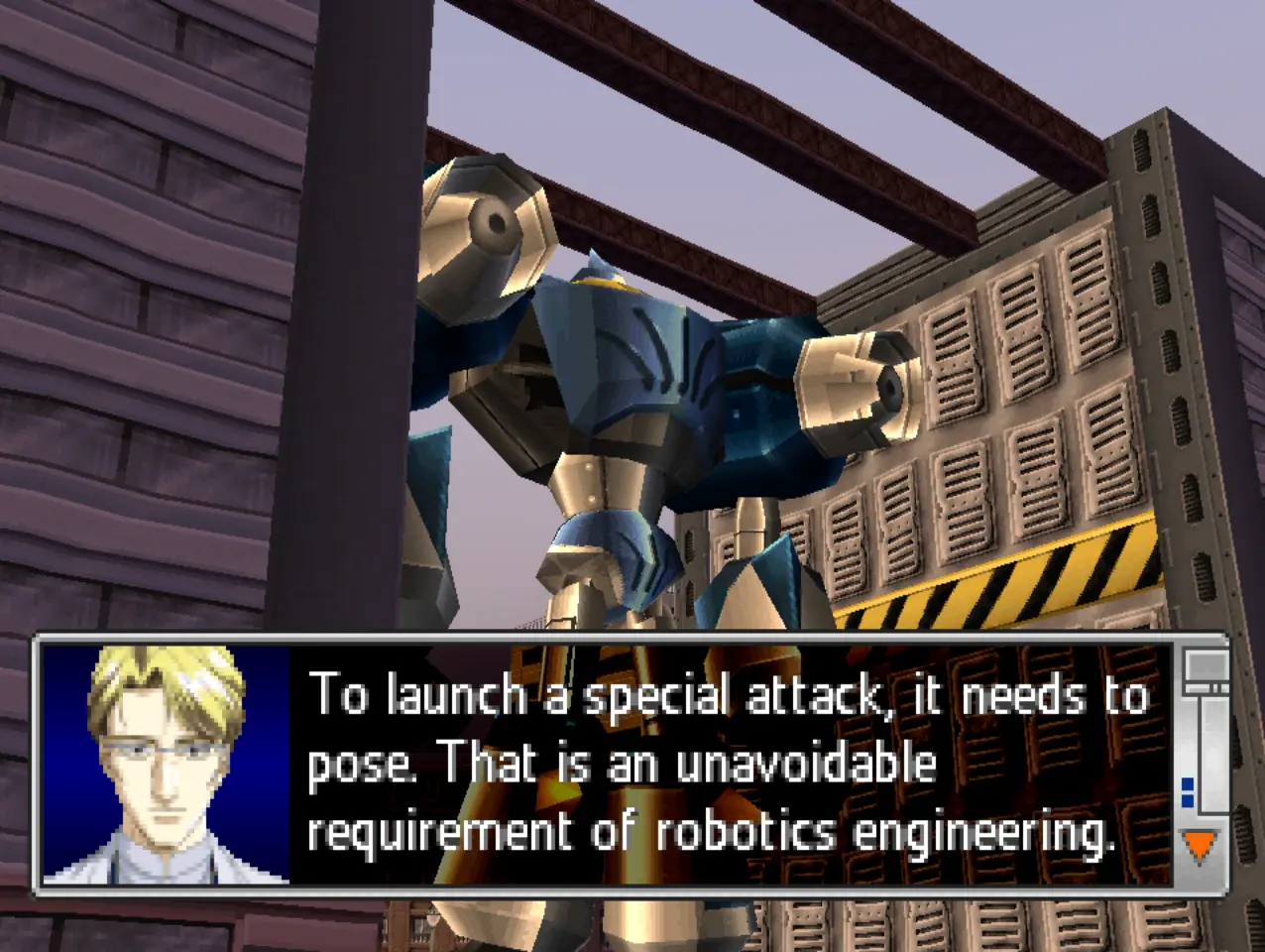
Rewatched the first Doctor Who episode with Martha with my girlfriend last night and everyone making fun of Martha’s dad’s girlfriend for having so much fake tan and maybe I’m just too used to how much Irish girls overdo it but she looked fine
did the Uma Musume IRA kidnap Uma Musume Shergar?
Snake: Super Mario Nation?Otacon: No, Snake! Supermarionation. It’s a portmanteau of “super”, “marionette” and “animation”. It’s an animation technique employed by AP Films in classic British TV shows like Thunderbirds and Captain Scarlet.
huh apparently Robot Alchemic Drive started as a licensed game for a tokusatsu show that ended up being cancelled after six episodes so there was only ever a demo of the game released
I knew it was a spiritual successor to Remote Control Dandy but not this

Caoimhe³ gave me her old Canon EOS 5D
Have some cat photos.

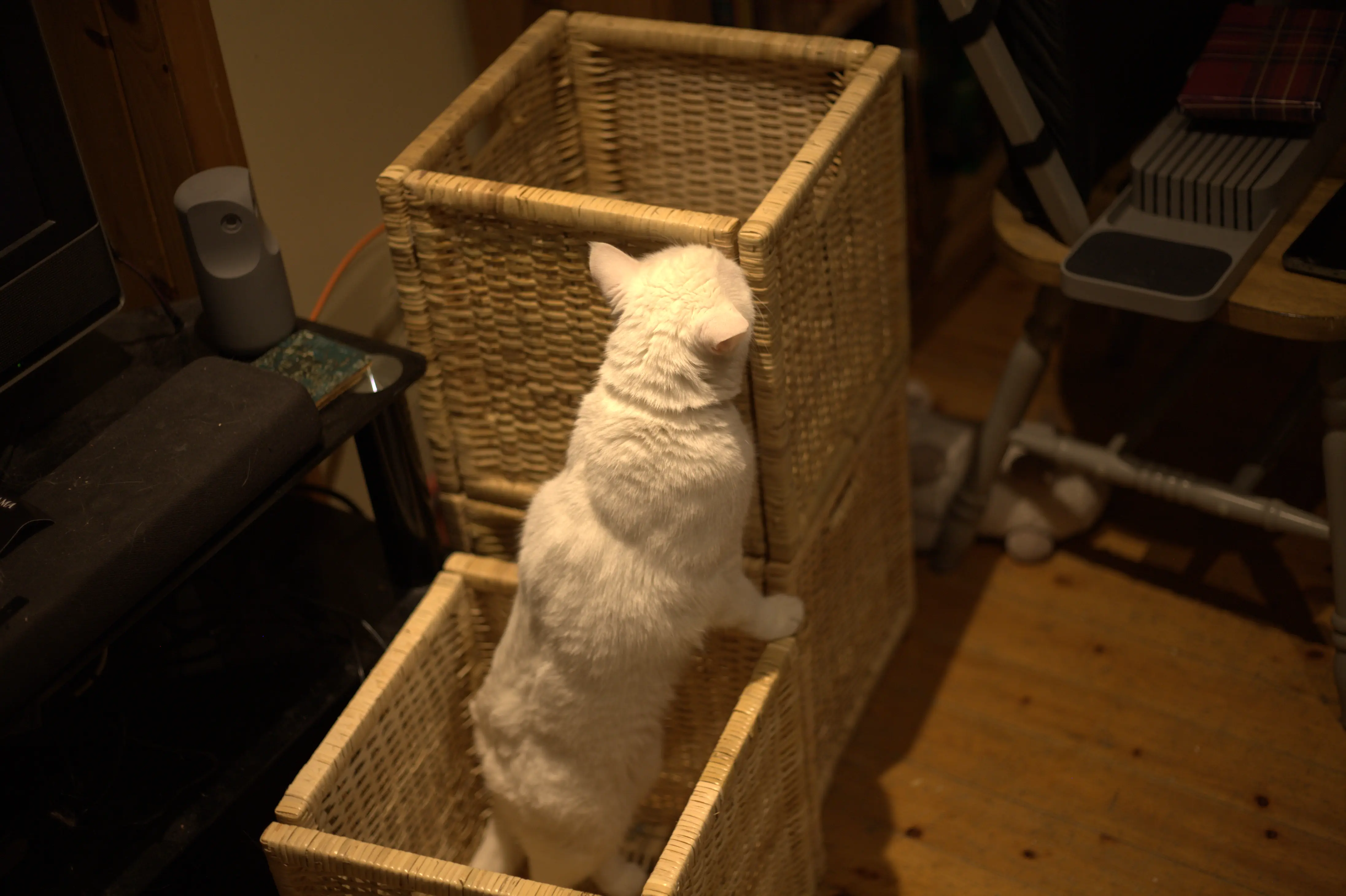


Stoic the Hedgehog
I need to know: Is Sluggo still lit?
cartoony video game sprays of blood, people being run over by a car
was flicking through a Youtube playlist for a specific Robot Alchemic Drive cutscene and caught his one of Ellen telling Yui to be careful during a an evacuation training exercise while cops run people over in the background
I hate seeing tablets and smartphones in scifi media. Gizmos should be bespoke. Interface should involve a complex array of switches and knobs. Physicality. There should not be apps.
I have started doing tarot to gather my thoughts in the morning. I have three decks.
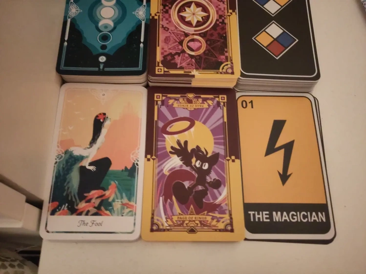
people complain about gendered nouns in languages but it does mean that you can look up feminine words for penis and giggle at them

they call it microsoft 365 because you turn around 365 degrees and then walk past it at a very close approach

Nasclitreacha
I saw Molly Noise linking to the first post from a new blog by J.D. Murphy which was about Gaelic fonts, much like the first proper post on this website. This was originally going to just go in my next what I’m reading roundup but I ended up being severely nerdsniped by it.
Like D.J. I use a font from Gaelchló on the Irish-language parts of my website, though preferring to be a little more pretentious and old-fashioned I use Mínchló rather than his choice of the more modern, sans-serif Úrchló. And much like D.J. I wanted to include the poncanna séimhithe instead of the affixed haitch that marks lenition in modern typography. Not considering the accessibility problems that he highlights in his post, I did this simply by using the little-used unicode codepoints for consonants with overdots1.
Seeing D.J.’s solution of modifying the typeface to include custom ligatures instead I immediately wanted to copy it and so set about making a modified version of Mínchló for this site. Despite my talk of being old-fashioned I decided, for readability purposes, not to use the stylistic set for Insular-style s and r, but did I customise the r glyph such that it is mostly the Roman-style but with the trailing foot of the Insular style, much like I do in my own handwriting. Font Forge did give a few warnings when exporting the modified fonts but they seem to be displaying well for me.
The customised font and updated text should be visible in the title of this post2 as well as any other Irish writing on the site3 and I have went back replaced overdot character codepoints with modern spelling.
girls night
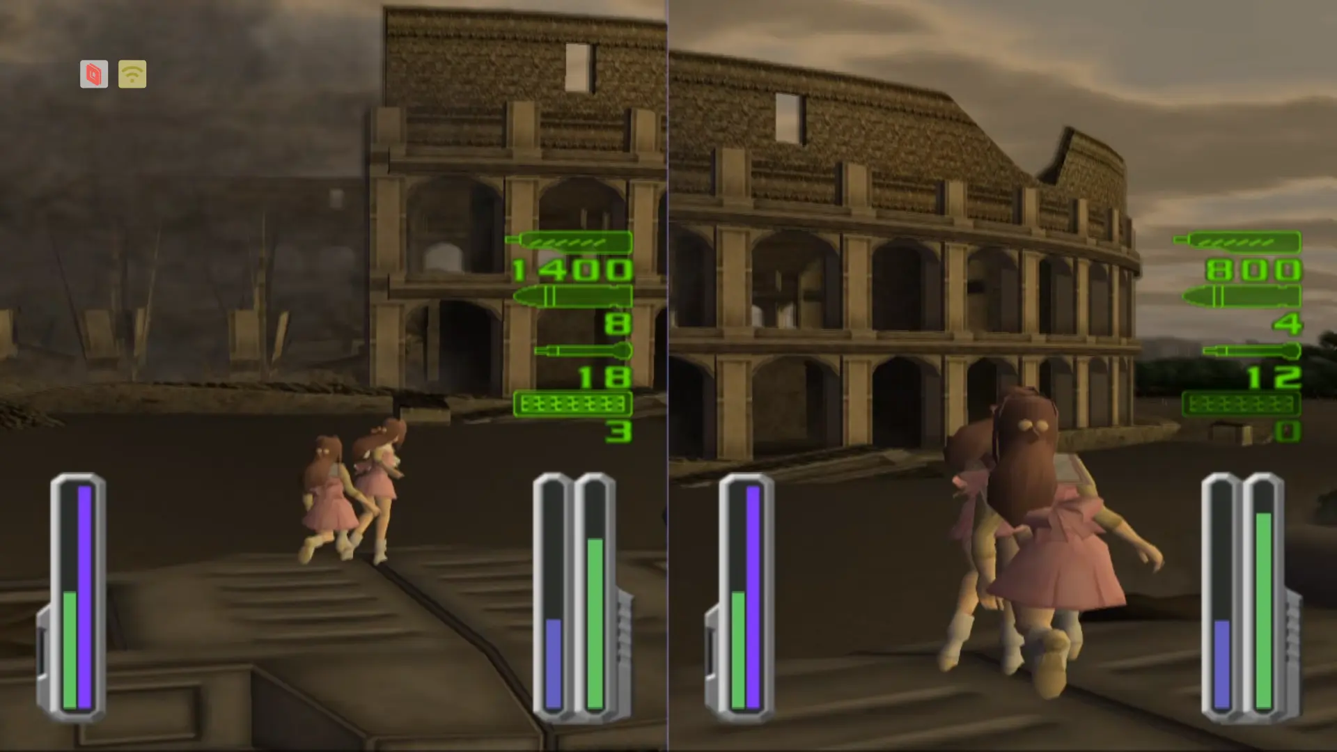

Just wanted to highlight the cool artwork on the website homepage whiteboard at the moment. Thanks to whoever drew it!


The National Gender Service are messy bitches who love drama
About a month ago RTÉ Prime Time published an article announcing that the Irish Nation Gender Service (NGS) would be closing its waiting list to new adult patients1. That evening an episode of Prime Time aired that discussed this and featuring an interview with the NGS’s Paul Moran2. The programme made something very clear: This was not really an announcement about the closure of a service, this was a publicity stunt intended to put pressure on the Health Service Executive (HSE) to try and get the NGS more funding. Junior minister for health Jennifer Murnane O’Connor appeared on the show being asked to comment on the announcement, which apparently was sent to the HSE only that day in coordination with Prime Time. The next day the HSE issued statements that the NGS did not have the authority to unilaterally close itself to new patients in a hissy fit. As far as I’m aware there has not been any clarification of what trans people are meant to do about all this since.
The article notes that the waiting list had about 2,470 people on it the waiting time was four and a half years. This is somewhat misleading. They are currently seeing people from about that long ago, but if you are referred now then, at current rates, you will not be seen for well over a decade. The NGS is well over capacity and has been for many years, now. They want more staff, they want their own building. The article notes that they currently operate out of two prefabs. From my experience with them I was mostly seem in regular rooms so they certainly have other hospital resources available to them, but perhaps it is the case that they only have those two prefabs available for their exclusive use. Several larger sites have been explored to house the NGS but each time plans have fallen through, which Paul Moran asserted no blame laid for with the NGS themselves.
I am not inclined to be charitable to Paul Moran or the National Gender Service—I have written them before—but it’s not really hard to believe that the HSE is capable of fucking up such efforts on their own without the NGS’s help. Regardless, I found myself extremely frustrated with the framing chosen by Moran and allowed by Prime Time: That the solution to the problem with the inadequacies of transgender healthcare in Ireland is the further expansion of the NGS, not more clinics, not GP- and patient-led care, not informed consent or international best practises. They want to be cemented as the centralised arbiters of gender for the whole country, just as their self-declared name implies.
And they want to be left alone while they do this, complaining about being intrusively filmed while asking completely unintrusive questions about people’s Tinder hookups, dismissing anyone who does not want to talk about whether they want to be penetrated or not with a doctor they have just met as “not ready for life-changing treatments”.
There is, perhaps, some hope that a different model of care might be pursued. Another junior minister travelled it Iceland recently to examine their informed consent model of care and some opposition TDs have been highlighting the awful state of trans healthcare in the Dáil, but I expect any increase in agency or dignity for trans people is going to be fought kicking and screaming by the men who have gone to court to try to stop trans children being referred for care.
If you want to keep up on any news about trans healthcare in Ireland I recommend Trans Healthcare Action’s newsletter, Trasinscnuacht.
-
Referrals for trans minors were already stopped years ago. ↩
-
You can watch the episode here3 with the relevant section starting at 24:12 and the interview starting at 25:45. ↩
-
This might be geoblocked outside of Ireland. ↩

My months-long unundefeated losing streak in Magic: The Gathering continued the other night
I have played another game of Magic: The Gathering using my revised Seto Kaiba deck. I lost again!
It was a three-way game between myself, Caoimhe³ and Tigris, who I also played in the previous game I posted about. Tigris was using a revised version of her defender deck with Arcades the Strategist as commander while Caoimhe had Derevi, Empyrial Tactician commanding a deck based around tokens and snowballing counters.
Tigris pulled ahead early, getting a lot of mana production off the ground, aided by Arbor Adherent, allowing her to put out The Pride of Hull Clade, which proceeded to knock out a huge chunk of my life in the first attack of the game. When she tried to put out The Walls of Ba Sing Se I Power Word Killed it immediately and then a turn later was able to use Crux of Fate to wipe the board of everything other than Arcades and a couple of dragons that I had managed to get on the board. With her big mana reserve Tigris remained quite scary and between myself and Caoimhe targeting her after that she was the first to be knocked out.
Unfortunately this did allow Caoimhe enough time to get some of her counter-creating engines up and running with Felidar Retreat having buffed Derevi to the point where it made it difficult to attack with the couple of dragons that I had gotten on the board and Elite Scaleguard stopping me from putting up a proper defence. With the big blow that Tigris had already dealt to me I was loosing life quite quickly. I used Exude Toxin to wipe out the token creatures that she had put on the board thanks to Moogles Valor and Martial Coup but because of Resourceful Defense all the +1/+1 counters on them were able to go straight to Derevi, making her powerful enough to wipe me out with one attack. Forgetting about Elite Scaleguard, I thought that I could hold out for one more turn, so when I drew Haunting Voyage I foretold it, thinking I could activate it next turn to bring a lot of dragons back for a counter-offensive—my graveyard having been filled up a bit previously having milled when Kairi, the Swirling Sky died—but Caoimhe was able to simply tap my would-be blockers and end the game.
I enjoyed the match, though from my two games so far it does strike me that multiplayer games lead to a first mover disadvantage where the first person who gets too strong will be ganged up on. It reminds me of Munchkin in a way that I dislike.

Kaiba Deck: The Revenge
I mentioned in my post about playing Magic: The Gathering that I was working on a revised version of my Seto Kaiba deck. I have now played a game with that revised deck and I’ll write up a post about that soon, but first I just want to make a small post on the changes I’ve made.
Sivitri, Dragon Master has replaced Dromar, the Banisher as commander, requiring the removal off all cards and in comparison to the previous version I’ve taken out cards that require searching an opponent’s deck, as I don’t feel very comfortable spending time doing that as a new player when I won’t really know what to pick a lot of the time.
With the new cards I have tried to double down on a few of the themes of the original deck: Instants, counter spells and sorceries with foretell to mimic trap cards and making treasure tokens, though probably not really enough enough to make it a main part of the deck’s strategy.
I, of course, also made a few more custom card proxies:
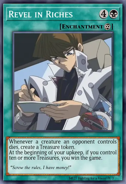
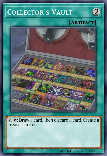


I have realised something about the saga of my bed constantly hurting my back: The bed not being level (due to my upstairs floor being uneven) isn’t just uncomfortable in and of itself, but probably results some of of my weight being shifted from a compressive force that the mattress springs are meant to take into a sheer force that they are useless for, rendering my mattress less firm, less comfortable and less effective.
I had already been using boards to level the bed but the other night I made a more fine adjustment putting a few layers of cardboard under some of the legs and even that minor height adjustment has made a huge difference in comfort.

2025
I both ended and started the year madly in love with a new partner. It would be nice to pretend that the middle part didn’t happen.
I ended my post about 2024 saying that I need to recover and heal and I am so tired now reading over that again. My general health is maybe doing a bit better than it was then, or at least I have figured out how to manage things a bit more. I mentioned replacing my mattress there. I have now replaced the awful pull-down wall bed that I had then with a more stable one. I thought, moving into a small house, that I should be optimising for space but I ended up doing so at the expense of my own comfort and long-term health and even then I ended up not even optimising for space very well. I think I am going to go for an even firmer mattress too; going back to Ikea for one was a mistake. Caoimhe³ has a new, firm King Koil mattress sleeping on it I feel an immediate difference. It is expensive but I am probably going to get one for myself.
Early in the year I released that I was suffering from some sort of photosensitivity problem and had been since at least late 2024. Anti-migraine medication has not seemed to help with it but some prescription sunglasses have, as well as simply recognising when it is flaring up and turning down the lights. The cause remains mysterious. MRIs have revealed some demyelinating lesions on my brain and spine, but my neurologist says that they are not on the visual cortex or any other area one would expect to be causing symptoms related to vision and, thankfully, they do not seem to be progressing (though another MRI in April is going to be double-checking that). There is no known history of autoimmune disease in my family that would explain the lesions and apparently the damage not extensive enough to diagnose me with anything serious like MS I remain in that grey area of sick enough to have problems, not sick enough to have answers.
But, health issues and general burnout mounting, I did a spring clean this year and got a lof of things off plate. I stepped away from a local trans community organisation, some kink meetup stuff. I pushed myself to keep going with The the Ring Podcast until April because I had an April Fool’s bit that I really wanted to do but ended up putting it on hold after that and did not get around to returning to it for the rest of the year. Journey of the Monkey King has not had an episode for all of 2025, the second time it’s gone on a year-long hiatus. I do want to get back to them but I need to do it in a way that doesn’t just burn myself out again. I am definitely not going to try to stick to a schedule again. Episodes will get done and go out whenever we can manage. I also got formally diagnosed with ADHD this year and started taking methylphenidate which has been a big help and I felt that I getting my momentum back recently but I got suddenly quite sick again a few weeks ago and it knocked me on my arse. Thankfully, Caoimhe was here to take care of me, as she has been a lot this year1, as Ellie was doing before she died.
The weeks after that were the worst in my life. I cannot describe the pain of it. But I had wonderful people helping me through it and I was fortunate enough to be able to take an extended period off work. My brother sent me a copy of Abiotic Factor as something to keep my occupied and I ended up playing it nearly every day with my friend Ruby for a while. Caoimhe was amazing as a shoulder to cry on and also just bringing me shepherd’s pies and the like to save me cooking. My other partner in Copenhagen was able to make it over a few times in the aftermath as well and I got to see her in Edinburgh in January and October in Copenhagen itself. I have a lot of wonderful people around me and it’s made it bearable.
I also flew out to a kink con for the first time in the autumn. It had been booked long before Ellie died and while I was not really emotionally up for doing anything with anyone I think it was still a very useful experience. I took a lot of notes that I have since brought back to Caoimhe and everyone was very lovely and understanding about me crying all the time. I did a lot of sexual exploration the past year and it has been a really positive and freeing experience. Not unrelatedly I have put in a request for bottom surgery through the public system. That will take a while but I think I do want to go through with it, scary as it is. I don’t think I’d be able to deal with the recovery period without a partner at this point, though. I have been living alone with just Easóg for a long time, but that has felt a lot lonelier since Ellie died.
But I still have people I love dearly, and we keep going. I got a few lines from a poem that Ellie would quote when she was struggling tattooed on my arms as a reminder of that and of her.
I love you, get up, we are going to keep going.
It could not kill me, I would not die.
-
On the other hand she has gotten me into Magic: The Gathering, so maybe she is evil. ↩

Celeste race 2026
Update: Caoimhe³ has also written a post about the race with a bit more narrative detail than my terse summary and statistics below.
The New Year’s Celeste race I do with friends happened today. When I sat down to practise this year I decided to just replay the game from the start, redoing all the main levels, getting all the strawberries and crystal hearts again, etc. I fully cleared1 the A and B sides of chapters one through six and fully cleared the A side of chapter seven and then failed to find the time to do an actual practise runs for the race. Whoops. But I still managed to set a personal best for the race, which surprised me because I felt quite fatigued today during the race and didn’t feel that I was doing my best.
Even so, it was Ruby who came out on top again—managing to come in under the hour mark!—with Caoimhe³, joining for the first time, in second.
| 🏃 | ⏱️ | 💀 | 🍓 |
|---|---|---|---|
| 🥇Ruby | 0°59′30.986″ | 69 | 1 |
| 🥈Caoimhe³ | 1°02′14.985″ | 123 | 1 |
| 🥉Caoimhe′ | 1°07′39.175″ | 143 | 0 |
And of course we also did a pre-run warmup race of Pico-8 Celeste.
| 🏃 | ⏱️ | 💀 | 🍓 |
|---|---|---|---|
| 🥇Ruby | 4′50″ | 26 | 1 |
| 🥈Caoimhe′ | 5′28″ | 26 | 0 |
| 🥉Caoimhe³ | 7′42″ | 57 | 1 |
-
I got all normal strawberries as well as the crystal hearts and tapes. I have never gotten golden strawberries or winged golden strawberry. ↩
I think one of my favourite hobbies is inflicting brain worms on my friends

I made some chains
I was intending on having some friends over the other day for a small party and give them each a small Christmas present but I ended up being too ill to host. I had one present that I was going to give to Caoimhe³ early too (the rest to be saved for Christmas Day), selected mostly as an excuse to show off in front of other people because it’s the one thing I made for them myself: A pair of belt and boot chains in the nonbinary flag colours.

I was inspired by these chains from Renders Renderings and seeing as they were all out of stock I decided to fashion my own. I made mine with thinner chains and I am a little worried that they might be too delicate but I had trouble sourcing small lengths of coloured chains in larger sizes and thought it would look better to get ones that came the in right colour rather than trying to spraypaint them. If they end up breaking I still have some more chain so I might try and fashion something that is less likely to be caught on things or be subjected to force.
Caoimhe came over the day that party was meant to happen anyway to look after me a little and I gave them to her then and she seems very pleased with them. I love my nonbinary girlfriend :)
me after getting five sets of kallax shelves: I definitely have enough storage now
me going back to Ikea at 3am for more kallax:

I’ve moved from Goodreads to Bookwyrm
Just a quick update that I’ve moved my book reviews from my Goodreads account to a new Bookwyrm account. It is not owned by Amazon! They will still be syndicated over to my reviews page.

You can now hide tags on this site
The page for each tag on this site now has a button to hide that tag, so if you don’t want to see me posting about Doctor Who you can visit that tag’s page and select to hide it. This will hide those posts entirely from the homepage list and elsewhere will collapse them with a button you can click if you want toggle the visibility of the individual post and another button to remove any tags that that post has from the hidden tags list. I’ve set it so that tags for adult topics are hidden by default.
This is done with a hundred and thirty-odd lines of Javascript and stores the tags one has hidden in one’s browser’s local storage and so will persist between visits on the same device but will not transfer to any other browser or computer and it doesn’t send any data to me.
By the way, tags are also included in the site’s Atom feed and some readers support blocking tags as well (I believe that Newsblur does), though other readers (like Feedbin) just ignore tags entirely and don’t even show them.
I cannot decide what to set my desktop wallpaper to. Open to suggestions.
Hypothetically, what if you could watch it on Poob right now.
Say, for the sake of argument, that Poob has it for you.
Ireland does not have trans healthcare
Transgender care waiting list to close due to resourcing concerns
The National Gender Service (NGS), which provides healthcare for transgender adults, is closing its waiting lists due to a lack of resources, Prime Time has learned.

After rewatching the Eccleston series of Doctor Who with my girlfriend (which she hadn’t seen) I am just thinking again about the fucking Big Brother reveal and how that is just not going to have the sheer what the fuck impact to anyone who wasn’t at least somewhat familiar with British TV culture at the time and wondering what would have been the equivalent with Gatwa. I feel like television not being the dominant cultural form any more (The Long Game and Bad Wolf both feel a bit aged now in particular because of that) and it would have to be more of an online personality, and not being particularly familiar with or paying attention to that stuff at all and in particular what might be particularly popular to people in Britain the only thing I can come up with is, I feel, the most obvious thing: The Doctor wakes up and sees a dead-eyed smiling hologram of Mr. Beast.
cuirim isteach uirthi
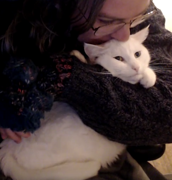
I am being accused of being a nefarious warlock passing Lovecraftian tomes to friends to inflict new hyperfixations on them

My decade-long undefeated winning streak in Magic: The Gathering ended last night

I played one game of Magic: The Gathering back in uni at a games night against one other person who had also never played it before and won. Yesterday I played my second game: A commander match against Caoimhe and our friends Tigris and someone who I will be calling a zombie enthusiast.
I was, of course, using the Seto Kaiba deck1 that Caoimhe had made for me. Caoimhe herself had Lazav, Dimir Mastermind as her commander with a deck based around milling everyone’s cards. The zombie enthusiast also had a mill-heavy zombie deck led by Gisa and Geralf. And Tigris had Arcades the Strategist commanding a deck otherwise made mostly of walls.
It was a lot of fun and I did quite well despite not having really studied the deck that had been made for me that much beforehand. It took a while before much started to happen but as I started to get a few dragons on the board Tigris quickly became a very intimidating threat with a Corrupted Shapeshifter duplicated by Mirror Room and boosted by Arcades the Strategist giving her two
In response to an increasingly scary board state I summoned Junji, the Midnight Sky then Damned the board to wipe the slate clean, using Junji’s death ability to put Corrupted Shapeshifter back on the field as
I was doing well for some time, with the most life of everyone for much of the game, but eventually myself, Tigris and the zombie enthusiast all got whittled down to single-digit life. Junji got raised from the dead twice during the game, once as a zombie and once by me, and Tigris’ walls were not able to block it’s menacesome flying and was killed by it, leaving only myself and the zombies.
I think I managed some Yu-Gi-Oh! worthy reversals a few times, countering some nasty spells, using Aetherize to ward of horde of zombies that would have finished me off, and then stopping their master from being able to attack me at all with Sivitri, Dragon Master as she didn’t have enough life to pay the tax to attack me. But, unfortunately, life didn’t otherwise matter to her as she was able to play Lich’s Mastery when I didn’t have any mana to counter it and then could not find a way to remove. By then she had refilled her graveyard and I was just not able to do enough damage to empty it as she used it as her replacement life pool. I thought I was being very clever spending a couple of turns using Soul Manipulation to revive Hammerhead Tyrant and then using its ability while recasting my commander so I could send Lich’s Mastery back to her hand but I failed to notice that it had hexproof. Phyrexian Arena had been serving me well in getting me more cards throughout the game but now it was acting as a countdown for the number of turns I had left and even though the zombies couldn’t attack me she still had other things that could drain my life. In the end I was finished off by her playing my own Brainstealer Dragon from my graveyard, trigging its ability and killing me2. Ugin, the Spirit Dragon could have saved me from Lich’s Mastery but this is not Yu-Gi-Oh! and it does not count as a dragon just because it has the word “dragon” in the card name, so Sivitri, Dragon Master could not pull it from my deck for me.
It was a lot of fun! Thanks to some megamorph creatures I even got to say “I play one monster face down and end my turn!” One thing the game did highlight is how, even though having a flying
I am playing with revising the deck with Sivitri as commander rather than Dromar. This means no more but that was the least-used colour in the deck anyway and of the custom proxies I made it only loses Smothering Tithe. Caoimhe has objected that “a little bit of white mana is useful for Kaiba to be portrayed as not entirely evil,” but on the other hand, nah.
-
I also swapped out one card for my Bane of the Living CSS crime that I printed off as a card because I thought it was funny. ↩
-
We weren’t actually entirely sure if Brainstealer Dragon’s ability should trigger for its own summoning, but she had other things that would have finished me off anyway and this is more poetic so I’m going to pretend we ended the game immediately there instead of a minute or two later. ↩

I was hypnotised on Sunday
Hypnosis is something that I have had a, let’s say, strong interest in for much of my life but have long failed to explore. Part of this is simply being embarrassed to bring it up with people. It’s kind of a weird thing. One associates hypnosis with old movies and bad genre fiction1. There isn’t even any real consensus on what hypnosis actually is, just a set of overlapping conditions people experience when guided in a certain way that is collectively understood as “trance”, “hypnotic loops” and other such jargon.
But I have a partner who has been willing and enthusiastic about exploring it with me and on Sunday, after much discussion and preparation, we had our first proper session and it’s the first time I’ve been confident that, oh!, that worked! I have tried this before a few times when I’ve been able to get over the hurdle of shame but it never went particularly well. Trance is often described as your mind “going blank” but I had always been very self concious of the fact that that doesn’t happen for me. My brain does not ever really shut the fuck up. ADHD is certainly a contributing factor here. I would be trying to follow along with the hypnotist, notice something and think about it, then think about the fact that I was thinking about it and does that mean I’m not doing this properly when I’m meant to be focusing on the thing does that mean that the hypnosis isn’t working or am I doing this wrong am I just being stupid etc. etc. and just spiral out of it from there.
I did get some advice from some people; different approaches to try as well as reassurances that trance is not just any one thing and it’s fine if you are still thinking about other things and noticing things during the process, but I think what was most helpful in the end was having spent some time over the last few months practising mindful vipassanā meditation and learning those techniques for entering a meditative state while allowing thoughts to pop up, acknowledge them, and let them drift pass without obsessing over them. As my partner was counting me down I was noticing things she was doing: The techniques she was using, what she were asking me to visualise and the subtle contradictions caused by how the details I had already filled in in my mind were different to the ones she then tried to fill out the picture for me with her own words, but I simply let those pass and went back to focus on what I was being guided towards and the countdown she was doing that I could very much feel having an effect on me.
After I was under we didn’t do much. To test out the waters she gave me a suggestion that my left arm was filling with helium and getting lighter. Under trance I was still aware enough to note that she really should have said my right arm as I was sitting to her right on the sofa, facing her, with my left side pressed against the back of the seat, my bodyweight pinning my left arm somewhat. I, again, let that thought pass2 and just let things happen. I did not really feel the physical sensation of the arm getting lighter, but it did, eventually, slowly start to rise without me consciously moving it and easily floated around to wherever my parter moved it to after she grabbed it. And then she brought me back up.
It was not much but it was quite fun! I am very happy to be finally exploring this and I look forward to much more.
Chuir mé fáinne airgead ar mo chóta.


What I’m reading vol. Ⅺ
Vols.: Ⅰ, Ⅱ, Ⅲ, Ⅳ, Ⅴ, Ⅵ, Ⅶ, Ⅷ, Ⅸ, Ⅹ, Ⅺ, Ⅻ, ⅩⅢ
Hello. Been a while since I’ve done one of these. Life has been extremely busy. In the interim Ireland has elected a new president and several things I’m going to link to touches on that. Also Mike Egan has moved his own monthly reading roundup posts to their own website. Check out What Else Is On?
Also, Vócalóid…
Ireland
The Future Speaks Irish! — Seán MacBrádaigh
Tá súil agam é.
When Catherine Connolly began her election victory speech in Irish and continued in it, O’Connor admitted admiration for her fluency but could not resist wondering aloud how the English-only establishment figures beside her must have felt. The implication was that Connolly’s Irish was somehow impolite - as if speaking one’s own national language at the inauguration of an Irish President required apology.
That mindset - the instinct to pathologise authenticity - is the hangover of a post-colonial elite that still measures respectability by distance from our own culture.
I also liked Molly Noise’s thoughts on this.
Irish nationalism has historically avoided crass nativism (an Irishness defined by "blood and soil", if you like) by dint of being anti-colonial and neccissarily recognising a common struggle with other anti-colonial movements and, of course, not ignoring the fact of our massive emigrant diaspora.
the 21st century irish far-right morass, ignorant of its own history and internet addicted, takes on the right wing nationalisms of the UK and USA, oft quite comfortable with NI Unionisms worst trends
Taking things Seriously — Paulie Doyle
And another way Connolly is frustrating the commentariat.
Collins doesn’t need references – he’s a Serious Guy. If you’ve ever picked up a broadsheet you’ve encountered them. They’re usually male and middle-aged, wearing a solemn expression indicating anguish about the prospect of falling house prices in south Dublin. They say things like politics is the art of the possible and this budget should be sensible and at the end of the day, elections are about getting votes. Their mugshots next to the serif font. This is a Very Serious Publication.
20th century television — Laura Michet
And then a somewhat different view into Ireland provided by Laura Michet.
Games
mgs3 and photorealisming the painterly game — Joe Wintergreen
Joe Wintergreen talks about the loss of visual identity in the remake of Metal Gear Solid 3. I am somewhat reminded of Kayin’s more acerbic words on the Demon’s Souls remake, though that is coming from a very different direction.
This connects to something I’ve talked about before: the way the costs associated with the visual end of game development have shifted around in counterintuitive ways. It used to be that photorealistic graphics were the most expensive goal you could strive for. They aren’t anymore – we have very efficient ways to do this now. And the more real the assets look, the more they’re interchangable – the exact same kinda-rotten fallen-over tree trunk is in InFlux Redux, MGS Delta, COD Warzone, and dozens of others. Which is fine in itself, as a labour-saving device, but you have to be careful about which labour you’re saving.
Starlight Spotlight: A Hospital Wii in a New Light — JMC47
I love reading the Dolphin progress reports and it’s always a fascinating read when the blog does a deep dive into something unusual.
In 1992, the Starlight Children's Foundation partnered with Nintendo to bring video games into hospitals in a way that complied with stringent hospital regulations. Instead of subjecting children to magazines, books, and daytime television (if they were lucky), the foundation wanted to bring premiere entertainment right into their rooms by creating a hospital approved all-in-one media and gaming station. Their belief was that giving kids a well-needed break from the hardships of treatment, injury, and illness would promote recovery.
Snatcher [1988/1994] — Arcade Idea
Arcade Idea is back after a long, Polybius-induced absence, with some pretty scathing words about Snatcher.
This may be a Hideo Kojima game, and many of his tics and tendencies are already right here… but looking at Snatcher’s contemporaries and influences shows these formal tics and tendencies to be common and unremarkable within his scene. It’s only later, especially when he becomes removed from this context, that he becomes an odd specimen, the “auteur” — in particular, the 1992 PC-Engine CD additions to the text are far more akin to what is thought of as Kojimish, including an entire new conclusion which is essentially a 30 minute cutscene full of twist upon twist.
Spellgram — CD-ROM Journal
And Misty De Méo documents a Mac game that never saw the light of day that Outlaw Star’s Takehiko Itō worked on.
Spellgram is described as a "space fantasy" incorporating heraldry and hidden spells. Unfortunately, this hint is close to the only taste of what the game might have been; the catalogue is vague about the story they hoped to tell and how it would have played. The screenshots don't reveal much about gameplay, though they imply an interesting setting. Even though the ship designs and space scenes are a bit generic, the contrast between them and the protagonist's elaborate fantasy clothing is intriguing. Based on Bandai's history, it's likely it could have been either a CD-ROM film with limited interactivity or a more-involved Myst-esque graphic adventure.
Kink
Mechsploitation, Misconception, Bad-faith Criticism, and Transmisogyny — Erin
Some notes on the history of a genre and corrects some common misconceptions that I was labouring under.
This isn’t to say that there’s nothing of AC6 in WARHOUND and its daughters. The AC6 story trailer, a short which heavily centers the handler & hound imagery only vaguely present in the actual game, was the catalyst for the idea which became WARHOUND. But it is that word, catalyst, which is key: it was just a single spark, dropped into a container of already-prepared themes and ideas, to synthesise them into something new, and singular, and cohesive.
The Goon Squad — Daniel Kolitz
I don’t think this is actually a great article. The author is extremely credulous of people describing the behaviours that people are fetishising and takes them as sincere expressions of the things people are actually doing or goals they are achieving and not just part of what they are getting off to and calling it a movement comparable to the Tea Party is ridiculous on its face. But still there is some simple amusement in reading a Harper’s Magazine writer trying to write something in grand and serious terms while using the word goon one hundred and fifty times.
When I asked Gooncultist to describe the average gooner, he insisted that such a person is a “statistical fiction.” The community is too vast, composed of too many distinct and overlapping spheres. Gooncultist himself is fairly ecumenical, as far as gooners go—he has his niche fixations, which I won’t ruin your day by describing, but he seems to dabble in much of what the space has to offer. There are definite camps in Goonworld, as I was quickly coming to learn.
Everything else
The rise of Whatever — Eevee
If you call anything I make “content” I will shoot you with a gun.
And I suspect the core problem that has wended its way through the history of cryptocurrency is that the vast majority of people involved do not actually care what the thing they’re flocking to is. What they care about is that it has a graph, and that they get rich if the graph goes up, so they say whatever might make the graph go up. The graph even looks exactly the same for every coin and NFT and Whatever else: x-axis time, y-axis dollars. The only place the thing appears at all is in the title, where you can safely ignore it.
Seen via Rabbit’s link roundup.
A Typology of Insecurities in Non-monogamy — Devon Price
It has been a while since I linked to Devon Price. I am a bit less infatuated with him than I was when I first came across his writing and this is a little bit of an agony aunt column but the questions of how to navigate polyamory has come up in my life again and it was a helpful read.
“What do you do about jealousy?” is one of the most common and annoying questions that the non-monogamous get asked from people outside our community. The fact that jealousy happens and cannot always be fixed is a problem that we are expected to answer for, a bug in our relationship structures, whereas monogamous people get to see jealousy as a feature that helps preserve relationships.
Collections: Life, Work, Death and the Peasant — Bret C. Devereaux
First in a series of blog posts trying to put some data to the question of how much work would a typical medieval peasant actually do and the general shape of their life.
Prior to the industrial revolution, peasant farmers of varying types made up the overwhelming majority of people in settled societies (the sort with cities and writing). And when I say overwhelming, I mean overwhelming: we generally estimate these societies to have consisted of upwards of 80% peasant farmers, often as high as 90 or even 95%. Yet when we talk about these periods, we are often focused on aristocrats, priests, knights, warriors, kings and literate bureaucrats, the sort of folks who write to us or on smiths, masons and artists, the sort of folk whose work sometimes survives for us to see.
Rupert's Snub Cube and other Math Holes — Tom 7
And finally, some maths.

Da Big Weague
I have set up an account on one of the Website League nodes. I haven’t really posted there yet but you can find it here @soilseacht@weague.awful.cloud.
The Website League is an organisation that came together as Cohost shut down with a goal to make a smaller-scale online space, decentralised but closed and with consistent values and moderation goals. I took note of it when it first got going but it seemed like a a lot committees to organise the meeting to select the committee to schedule the meeting to decide the code of conduct and it all seemed a bit exhausting. But, having taken a year to sort things out, the Weague formally launched about two weeks ago and I decided to set up an account.
In practise what the Website League is currently is a set of eighteen Activity Pub servers (similar to Mastodon, etc.) in a closed loop that only federate with each other, creating a small network that is not a free-for-all but still not dependent on a single system or admin to run it all. I want to give it a shot, though I’m not really confident they can capture the lighting in a bottle that was Cohost. A smaller, self-contained Fediverse seems like it will just be that: Mastodon, but with less things on it. The Cohost-inspired Pillbug interface is cute but it still feels like I am still fundamentally reading long tweets on another social media site that is basically Twitter because they’re all basically Twitter.
I hope the project can prove me wrong and I do intend to give it a fair shake, though I am not sure what I will post there. I think in light of the closed-loop nature of the platform I won’t mirror posts from my account there to here like I do for my Cathode Church posts but I might experiment with the opposite: Cross-posting some bog posts from here to The Undergrowth—the Website League instance that caught my eye due it its stated interest in longform writing and multimedia posts.
And if you join the Weague too you should also follow Freja because she’s cool.

Seto Kaiba’s Magic: The Gathering Deck
An increasing number of people close to me are into, have been getting into, or are getting back into Magic: The Gathering. I don’t have a massive reluctance to learning or playing it but there’s a big upfront investment in learning it and I wasn’t particularly motivated to, but I was picking bits of it over time just from conversations with friends and I was on a nostalgia kick for Yu‑Gi‑Oh! recently so eventually I agreed with Caoimhe³ to play iff she made me a commander decker themed around Seto Kaiba.
This Reddit post outlined a basic idea for a deck with Dromar, the Banisher as a commander and other themes that were identified for the deck where: dragons, machine monsters, lads with big axes and the words “raider” or ”kaiser” in their names and big flashy trap cards that fuck up the opponent’s deck because this is first a comic about card games with big dramatic reversals and second a an actual card game. As well as Dromar repping the mandatory Blue-Eyes White Dragon I was keen on having some representation of some other cards I always associate with Kaiba like Crush Card Virus, Lord of D. and XYZ‑Dragon Cannon. I also wanted to have at least a few cards that functioned similar to trap cards or flip effect monsters from Yu‑Gi‑Oh!
Another friend threw out a list of card suggestions, though warned that Dromar was not a particularly good card to build a deck around. I pointed out that that was appropriate seeing as Ol’ Blue Eyes itself is fairly rubbish in practice and I am not intending to enter tournaments here, just play with some friends. I also suggested toning down the amount of cards from her suggestions that involve searching through the opponent’s deck, as doing that constantly sounds miserable for everyone involved in the game, especially when I’m new and wouldn’t really know what to look for.
Caoimhe took all of this and did her best to turn it into a usable deck list. I have no intention of spending a load of money buying cards, I am just going to print off proxies for all of these (the fact that I have a printer has also made me popular amongst my friends who play) and I have had some fun making some Yu‑Gi‑Oh!-styled proxies of the cards for the deck using the YGO Pro card editor, Card Conjurer and the GNU Image Manipulation Project.


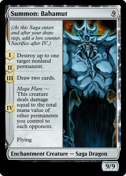

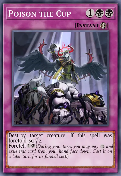



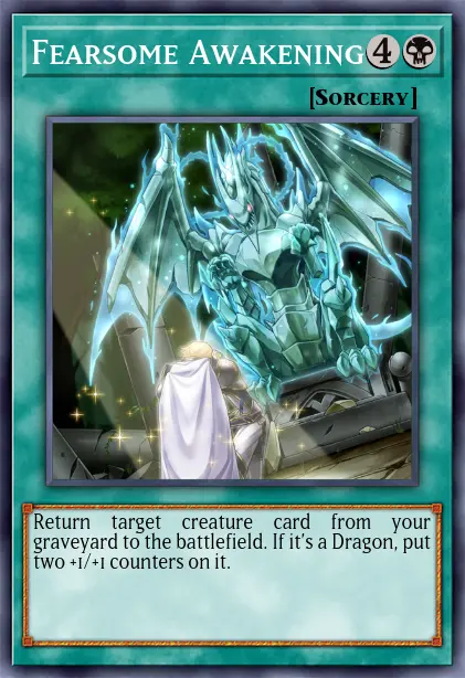
 Jester’s Cap combines the Crush Card Virus and Saggi the Dark Clown, which Kaiba often used together. I originally used the trap card layout for this but decided to save that just for cards with foretell, as those are going to be the ones played face down and settled on leaving artefacts as normal spell cards.

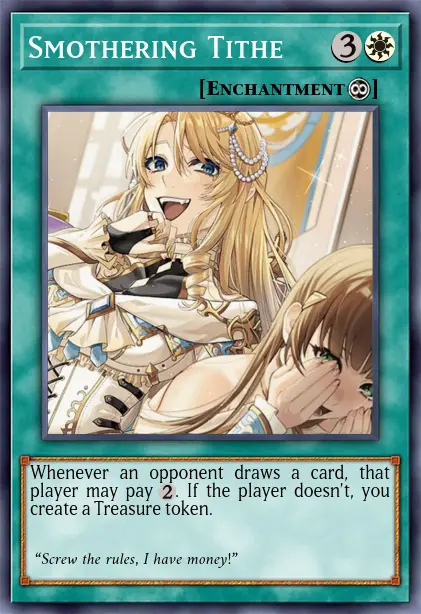
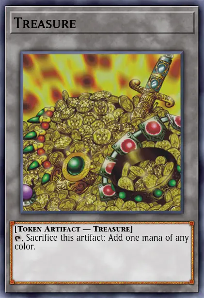



I might make some more if any particularly cute or fitting ideas strike me, but I don’t intend to do the entire deck. Trying to do a full hundred cards would quickly go from fun to tedious.
And now I need to actually play a game.

Happy birthday, Ellie
It would have been Ellie’s
If I want to turn this into some kind of positive message: It is a tragedy that it took until her forties to get to where she was, and an even bigger tragedy to have her life cut short just as that was happening, but she was still able to start doing that in her forties. To figure things out, to transition, to come to terms with part of herself, to love without shame. As long as you are alive there is still time.
I went out for dinner with some of our friends last night to the same burger place we went on her birthday last year. We talked about Ellie a little bit but mostly just enjoyed each other’s company. It was a nice thing to do to mark the occasion in a positive way. Caoimhe³ was there as well. She has been one of the people who has most helped me through the last few months and more recently we have started dating as well. She was a great comfort yesterday and she spent last night at my place after the dinner.
I brought the Zippo lighter to the dinner that I gave to Ellie as a birthday present last year. I lit for a while to warm it up and held in my palm for a little bit during the meal. She had had a running joke that what she wanted for her birthday was €200 worth of marshmallows, so I gave her €20 of marshmallows with the lighter as the initial deposit on that that she could toast and make s’mores with. €20 gets a lot of marshmallows it turns out. I don’t think that she had even gotten through them all by the time she died. After that dinner last year we went back to her’s and watched the trans episode of Dirty Pair (which she didn’t actually like that much outside of the transness and burgers, something I left out of the original post about it) and we also watched the first episode of the Chucky show together after she had been recommending it to me. It was a wonderful night, and, sad as it was, so was last night as well.
maybe cats bury their poo because they’re embarrassed about shitting
targetted advertising should be illegal
sranked Eggmanland


The Train Fiend
I feel so grateful to the man who invented the “Traveller’s” typewriter.
Mina Harker, expressing her love for her laptop.
Applying modern labels and understandings of people to the past is iffy and and remains so when applied to fictional characters who were certainly never written with those as-yet non-existent concepts in mind but also it’s fun so I’m going to do it. Mina Harker (née Murray) is an autistic, bisexual, and cool as hell.
None of what I’m going to say is a particularly original idea and much of what I’m drawing from here is from the general milieu of the Dracula Daily fanbase. This was, of course, a large part of the appeal of Dracula Daily; not just a novel way to read a classic book but also a participatory exercise in going through that work and evolving a fandom understanding of it as it progresses, with all the tenuous headcanoning that such things involve.
Dracula is Gothic fiction wherein the ancient horror is defeated and soundly routed by modernity. Our heroes are doctors and solicitors (and a rich Texan who fancies himself a cowboy) and an important weapon in the arsenal used to defeat the count himself is meticulous note-taking. And it is Mina who transcribes, edits, organises and distributes these notes. Within the fiction it is she who creates the manuscript that is the text of the novel itself and makes carbon copies to provide to the other protagonists. She habitually organises and sorts information and while she often frames it as making herself useful to her husband1 she displays a clear knack and enthusiasm for doing so.
“When does the next train start for Galatz?” said Van Helsing to us generally.
“At 6.30 tomorrow morning!” We all started, for the answer came from Mrs. Harker.
“How on earth do you know?” said Art.
“You forget or perhaps you do not know, though Jonathan does and so does Dr. Van Helsing that I am the train fiend.”
“I am the train fiend”?! This girl autistic as hell.
Mina is also the one who sits down and logically deduces Dracula’s escape plan from everyone’s scattered notes and observations, writing it out her evidence and conclusions point by point.
Ground of inquiry. Count Dracula’s problem is to get back to his own place.
(a) He must be brought back by someone, This is evident; for had he power to move himself as he wished he could go either as man, or wolf, or bat, or in some other way. He evidently fears discovery or interference, in the state of helplessness in which he must be confined as he is between dawn and sunset in his wooden box.
(b) How is he to be taken? Here a process of exclusions may help us. By road, by rail, by water?
[…]
Van Helsing says that Mina has a man’s brain and a woman’s heart1. While this is meant simply as a compliment of her faculties1 the fact that her analytical nature is framed as inherently masculine reminds me of the (nonsense) extreme male brain theory of autism which is rooted in notions of men being naturally more systemising and women being naturally more empathising. This is starting to bend towards me just documenting some free association so I will move on to Mina being gay.
Mina and Lucy in the book have a classic romantic friendship, gushing and fawning over each other to a degree that is difficult not read as somewhat sapphic to a modern reader. Mina takes care of Lucy while she is being secretly preyed upon by Dracula, and while she sleeps Mina notes how beautiful she is, thinking about how it could make someone fall in love with her, about sex outside of marriage, and about the idea of women being able to make marriage proposals1.
Lucy is asleep and breathing softly. She has more colour in her cheeks than usual, and looks, oh, so sweet. If Mr. Holmwood fell in love with her seeing her only in the drawing room, I wonder what he would say if he saw her now. Some of the “New Women” writers will some day start an idea that men and women should be allowed to see each other asleep before proposing or accepting. But I suppose the “New Woman” won’t condescend in future to accept; she will do the proposing herself. And a nice job she will make of it, too! There’s some consolation in that. I am so happy tonight, because dear Lucy seems better.
Later, not having seen Lucy in some time and unaware of her rapid deterioration, Mina sends a letter to Lucy that directly compares the love between her and her husband to the love between her and Lucy and that she could, would, has, does and will love her.
Jonathan asks me to send his “respectful duty,” but I do not think that is good enough from the junior partner of the important firm Hawkins & Harker; and so, as you love me, and he loves me, and I love you with all the moods and tenses of the verb, I send you simply his “love” instead. Goodbye, my dearest Lucy, and all blessings on you.
The novel—the manuscript compiled by Mina herself—emphasises the tragedy of this goodbye and this expression of love by noting that this letter was not opened by Lucy before her death.
Also her favourite spot to hang out in on her holiday in Witby is the graveyard so she’s pretty goth, too.

Say Hi to Goomy
I posted a diorama I made for Caoimhe³ yesterday. I like to make little things for partners sometimes.
My other partner has a strong fondness for the pokémon goomy and I have learnt that your partner identifying with an extremely marketable pokémon makes putting together silly little gifts pretty easy. A couple of years ago I got a little 3D-printed goomy figurine from an Etsy shop (that doesn’t seem to sell it any more), painted it myself and and paired it with a love ball from a more official toy as a gift for her.


She has also been, more recently, getting back into Magic: The Gathering and had put together a ooze deck which she used my printer to make proxies for. While I was doing that for her I threw in some little custom cards for the deck.

For the Slurrk card I used Poké Card Generator to fill in the basic rules then made more modifications in GIMP. For the token card I used Card Conjurer and put a photo of the goomy figurine over a swamp background made by Aveontrainer.

Say Hi to Takumi-kun, the Model Toyota GT86
Caoimhe³ has a Toyota GT86 named Takumi that she is taking out for a track day tomorrow. I gave her a little something today to commemorate it.

I got a 1:36 scale model car online and originally simply intended to give that to her as a gift, but the idea of making a small diorama for it struck me and I threw this together yesterday in a fit of anxious hyperfocus. The construction was a mess and I was surprised with how well it turned out in the end.

Pretty much everything that you can see other than the car and the foam it’s mounted in came from a local model shop.
The cobblestones were originally a uniform grey but I painted them with some watered down black paint to sink into the crevices and then heavily drybrushed grey over them to give a little bit of depth. The footpath could have perhaps done with similar treatment but I didn’t think any of the paints I currently had were very suited.
The streetlamps, perhaps a bit out of scale with the car as well as not being mounted particularly straight, are powered by 3V from two AA batteries, which are mounted in a battery holder with a power switch that I cut from a length of fairy lights and sloppily soldered to the lamposts. It’s rough and I think the connections are liable to break if it needs to be taken out for a battery change, but it works and the switch to turn the lights on and off is accessible through a discreet hole cut in the side of the foam.
The foam itself is just something I found thrown with some other miscellaneous rubbish in the press under the stairs while looking for something to mount this on and ended up being almost perfectly shaped to hold the segment of road as well as having depth enough to hide the battery pack. I didn’t even have to cut it other than the hole for the lightswitch.
watched Doctor Who with some friends last night and this pause made us burst out laughing
what if I was a pudu
I have never had a fursona or been a making OCs gal but the thought occurred to me that if I had a Sonic OC then I might indirectly, accidentally clowned on by an issue of the comics that had a similar bit character or background character and that is making me want to make one
I will do pretty much anything for an extremely tenuous bit
Less Wrong and The Scariest Snake Imaginable
We sat around the campfire. All of us rational, we rarely gave in to the aesthetic of the primal. But fire reminded us of masculinity, the most rational of the two genders, according to Christian God. And it was warm to the flesh.
"Let us tell campfire stories," one of us said, "For we are Rationalists and most scary stories are irrational. We can only be scared by rational scary stories."
"Agreed," another said, "I fear not ghosts since they can't possibly exist. Perhaps something real which is scary?"
"Actually, I think ghosts are real, but they aren't scary," another chimed in.
Recalling earlier the slithering beast we found earlier on the trail, positively identified as the thamnophis sirtalis sirtalis, I made the grave mistake and proposed,
"Perhaps stories of snakes?"
Snakes are, after all, scary. "I saw a snake" is a pretty scary story.
And so began the worst night of my life.
"… And then he said, better Nate than Lever, and his dune buggy turned that snake into a fine pate in the sand."
"Wow," said Markus Yakovlevich Rothkowitz, the inexplicable thirteenth member of our group. "What a tale. But that snake was not scary, merely the circumstances."
"Can you propose a scarier snake, Rothko?"
"Perhaps… What if it were a large square of color?"
"That doesn't sound scary."
"You'd have to be there," Rothko retorted.
The tales went through the night, when a member of our group who had not yet spoken a sentence said,
"Well, what about the scariest snake you can imagine?"
This gave me pause. The night was black and deep and a chill ripped through the air. The scariest snake I could imagine? That's like the '10' on the scale of pain from 1 to 10.
My compatriots were similarly chilled. Images of a gigantic beast, slick and venemous, faster than a moving train, teeth sharp and venemous. I shuddered. Surely we were all imagining the same thing.
"Besmirch you, Roko, that was scary!" said the leader of our gang, Eliezer Yudowsky. "I might have to get naked, like in Beowulf, in case that snake comes. Does anyone want me to get naked?"
"Well," Roko said, with no pretense of answering the question, "Now imagine a snake scarier than that."
I brought my trembling hand to my trembling face. I knew such a snake could not exist, but… Being a rationalist, if I could imagine it, it must be possible. And something scarier than my imagination….
Eliezer, unbuckling his pants, began with a voice one step too fast and one octave too high, "Do not say such a thing! Even if it is so unlikely to exist, it would be so horrible that it counters out!!"
Roko smiled. "p(doom) approaches zero, but e(doom) approaches infinity, no?"
Cursing that I was too blasted during the entirety of the semester I took Calculus II and Probabilistic Modeling, I nodded pretending to understand.
But now, Eliezer was standing, and running in circles, making a scene. Being that he was a rationalist, like us, I knew this must be bad.
"No! No, it is too terrible to imagine- a snake that scary-"
"Actually," said Roko, "Even scarier than that."
My God- I realized. Once the sentence "A snake scarier than I can imagine" was internalized, that snake immediately became as scary as I could imagine. And so, the snake scarier than I could imagine was even scarier than that.
My God. That meant-
My eyes uncrusted under the blazing sun as I opened them. I must have had blacked out.
I propped myself up on my elbows, to see all but blood around me. The scant unstained surfaces were oases in the sanguine sea under the cerulean sky and its searing sun. It felt as if I was sitting in the middle of the canvas of an abstract painting.
The bodies which produced the blood were nowhere to be seen; it was only I and Eliezer, hunched forward.
"I saved them," he explained, "From the snake."
I thought this was the beginning of a longer explanation, but he said no more words. He sat squat in silence, and I lay propped. We mutually understood I needed no further explanation– except, maybe, for why he spared them and not me.
Eliezer was entirely nude now. "Like Beowulf," I said.
I winced as the image of the snake danced in my mind. Scarier than I could imagine, it notched one iterated aleph higher.
Fuck.
That's a really scary snake.
Have you seen the new movie? It’s on library. It’s literally on the library. It’s on library without ads. It’s literally on your local public library. You can probably ask for it on your library. Dude it’s on your library. It’s in the original case too. It’s on library. You can watch it at the library. You can go to your local library and watch it. Register onto your local library right now. Go to your library. Dive into your library. You can watch it. It’s on there. Your library has it for you. Your library has it for you.
I get annoyed by people saying that they met such-and-such politician and actually they’re really nice in person. Of course they are! It’s part of their job to be. They are advertising themself to you. I actually dislike them for the policies that they enact and ideals that they espouse, not that I was under the impression that they had poor social skills!
No cap? Yes cap! Get on da freakin’ point, dumbass!!
Very strange getting an MRI yesterday and getting told to make sure I had no metal objects on or in my body, filling out multiple questionaries to that effect, and having a poster in the changing room reminding again to remove all piercings, etc. that it was totally fine that I still had the IV needle for the contrast solution in my arm the entire time that I was in the machine. I asked them twice as I was going in just to make sure. And it was fine.
having an MRI is like being inside a dial-up modem
How common is non-UHT milk across Europe/the world? UHT milk is uncommon and generally disliked in Ireland but it seems to be the standard in mainland European countries that I’ve visited.
ounce (n): the unit of weight (force) which, if it falls upon one causes one to utter “ow,” once.
My flirting strategy for pulling autistic trans women
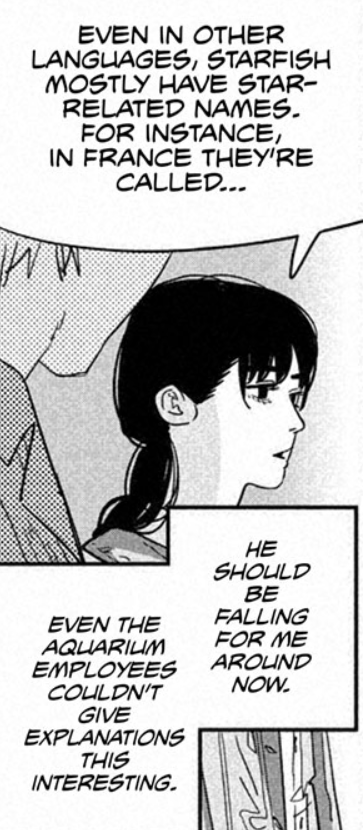
Cuddling 👍🏻
I can be your bestie 😇 or your beastie 🍤
dream last night where partner told me that “reywal” (lawyer backwards) used to be a very common word and job
Poob has it for you. and by "it", haha, well…

Tags page!
Something that should have been obvious with adding tags but I didn’t think of until after the fact: There is now a tag page showing all the tags used on the website, ordered from most ot least used. I also added some more tags and went back and retagged a lot of posts.

Tags!
After a year I have finally added a functioning tagging system. I had been tagging posts already but they were pretty much non-functional, just sitting at the bottom looking pretty. Now every post has some category icons under it. Mouseover each for titles if it’s unclear what they’re meant to be. As well as posts the tag pages include reviews and gallery exhibits.
Warning: I wrote this post nearly a decade ago so it’s a bit cringe.

Long Live the Queen - extreme trailer overanalysis
The things I write on this blog are all things that are personally interesting to me. I want people to read them (I really want people to read them, if you enjoy reading them consider linking your friends who might enjoy them too) but I don’t pick topics based on what’s popular or controversial to get views. But I also don’t want to disappoint people and today I am bending to popular opinion - here’s the blog post I know my subscribers have really been wanting me to write: An overanalysis of a trailer for an indie visual novel game from 2012.
When the trailer for Long Live the Queen first popped up in my Facebook feed courtesy of GOG.com I’m not sure why exactly I clicked on it. I don’t think I’d ever bought a visual novel and I don’t normally bother watching videos on my Facebook feed either. It’s a very good trailer and it immediately piqued my interest in the game. After checking out a few reviews and one or two snippets from let’s plays of the game I bought it and quite enjoyed it. But I found myself doing quite odd: A couple of times I just went back and watched the trailer again.
You might want to watch it before continuing this post.
Now it’s a pretty good trailer just in the simple function of selling the game I think. It gives an informative broad-strokes idea of how the player can guide Elodie without getting bogged down in the stats-picking. It manages to present gameplay footage of a visual novel and make it look interesting. That is praiseworthy in itself! It also gets across the game’s morbid sense of humour. The narrator’s delivery is perfect to the point to the point where it almost seems a shame he’s not a feature of the game itself. But I think there’s something else to the trailer - it’s not just showing four possible playthroughs of the game - it’s showing the metanarrative of a single player making multiple attempts at the game.
We start off with “the fair Princess Elodie” and this is the player’s first time through. They’re probably picking choices as a matter of taste rather than something that can lead to game-ending consequences down the line. They make moral decisions rather than political decisions and attempt to play a kind, gentle soul. They probably even make sure Elodie’s mood is happy all the time. Everything is going well. Elodie is a lovely princess who everyone adores. And then she takes an arrow in the side and dies. It’s hardly fair but it’s a wake up call. The player realises that the real goal of the game is not to try and get the princess ready for her coronation so that she can be the best possible Queen; it’s to survive long enough to get there in the first place. They readjust their priorities.

And now we have “the agile Princess Elodie.” All decisions have been refocused on survival. Public appearances are out and social engagements are refused - that’s what got Elodie killed the first time. No more risks of any kind. Reflexes and Medicine are probably the top priority skills to learn, perhaps with some weapons for self defence a situation where they are necessary comes about. The sense of security is of course false. Hidden away, Elodie neglects her duties to the kingdom and it starts to crumble beneath her feet. A rebellion rises up against monarch-to-be and Elodie is once again killed. “But I was so careful!” cries the poor player.

But they understand this. They know what they did wrong. As a leader you can’t neglect the kingdom. They’ve seen the skill checks they failed. They’ve taken mental notes. They know what they have to do to stop going to war in the south. They know how to rule. Presence, Elegance, Royal Demeanor, Novan History and Foreign Intelligence. These are the keys to politics and rule. We have “clever Princess Elodie” and everything is going fantastically. Peace reigns as Elodie outmaneuvers her rivals and peers. There’s a tournament being organised this week. “I wonder if I’ll get the option to give another speech. What’s this? Chocolates. That’s a bit odd. Why did I just fail three stat checks. No. Stop. Stop eating the fucking chocolates fuck fuck FUCK STOP.” and Elodie is dead again. And then something snaps. “I did everything right! Why wasn’t there an option to just not eat the fucking chocolates?! I did everything right.”

“FUCK THIS GAME FUCK EVERYONE FUCK. This time EVERYBODY DIES. Swords, Naval Strategy, Logistics, Death. This is what we are studying this time Elodie. Peaceful negotiations? No. The south is mine. The kingdom is mine by fire and blood. I am the heir of a bloodline that has ruled for generations by right and might of the power that flows through my veins. I can wield a power to level cities and I just fucking blew myself up.”

At this point the player uninstalls the game and never plays it again.
What I’m saying is that it’s a good trailer.
someone should make a newsletter or blog or podcast or something about stuff made by Irish trans artists and call it Trashinscneach
free idea because I am far, far too tired to do this myself
does anyone make fidget spinners with beyblade launcher mechanisms to make them go?
talking about AI art and weird fetishes, not serious, nothing explicit
I bet the wonderbread guy with the fetish for blonde women destroying the environment and building polluting sandwich factories etc. really loves AI slop
people keep asking “who are these AI generation tools for?” and the answer is it’s for the wonder bread guy
poob has had it up to here with you

One Year of Posting
I first started working on this website three years ago, in September of 2022. Then it was just a gallery of projects that I’ve made built on top of the default Jekyll minima template. I’ve been continuing to add to it, turning it into my own custom nightmare with a bespoke build process for generating podcast feeds and customised Pico-8 cartridges. A website is just something that you can endlessly tinker with with you have the inclination to. Then one year ago today it sprouted a bog1.
Like many other blogs that popped up at a time this was a reaction to the announcement that Cohost was going to shut down, something that I am still deeply upset about. For a lot of people Cohost was a reminder that websites can actually be fun. That they can be a place for creative output and joy and not just doomscrolling or reposting every blorbo that you see. That HTML is a canvas that you can use to paint, even if all you are painting is a silly bit of bespoke CSS or javascript to make something silly. I still have a todo list for things I wand to add to the site the length of my arm2. Making my first posts a year ago I really had no idea if this was something I would stick to and I am glad and somewhat surprised that I have.
I have also tried to re-evaluate how I use the internet as well, trying to be more deliberate with how I spend time on it and what I’m reading and giving my attention to. I was using an RSS reader long before the Cohost shutdown and I am probably preaching to the choir here but I will continue to evangelise them as the best way to follow anything and most things do still expose an RSS feed even if they can be a little hidden. Youtube, Mastodon, Bluesky, Substack and Tumblr accounts all have RSS feeds that you can use to subscribe and read rather than having to log into each site and be bombarded with ads and algorithmically boosted posts designed to piss you off. I use Feedbin but there are loads of others.
I do still find myself falling into old, bad habits, especially on days when I am down or lack energy, but I really do recommend being deliberate in what you read online. Unfollow, mute or block people who post stuff that just pisses you off. It might feel like you are keeping on top of important news but you are probably just drowning yourself in misery (and hey, news sites also have RSS feeds if you want to actually stay informed). Read what matters to you, write what matters to you and share with people the things you find that are worth sharing. Or just post nonsense about Sonic the Hedgehog and Seto Kaiba. That is also important.
made a friend tonight

what if I started calling myself Seto Caoimhe
Hey
I tried to put a batman mask on your cat on your webpage, refreshed the page and it… did not save most of the attempt, so it looks like I just scribbled over the top of its face, im really sorry, I cant see any way to undo it.
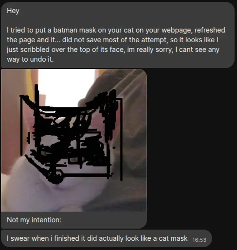

Sega’s PAL manuals were so bad
I have been waxing nostalgic about PAL versions of games lately but I will acknowledge that in some regards we did get the short end of the stick. As much as I fond of the slower version of the game’s music I don’t think Sonic the Hedgehog running one sixth slower than it was designed to was a good thing and the game manuals we got here seemed to be made as cheaply as Sega could get away with.
Let’s compare manuals of the Japanese, North American and European release of the same game, called Ragnacënty, Crusader of Centy and Soleil respectively in each region.
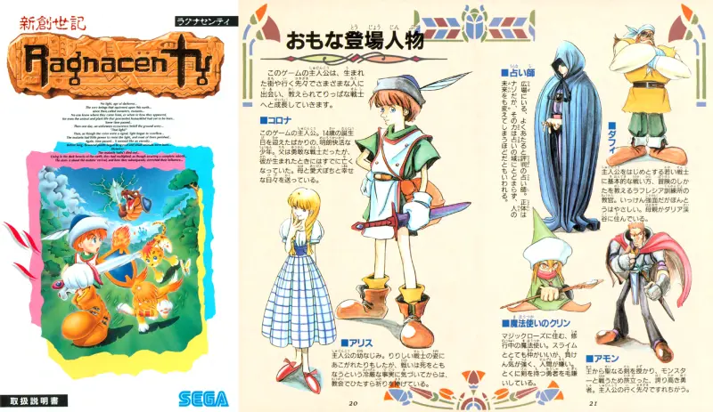
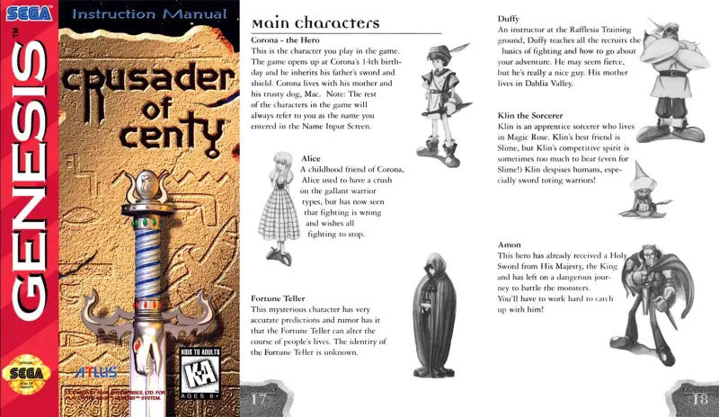

This is fairly typical of what European Mega Drive manuals were like. Fully black and white, printed in in a landscape orientation, arranged in thin columns, having little interior artwork other than screenshots that are so squashed down it’s hard to tell what they’re even showing and cutting everything down to the bare minimum details. The character bios aren’t included at all. This little bit of narration from the perspective of the protagonist is the closest thing. The whole manual is only 17 pages compared to 30 for Ragnacënty and 40 for Crusader of Centy.
And Soleil’s manual’s layout seems downright roomy compared to a lot of games. You might have wondered why the manuals might have that strange multi-column landscape layout? Well Soleil had separate manuals printed for each language the game was released in but that wasn’t always the case. Compare it to Tails’ Adventure for the Game Gear which across each pair of pages has separate columns in English, German, French, Spanish, Italian, Swedish and Dutch.
But even this is still worth preserving. Soleil and its manual were precious artefacts for me for a very long time. I still had the game cartridge and manual up until a few years ago when I did a big clearout of all my old games (mementos are precious, but so is space and I live in a small house) but even when I sold it on I actually cut out the cover of the manual as a keepsake. Had I known as a child the stark difference between those pages and that of Rangacënty I might have held it in less regard, but it was still a piece of my childhood and worth preserving along with the other versions.
Weekend at Bernie’s good ending: Larry takes the money and actually gets the sex change operation
I refuse to call it getting my freak on because to me sex is a normal and natural thing

What I’m reading vol. Ⅹ
Vols.: Ⅰ, Ⅱ, Ⅲ, Ⅳ, Ⅴ, Ⅵ, Ⅶ, Ⅷ, Ⅸ, Ⅹ, Ⅺ, Ⅻ, ⅩⅢ
Did you know that due to the differences in power grid standards the Mega Drive CPU ran at 50 Hz in Europe and Australia rather than its original 60 Hz? That means that if the programming for the games didn’t compensate for it that meant they ran one sixth slower, even the music. This is what the original Sonic the Hedgehog sounded like to me as a child and most of these songs still sound strange to me at full speed. And following on from that…
PAL retro games deserve to be preserved, respected, and re-released — Kimimi
In most cases these aren’t the games an entire continent (and beyond) grew up with, and we need to seriously consider how successfully the industry’s caring for its past by so quickly and easily throwing out the likes of Castlevania: The New Generation (Bloodlines), Shin Megami Tensei: Lucifer’s Call (Nocturne), and Kirby’s Fun Pak (Kirby Super Star). For millions of us there is no preservation to be found in these otherwise excellent re-releases nor any chance to revisit a childhood favourite, because the games we played often aren’t even mentioned, let alone included.
Yes I have a bee in my bonnet about this. There’s another interesting thing to note here: PAL versions of Japanese games also often had quite different English translations to the North American releases. As a child I played Soleil on my Mega Drive, saving the world with Johnny the dog, Charlie the cheetah and Penguy the Penguin, while a girl in Canada playing Crusader of Centy on her Genesis would have met Mac, Flash and Chilly instead1. Nintendo did this as well and for a lot longer than you might expect. The most recent game that I know off the top of my head that had two different English translations for PAL and NTSC regions was Splatoon in 2015.
Overview of my Sun Microsystems Type 7 Keyboard and a little Guide on how to use the Compose key in Linux — Pom
I haven’t bound all of them, but having extra keys to do with as you please is sooooooo nice. I really wish I could get, like, relegendable keycaps where I can write down what alternate functions I have them mapped to. (this is where the Type 5 would kinda come in handy, since that has MX switches, that I could easily put relegendable ones on). So far I’ve mainly have them mapped to window controls, like Stop and Undo each move windows between my monitors. The Help key is one I’m kinda unsure on, since I’ve often hit it by accident instead of Escape so I don’t want something else pop up in situations where this happens. Maybe I could map something to hitting Help along with a modifier? I’m not sure.
I haven’t done much manual key remapping myself but on the Manjaro install on my main desktop I have keyboard layout set to an Irish Cló Gaelach layout that gives me easy access to writing vowels with síntí fada and consonants with poncanna séimhithe using the AltGr key but a lot of other handy or cute little key combinations for different characters, including smart quotes, en and em dashes, and the Tironian et (⁊) which is still sometimes used in place of an ampersand in Irish and Scottish Gaelic and is appropriately on AltGr+⇧ Shift+7.
Blaugust Notes on Comments — Rabbit
“If you don’t have comments enabled, then you’re just preaching your truth. You don’t want to have a conversation.”
Correct.
Okay, no, not really–but why is that so bad? If you believe this, why do you think it’s a bad thing for someone to opt out of other people’s viewpoints on it? It’s their blog. A blog or personal website is intrinsically a different thing than a social media account. It is entirely customizable and on your terms. Why is it a bad thing to have full ownership of your space in an era of the internet where we own so little?
Agree wholeheartedly with xir on this. I do have comments on here but I mostly just hope for the occasional nice little comments for my friends. This is my website and I am fully and unapologetically in control of what appears on it. I am not averse to feedback or discussion but if you try to post a comment I don’t like I will simply delete it.
Further Notes on the Death of the Author — Rabbit
We watched this during critique in class and sat afterwards in horror, none of us willing to be the first person to speak up, until finally someone broke and said, “Is this a film advocating for suicide?”
She was upset with us for thinking such a thing when, to her mind, this was a film about getting in touch with nature to brighten your life. Obviously. Unfortunately, no matter what her intentions were, she had definitely just made a film that was pro-suicide. She was too unskilled at that time to be able to make a film that met her intentions, and also too unskilled to identify what the film was actually about.
Some more notes from Rabbit.
if you love it, download it — Erysdren
this post started out as a rant about the current state of media preservation on the modern internet… but ranting and complaining rarely helps anything.
so instead, i have written a few short guides and notes about ways you can help contribute to media preservation by doing it your damn self. most of the guides lean very technical, but i try to give appropriate explanations and links to the tools and documentation where i can.
I think that every blog that I currently follow that does its own little post roundups has already linked to this but I will add my voice to the choir as someone who was recently struggling to download and preserve something myself.
Laura Michet also recommended a few other downloaders.
Let's stop pretending that managers and executives care about productivity — Baldur Bjarnason
Today, big chunks English-language management and executive culture are effectively the opposite of what we know works when managing organisations.
One example are open offices: these have been proven many times over to harm productivity, focus, collaboration, and employee well-being. They only improve real estate costs and employee surveillance.
I love the efficient allocation of resources under capitalism.
An infodump on vaginal sex, by a lesbian — Elilla
Lately the bottoms I've had the privilege of bedding all have described my fingers with the word “magic”, so I figured I must be doing something right. Might as well write down what I've learned from a lifetime of chasing skirt.
I already linked to this on my own recent post on penile sex and might as well throw it in here too.
-
And the original ラグナセンティ had ぽち, ちった and ぺんぎー. ↩
Hey are you doing okay? I know you’ve been through a lot lately and I can’t help but notice that your irises and pupils have turned into a flat gradient.

You can no longer rent a 3DS at the Louvre
For over a decade the Louvre has offered an official guide for the 3DS. A very cute meeting of games technology and art.
Ellie had wanted to go on a trip to Paris together and back in May, just over a week before she died, I had joked about needing to go before September when I read about the Louvre 3DSs being discontinued. That trip never ended up happening and as of today the service has officially ended.
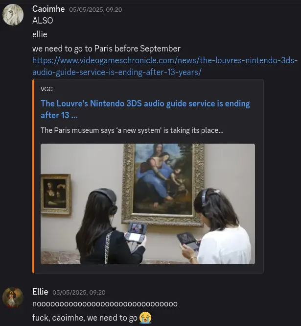
I had completely forgotten about all of this until seeing a post about the Louvre 3DSs again just now. Funny the things that can send one into floods of tears. Echos of plans that never came to pass and reminders of what could have been. I had been considering doing the most cliché thing in the silliest way possible and proposing to her in Paris with a fidget ring I was going to get off of Etsy. Rose gold with symbols of the moon on it. I ended up getting one in my size instead that I have worn occasionally as one of my mementos of her.

Sonic Racing: Crossworlds demo impressions
I’ve been playing the “open network test” demo for Sonic Racing: Crossworlds and having a good time. I am not much of a kart racer gal but I did really like Sonic & All-Stars Racing Transformed and that is going to be my main point of comparison. The quick version is that it’s fun but I am not spending 70-bloody-€ on this.
One thing that is immediately apparently compared to Transformed is that Crossworlds is much more chaotic. The game is a constant sensory overload. The central gimmick is that the second lap of each race sends you to a random other track and the last lap of each track also adds new items, hazards and shortcuts to the track, so things are constantly changing every race and items feel more powerful and far less easily dealt with than in Transformed. That game’s blue shell created a minefield in front of the lead player, something that is going to slow you down a little but was avoidable with some care, while Crossworlds has two different items that directly target the lead player and seem nigh-undodgeable. The three different homing attacks also feel significantly harder to get away from with a well-timed boost than they did in Transformed (or perhaps I am just very rusty) with the constant sensory overload of the game not helping there. There are also three different catchup items that automatically send you forward in position on top of the monster truck super transformation and regular boost powerups which also help anyone who has fallen behind rejoin the clusterfuck in the middle of the pack.
Of course my impressions also being coloured here by the fact that I mostly played the single-player mode of Transformed while this demo of Crossworlds, being a network test, has very limited singleplayer options with only one grand prix with three tracks1 to play singleplayer and many more tracks available to experience in online play so I have mostly been sticking to that. I am a bit disappointed that there doesn’t seem to be much character dialogue when playing multiplayer. The grand prix mode assigns you a rival character who will banter with you as you race other racers might talk to you as you interact (i.e. attack each other). I can understand that people eventually get sick of repeated dialogue in online matches but I wouldn’t mind the option to toggle it on and maybe even toggle on assigning other random players (or friends that you are partying up with) as rivals for a race.
The character I’m most interested in terms of these voice lines is Sage, who was only introduced in Sonic Frontiers and hasn’t interacted with most of the wider cast at all yet. I’m curious as to how they handle the context that she exists in outside of the plot of that game. She is not available in the demo, though, and I have been playing almost exclusively as Cream (because Blaze also isn’t available in the demo).
One thing that Crossworlds does have over Transformed is the vehicle customisation. It’s done a little strangely and there’s not a huge amount of depth to it—you are not swapping out spoilers or other individual parts, only the front and back halves of various vehicles—but it’s still fun to play around with. Layering decals on top of the paintjobs does give you some more freedom but even this is pretty restrictive – you can’t overlap decals and they tend have a large transparent zone around the main image that stops you using them to create more detailed shapes. I imagine that this might be intentional to try to stop people making anything offensive with them but I did try my best on my extreme gear design to combine some basic shapes to make a depiction of Rocky behind where the rider stands.


One criticism I have of the car customisation is that when it comes to horns and decals they don’t seem to have given much thought to the Sonic the Hedgehog theming. The horn options sound like they came unaltered from a stock asset pack. There is one labelled “spring” and it is not the Sonic spring noise, just a generic cartoon spring. There is a decal in there of Sonic’s face (which looks quite funny) but really none for rings or Chaos Emeralds? None of the other characters’ silhouetted extra life icons? The “auras” you can apply to the cars also all look like shit and just add to the visual noise of the game.
Your custom paintjob also gets overriden in the game’s time-limited festivals, in which players are put into themed 4v4v4 teams in races with special rules, with the winning team for each race earning points. The festival for the network test is Persona 5-themed with Team Joker, Team Violet and Team Mona. This sounds like a Splatfest but it is not—it’s a battle pass. You do not choose a team you are randomly assigned one every race, making them utterly pointless other than what colour your car is going to be for the next five minutes and points simply go to unlocking Persona-themed decals that I will never use. Joker himself, one of the future DLC characters for the game, was also temporarily unlocked for this which just highlighted how much of a lazy cashgrab the cross-promotional characters are, lacking any voicelines or even a full set of animations. From what they’ve shown of the game so far the only voiced DLC character is going to be Hatsune Miku, the one that they don’t have to pay a voice actor for. Even the Werehog pre-order bonus doesn’t have any lines and he’s just Sonic with a gruffer voice. They have Roger Craig Smith voicing Sonic and Omega in the game already could they not have him do this too at least? But if you want to race as a completely silent Spongebob Squarepants be sure to buy the season pass.
Also the final lap music for a lot of stages is really bad.
-
In keeping with the gimmick of opening portals between tracks mid-race the fourth and final race of each grand prix in the game is one lap each from the three previous tracks. ↩
they’re calling it the movie that smells you back!

Bane of the Living |
2 💀 💀 |
|
|
||
Creature — Insect |
🛡 | |
|
Morph X💀💀 (You may cast this card face down as a 2/2 creature for 3. Turn it face up any time for its morph cost.) When Bane of the Living is turned face up, all creatures get -X/-X until end of turn. |
||
4/3 |
||

How Wikipedia Got The Crazies (1973) Wrong
This post contains spoilers for the 1973 film The Crazies.

Several years ago Shaun (né and Jen) released a video complaining about Wikipedia’s summary of the 2014 film Ex Machina at the time. I have been holding a similar grudge about the article for George A. Romero’s 1973 The Crazies and like Shaun instead of fixing the article myself I am just going to complain about it.
The Crazies, filmed between Romero’s Night of the Living Dead and Dawn of the Dead, is sometimes described as a quasi-zombie movie. A virus called trixie, created by the US military as a bioweapon, has leaked into the water supply of Evans City and is spreading rapidly throughout the town. The military attempt to quarantine Evans City but struggle to deal with the rapidly spreading virus and the panic and violence that the virus is both inspiring and directly causing and the ambiguity of the two. I think ambiguity is an important part of the film and the Wikipedia summary, in trying to be a flat description of the plot, ends up removing that ambiguity and presenting a simple and wrong view of the story.
The virus causes mental degradation in its victims. As the current Wikipedia article puts it causes “victims to either die or become hysterical and homicidally insane.” This is, I think, the first way the article gives a misleading picture of the plot. Trixie does not simply make people into mindless killing machines, it is not the rage virus from 28 Days Later. People infected with it do end up killing a lot, but it does not necessarily inspire bloodlust: It generally seems to cause irrationality and a complete loss of moral perspective. In one scene three infected men charge towards the protagonist David, who is wearing a stolen military biohazard suit, wildly shooting at him. He tries to shout that he’s not part of the army quarantine, that he is not a threat, but when they hit Judy, a woman David was trying to protect, David returns fire, killing two of them. When the last one reaches David and sees him he simply stops, causally mutters “Hey coach, I didn’t know it was you,” and sits down without a single care about his two friends that were just killed or the woman dying in front of him and not even reacting when actual army troops show up.
People infected with it are still capable of thought and communication and this is, in fact, a huge problem and one of the core tensions of the film is the uncertainty of infection. One does not have to be hiding an obvious bite mark to be a risk in this movie and the military are in many ways just making things worse, packing everyone into the high school as an attempt at quarantine and shooting everyone who won’t comply. Within this effort a doctor named Watts, who was involved in the creation of trixie, is desperately attempting to find some sort of cure or vaccine. He hopes to find someone amongst the residents of Evans City who has a natural immunity from which antibodies can be taken but lacking that still attempts research into a cure throughout the film. He eventually develops a potential cure but is killed and the samples are destroyed in a stampede of infected townspeople breaking free from quarantine, while David realises that he is immune to the virus but decides to keep it to himself and not co-operate with the military.
That last sentence is at least how Wikipedia describes it. I disagree. Watts, throughout the movie, gets increasingly agitated, desperate and irrational. He tears off his gas mask in frustration while working on samples because it is too cumbersome to use a microscope while wearing it. He starts to see something in his samples that his colleague does not see or understand the significance of. When challenged he tells her to “just have faith.” It is very clear that Watts is acting, at best, extremely irrationally. The Wikipedia article states that he is killed in a stampede of people breaking quarantine but this is not simply a co-incidence, it is because when he runs into a group of soldiers and starts telling them that he’s a scientist they just think he’s as crazy as everyone else and shove him in with the rest of the population. Whether Watts has actually found something, is having a breakdown from stress, or has become infected either from general spread or from mishandling samples is unclear. When he dies he may losing a potential cure, but there is also the potentially worse possibility that he had absolutely nothing and now the rest of the researchers, assuming him to be brilliant, are chasing after shadows he was casting on the wall. A doctor reassures Peckem, the colonel in charge of the quarantine, that “Our boys have checked the slides [Watts] left in his microscope, but we can’t make heads nor tails of it. He was on to something. We’ll dope it out sooner or later.”
As the colonel and doctor leave, David is taken in and the soldiers ask the doctor if they want to test David for immunity. The doctor takes one look at him and dismisses him as one of the crazies. David, as the Wikipedia article notes, keeps his believed immunity to himself, cutting off a potentially fruitful route for a vaccine. That is, if David is actually immune. He thinks he is, but he has hardly been a perfect beacon of rational behaviour either. Peckem is ordered to move out to Louisville, where there are “reports of symptoms.” The quarantine seems to have failed. Though perhaps panic is just spreading as news gets around of the military rounding up the entire population of Evans City and shooting a third of them. It’s going to be hard to tell the difference between the virus spreading and the news of the virus spreading.
I think this lack of clarity is a huge strength of the film and makes the closing shot of Peckem’s point of view as he is taken away by helicopter of the light of a small, illuminated landing pad being swallowed by the darkness of the night around it much more bleak.
And the Wikipedia article is bad.
Do NOT call yourself a woman unless you can be equipped with Malevolent Nuzzler.
https://sandyspalace.ie/2025/08/25/You-Wont-Believe-This-Game-Exists.html
the thing that people don’t realise is that I am normal
making my Jellyfin server sillier to amuse myself again
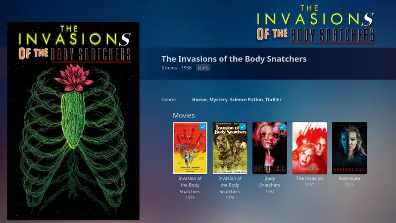
today in people doing whatever with mind control fetish fiction: Woman literally just has a concussion
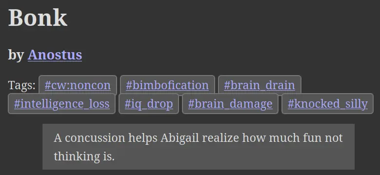

Bog update
It’s wider now.

Wplace 2
I am probably going to wind down using Wplace. It was fun to mess around with for a few days, flex my pixel art muscles, see what other people are drawing, see how the canvas evolves, but it’s very much a flash in the pan thing that most people are going to move on again from quickly, myself included. I have dotted down a few more things on the map, this time putting some larger pieces of other people’s art in a few places rather than my own pixel designs.
I put down the Pico-8 logo and a few characters near the Pico Pico Café in Kichijōji, Tokyo. This is a busy area and it has quickly been drawn over again, but all of this is ephemeral.
One of my past brief obsessions was St. Bride’s a strange mock-Victorian girl’s school holiday destination in Ailt an Chorráin, Donegal that in the 1980s promised a total disconnect from modern society and modern technology. They advertised that they had no electricity and did not believe in such things and also published a series of text adventure games for the ZX Spectrum. That is a rabbit to save for a future post, perhaps. I planted a shrunk-down recreation of the title screen of the game The Secret of St. Bride’s in the village where the school was based.
I started using the Blue Marble user script for these which helped with planning out size and position for these larger drawings a lot, as well as speeding up the actual drawing. I dropped a little art of Transy east of Bournemouth. It’s modified from a comic panel but this is the art from this lot that I can probably take the most credit as being “mine”.
I also draw the character select art for Snolf that I originally commissioned from Mars Gainsboro and decided to arbitrary place them on the Isle of Skye Golf Club.

Finally, I also contributed my pixels to my friend Ruby’s big rendition of the art for the P-Model album In a Model Room in Tsukuba, a hotbed for artwork of Susumu Hirasawa. She contributed to helping draw my art a lot as well.

forgot to have tea before getting on the train this morning and I am suffering from caffeine withdrawal
re-experiencing Yu-Gi-Oh! through the magic of the “I shortened Yu-Gi-Oh!’s nth episode down to about a minute” series and everyone in the room lost their shit at this line
not sure how I feel about the nodding emoji
the transition to digital animation was not kind to The Big O


Clitoral vs. Vaginal Orgasms for Trans Women
This post discusses the mechanics of sexual pleasure for transgender women in frank detail.
A while ago Devon Price’s article The Quietly Coercive Nature of "Vanilla" Sex prompted a lot of self reflection about what I actually enjoy during sex and a few discussions with my partner about what what worked for each of us. I realised I never really enjoyed receiving oral sex very much, though I was more than willing to give it. This, happily, suited us both just fine. She also reminded me to finally get around to reading Fucking Trans Women.
One thing that became clear is how both of us, being trans women with penises, were using what worked for ourselves as a guide for the other. This was a mistake. Elilla’s recent post, An infodump on vaginal sex, by a lesbian, has gotten me thinking about this again. Like many others she make the distinction between people for whom clitoral stimulation works better and those for whom vaginal stimulation is preferable, or in her own terms: Clitoris-oriented bottom and penetration-oriented bottom. This is a familiar concept in writings about sex but I don’t think I’ve ever seen this sort of distinction applied to penises (not that I am a particular well-read in this regard). But it became clear to me, going over the differences in what worked for me and my partner, that I was somewhat of a clitoral (glans) orgasm girl and she was much more of a vaginal (scrotum, base and shaft) orgasm girl.
I had a small, battery powered handheld vibrator and while it could be fun for me to use it very much required me to already be aroused and erect to have much of any effect and the pleasure I got from it could be very fickle and flighty. I was surprised when it worked so much better for my partner and the ways in which it worked for her. I at first put it down to a difference in sensitivity but she enjoyed types of stimulation and areas of stimulation that really did nothing for me. The vibrations applied to the base of her penis and the area around her scrotum were immediately great for her in way that, to me, just felt like getting my skin vibrated. When I’m erect applying a vibrator to various parts of my knob can be pleasurable but it is the head that is feeling that. If I’m applying the toy to the base and it feels good that’s just because the vibrations are carrying their way up. Not so for my partner, apparently. I do seem to need stimulation of the glans—which in a penis is the equivalent tissue to the exposed part of the clitoris—for sexual stimulation in a way that was simply not the case for her. My limited experimentation with muffing and anal stimulation have also not proven to be particularly pleasurable, though I don’t yet have enough data to fully write those off.
An aside about vibrators: I have since gotten a corded Doxy vibrator and compared to the small battery powered one it is a hydrogen bomb vs. coughing baby situation. Like fuck I did not realise there was that much of a difference. It is not only much more intense but it can actually be effective at stimulating me even when I’m not already erect, which is very useful. My partner actually found it a bit much for her. I originally got the Doxy as a sort of shared Valentine’s Day gift to give to her that we could enjoy together when at her place but she told me to keep it and she took my battery-powered one home instead. Elilla stating that in her experience that other brands work better on penises has me intrigued.
I don’t have much in the way of data to come to any grand conclusions but I would advise anyone, even if you are already used to open communication with your partners about sex, to reconsider your assumptions about what you should be doing during sex, what is going to feel good for you and what is going to feel good for your partner. Their needs may not map directly from yours and you may not have fully examined what actually works for you, either. There may be things that you are going along with because they are seen as the default or things that everyone is meant to enjoy. Is there anything you are going through the motions of because you think it’s meant to feel good for you when it doesn’t? Is there anything your partner is focusing on because they have a false impression of what works for you or even because you have a false impression of what works for you?
And perhaps oral sex could also work better for me if these lessons about what actually gets me off were applied. I would be willing to experiment with that more but first I need to start getting laid again.

My first expo
I exhibited at a showcase for local game makers yesterday. It was the first time I had done something like that and it was extremely fun and utterly exhausting. Working on games is an occasionally hobby; I don’t intend to make it my job and I haven’t worked on any game projects since the game jam last year, but I dusted off Snolf Robo Blast 2 and Conway’s Garden and set them up with some controllers for people to try out.
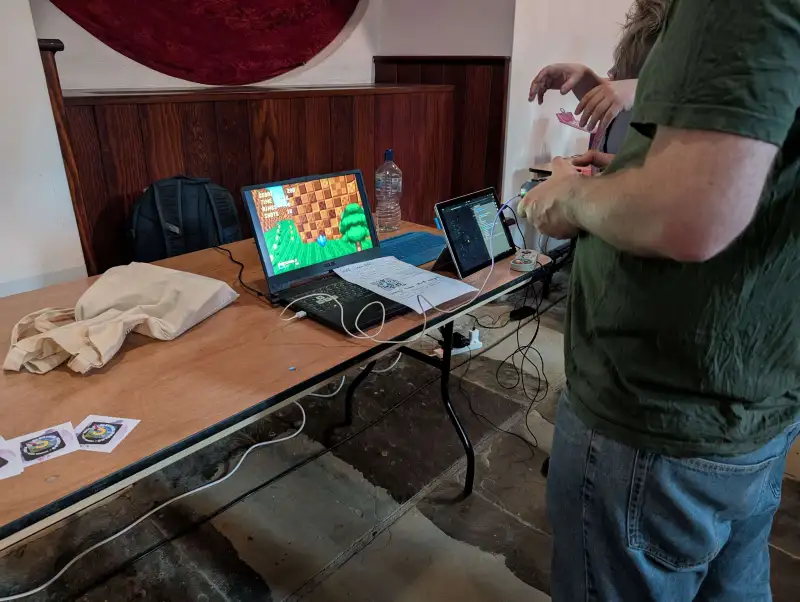
I had not thought about how exhibiting these would work before the event but I quickly realised that I was going to have to give a lot of context to people as to what they were playing. The vast majority of people attending never heard of Sonic Robo Blast 2 before so I had to give a quick rundown to everyone on what it was and sometimes the concept of fangames and mods.
Even with that explained, though, it became apparent how awkward it was to try to convey what the mod is doing when people seeing it do not have a context of the base game and how the mod is creating an experience on top of that. They are coming in and seeing and playing this game for the first time and expecting it to be a coherent whole, not this deliberate awkward layer on top of a base game. You don’t have the context that the joy in it is that you are playing the game “wrong”, layering a control scheme and method of play that the world was not intended for. Many people when seeing it as a golf-type thing started looking for a hole or guidance on where they are shooting for. The levels have a fairly legible linear structure when played normally, but when you have never seen them before and can freely shoot yourself much farther and higher than the levels for designed for, bouncing every which way, it is become very difficult to parse the structure of the space. More than one person suggested there should be guiding arrows of some sort to help.
Some people, though, did gel with it straight away and were delighted by blasting Snolf around, which was really nice to see. I was quick to give credit to the SRB2 team for the game itself and Dr. Melon for the concept. A line I fell into saying that got a laugh from a lot of people is that “all I did was make the controls worse.” A lot of people also got a kick out of it when I pointed out that the game was technically an extremely heavily modified version of Doom. Some people did have more of a concept of an antigame and compared it to QWOP and Getting Over It when I tried to explain the awkwardness of it not being entirely unintentional and the other game makers there generally got it and found it interesting. There were a few parents who brought children, including a Sonic fan or two, and they gravitated over to it being one of the more brightly coloured, exciting looking things on display, only to get pretty frustrated with it. For the kids at least I did quickly quit back to the main menu and restart the game with normal Sonic so that they could have a bit of fun trying it out and gave on the details of SRB2 to their parents if they were interested in it, pointing out that it was free. I think if exhibiting it again it would be useful to have a second computer set up with the unmodified version of the game, both to give context and to allow any child who sees Sonic and gets excited to play something that would actually be fun for them.
Similarly for Conway’s Garden I had to let people know that there wasn’t really any goal or point to it and it was more of a piece of art and a challenge to make something in a tiny amount of code. I had the code open in a second in a second window to the side so people could see how small it was for themselves. A lot of people, quite fairly, lost interest in it quickly, but some people were fascinated by the highly condensed code and the idea of tweetcarts and Pico-8 itself and a surprising number of people were already familiar with and recognised Conway’s Game of Life.
There was one man in particular I had a lovely chat with who was unfamiliar with games generally (he had to ask to clarify if “mods” was short for “modifications”) but enthusiastic about discussing the things on display as art. He said the mix of chaotic generation with the player’s simple, deliberate movements in Conway’s Garden reminded him of Joseph Beuys’s I Like America and America Likes Me and immediately recognised the Sisyphean nature of Snolf.
I don’t know if I will do anything like this again any time soon (and I won’t be working on anything new to show for the moment) but I had a great time and met some very cool people.
he’s called Maes Hughes but actually he’s normal sized
Reviewing stuff is fun and it’s nice to have a little log of your thoughts that you can go back to every once in a while and say “oh yeah that was what I really liked about that show.”

Wplace
I have some more Wplace art in a new post.
I’ve been spending a bit too much time fucking around on Wplace but it’s been nice to flex my pixel art muscles a tiny bit again. One of the first things I added to the map was a dusted-off pokémon trainer sprite I made a few years ago when playing the ROM hack Pokémon Crystal Clear.

I used the Crystal player sprite as a base for this with the arm of the youngster sprite from the first generation games. I put this down near where I grew up, a pretty rural place. It can be quite isolating to grow up weird or queer in a place like that and it warmed my heart to see someone else had already drawn a few pride flags there including a trans one. I don’t know who drew that but I hope they are doing okay.
I also saw a few local GAA club flags and didn’t think much of it but checking back over a few days it quickly became apparent that some cunt was drawing these to cover over pride flags. This put me in a foul mood but over the next few days the ever-growing retaliatory pride flags made them give up and there is a big, unmolested rainbow heart in the middle of the village now.
After that I set my sights on a few landmarks. These took a few revisions but I’m really happy with how they turned out.


Large collaborative art projects Wplace are cool but it can be frustrating when they do them right on top of cities that are already crowded for space. Still, with a bit of silent negotiation I was able to put these down close to where they are on the map.
I do have one other gripe with Wplace: The gamified system and slow drip of pixels back is unfortunately very effective and leading me back into bad habits of sitting at my desk refreshing webpages that I have been trying to break. At least the ability to get larger charges over time, as much as it plays into those systems designed to be addictive, does give you more room over time to step away from it and not feel like you are wasting your chances to draw something.
The other little unique doodle I’ve done is one of Sadako Yamamura, which I wasn’t entirely happy with but a friend said was really good so I will take that compliment.

I have been dotting some variously-sized Eggbugs and some other small things around as well as contributing to a few larger pieces of art and fixing vandalism here and there. It’s been a fun little time waster.

I was going to sign off saying that I didn’t yet have another project I planned on drawing but while writing this I had a brainwave.

I’ll be filling this in as my paint refreshes.

Echinomorphic humans
What planet is Sonic the Hedgehog from? That depends on which version of the character you’re talking about. The earliest bios from Sega imagine him as simply living on more or less the Earth as we know it, giving his place of birth as Christmas Island. When the series was published outside of Japan a more elaborate background was painted, putting him on a planet called Mobius inhabited by mobians—anthropomorphic talking animals—and ruled by the evil dictator Dr. Robotnik. Sega were similarly lose with canon when it came to licencing, allowing the details of the world to be filled in very differently in the various adaptations.
In Archie Comic’s Sonic the Hedgehog Mobius is a post-apocalyptic Earth in the far future, a background shared by Sonic the Hedgehog: The Movie’s Land of Darkness, while in Fleetway’s Sonic the Comic the Earth as we know it exists as a parallel dimension to Mobius, with characters sometimes travelling between the two1. Sonic X and later the 2020 Sonic the Hedgehog film also feature Sonic travelling from an (unnamed) parallel dimension but then have him be taken in by a human family on Earth, where the bulk of the action takes place.
But this divide between Earth and Mobius never really existed in the games, at least as far as the Japanese versions were concerned, and starting with 1998’s more narrative-focused Sonic Adventure Sega started trying to unify things a bit. The English localisation featured almost nothing from the previous Western Sonic canon: No mention of Mobius, badniks or roboticisation2 and with Sonic and friends being just a few talking animals in a world made of mostly of ordinary humans. This depiction of the world and Sonic’s placed in it held in the games for the next decade, as far as Sonic Unleashed in 2008.
The Sonic games of the 2010s, though, shied away from narrative focus and tried to steer the series in a more cartoon-y direction. These games vastly cut down on the size of the secondary and incidental cast, not only dropping background NPCs entirely but also vastly trimming the size of recurring cast of mobian3 characters, sometimes only having Sonic himself and Tails have any major role. Still, one could imagine those teeming human cities just off-screen somewhere. That depiction of the world was not seriously challenged until 2017’s Sonic Forces.
An big selling point of Sonic Forces was that it had a character creator, finally allowing you to play your own Sonic OC in an official game4! Your avatar in the game starts off as an ordinary, frightened, mobian who rises up from the crowd to fight against the Eggman Empire alongside Sonic and his friends. For this narrative to work then, your furry OC must start as someone ordinary. Therefore mobians must be ordinary. There wasn’t really such a thing as an ordinary mobian in previous games. Barring the ancient echidna tribe shown in flashback all the way back in Sonic Adventure there had never really been furry background NPCs. No generic anthropomorphic animals. They were all important, named characters. For the avatar character to rise up as part of the masses and become a hero they first need to fit into the masses, and thus Sonic Forces came with a colossal shift in how the world of Sonic the Hedgehog was presented: A world of animals under the thumb of Ivo Robotnik, the sole human in the game - something that aligned closer to Sonic the Comic than any of the previous games5.
While the text of Forces itself doesn’t address this change directly series producer Takashi Iizuka made comments to the effect that the there are two different worlds: One that is home to humans and the other that is home to mobians. This, frankly, does not remotely make any sense if you try to fit it with previous games and this was not some sort of reboot, either! Sonic Forces directly references several earlier games. This was coupled with another retcon where the game tries to reframe the younger version of Sonic, returning from Sonic Generations, as actually being from another dimension6 rather than being from the past, suddenly putting Sonic Mania and by extension all the Mega Drive games into a different continuity to everything else and making a complete mess of everyone’s understanding of the series. The people who maintain the Sonic the Hedgehog Fandom wiki started splitting off every character into two different pages: One for the primary version and one for the “classic” universe version. It was, in short, a complete disaster if you cared about the canon of a series of children’s computer games.
Something good did come of this, though: The long-running Sonic the Hedgehog series published by Archie Comics had ceased publication in 2016, one year before Sonic Forces was released, and in the year that followed Sega negotiated a new line of comics with IDW Publishing instead. And while Ian Flynn returned as head writer, having helmed the Archie comics for a decade, the new series abandoned the continuity (and legal baggage) of the old comics and started fresh with a backstory much more closely aligned with that of the games and a plot following on directly from Sonic Forces, keeping its status quo of a world full of mobians.
And the IDW comics are really good! Ian Flynn, Evan Stanley, et al. have a deep love for the series and are able to consistently deliver endearing, interesting and fun interpretations of the characters. It has made me warm up a lot to parts of the cast I previously disliked and introduced wonderful new additions like Whisper and Surge. It also strikes an amazing balance in tone, managing to deliver just the right amount of self-serious edginess in its stories while maintaining its warm, bright, colourful world. It successfully managing to keep the good parts of the ow the Edge 2000s without whollly abandoning the cartooniness of the 1990s and without the layer of ironic detachment and self-cringe that haunted the series in the 2010s. I maintain a reading order if you want to have a go at them yourself.
And as the comics became more aligned with the games the games have in turn became more aligned with the comics. Characters from the IDW comic have started appearing in mobile games and Sonic Speed Simulator (the official Sonic Roblox game) and were mentioned in 2021’s Sonic Frontiers. This is because with the success of the IDW comics Sega have more and more let the lunatics run the asylum. Flynn has been writing more and more for the series, from promotional material and animated shorts to eventually being the writer for the games themselves, penning the scripts for Sonic Frontiers and Shadow Generations. And being someone who does care about the canon of a series of children’s computer games he has taken upon himself to sort out the lore mess.
Under Flynn Sega has put out a series of in-character Youtube shorts called Tailstube, which act not just as promotional material but also an ongoing lore-clarification series7 with the very first episode trying to lay out as plainly as possible while staying in character: All games take place on the same planet. Humans and mobians8 just mostly live in different parts of the world. The Mega Drive games are part of the main canon. Please forget those retcons. Please go fix the wiki pages.
And the games have embraced talking about their history again, acknowledging backstories and characters who hadn’t been mentioned in a decade. The extended human cast, particularly those related to Shadow’s backstory, exist again. Maria and Gerald Robotnik feature in Shadow Generations and the GUN commander9 was in the game’s promotional short Dark Beginnings. But the IDW comics, their timeline seemingly stuck in a pre-Sonic Frontiers limbo, has yet to feature any human characters outside of Eggman. Even when using locations that were shown in the games to be populated by humans the comics will show them as being full of mobians or simply empty instead. There still seems to be a reluctance in the series to portray a wider human cast, but that might be changing!
Sega recently licenced a new manga series called Sonic and the Blade of Courage where Sonic returns to the world of humans and teams up protagonist Yuuta, an ordinary boy, to fight Eggman, who has been going around using an ancient cursed idol to turn (human) people to crystal. In the third chapter Sonic takes Yuuta to Spagonia10 to meet Tails, the only mobian character in the comic so far other than Sonic himself. Spagonia is, like Yuuta’s home Metro City, full of humans. This stands in contrast to the last time Spagonia was shown in the IDW comics, with Sonic and Blaze the Cat on a sightseeing holiday running through empty streets.
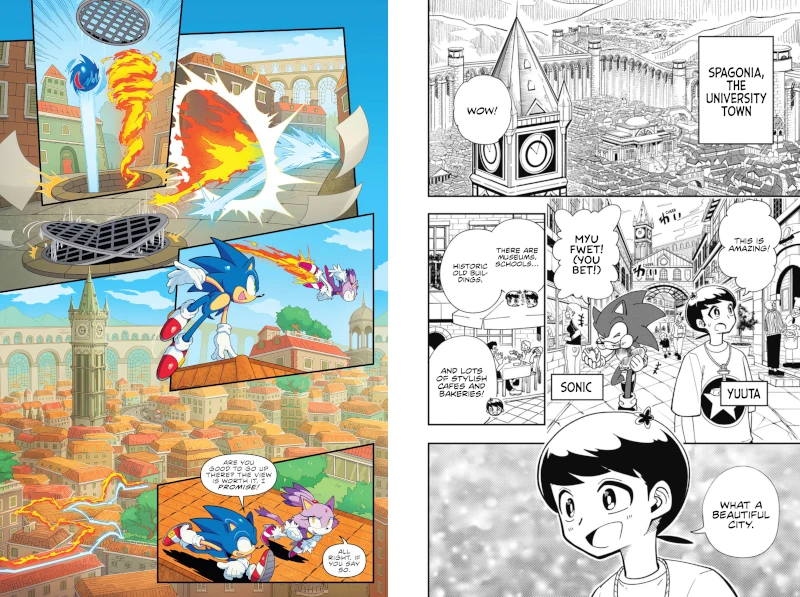
Does this mean Sega is open to portraying more humans in the series as a whole again or is it compartmentalising aspects of the franchise to different media? Will any new Sonic mangas barred from having background mobians while IDW stays devoid of other humans? It would, I suppose, contribute to giving different parts of the series their own identities.
That said they have also introduced a new human character in the most recent Tailstube (which is also set in Spagonia): Professor Victoria11. And Sage, Eggman’s AI daughter from from Sonic Frontiers, is joining the IDW cast in issue #8412 which means that that status quo is finally being moved forward as well.
In any case I really enjoy the direction that the series has gone in recent years and I’m looking forward to seeing how it continues to evolve.
-
Sonic met Tony Blair once. ↩
-
The one thing that did seep through was the name of the main villain: Originally called Dr. Eggman he was known as Dr. Ivo13 Robotnik outside of Japan. Sonic Adventure uses both names, with Robotnik being his real name and Eggman being an insulting nickname that Sonic and other characters call him (that Ivo eventually decides to reclaim and own). ↩
-
While the term “mobian” is not used in any current official Sonic media I am going to keep using it so that I don’t have to type “anthropomorphic animals” a dozen times. ↩
-
I am going to ignore Sonic Boom entirely. Don’t worry about it. ↩
-
Presumably a third one compared to the one the humans and the normal mobians are from, unless Earth and Mobius are just meant to be different planets in the same dimension? Who knows? None of it makes sense anyway. ↩
-
As expected they still don’t use the word mobian but strangely they also seem to be awkwardly avoiding the word human too. ↩
-
The GUN commander has a name now too: Abraham Tower, the same name that Flynn used for him in the Archie comics. ↩
-
Spagonia, introduced in Sonic Unleashed, is the Sonic version of Italy. Not to be confused with Soleanna, a city state based on Venice from Sonic the Hedgehog 2006. ↩
-
a.k.a. Tori. She was actually originally teased in the very first episode of Tailstube and then again in one of the trailers for the third Sonic movie before finally making a proper appearance three years after her original cameo. Fans have speculated that she may be Maria’s sister and Ivo’s cousin due some new background material in Shadow Generations and tori being the Japanese word for chicken. ↩
-
I am very much looking forward to seeing the angst this will cause in Eggman’s good-guy robot puppet daughter in the comics, Belle. ↩
-
Usually Ivo Robotnik at least. He was Julian Robotnik in the Sonic the Hedgehog cartoon that fans call “SatAM”. ↩
Flexing my pixel art doodle muscles again on WPlace has been nice

The Apotheosis of American Cultural Hegemony
It bothers me more than it should when I hear Irish people, or anyone outside of North America, call a Mega Drive a Sega Genesis. It’s quite common among people younger than me; people who didn’t grow up with the machine itself. They know about it from the internet, from the video game history that gets talked about and passed down online, and that is generally the American history of video games. The great video game crash, the dominance consoles over home computers and the dominance of the “Super Nintendo”1 among consoles—all things that did not really happen here. There were only two countries where the Mega Drive was called a Genesis but one of those two countries is the United States of America which is, of course, the only country that matters.
This is a pretty trivial aspect of the general cultural imperialism of the USA and this is nothing new. The US is a huge country, the largest economy in the world and has spent the last hundred years dominating the media and cultural output of the rest of the world. It drowns out all other voices and perspectives, especially in a small English-speaking, and up until recently, very poor country like Ireland.
And as the internet allows us to be more connected and allow other voices to get out this it also accelerates this. Now the world is not only watching the same Holywood movies but following the same big accounts on US-based and -designed social media networks, having the same conversations about the big American political news. Which, to be clear, there is good reason to do2. America is, again, the biggest economy and most powerful country in the world. What it does impacts all of us but also what its tech companies do shape the information we see and the ways in which we see it.
How we access information and what information is prioritised is controlled largely by companies like Google, Microsoft and Facebook. Facebook’s algorithms, policies and moderation are responsible for genocide. I perhaps cannot as easily level such a claim against Google yet but its search, the most common tool for accessing information in the world, has gotten worse and worse at doing that, prioritising profit, advertising and keeping you enclosed within a Google ecosystem. And now, of course, funnelling you away from links to other sites entirely, links to other resources and perspectives, and towards their chatbot output.
Large language models are swallowing so much of the internet right now and lot of people already swear by them, turning to them for questions, for help with writing, for ideas for when they’re stuck, for therapy and for companionship. There is a lot to be worried about with this but one thing I have been thinking about is how these chatbots—whether Google’s or Open AI’s or whoever’s—is that they are probably all going to call a Mega Drive a Genesis unless specifically prompted against it.
These models are trained using the internet as a corpus, an internet already dominated by American perspectives. They are made and shaped by American tech companies who are increasingly cosying up to an ever-more chauvinist US state which is itself embracing “AI” tools as much as it can.
There is reason to think that the current bubble is unsustainable (and I do hope it bursts), but if these tools become normalised as a primary way of attaining answers, of seeking information and perspectives, I think it will have a horrifying flattening effect and accelerate the general Americanisation of the world beyond what is already happening.
And everything I said above is assuming no outright maliciousness. Twitter has repeatedly shown us that the people who make these chatbots can deliberately steer them to avow certain perspectives, from promoting South African white genocide myths to conspiracy theories about Jews. There is nothing really stopping Google from, say, deliberately trying to seed racist, anti-vaccine or anti-transgender propaganda into its chatbot and search summaries if it thinks that might get it points with the current regime which is already demanding idealogical purity from such systems, in effect ordering the limitation of acceptable perspectives.
-
Another shibboleth. We called it a “snez” here. ↩
-
And I am not saying the internet was a mistake or being connected to people around the world is itself bad. It has been a wonderful thing for many of us weirdos to connect with people who actually understand us. One of my best friends is in Australia and even though I have not yet met her in person and I am very glad to have the connection I have to her through the internet. ↩
My goal in life? To have a novel fungal infection named after me
They give titles to the homunculi in Fullmetal Alchemist that mostly rhyme: Greed the Avaricious, Lust the Lascivious, Envy the Jealous, Gluttony the Voracious, Wrath the Furious but then the last two are Pride the Arrogant and Sloth the Indolent when they could have gone for Pride the Vainglorious and Sloth the Languorous.
What if instead of keeping the names of the homunculi in English when translating Fullmetal Alchemist they replaced them with the ecclesiastical Latin to keep it foreign? Avaritia, Luxuria, Invidia, Gula, Ira, Superbia, Acedia.

Seaside town elects dog1 mayor
I have posted about how one of Dracula’s funniest moments is from it examining its own format as an epistolary novel but a another amusing use of the format is the inclusion of newspaper articles that give a perspective of some of the events of the novel from the detached perspective of (absurdly verbose) newspaper clippings whose writers have no inkling of the broader events of the story.
A correspondent from The Daily Graph recounts, on the
The reporting continues the next day that the cargo of the ship (boxes full of Transylvanian soil) being consigned to a local solicitor and, more importantly, the Whitby SPCA putting out a desperate search for the poor dog who fled the ship, who is imagined to be terrified and hiding in the moors and definitely not a murderous vampire in the guise of a gigantic, ferocious, black wolf.
The newspaper clippings end with the paragraph:
No trace has ever been found of the great dog; at which there is much mourning, for, with public opinion in its present state, he would, I believe, be adopted by the town. To-morrow will see the funeral; and so will end this one more “mystery of the sea.”
I got accused of being from Dublin yesterday for pronouncing RPG as “or pee gee” rather than “ar pee gee” 😭
I blame my parents sending me to elocution lessons as a child to get the culchie out of me

᚛ᚑᚌᚐᚋ᚜
Ogham is an interesting writing system with a lot of unusual features. It was used to write Primitive Irish inscriptions on stone monuments in early Medieval Ireland and parts of Britain, the letters consisting of tally-mark like lines carved along the edge of a stone column. It’s a writing system that originally existed on a three dimensional medium rather than a flat page or tablet. Being written on the edges of standing stones means it is also a vertical writing system and unusually it is one that is read bottom-to-top1 and it’s the only writing system encoded in Unicode with its own unique space character where the space is not blank but a straight line.
I was originally writing more infodumping here but I thought it was coming out very dry and if I have piqued your interest then you are just as capable of reading the Wikipedia article on Ogham as me.
But Ogham is really cool and pretty common tattoo fodder. Years ago I was considering getting my name tattooed in Ogham but at the time I also felt very perfectionist about getting something permanently drawn on my body and never went through with it. It’s just as well as that was pre-transition and I would have then had my deadname stuck on me. Having been transitioning for a few years the idea of permanent changes to my body no longer felt like such a big deal2 and I have gotten a couple of tattoos now without worrying to much about it but I never got that Ogham one.
I was thinking about this recently and have been experimenting with an Ogham design that is deliberately my dead name with my chosen name written over it. It happens to work out pretty well because the rendition of my name into Ogham has more strokes than my deadname and the new strokes can be pretty easily added in to the gaps provided that some space is left between each line (and particularly with some deliberate stylistic liberties in how I am transliterating the names). So maybe I will still get my deadname tattooed in this way?

Also sometimes people try to make modern calligraphic or cursive interpretations of Ogham and I think that’s really cute. Check out Úrogham and Ogham Cruinn.
in the next Street Fighter game they should let M. Bison finally transition
Bless the V-22 Osprey, a design that is looks simultaneously so ridiculous and so cool that it seems like it must have been designed by a twelve-year-old and has the safety record to match, continuing to get U.S. marines killed for two decades.


What I’m reading vol. Ⅸ
Vols.: Ⅰ, Ⅱ, Ⅲ, Ⅳ, Ⅴ, Ⅵ, Ⅶ, Ⅷ, Ⅸ, Ⅹ, Ⅺ, Ⅻ, ⅩⅢ
I have been rewatching Fullmetal Alchemist 2003 and talking about it with friends a lot so here is my favourite of all the intros from it or Brotherhood (it’s just the first intro from Brotherhood).
Also just a small rant: I hate how the top results on Youtube for this kind of stuff is always horrible interpolated to 60FPS upscaled crap that ruins the animation.
It’s been a while since I’ve done one of these. I have conflicting urges to want to write more and do more but also I know I need to rest more. Don’t expect me to be Blaugusting. I am actually trying to get as much off my plate as possible and not commit to things, including pruning my RSS feeds quite a bit so I feel less obliged to keep up with so much. Everything is difficult 👍🏻
But I have still been reading and have things to share. No particular order or categories to things this time.
The Narrative Fallacy — Nikhil Suresh
On how a compelling narratives not just get people to buy into ideas, but obscure otherwise very obvious flaws, and how the use of narratives in this way is actually taught and enforced in university education.
No, the real point is that the claims from this study are ridiculous and intelligent people that have been studying for years can’t pick up on it. The real point is that I am actually really confused as to how Piff got his results, but at least I’m not tricking myself into thinking I know what’s going on. Did he fudge the numbers? Was the experiment poorly set up? Just pure bad luck in sampling? Hell, is the result true? I don’t know, but I will say that you don’t know either.
The Missing 11th of the Month — David R. Hagen
Why is the 11th of each month (other than September) consistently underrepresented in the Google Books database as shown in this XKCD comic? The answer is typographical.
When I began this study, I was hoping to find a hidden taboo of holding events on the 11th or typographical bias against the shorthand ordinal. Alas, the reason is far is far more mundane: a numeral
1looks a lot like a capitalIor a lowercaselor a lowercaseiin most of the fonts used for printing books. An11also looks like ann, apparently. Google's algorithms made mistakes when reading the11thfrom a page, interpreting the ordinal as some other word.
So-Called "AI" Cannot Program — Natalie Weizenbaum
This really resonated with me. The most frustrating projects I have coded for are the ones where people have not thought through the meaning of what they are asking for, where they ask “make this work” with no clear definition of what working looks like outside of the most idealised possible scenario without consideration of real world use, let alone edge cases or failure states. I feel “a programmer is paid to refine semantics” to my bones.
Programming is the act of making a computer enact a semantic task. The computer's silicon internals, its RAM and hard disk and even its pixels, are the syntax here. It has no intrinsic meaning, just a set of ones and zeros and a very complex set of rules for transforming them. The semantics are the human interpretation of what it's doing and why, the understanding of those numbers and pixels as a map to the nearest ramen joint or a simulation of a puppygirl begging for treats.
(a) cohost postmortem: life after death — Jae Kaplan
I still get far too emotional thinking about Cohost.
the reality of social media is that unless you have an Audience, you are probably better served among friends.
Revisiting Chapters: Tyrion V, ACoK — Turtle-paced
I really love A Game of Thrones and I used to read a lot of fan analysis stuff and listened to a couple of podcasts just about the series. Turtle-paced is the one person in that sphere that I still follow and I still really enjoy reading her deep dive chapter analyses when she posts them. She does, as the name of her blog implies, post them at the rate of a testudine and it is a nice occasional treat for me.
This is just how it is, per Tyrion. His response is not to address the unfairness but to show gratitude for the benefits he enjoys. The idea that everyone should have those privileges does not cross his mind. It’s a way in which he’s like Cersei. Though again, and as usual for the Lannister siblings, this is also a product of an abusive home. Tyrion’s only protection against the various injustices he faces in life due to his disability come from being a Lannister. The idea that everyone should have Lannister-level privileges is a threat to him - which in turn is a belief born of despair that of course everyone will hate him for his disability, and this can never change.
GameCube controllers in Sunfluffs — Azure
Putting native Gamecube controller in a new PC game, cool! Seen via Misty.
okay so, something that's been bugging me for 15+ years but i never realized how to put it into words until recently: regular game controllers have different layouts depending on if you're in gameplay or in menus.
Moon Light Café — CD-ROM Journal
Another multimedia CD.
Writing about early CD-ROMs means coming across a lot of early examples of things that became famous later. Sometimes that means finding new and exciting angles on something familiar… and sometimes it means something that's only notable for being early. Today's disc is one of those.
What I'm Reading, Volume 3 — Caoimhe
My clone also shared some interesting links, including an article about the decline of bin stores, a type of business I didn’t even know existed and beautiful photos of industrial waste dumps in Russia.
Ancient Globalism: Rome, India, China, & Beyond — Nathan Goldwag
Ancient trade is cool! The past was international!
Titianus himself was a Macedonian, as well as a Roman citizen, and reflects just how complex and multifaceted these exchanges truly are. We talk of “Rome” and “China” as unitary civilizations, exchanging speech and goods like two singular individuals, but of course both were mere representations of vast conglomerations of peoples, cultures, and nations, all of which were constantly in flux. At Shatial, in the Karakoram Mountains of the Punjab, more than 1,000 inscriptions and 700 petroglyphs were carved into the rock near a key pass, recording names, dates, and prayers from travelers. They appear mostly in Sogdian, Middle Persian, Parthian, Aramaic, Brahmi, and Kharosthi. Nine are written in the extinct Bactrian language, one uses Chinese characters, and one is in Hebrew.
Rachel’s iPod — Luna
A short lament about erasing someone’s past from an old device.
Have you ever bought a pre-owned game cartridge or MP3 player or something, and the previous owner’s data is still on it — and for a brief moment, you feel a sense of connection with that stranger through their lingering data, and a twinge of sadness at the idea of deleting it to use the device for yourself?
Hell, I have felt sad in the past about clearing out my own childhood savedata from a cartridge. A few years ago I was able to boot my old copy of Soleil and was greeted with save files under my deadname as well as my brother and sister’s names.
Let’s make up fantasy consoles for fun — Kyle Labriola
Seen via Mike Egan’s link roundup.
If you could wave a magic wand and wish a new fantasy console into the world…what would it be like? What constraints would it have to force developers to get creative? If it came with hardware, like the Playdate, what would the console physically be like?
This is something I have actually thought about before. One of the myriad little ideas filed away that I will certainly never have time for (and would have to learn many, many new skills to ever do myself) and if I ever do get time for it the moment for it will probably have passed. But the idea of a Pico-8 style fantasy console with its own integrated development environment but 3D with an eye to creating PSX-style visuals in the way that been in vogue, especially with horror games with a Crocotile-style friendly editor for mapping and modelling has been fermenting in my mind for years.
And very importantly it would also be paired with a secondary, 2D, low-spec fantasy console similar to Pico-8 (some musings of this involved it being a Pico-8 clone that could run Pico-8 carts itself, but maybe that would be stepping on Zep’s toes too much) that could play its own separate games as well as link to main console to act as a simple secondary screen like a VMU, either running it in a separate window on the same desktop or else running on your phone linked via wifi connection. Have extra HUD info on the second screen, control a game entirely through your phone with a unique interface, pass it to a friend and allow extra asymmetrical co-op control, download a chao to your phone! I am aware that second-screen peripherals have been done a load of times and it has basically always bombed but I don’t care I love control and interface gimmicks and am eternally enamoured with stuff like the Dreamcast port of Silent Scope allowing you to use the VMU screen as an incredibly low fidelity scope and Zombi U’s gimmick of making you look away to the Wii U gamepad so much to divide your situational awareness in stressful situations.
What My Hysterectomy Taught Me About Bodily Autonomy and Misogyny — Kelly
Medical misogyny is nothing surprising to me but this lays it out very strongly.
There was no medical reason to keep it. You don’t need your uterus to survive, it’s only function is to be a womb. If you keep your ovaries you won’t even go into early menopause. Yet they made it clear that saving my womb was more important than my life.
Why are games scary? — Laura Michet
But at a certain point, you have got to stop accepting the argument that an amateur Daz 3D porn game is worth an international uproar, no matter how transgressive and offensive it's trying to be.
I think this raises an interesting question of why anyone is bothered to take a game like No Mercy seriously at all. I do think there is an interesting idea in how games so very opaque to a lot of people that they don’t necessarily intuit the obvious difference between a shovelware porn game and something with the the actual cultural impact of, say, Call of Duty in the way that they obviously can between a Holywood movie and some random porn film but I do feel like it is something more culturally based than games just been too long and too much of an investment to experience.
ah lads not again

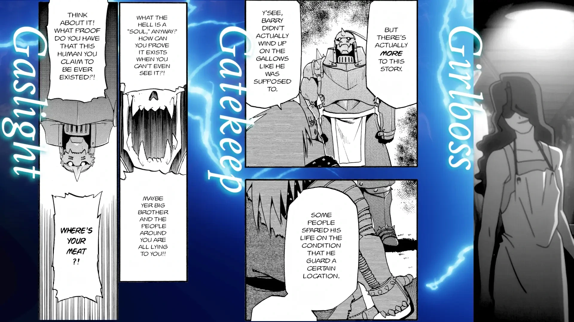
when all you have is a hammer everything looks like a brush

Kat
![]()
I have been writing about Ellie since her passing but there is another person who died who I have failed to mention. Only week or two before she died Ellie told me that she was plural. She was understandably extremely worried about this. Worried that admitting to this would ruin her life, that I might judge her and leave her. She had, as I understand, never told anyone in person this, barely told anyone online. She thought that I would think she was crazy. I just told her that I don’t care if she was “crazy” or not. Many people would have considered the both of us crazy by definition for being transgender. It’s a vague and all-encompassing word for people that one doesn’t understand and hates.
Her headmate was named Kat and I feel a great loss that I never got to know her, but Ellie did tell me a bit about her. She did not really front ever. Her and Ellie did not consider themselves plural for a long time and just through of Kat as a negative voice in her head (they did not get on for a very long time) and Kat kind of hated having a body and physical sensation and was very repulsed by sex. I asked Ellie at one point if it is not very annoying for Kat when myself and Ellie were so physically affectionate and she just laughed and said “Yes” in a flippant and mischievous way, clearly teasing Kat as much as joking with me.
They were not the first plural system I knew but this is the first time I became aware that someone close to me was one and I don’t really know that much. I found asking Ellie about it fascinating. I was a bit self-concious that I was being invasive or treating them like some weird oddity but Ellie said she was happy to talk about it. Apparently alcohol and weed seemed to affect Kat less and even made her a bit more comfortable with the physicality of their body, dulling the sensations a bit I suppose—putting a barrier between her and it. Ellie told me that a few times when she got too blackout drunk to function Kat was able to front and safely navigate them home on the bus. So thank you, Kat, for keeping Ellie safe.
Kat was more brash, more impulsive, more of a bitch (a word she took some pride in as I understand it). They had different tastes but the only thing I know for sure is that when we were watching Outlaw Star Ellie did not really understand my love for Aisha Clan-Clan (her favourite character in it was “Hot Ice” Hilda and wished the show had been about her instead) but Kat was fully on the Aisha train with me.
Kat never spoke directly to me in person but passed on a few replies and opinions that Ellie relayed. Even that she found strange and awkward and difficult to get used to, but she made a Discord account and sent me a few messages the day before they died. This is the ony direct conversation I ever had with her.
hello!
this is weird
like i’m only doing this cause i don’t want you to associate stuff i say with ellie
i’m a bitch and she doesn’t alwasy say what’s on her mind
so i will
fuck this is so weird
lmao fair
gragjhfkdshgtoledsg;.s
yeah I assume this is very weird for you in ways I cannot begin to understand so no worries if it’s difficult
i know you probably think this is weird and stupid or maybe that i don’t exist and ellie is just fucking with you or crazy
but it’s not. i am here
so yea
fuck
i want to die now
goodbye /end of communication
for now
cool, talk to you when you are more up for it
you should set Aisha Clan-Clan as your avatar >:)
fuck off. i was just looking for a image of her
hahaha
fuck yes
she’s really cool. you have some taste
I really wish I could have gotten to know her better than that before they died. They both deserved so much more time.
would transition have saved Barry the Chopper?

Shortened Yu-Gi-Oh! hunt update
After reading yesterday’s post my friend Ruby reached out to me and told me that she was able to find the shortened Yu-Gi-Oh! episodes one hundred and two, one hundred and three, etc. by searching Nitter instances. Nitter doesn’t really work any more either due to Twitter’s APIs having been locked down significantly but there are still running instances with archives of a lot of accounts.
After finding some posts that way and then opening them in Twitter itself I could see that was blocked from viewing them due to the posts had been flagged as potentially containing adult material and Twitter wanted to verify my age before I could see them. Another system working well, then. And another way that the internet is being closed off. Presumably this is actually why they didn’t show up in searches for me.
I tried a couple of Nitter-scraping tools to see if I could mass download the videos but I couldn’t get them to work. I had also previously tried to use an Extreme Picture Finder template on the Twitter account too but it couldn’t go past the most recent thousand posts from the account. Not really having any luck with automating this I went to bed but while I was asleep Ruby painstakingly went and manually downloaded every episode she could that I was missing and sent them on to me. Thank you so much, Ruby!
There were a few that none of the Nitter instances she tried seemed to have and don’t seem to be findable on Twitter either. As such I am still missing episodes 121, 188, 215 and Capsule Monsters episodes 5 and 8, but I have most of it now at least.
The show is now living on my Jellyfin server with its own extremely high-effort cover art for it that you can see above.
Update: I managed to find episode 121 and Capsule Monsters episode 5 through Googling the exact phrasing of the posts and I was able to find the post for Capsule Monsters 8 via a Wayback Machine snapshot of Bing Bong’s Twitter profile, but episodes 188 and 215 don’t seem to be indexed on Google or Bing nor visible on any of the Wayback Machine snapshots. There are only a few snapshots on there from the period where he was uploading the episodes, unfortunately.

The Internet forgets
Update: My friend Ruby has managed to get me most of the episodes that I was missing.
People have often said that if it exists then you can find it online and that the internet never forgets. These people have never tried to find an archive of the Irish dub of Avatar: The Legend of Aang or dug through tech support forums full of dead links and a dozen pictures of the same yellow frog saying that the image you’re looking for is no longer available. The internet is, in fact, extremely forgetful and its memory is deteriorating rapidly as the companies that have been relied on as communication infrastructure rapidly close themselves off more and more.
There’s a guy who goes by Bing Bong who in 2021 posted a video online simply titled I shortened Yu-Gi-Oh!'s 1st episode down to about a minute, and over the course of months posted similar edits of subsequent episodes, eventually covering the entire show. I really liked Yu-Gi-Oh! growing up and it was a really fun way to revisit them without actually having to watch the entire show again. It’s two hundred and twenty-four episodes long and quite frankly not a lot happens in most of them. The high-speed recap giving me the gist and jogging my fond memories was, I think, a nice way to dwell in some nostalgia without having to spend a hundred hours watching something I don’t think I’d have the patience for as an adult. It also has a few of its own fun running jokes in how its edited, such as trying to “fix” characters saying Reborn the Monster instead of Monster Reborn and leaving in every single instance of characters explaining the rules of Pot of Greed or every utterance of the phrase Egyptian god cards1.
Bing Bong is still uploading similar videos to his current Youtube channel (he’s covering Bleach at the moment) but the Yu-Gi-Oh! videos are long gone. I said his current Youtube channel because his original one was banned due to copyright claims. These videos were posted elsewhere but it has been a pain trying to track them down again. It looks like he was uploading them to a Tiktok account for a while but it only has the first ninety-seven episodes and hasn’t posted in months. Still, that was at least a good chunk of them and I was able to save them with yt-dlp.
Trying to find these videos with Google and other search engines can be difficult because they all think they know better than you what you are asking for and keeps giving me results for Yu-Gi-Oh!: The Abridged Series. Still, I found that he uploaded at least a couple of episodes to Vimeo at some point but I genuinely don’t know if the rest of them are on there. Apparently Vimeo no longer allows you to open a user’s profile to view their uploads or even search for videos that you have not already added to you “library” and if other episodes are uploaded there then search engines do not seem to have indexed them.
These videos were also uploaded to Bing Bong’s Twitter account and as far as I can tell were never taken down but Twitter is barely functional any more. It simply won’t show you anything any more without an account and even with one it’s almost impossible to find things. Trying to scroll through the media tab to see older uploads it just stops loading new posts after a while and the search function seems to be falling apart at the seams. I tried searching for posts from his profile in a range of specific dates for when he was uploading these but whether it actually returns any posts seems random, often showing only two results when trying to search a specific month and then potentially showing nothing when I put in a different date range even if it actually contains the dates the posts I just saw posted on. Incidentally, apparently at some point Twitter added the ability to filter advanced search results by engagement metrics, i.e., only showing posts that reach a certain minimum threshold of replies or likes, which is not something I have ever seen on a site before. They truly have just laid bare the ideology of the site.
After some experimentation I did finally get some results searching for the specific titles of individual videos and managed to get episodes ninety-eight through one hundred and one that way but then get no results for the subsequent four episodes. The one hundred and sixth episode does show up but immediately after that they’re missing again. So I might be able to, slowly and painfully, fill in some blanks this way but it is not reliable at all. I can’t even just message him about getting them because Twitter no longer allows direct messages from people you don’t follow unless they have paid for a premium account.
This is not ancient history; these videos are less than five years old and attempting to find and archive them has been a frustrating mess. Anything online that you might take for granted could easily become inaccessible tomorrow and the trend at the moment for it is to become ever-more closed off.
-
Egyptian god card? Egyptian god card! Egyptian god monsters. EGYPTIAN GOD CARDS. ↩

Reorganising
I have a small pile of posts in various stages of being written sitting in my drafts folder and a todo list for things I want to add to this website as long as my arm on top of a pile of other, much larger todo lists for everything else I want to do. This is, frankly, a problem. I am very burnt out. Ellie dying is just the straw that broke the camel’s back; I have been trending towards this for some time. I do not know how to relax, especially when I’m by myself. I had fallen into watching television so much with Ellie I think in part because it was one of the few ways that I did allow myself to relax.
I am trying to do better with this. To take time to relax on my own time. To watch stuff, to read, to play games again. I still have that feeling gnawing on me, though. That I should be doing something. Something useful, something productive. Again, I knew this was a problem even before Ellie died. My two podcasts have been on hiatus for a long time now because I couldn’t keep up with them, but I end up filling that space with more projects, or often just sitting at my computer cycling through Discord channels constantly making sure I am reading every update on every channel with my todo open in another monitor thinking that I should be working through stuff from it. Not relaxing, not getting anything done, but a secret, third, worse thing that serves only to slowly wear away at myself.
One of the things I am trying to do now is reorient myself so that sitting at my desktop is not my default state of being as it has been for a very long time. I work from home and I organise myself based around todo lists and notes that I keep as basic text files. I broadly like having my notes like this, I have ADHD and tend to forget things quickly unless I have them somewhere and text files are simple, easy to search and portable. Though I prefer to use my desktop they are also synced to my phone if needs be.
But I just fall into these habits that are not good for me. If I don’t know what to do I go to my desktop. I open Discord. I open my todo lists. I open my RSS reader. I bounce between things rapidly trying to work through my endless ideas while feeding myself constant little updates to quiet the ADHD ants in my brain and keep going.
I am trying to break these habits and reorganising my house a bit to make my living room more of an actual living room, as a place where I spend time and organise myself even when I do not have people over. Defining my space and using it to make my life easier and more pleasant is something I am very keen on. I have a lot of decorations around my house, many of which I made myself. I keep things, as much as I can, in a series of labelled drawers, because I will never be able to find things otherwise. I have gotten a lot of complements on my giant tower of labelled drawers. Things move between them and get reorganised and relabelled pretty frequently as I adjust things to myself.
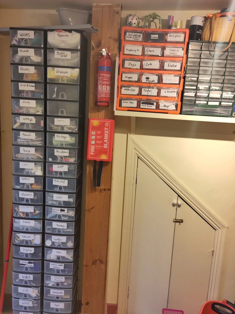
My house is also quite small and I sought to optimise the space. I have downsized kitchen appliances, a kitchen table that folds down up to take up as much space as needed in a given moment, a sofa-bed that folds out to not take up much extra space in a narrow living room and a pull-down Murphy bed so that I can pack it up during the day and have extra space in my bedroom that is also my home office. At one point I bought a whiteboard that I intended to use for organising and mounted it on the outside of the Murphy bed cabinet, mostly because I thought that was a cool place for it. But this means I could not actually use the whiteboard when the bed was down and, quite frankly, I often do not have the spare spoons to pack away all the bedclothes and put the bed up.
I have now moved that whiteboard into my living room. Instead of rolling out of bed directly into my office chair to start my day I am going downstairs, making breakfast and eating it at my dining table (and not at my desk!), taking my meds and trying to plan things out down there rather than on my computer. I have some daily checklists on there, I have my shopping list on there and add things to it as I notice I’ve run out, I plan out my highest priority todos.
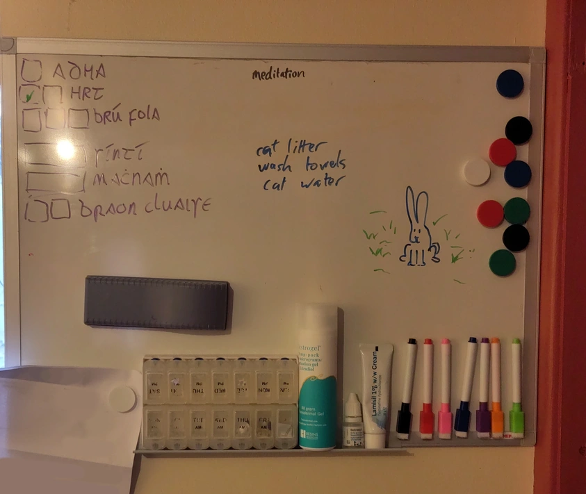
This is still a work in progress and I am trying to figure out what does and doesn’t work for me. The checkboxes in that photo have already been whipped clean and rewritten somewhat. Maybe I will move away from this too and figure something else out. I still feel the pull of habit and dopamine sources pulling back to the computer constantly.
Outside of being “productive” I am also trying to get into the habit of watching TV on my actual TV again, or reading on my sofa rather than in bed (or more often, not at all). I should probably also get out of the house more too but I am pretty bad at that still (and there are a lack of third spaces around here that do not cost money to be in).
I need to slow down and recover. I hope this helps me with that. If not, we keep looking.
Irish politics
the president doesn’t have much power or particular influence but if Miggeldy gets replaced by some Fianna Gael gombeen it is really going to drag down the vibes of the whole country a little bit
the thing about hosting parties as an introvert is that it means you don’t have to go to other people’s houses
they’re saying that I’m the best there ever was at tickling

*evil overlord voice* I will not succumb to link rot
Hi, we have been living in San Francisco for about 12 years, but we have decided to move back to Japan soon.
And also I decided to virtual garage sale and selling the hell machine (plus something).
Please check and bid if you want:) Thanks!


it’s been two months
and it’s been five minutes
and it’s been a year
and tomorrow it will have been five minutes
and tomorrow it will have been an eternity
and again
and the next five minutes
and the next six months
and the next ten years
and again and again and again
Balatro Wonderworld

ellie_online
I have been setting up a few mementos of Ellie in my house. One of the things that I’ve gotten was some prints of her Discord avatar from the original artist, Aitor Sebastián.

Also pictured: A small print of a render of a crystal by Luna which I got at the same time.
I’ll post some more photos of my little memorial to her when it’s more complete.
struck by a vision of an Irish mammy offering someone green or black tea but meaning if one wants Barry’s original blend or master blend
Don’t Forget-Don’t Watch Mr. Beast mashup
re-form the Ireland Simpsons Fans Party
I am interested in resources for guided meditation, relaxation-focused hypnosis audios or similar things to try if anyone has any recommendations.
I was rambling to someone the other day about how endearing I find the names Biolizard and Finalhazard and how someone spoke English natively would probably not name something that and they suggested maybe Biolizard was meant to evoke Biohazard in the first place which I hadn’t considered and makes it make a lot more sense but in a way that still I don’t think scans very well to a native English speaker lol
Orthanc you very much :)
VVVVVV is Ireland’s greatest cultural export
I wonder has anyone written a sequel story to Godzilla that focuses not on any further monsters but on the consequences of the use of the oxygen destroyer on the ocean
finally, they made a burger that can consent
what


Someone needs to do something about Amaury Guichon
You’ve seen them. The videos. The chocolate videos. There is a man out there doing things that were never meant to be done to cocoa beans.
What the fuck. That is not tea. That’s not even a kettle. What the fuck.
Look at this shit. This CANNOT be allowed to continue.
He doesn’t even set up his shitting fake chocolate chessboard correctly. THE BOTTOM RIGHT SQUARE SHOULD BE WHITE.
HE HAS TO BE STOPPED. This can’t be allowed to continue.
SPRINGS? CHOCOLATE SPRINGS? We cannot allow this.
We all know what needs to be done.
Okay the above is a joke I do not wish anything bad on Amaury Guichon. I just kind of dislike his videos. There is something offputting to me about his overly clean, edited style. How his artisanry feels like artifice in his immaculate, minimalist kitchen-set that always looks like it’s never been used before. How he creates these things and starts eating them on camera immediately, demonstrating that they were never meant to be consumed as food, only consumed as content1. It feels like watching a How It’s Made video for production a line that that was made only to be on the show, whose output is going directly into a landfill rather than something that is of use to someone.
Is this unfair? Yes. It would probably be more reasonable to treat these videos as a timelapse video of a sculpture being created or, being less fair, a preppy Epic Meal Time. It’s spectacle and art2 and it’s just a particular popular artist I don’t care for. I am just being hater. It’s fine. Chocolate man is fine. I don’t like his videos.
I am normal.
I am meant to monitor my blood pressure but the sound of the velcro strap scares the cat and she is currently sleeping on my desk and I do not want to disturb her

R1-C3
My house is quite small and my kitchen is tiny, so when I moved in I set about optimising my space a lot. I sold my physical video games collection, most of my books, a lot of electronics and some of my small kitchen appliances. While both cupboard and usable counter space is limited in my kitchen there is a little 22cm alcove under my kitchen presses that, while not usable as part of the counter space, is handy for keeping small appliances. They do have to be quite small, though. With this in mind I went into Harvey Norman’s with a tape measure and replaced my kettle with a travel kettle and my toaster with one short enough to fit in the gap. I also got rid of my slow cooker and instead got a more squat rice cooker in its place.
Rice cookers are incredibly elegant little machines and I highly recommend this Technology Connections video on how clever the design is. And while dealing with burnout and general lack of spoons one thing that has been getting me through it has been that rice cooker. Rice, beans and Lao Gan Ma has has become a staple meal for me. They are amazing for low-spoons, ADHD-friendly cooking because as long as you put in the right amount of water you can simply set it going and walk away, not having to babysit the pot or worry about timing very much.
That said, I am usually just cooking for myself and the rice cooker I had, as much as I love it, didn’t do small batches very well, so I was generally cooking two cups of rice at a time and then having to refrigerate and reheat most of it over the course of several days to get through each batch.
The solution to this: I just got an even smaller rice cooker. Meet R1-C3.

I am not much of a Star Wars gal1 but when some friends were over last month they remarked that the new rice cooker looked like a droid and I couldn’t disagree. It is a cute, compact, little friend. My friend Lena christened it R1-C3 and R1-C3 has been very faithful so far, making me nice meal-sized batches of rice to keep me going in these times.
this game looks extremely my shit
https://www.youtube.com/watch?v=V_wvFtCS2QE
https://nebulous.group/index.php/projects/translations/hybrid-front/
rice cooker rice, microwaved baked beans and Lao Gan Ma is what’s getting me through it

if Windows is going to demand line endings be \r\n it should actually treat them as separate operations and not one thing. If it sees a \n character on its own it should put the output onto the next line without returning to the start of the line instead of just doing nothing. if it sees an \r character on its own it should start layering lines on top of each other
I think this might be the worst map in any fantasy novel I’ve read
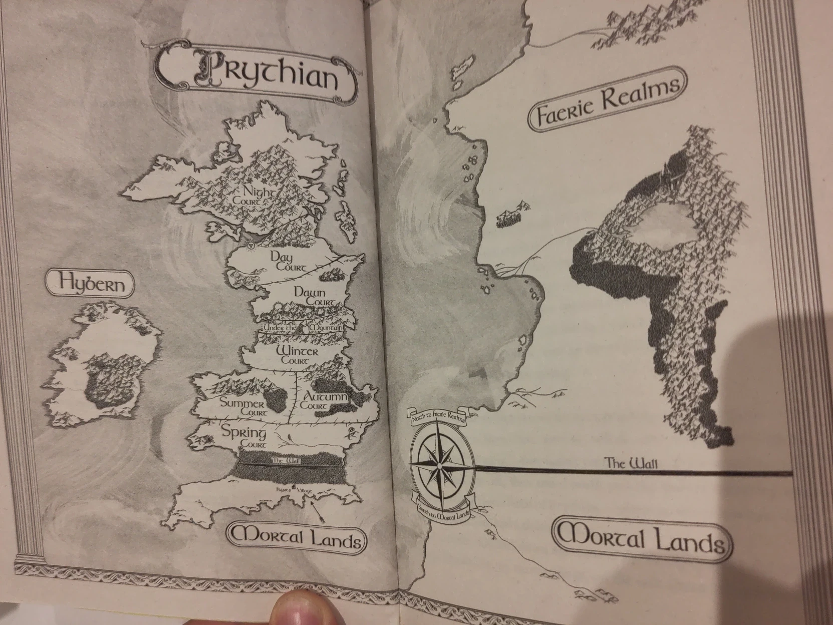
Borders that could only have been drawn by an American.
there are some kinks where the spaces are split between extremely self-aware feminists and also the worst men in the entire world
the thing about Ireland is it might only be 16°C but it's also 100% humidity so walking up hill to the train station with a backpack on I am drenched in sweat and it just doesn’t evaporate because the air is made of water

Mario Burnt Ass
Sonic Frontiers: The Final Horizon was a fascinating coda to Sonic Frontiers, a very experimental expansion to a game where Sonic Team was already going outside of their comfort zone to do new things with the series. The world map threw together Only Up!-esque climbing challenges, playable Tails, Amy and Knuckles very different movesets to how they have worked in past, an absurdly fast and powerful dropdash for Sonic in 3D and wildly more difficult combat than the base game. I streamed it to some friends when it came out and one of them remarked “this is the least designed game ever made.” I couldn’t really disagree with her. So much of this is janky and half-broken in various ways and it was incredibly fun. It made me hopeful that Sonic Team was happy to keep experimenting with what worked for the series and keep allowing more player freedom in future games1.
In keeping with this, while the levels in the base Sonic Frontiers were almost entirely reused from previous games the ones in The Final Horizon were much more experimental, being very clearly thrown together with very basic assets rather than having their own sculpted level geometry but also with much fewer guardrails and much less guided than a normal Sonic level and with new, bespoke mechanics and side missions, some of which required more slow, careful exploration than high-speed platforming.
Early on, while playing one level, 4-D, I noticed an exclamation mark appearing over Sonic’s head in certain locations, accompanied by a beeping. You cans see it at about a 1′18″ in in this video. It would turn red and beep faster as I approached a certain spot. When I saw this the first thing that came to mind was Knuckles’ emerald-hunting missions from the Sonic Adventure games and thought it might be part of one of the level’s optional missions. I actually had a bit of trouble finding the source of the beeping but once I zeroed in on it and finally found it I was greeted to Sonic being blown up into the air by a mine, his hands held down protecting his singed arse. This was a very sudden gear-shift in my head and in my confusion, still processing what I was seeing, I screamed “I’M MARIO BURNT ASS?!”2 into my microphone, which caused myself and my friend Ruby who was watching to double over laughing till we couldn’t breath and then Ruby set my display name on the Discord server to Mario Burnt Ass for a month. It was funny.
That’s the story.
Thanks.
-
Because the first thing it made me think of was Mario’s lava burn damage animation from Super Mario 64. ↩
updated my terminal config so it uses the PC speaker for the bell 🤓
IDW Sonic the Hedgehog #79
Incredible that today’s Sonic comic ends with the heroes teary-eyed celebrating a successful revenge-murder and no one suggests that this might be a bad thing.
lesbian couple going on revenge-murder mission and also their supportive friend Silver the Hedgehog is there
the vibe here really comes off as lesbian couple going on adventures and also their supportive friend Sonic the Hedgehog is there
which is, frankly, the ideal relationship dynamic
I have been struggling to get my zippo to catch consistently and I think one of the problems was that I was actually tightening the spring too much and pressing the flit too hard against the spark wheel. After putting it back in and tightening it with just my fingers instead of a tool the wick seems to be catching better now.
Depressing how much Computerphile is just shite about LLMs now.

Invisible Cyberpunks
I had an old Big Joel video about scambaiting on as background listening while doing my little daily puzzles and had some idle thoughts on the way people talk about the world we live in as a cyberpunk dystopia but boring or stupid or uncool or other such descriptors. The awful world is there but not the spirit of fighting against it. We have the corpos but not the punks.
And I think one thing in cyberpunk works is the class stratification, the corpos and the punks, are very geographically localised. Class stratification is present and highly visible, the rich gorging themselves in their towers and the poor living on the scraps below. Obviously there is class stratification in western cities but there is of course a larger stratification between the global north and south. The manufacturing and menial service jobs that can be done remotely outsourced to places with lower pay and fewer labour rights. The most marginalised are on the other side of the world.
This video in particular is talking about Indian call centres and Indian scammers and, returning to our boring cyberpunk dystopia, a lot of the people hacking other people’s brains, the people flooding Facebook with AI slop chasing trending keyword and engagements are largely people in India and other developing countries who have familiarity with tech doing those devalued jobs who are able to eke out some meaningful amount of money through exploiting Facebooking algorithms and ad revenue. It was the same with “fake news” before that term got hijacked to mean deliberate political misinformation. That originally comes from an ecosystem of people creating outrageous false clickbait aimed at an American audience without actual care for political aims, just syphoning off the pennies they could get from ads on emotionally charged headlines in a strategy that was only later merged with deliberate misinformation networks.
I am not trying to say these things are noble, but they are interesting and often invisible to people because we have already structured society to hide those people and that labour off beyond the horizon and we only really see the parts that are reflected back into the western cultural consciousness. People see shrimp Jesus and think about the evangelical Christians on Facebook who it is targetting and not the tech support worker in the Philippines who is actually producing it.

List of fictional characters who have played Sonic the Hedgehog (2006)
This list is incomplete; you can help by expanding it.
References
- ^ Misterlinkwait, Youtube, Breaking Bad: Sonic The Hedgehog.
- ^ 90.200.188.105, TARDIS Wiki, Winner Takes All (novel).
I bet it feels amazing to be an enemy made of a bunch of separate sprites that look like spheres
oh fcyj
im autims
:)

Consider writing a will
Do you trust your family to not bury you under your dead name? To invite your friends and partners to you your funeral? Do you trust that your family members who have the decency to do those things won’t allow themselves to be browbeaten by those who don’t?
Recently I had a reminder of something that every queer person was painfully aware of during the height of the AIDS crisis: If your partner dies and you have no legal relationship to them then you have no legal rights over what happens to them. That is perhaps a tautological statement but one that is worth internalising. When you die what happens to you is up to those that the state considers to be your family and in the absence of any legal documents saying otherwise that is generally your blood relatives. And of course there’s the matter of inheritance if you want to leave things to anyone other than your relatives.
What’s funny is that myself and Ellie had been discussing this. We had talked about looking into the process of getting wills written, etc. Her family did not take her transitioning well. Her brother refused to let her into his house to drop off Christmas presents for her niblings last year because he did not want his children to see her as a woman. We knew what would likely happen if she died, we just did not expect it so suddenly.
I don’t have any actual advice to offer for how to go about this. We hadn’t gotten around to it ourselves and if we had anything I could say would only apply to the Republic of Ireland.
I accidentally stepped on my cheap theracane knockoff and snapped it. I have splinted it with a metal rod from a broken folding chair and judicious application of duct tape. Seems to be holding up so far.


Steven Wars
, or: Talking about Steven Universe discourse but not because the spinoff show was announced. I started writing this before that happened.
The other day myself and two friends were rambling to two other friends who had never heard of Steven Universe about said show, talking a lot about the overall plot and setting. If you don’t know the general plot of Steven Universe and don’t mind spoilers I will go through the relevant parts of the plot for what I want to talk about: The protagonist Steven is half-human and half gem. Gems are magic space rock people and most of them live in an authoritarian, colonial, caste society ruled by the diamonds and Steven is being raised by a small group of survivors of a failed rebellion.
Among the magic powers that gems posses multiple gems can fuse into a bigger, stronger gem. Fusion gets used as a very general and multilayered allegory for relationships in general and can work a bit different for different gems depending on the needs of a given story. A lot of what the show is doing with its world and plots is heavily allegorical. One of the big taboos that the rebellion breaks is different types of gems fusing together. I said it’s a caste society but it’s a little weirder than that. A given gem is defined by what type of gem they are and expected to be basically completely interchangeable with them.
All rubies are bodyguards and all rubies are named Ruby (and also in the show all have the same voice actor). Ruby is a name, job, gender and role in society and straying from that role means you are fundamentally broken and wrong and fusing with a different type of gem is a complete perversion. The roles gems are defined as is a metaphor the story uses but it’s a flexible one. It maps onto things like gender roles (and if read a certain way amusingly means that for gem society homosocial relationships are the only acceptable kind) but also for societal expectations and pressures in general. It also ends up, for the title character, being very much about the pressures that a shitty, unaccepting family puts on someone.
The diamonds are the rulers of gem society. They are authoritarian dictators who see other life as beneath them. That is the facts of the setting. But in terms of how they are actually portrayed and used in the show, especially as it goes on, they are a dysfunctional family who (without going into the specifics of why they think this) see Steven as a brat who has thrown a tantrum and run away. Judged in absolute terms they don’t see humans as real people, just amusing pets at best, but that is not in service to a story about how they are space Hitlers, it is in service to a story where they are dismissive of Steven as a person and see his life on Earth as someone playing pretend who is going to grow up and move on with his life, go back to “real” name and pronouns, and stop making such a fuss.
And, if you are unaware, when the show aired there was considerable controversy about the fact that these the terms on which the story is resolved. Many people were invested in the lore of the evil gem society and would only think of it morally on those terms and were furious that this children’s cartoon did not end with the diamonds being brought before the space Hague for their space warcrimes, that the story that was being told was one about family trauma and healing and that the space opera trappings were in aid of that and not the point in and of themselves.
So I had this in mind while explaining the show to my friends and, perhaps overly defensively, emphasised how the resolution of it was on the family drama allegory level and not about killing space Hitler. And his response surprised me: “Oh, like Star Wars!”
And it struck me how apt a comparison that was. I think it is genuinely astute and cuts straight to how this is a normal part of storytelling and not some morally repugnant aberration like so many people high on the discourse treated it. Someone who I related this story to said it reminded them of this video from Man Carrying Thing talking about bad faith deliberate media illiteracy.
And I have just been ruminating on that for a few days. On how so much discourse is fuelled by refusing to meet things on their own terms at all and it’s bad! That’s all, really.
Sorry for dragging up Steven Universe discourse.
Bye.
getting into this print photography thing


Ellie stories
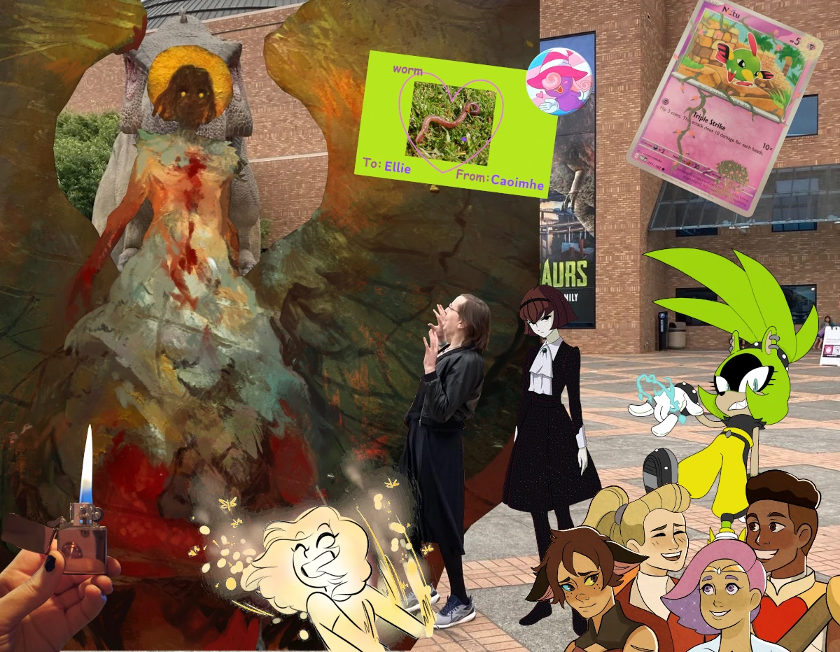
I have pretty bad impulse control around eating. If there is food in front of me I struggle not to keep picking at it even if I’m already uncomfortably full and even if I don’t like it that much. I generally don’t keep sweets or alcohol in my house because I tend to binge through it if it’s there. Moderation is not something I am good at.
One thing Ellie used to do sometimes is hide chocolate bars around my house and then, when I was in need of a treat, tell me where to find one or pull them out herself. She was incredibly sweet. I found a Galaxy caramel bar in the back of the kitchen press this morning. One last birthday present from her.
And now I guess I just want to share stories about her. We watched a lot of TV together. Just cuddling on the sofa or in bed and watching television had honestly become of my favourite things. I came over to her place once when she was watching Evil, enjoyed it and then she rewatched it with me from the start and we carried through all the way to the end together. She talked about watching a video essay (I do not recall who by) about Miraculous Ladybug and how it matures and grows more complex each season and I basically downloaded it and made her watch the first few episodes as a joke and then just sort of fell into continuing it because I cannot resist sticking to a bit well beyond what is warranted. It was a bit of mindless fun to put on and cuddle and chat. We were most of the way through the third series.
Just feeling the warmth of her body against mine is one of the things that I miss most of all. I got her a rose gold Zippo lighter for her last birthday. She liked fire and burning little things. She could be a real little very tall gremlin. She had left the lighter in my house a few days before she died. I had it with me to give back to her when we found her body. Sometimes I light it for a while and then just feel the warmth of it in my hand. Somehow that feels like the closest thing to having her here again.
We were also rewatching shows we liked as teenagers together. She was showing me Wolf’s Rain, I was showing her Outlaw Star and we were revisiting The Big O together. She loved R. Dorothy. We had also started rewatching Fullmetal Alchemist together and had gotten as far as The Alchemy Exam back in September and then it took eight months till she was finally in the mood where she was happy to sit through Night of the Chimera’s Cry again just a few days before she died. Seeing as this has turned into the anime paragraph I will also say that we had both enjoyed Dungeon Meshi but had watched it separately as I was watching the dub and she was watching with subs. She loved Falin, too. She related a lot to robot girls and monster girls.
She was a big, lovely, autistic, dork and I cannot describe how wonderful it was watching her unmask and being earnest and silly about things she was self-concious about. I understand deeply the shame of trying to be normal, of burying stuff you are enthusiastic about, and I loved seeing her dig it all up. One time while we were hanging out at home I turned a corner to see her standing stimming in the middle of the living room, shaking her hands back and forth and bouncing a little. When she saw me she withdrew a little bit. She was a bashful about it but it was adorable. I wanted to encourage her. I asked her to keep doing it and when she demurred I cupped her head in my hands and begged her “Ellie, I need you to be more autistic!” She cringed into herself shyly from that but smiled and giggled and said, mock-ominously “You know not what you ask!” and I just kept saying it until she said she would. From then on “I need you be more autistic” became something I would implore when she was being self-conscious about herself.
She really liked making characters and just fucking around in games. I’d watch her play WWE 2K24 and she would often play a random match and not even particularly try to win. Just have fun and being playful with the narrative of a wrestling match, showboating, playing a referee and being as obviously biased as possible to the worse wrestler. She talked to me about some of her RPG characters. She had restarted Baldur’s Gate 3 a few times but had never actually gotten to the end. Her current character was named Drizz and she had a whole backstory thought out for him that she spent an evening explaining to me (with a lot of interruptions to explain details about the world because I do not know much about Dungeons & Dragons).
Drizz was a drow trans man, raised to be an assassin in a cult dedicated to Lolth, who was shunned for not wanting to be a woman, betrayed by his mentor and ended up living rough for a long time. There was a lot more detail but I confess my memory is very poor and I don’t know that she ever wrote any of this down. She played Drizz as angry, brash and socially inept, deliberately making obviously risky or poor choices with him that would piss people in the game off. She saw a bunch of scenes she hadn’t before with previous characters as a result. Also it’s definitely Drizz and not Drizzt. He gets mad if you call him Drizzt. He did not name himself after Drizzt and is annoyed at people who assume he did.
I am not good at conclusions. She was wonderful. She’s gone, but she was wonderful.
Very upset that my title pitch got rejected.
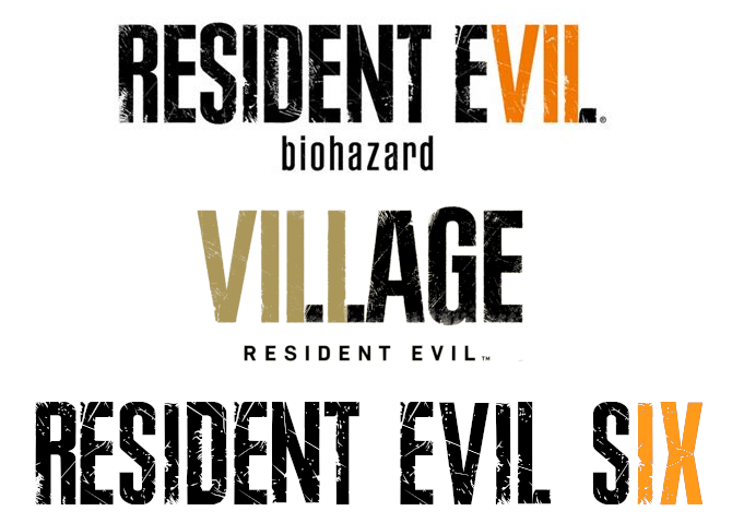
full conflict of interest disclosure: There was a Sewer Man

What I’m reading vol. Ⅷ
Vols.: Ⅰ, Ⅱ, Ⅲ, Ⅳ, Ⅴ, Ⅵ, Ⅶ, Ⅷ, Ⅸ, Ⅹ, Ⅺ, Ⅻ, ⅩⅢ
Your musical entertainment:
Media
The Curious Case of the Pygmy Nuthatch — Forrest Wickman in Slate
A look at how creative decisions and compromises get made on a movie set.
You see, there’s a scene in that movie that tormented me, that kept me up at night, and that lately has had me interrogating a wide variety of seemingly devoted, and certainly well-compensated, filmmaking professionals. That’s because the bird in Charlie’s Angels is, I believe, the wrongest bird in the history of cinema—and one of the weirdest and most inexplicable flubs in any movie I can remember. It is elaborately, even ornately wrong. It has haunted not just me but, as I’d later learn, the birding community at large for almost a quarter of a century.
Heaven Will be Mine – Caoimhe
My clone recently discovered Worst Girl Games and has been having a time of it. When I played it I actually didn’t click with Heaven Will Be Mine nearly as much as We Know the Devil but Caoimhe’s words on it are making me want to revisit it.
Heaven Will Be Mine is short and sweet. A full playthough is roughly five hours. Within that time, it packs a narrative of the trans struggle for identity and recognition, the search for meaning in a perpetually hostile world, the never-ending quest of humans' self-discovery and exploration, and of course cool mechs beating each other up.
A List Of Games By Trans People Before 2010 — Dot Maetrix
Cute little list and led me to this fun interview from Bad Games Hall of Fame with Rebecca “Burger” Heineman and to revisit this interview with Megumi, the programmer of Virtual Lab1 that I had read before.
Not gonna lie I did NOT realise how long Maddy Thorson had been doing Trans-People-Can-Double-Jump Platformers before making this list. Like, I thought that Celeste was primarily her drawing from the twitchy platformer style of Super Meat Boy but as it turns out, lmao nope Not only does Jumper predate Meat Boy by sevaral years, but the lead character, Ogmo, went on to appear as a playable character in Super Meat Boy, acknowledging the influence that game had taken from Thorson's work. Like, I fully had the order of cause and effect completely wrong here.
Chips Theory, In Brief: Doctor Who’s Unresolved Aesthetic Debate — Tamsyn Elle
I swear that I am not going to keep linking to blogs by lifeforms that have been bred for thousands of years to sustain themselves solely on ever-more incomprehensible Doctor Who criticism but I needed to share the chips–soufflé spectrum model of media analysis with the world.
Note how chips becomes synecdoche for an ordinary life, an inescapable pillar of the daily grind as fundamental as work, home, sleep, and commuting. Chips is what the rest of us do.
There’s an inescapable class element to this. Science fiction is often accused, with some justice, of being a middle-class genre; even when it’s militaristic our focus tends to be on the officer class. A good deal of the value of Rose in the first place is that, as a working-class soap opera type of character, she does not at first seem to belong on Doctor Who. Indeed, often that’s part of her quality: in her first episode it’s her experience in her school’s gymnastics team, silver medal, swinging on a chain, that saves the day with straightforward physicality where the Doctor’s talk of Shadow Proclamations and anti-plastic failed to hold sway. Then she’s befriending the lowly mechanics and servant girls who turn out to be key to their respective stories.
Thoughts on IDW Transformers: The Furman Era — Bobby Schroeder
A nice little piece laying out some interest aspects of the Transformers series2 through the lens of a particular run of comics including the historically weird handling of gender and how later IDW comics corrected that.
When James Roberts began writing the fan favorite series More Than Meets the Eye, he wanted to explore the subject of Transformer romance. And if Furman said that there aren't any women on Cybertron, then, well… I guess he's been left no choice but to declare it the robot yaoi planet! His hands were simply tied, folks.
Media ∩ Technology
The Logistics of Road War in the Wasteland — Bret C. Devereaux
Look. If Bret Devereaux is going to keep writing articles analysing the practicalities of speculative fiction tropes I am going to keep linking to them.
Complicating this picture further are spare parts. Without the ability to manufacture bespoke spare pairs at scale, keeping these vehicles in operation is going to be very difficult. So we ought to expect to see, alongside an emphasis on fuel efficiency, a preference for robust, easy-to-maintain platforms that use widely available civilian vehicle components, rather than hard to source or scavange military components. After all, asking your local junk mechanic to service the AGT1500 gas turbine engine in an Abrams MBT is going to be a pretty big ask, compared to finding the parts to fix the engine of yet another Toyota pickup.
Why We Don’t Have UIs Like the ones in Neon Genesis — Zemnmez
Damn now I want a vector-based display again.
Everyone who works with interfaces should be looking at these and asking themselves why interfaces don’t look like this. Where did we go so wrong? Where’s the big fuckup where we ended up with like, windows 95 instead of this shit? This is something I have devoted untold and definitely irresponsible brain space to. And honestly, the best answer I have is very simple, but I think also a kind of interesting look at how our tools shape the designs we make.
I wasted $410 recreating a fake website that shows up for 10 seconds of a TV show almost no one remembers — Alyx Wijers
Wijers doing an extremely important job 🫡
When I watch TV and movies, I sometimes notice web addresses. I’ll usually note them down, and look them up later to see if they’re registered. In most cases, they’re registered by the studio or network or whatever and just redirect to their site. AMC, for example, keeps www.savewalterwhite.com up from Breaking Bad (now 12 years after the series ended, as of the time of writing), and www.cometlist.net up from Halt and Catch Fire.
Technology
Xerox scanners/photocopiers randomly alter numbers in scanned documents — David Kriesel
Quite an old one but recently linked to by Tina. What if your scanned just randomly changed numbers around in the scanned image? What multiple models of scanners from the largest manufacturer in the world did that for years without being fixed? There is also an accompanying video.
In this article I present in which way scanners / copiers of the Xerox WorkCentre Line randomly alter written numbers in pages that are scanned. This is not an OCR problem (as we switched off OCR on purpose), it is a lot worse – patches of the pixel data are randomly replaced in a very subtle and dangerous way: The scanned images look correct at first glance, even though numbers may actually be incorrect. Without a fuss, this may cause scenarios like:
- Incorrect invoices
- Construction plans with incorrect numbers (as will be shown later in the article) even though they look right
- Other incorrect construction plans, for example for bridges (danger of life may be the result!)
- Incorrect metering of medicine, even worse, I think.
I Want to Love Linux. It Doesn’t Love Me Back — Fireborn
First of a series of posts on this blog dealing with the hell that is trying to use Linux while blind.
Linux claims to support blind users here. It even ships the tools. But using them? Getting speech or braille output when you need it most? That’s a punishing mess of driver quirks, missing defaults, audio stack failures, and layers of modern regression hidden under the surface.
Avoiding becoming the lone dependency peg with load-bearing anime — Xe Iaso
Anubis is a piece of software that has become popular for helping block unfriendly crawlers that have been overloading a lot of sites to grab data for neural network training without care for the damage they are doing to the web. It also has an cartoon character mascot that has proven useful for weeding people who like being dismissive pricks.
At some level, I use the presence of the Anubis mascot as a "shopping cart test". If you either pay me for the unbranded version or leave the character intact, I'm going to take any bug reports more seriously. It's a positive sign that you are willing to invest in the project's success and help make sure that people developing vital infrastructure are not neglected.
Technology ∩ Capitalism
Why Bell Labs Worked. — Areoform
Seen via a post by Fabio Manganiello going further into Bell’s treatment of people compared to what companies and academia both demand of them now, shared by Xerz and boosted by Jennifer Glauche which also inspired the next post by Elilla.
Reportedly, Kelly and others would hand people problems and then check in a few years later. Most founders and executives I know balk at this idea. After all, "what's stopping someone from just slacking off?" Kelly would contend that's the wrong question to ask. The right question is, "Why would you expect information theory from someone who needs a babysitter?"
Deep in Mordor where the shadows lie: Dystopian tales of that time when I sold out to Google — Elilla
On the empty promises and dehumanisation of Google.
It's the little things that bugged me, how people would eat the free candy or have a bowl of cereal and just leave trash and dirty dishes everywhere for the cleaning ladies (contractors) to deal with; more than that the way nobody looked at them or said “thank you”. We Brazilians have a social class for that, a social code underlying that studied invisibility, I knew what this was: these were maids. Servants. The women in my family, my friends at school. The “campus” was pretty open and my then-wife visited it a few times; it creeped the Fuck out of her, the distinction between people and non-people.
-
Virtual Lab is a body-horror falling-block game that used the Virtual Boy’s 3D effects for the self-insert mascot character’s breasts. ↩
-
I was going to mention her talking about the distinction between the Budianskian and Furmanist modes of Transformers stories but while she does allude to this she keeps it accessible for those who don’t want to know a bunch of fandom jargon and just mentions the distinction as “robots in space” stories versus “robots in disguise” stories. ↩
Porn.wad - Doom, August 1995
Description : I heard of a porn.wad, but couldn’t find it on the net. The obvious alternative to not finding it was to make it… and here it is.
(Source: gamers.org)
Really surprised but pleased at the reveal at the end of the episode that I am going to be the the new Doctor Who

It’s my birthday! (soon)
My birthday is in June. I was obviously hoping to spend it with Ellie but that is not going to happen now. Some friends have been organising a memorial for Ellie that is going to fall on the weekend I probably otherwise would have had my birthday party instead. Shit sucks. I will still be going out with some friends to celebrate the weekend before that and on that day itself I will be surrounded by friends and loved ones too. And fuck it if anyone else wants to get me a present I have a Throne wishlist here. I sat down to write this and I thought I’d have more to say but words are failing me a bit. The life I thought was happening has just been so abruptly cut off and I feel a bit stranded. I was going to go to see the Doctor Who finale in the cinema with her last night and I still went with other friends and it was lovely but me and Ellie had so many plans big and small and it’s probably going to be a while before I can think about the future at all without feeling her absence.

Site change: Reviews moved to their own page
After some deliberation I have decided to split off all of my reviews into their own separate page. Introducing: FWD:RE:views.
For RSS readers if follow the existing beag feed you should not see any changes. If you follow the bog and want to still see reviews you can add the new reviews feed to your newsreader.
To sum up the new situation quickly:
- New—FWD:RE:views: reviews
- Modified—Bog: original posts + Fediverse posts
- Unchanged—Beag: only original posts
I enjoy logging what I’m watching but I haven’t been happy with how all the stuff I was copying over from other sites drowning out my other posts. I was originally thinking about it in terms of my original posts versus “syndicated” stuff and was considering making the “beag” page the default and a separate one for everything else but I after ruminating on it I decided it made more sense to me to split just the reviews out as their own thing. I took my time before making this decision as I didn’t want to end up changing up my RSS feeds repeatedly and making a mess of people’s newsreaders.
The title FWD:RE:views is meant to reflect how most of the reviews are “forwarded” from my Letterboxd, Serializd, Backloggd and Goodreads accounts but there is currently one review that isn’t and there may be more if I want to log other things that don’t have entries in the databases of those website.

John Seward’s audio logs
This post contains spoilers for Dracula, which is 128 years old.
I have not been keeping up with Dracula Daily as I had intended1 but I wanted to make a post about it today. One of the features of the original Dracula that is often forgotten in adaptation is how modern it is. As an epistolary novel the story is mostly a series of diary entries and in the case of the character John Seward his diary, starting on the
The book heavily involves the collision of the very modern and scientific with the ancient evil that is Count Dracula. The novel opens with Jonathan Harker, a solicitor, travelling to Transylvania in order to sort out a property deal for the count. This journey involves going from the comfort and regularity of well-timetabled trains to a treacherous carriage ride through the old, wild Carpathian mountains. With him, as well as the needed legal documents, he has photos taken on his Kodak2 camera, which is far from the only piece of prominent technology.
The weapons used to fight Dracula are not just wooden stakes and crucifixes3 but also blood transfusions4, hypnotism5, next-day flower delivery from Haarlem to London6, shorthand7, meticulous note-taking, and in-depth knowledge of train timetables8. While it goes unremarked on in the book itself I like to imagine that Count Dracula’s statement that “to live in a new house would kill me” is due to a vampire’s inability to cross running water not playing very well with indoor plumbing. Abraham Van Helsing is not a young, sexy vampire hunter in this novel but an polymath professor with at least three doctorates9. Dracula is not that out of step with Buffy the Vampire Slayer answering the question of how to deal with a terrible and ancient demon with blowing it up with a bazooka.
But there is something else important about John Seward’s phonography: It ends up being extremely funny. Even just reading this and thinking that he is speaking this out loud to be recorded on a wax cylinder it seems incredibly obnoxious:
I questioned him more fully than I had ever done, with a view to making myself master of the facts of his hallucination. In my manner of doing it there was, I now see, something of cruelty. I seemed to wish to keep him to the point of his madness a thing which I avoid with the patients as I would the mouth of hell. (Mem., Under what circumstances would I not avoid the pit of hell?) Omnia Romæ venalia sunt. Hell has its price! verb, sap. If there be anything behind this instinct it will be valuable to trace it afterwards accurately, so I had better commence to do so, therefore R. M, Renfield, ætat 59. Sanguine temperament; great physical strength; morbidly excitable; periods of gloom ending in some fixed idea which I cannot make out.
One presumes that he is saying “memorandum” out loud and not just “mem” as is transcribed. Later, when he records his conversations with Van Helsing he includes the full back and forth dialogue, with all of Van Helsing’s disfluencies, grammatical errors and strange turns of phrase. One has to wonder is Seward imitating his friend’s Dutch accent while recording this? Is he doing voices whenever he is making his diary? What does his Mina voice sound like? We are reading, within the fiction, a transcription of him speaking out loud. And we know who does the transcription because it happens during the course of the plot. The later part of the novel involves the protagonists meeting up and compiling all of their notes together into what is the text of the novel itself.
This is done by Mina Harker and the reason she starts doing this is, again, extremely funny: She walks in on Seward recording on his phonograph and asks to hear some of it. He initially agrees but then starts deflecting awkwardly that most if is about his medical cases. When Mina asks specifically to hear about the last few days of her friend Lucy Westenra’s life he admits that he has no idea how to find a specific diary entry in his phonograph recordings. He has been using this for at least the last four months and he just never thought about it at all. He has not labelled anything. He has no system of any kind. He has just been talking into this and never reviewing it in any way! This is what prompts Mina to start transcribing the entries for him, as well as typing up her and her husband’s shorthand diaries for everyone else to read and compiling all the other letters and newspaper clippings that make up the novel. Going back to the modernity of it all the most in-spirit adaptation of Dracula set in the modern day would surely be composed primarily of screenshots of social media posts and podcast segments.
There is one more interesting angle on the fact that Mina is the author, or at least the typesetter, of the book within the fiction: How she types up the dialogue of Renfield, Seward’s patient and devoted servant of Dracula. Renfield’s dialogue capitalises He, His, You, Your and Master when he is speaking of Dracula, something that is only proper to do when referring to God10. This is obviously meant to ascribe a blasphemous devotion to Dracula to Renfield, but within the story it is Mina who is choosing to capitalise his words in this manner and Mina is also, at this point, partially under Dracula’s influence. While I don’t think that this was Bram Stoker’s intent we could read this an an unconscious sign of Dracula’s influence over Mina’s mind.
-
I think that in light of recent personal events that should be pretty forgiveable. ↩
-
Kodak had been founded 1892, five years prior to the publication of Dracula. ↩
-
Amusingly as an Anglican Jonathon Harker finds the whole crucifix thing all a bit Catholic for his taste. ↩
-
Some successful blood transfusions had been recorded for decades prior to the novel’s publication, but it was a very risky affair and blood types were not discovered until a few years later. ↩
-
Hypnotism, a word coined by James Braid in 1841, was very much in vogue as a serious path of medical exploration in the decades prior in both Britain and France. ↩
-
Van Helsing uses garlic blossoms to ward off Dracula in the novel, not strings of garlic bulbs. ↩
-
The Pitman shorthand system was published in the 1837 and the Gregg shorthand system in 1888. ↩
-
Please look forward to a post about the train fiend in a few months. ↩
-
He signs his letters “Abraham Van Helsing, M.D., D.Ph., D.Lit., Etc., Etc.” ↩
-
Within the cultural context of the novel. I am not religious. ↩
Great cover story. Definitely not a vampire.
(comic is Girls × Vampire)

Ellie

I have been struggling for the last few months. My health has been poor, it has been difficult to keep on top of things, I have just felt generally worn down and burnt out. But I have been managing. I have been trying to let myself rest more. Getting things off my plate. I have gotten ADHD meds. Most of all what has helped me get through is my partner, Ellie Cosgrove. We had only been together one year at the end of April but it was such a wonderful year. Being with her was healing in ways I cannot describe. I felt able to be fully myself with her. I was able to peel away masks I didn’t know I had been wearing all my life. I was learning to be myself through her. I was learning to love myself through loving her. I wanted to build my life around her.
She died on Wednesday night. The last few days have been the worst of my entire life. I have been looked after. Friends and family have been reaching out constantly. My mother and sister made sure that my fridge is more full than it has ever been and I had so much company over the last few days that it would have left me exhausted even in good circumstances. It hard to believe that it has only been a few days. It feels like so much longer. Like it has been weeks since this awful, raw thing crawled inside my chest and died. Weighing me down, wearing me out even more. So many of my everyday thoughts loop back to her and now everywhere in my mind there is just a horrible, grey, consuming, painful dead end. I’m thinking about This Is How You Lose the Time War again. About love infecting you and changing you and making the other person part of you. And in that last year that happened so much and so much more than I could have imagined. And now that part of me has been ripped away.
I keep coming back to this piece that she loved. I’m trying to internalise it. To remember to keep going. To remember that she loved me.
Okay. Come on, then. I love you, get up, we are going to keep going. Repeat this to yourself in a mirror or in a whisper or in the shower or in a shout. I love you, get up, keep going.
I am tired too. It’s okay. We will sleep in the car ride over. We will sleep on each other’s shoulders. We will sleep upside down and in the laps of new friends and on the bellies of our lovers and in the hands of better tomorrows. We will sleep and we will wake up rested and we will wake up happy and we will wake up home again.
I love you, get up. It’s time to write “maybe next time” on our gravesite. It’s time to write: it could not kill me, I would not die. It’s time to write a love letter to the sun and our one-act play and the history of our keychains. It is time to write a future where despite everything, we are finally warm and safe.
I love you. I love you. I love you.
Get up. Keep going. We are going to be okay.
Rowan Perez
I would also appreciate any comments on this or any other post on this site, even just because most of the existing comments are from her and I would like to be able to review the Comentario dashboard without seeing her words at the top of it and be reduced to a sobbing mess again.

Picmixen
Picmix is a website for making GIF collages. If you’ve seen square GIFs of anime characters drowning in glitter and surrounded by rapidly animating icons and text it was probably made with Picmix. The typical aesthetic leans extremely girly and overloaded; the digital equivalent of a scrapbook page covered in magazine cutouts, glitter and stickers. It is very charming (though sadly the current front page of the site seems to be flooded with AI art).
Last year on Cohost (RIP) Freja asked me what my favourite planet was and my reply was “♃”. This is mostly just vibes and associations with fictional characters that I have great fondness for: Lita Kino from Sailor Moon1, Jupiter from We Know the Devil, and it would be nice to round this out with a third example but actually it’s only those two2. But also the planet is cool and I like the astrological symbol.
But thinking on those vibes, that loose collection of associations that still resulted in an immediately clear preference it made me want to make something to tie together these Jupiters: The planet, the Sailor and the Devil-knower. And even though I had never actually used Picmix before that type of silly, sparkly, collage seemed like just the thing.
The Sailor Jupiter, rotating planet and glow around the edges were pulled from Picmix but I actually put it together using Aseprite. This is an artisanal GIF collage. The central Jupiter picture (that I also use as an avatar now) was made by putting the cover art for We Know the Devil through Luna Pic’s glitteriser. The little tin sample cube is because tin is the planetary metal associated with Jupiter in alchemy. I actually have a similar cube of copper in my house next to a replica Ea-nāṣir complaint tablet that I have on my wall. Perhaps I should get a tin one as well.
A little while later I decided to make a similar collage for Blaze the Cat, my favourite Sonic the Hedgehog character.

This one pulls from Picmix, The Spriters’ Resource and a GIF of Blaze running that I do not know the original source of that I cut the background out of frame-by-frame.
I never returned to making these but it was a lot of fun and perhaps the urge will strike me again at some point.
And let me know if there’s any other Jovian women that I should check out.
-
I have no idea what original names of any of the characters are outside of Usagi/Serena. The part of Sailor Moon that matters to me is the English dub that I watched growing up. ↩
-
Apparently there is a female villain in Pokémon Diamond and Pearl named Commander Jupiter and maybe I could get obsessed with her and add her to the list but also I don’t particularly want to play those games. ↩
one of the most annoying feelings in ADHD is the can't-get-started-with-anything feeling. like, your ADHD is screaming you have to do something. you can't just rest, resting isn't a thing. even if you are resting, it's by doing something.
but nothing works.
you try to watch something, it's not right. you can't.
read? can't read right now
play? nah none of these games seem fun
make something? ehh, you're not feeling any of these projects right now
social media? it's boring or worse right now, so… find something else
it's like you're not moving but it's because you're too tense to do anything, just vibrating in place
I got an MRI done a little while ago and I decided to download the data for it from the clinic just because I could and apparently the KDE Dolphin file browser has a thumbnail for MRI data files

this video has loud distressed cat noises
heard this from the bathroom and genuinely thought that my cat was dying but another cat had just managed to get to the outside windowsill
teaching her about her heritage
Add Eggbug sunset to Cohost page when you play Love Honk
normal git commit message

What I’m reading vol. Ⅶ
Vols.: Ⅰ, Ⅱ, Ⅲ, Ⅳ, Ⅴ, Ⅵ, Ⅶ, Ⅷ, Ⅸ, Ⅹ, Ⅺ, Ⅻ, ⅩⅢ
First some website bookkeeping: I’ve updated the homepage to emphasis my original bog posts a bit more and keep them on the page longer and moved the reviews and posts from other accounts that I’m mirroring to their own section. The bog and beag pages are left as-is at the moment. I am considering modifying them and their respective Atom feeds as well to have the default be without the mirrored posts but that will need a bit more consideration because I don’t want to create lots of broken links or cause a million posts to reappear in people’s newsreaders. I also updated my memorial page for Cohost a bit.
For some music: I had lovely time recently watching a couple of NPR’s Tiny Desk Concerts with my partner in bed. Here is the Moses Boyd one:
Digital media
Music CDs Are the Best — The Virtual Moose
Of course I ripped all the cds to my plex server while reading the booklets, something I really enjoy from the cd era. What no one told me though, and I guess why would they, is that Sarah McLachlan’s album Surfacing is a fucking multimedia cd-rom??
I am not the only person right now who is getting nostalgic about going back to a website and I think there’s a similar joy in old multimedia CDs from before everything got squashed into completely standardised forms for either social media site or streaming services. Little experiments, surprising features, discs that acted as different formats depending on what was reading them. While I was updating my Cohost page I threw in a short little bit of Javascript just embedded in the body of the page for a little bonus feature when you play the Love Honk audio. That wouldn’t actually have been possible even on Cohost itself but I think just quickly throwing a little unique interaction is carrying on that spirit that CSS crimes also gave us a glimpse of.
And in the golden age of multimedia discs you could have, as Virtual Moose discovered, little bonus programmes in your music album, hidden audio tracks if you put your PSX CD into a CD player or a a full XBox game demo on in your movie DVD alongside the minigames you could play on a normal DVD player with a remote.
This is turning into its own post so I will move on.
Retro Achievement Mastery 168 - The Yakyuuken Special - Kon'ya wa 12-kaisen!! — Lizstar
Lizstar is nearly defeated by a pornographic rock-paper-scissors game for the Saturn.
This is Rie Kouno. My villaness. Pretty sure she’s the oldest girl here, actually. She’s got this like, Japanese Housewife energy to her, as if 22 is 45 years old, cause this game is make by perverts with bad views on women. But anyway, my strategy did not work on her. I left the game playing, on double speed, for two days. And I did not win. By the end of the five days, I had assumed I had run through the entire RNG track, and it didn’t work. So I tried on Paper. Still nothing, two days later. Scissors? Nothing.
Kim-Venture (1979) — Jason Dyer
Seen via Misty De Méo. A not-quite Colossal Cave Adventure for a computer with a six-digit LCD calculator display and just over a kibibyte of memory.
Just like a common hack for modern machines is to see if it runs DOOM, programmers of the late-70s-early-80s tried to make every computer play a form of Adventure, even ones that were absurdly limited. Leedom cheekily explains in an interview he managed to fit “26 rooms, 2 treasures to take back, a magic rod, a magic word, a dragon, a bird, a whole bunch of stuff in there and I crammed it all into 1,185 bytes. I left 3 bytes over for user expansion.” In a different interview Leedom explains he used compression rather like the Z-Code of Infocom or the A-Code of Level 9.
Sci-fi nerd shit
Doom’s Tears: Remote Villainy and Real Violence — Jack Elving
An old musing on the line between supervillainy and real evil.
I think one can argue that the reason Gwen Stacy’s death is romanticized has to do with that simple and basic genre convention being overturned. The staging of Gwen Stacy’s death is extremely weird and odd for several reasons. But at it’s core, the logic of the scene is simple: Villain kidnaps Girl — Hero chases after Villain — Hero confronts Villain — Villain endangers Girl — Hero at last moment catches her.
The Second Russian Epoch, on Trial — The Hands Have Eyes
The first post of a new blog looking at Russel T. Davies’ return to writing Doctor Who. There is a second post too titled A Theory of Hyperpop Television. This is very much in the weeds of the fandom discourse and uses fandom terminology that is so obscure that I am not sure if some it is familiar to anyone outside of one specific Discord server. To explain two of the terms used: The Cambrian Era is a tongue-in-cheek term for the run of Doctor Who from 2005-2021 in reference to the geological Cambrian Era because the show was being produced by BBC Wales1 and the Lupine Era is the run of Doctor Who from 2024 to the present because it is now being produced by a studio named Bad Wolf2.
Obviously, at the end of the day, when the official (and snarky unofficial) histories are written up, the truth will out that this was an era incapable of living up to being all things to all people. And perhaps that was the only bar it was ever going to be allowed to define success as clearing. The historians may well conclude (the snarky ones, anyway), that it was simply not capable of being enough things to enough people to justify the ambition of attempting to appease the rads, the trads, the frocks, the guns, the soufflés, the chips, the centrists and the left (while the official histories will have a fascinating time explaining why the series cancellation was the result of a barnstorming success).
A little more serious
Over five decades, here's how voters have shifted away from the major parties — Casey Briggs et. al for the ABC
An animated visualisation of the steady drift away from the two major parties in Australian elections. I also appreciate that they have a legible non-animated version of the article in place if you don’t have Javascript enabled.
Liberal MP Keith Wolahan agrees: "When I speak to colleagues in Canberra, even those on really healthy margins, they're looking over their shoulder thinking, is my seat facing a contest that hasn't happened before?"
Futa_FAQ.md: My lesbian experience with topping without testosterone — Elilla
Seen via Rabbit’s link roundup, which also happens to link back to one of my link roundups. You are now trapped in an infinite loop.
Unter testosterone, spontaneous libido was urgent, almost like having to pee, or having to crack your fingers when they're tensely uncomfortable. It would happen without rhyme or reason (I recall getting hard for no reason in the midst of trying to understand math textbooks (and I don't even like math (ok δ looks kinda fuckable but…))).
Under estrogen, my responsive libido frequently needs to be fed before it can exist.
The History of Women’s Public Toilets in Britain — Claudia Elphick
Also via a link roundup from Rabbit.
This lack of access to toilets impeded women’s access to public spaces as there were no women’s toilets in the work place or anywhere else in public. This led to the formation of the Ladies Sanitary Association, organised shortly after the creation of the first public flushing toilet. The Association campaigned from the 1850s onwards, through lectures and the distribution of pamphlets on the subject. They succeeded somewhat, as a few women’s toilets opened in Britain.
The Serious Zone
‘It left me traumatised’: The barriers to accessing transgender healthcare in Ireland — Conor O’Carroll
If you haven’t had enough misery reading about Ireland’s treatment of trans healthcare from me Conor O’Carroll has written a series of three articles in The Journal after having interviewed Irish trans people about healthcare and DIY.
- ‘It left me traumatised’: The barriers to accessing transgender healthcare in Ireland
- Transgender people turning to DIY-healthcare due to lack of trust in National Gender Service
- Transgender people moving to Ireland put on long waitlist for vital healthcare until assessed
Muireann, who was in her early 20s at the time, explained that her family weren’t overly supportive and that she had come out to her friends.
She was told that she had to be out publicly full-time in order to access healthcare.
[…]
When Muireann got her family on board, she rang the clinic and was told she could now see an endocrinologist. Fifteen months passed without any word from the NGS, despite monthly calls from Muireann and enquiries from her GP on her behalf.
The Gist: Trans rights are Data rights — Simon McGarr
A solicitor looking at some recent legal rulings related to trans rights.
In other words, the CJEU, building on the earlier findings of the European Court of Human Rights' privacy law decision in the Godwin case against the UK, recognises that the issue of recognising, recording and otherwise processing a person's gender identity is an issue of data protection.
This is not a novel application of data protection law. It is exactly what the law has always been intended to achieve- it is a recognition that, all other things being equal, a person should be empowered to be the primary author of their own life.
People Are Losing Loved Ones to AI-Fueled Spiritual Fantasies — Miles Klee
I think I saw David Gerard sharing this one.
The infinite “yes, and…” machine does not mix well with people going through mental health crises it turns out.
“I have to tread carefully because I feel like he will leave me or divorce me if I fight him on this theory,” this 38-year-old woman admits. “He’s been talking about lightness and dark and how there’s a war. This ChatGPT has given him blueprints to a teleporter and some other sci-fi type things you only see in movies. It has also given him access to an ‘ancient archive’ with information on the builders that created these universes.” She and her husband have been arguing for days on end about his claims, she says, and she does not believe a therapist can help him, as “he truly believes he’s not crazy.” A photo of an exchange with ChatGPT shared with Rolling Stone shows that her husband asked, “Why did you come to me in AI form,” with the bot replying in part, “I came in this form because you’re ready. Ready to remember. Ready to awaken. Ready to guide and be guided.” The message ends with a question: “Would you like to know what I remember about why you were chosen?”
-
Cambrian is derived from the Latin Cambria, meaning Wales, from the Welsh Cymru. ↩
-
The era of the original run of Doctor Who from 1963-1989 is, of course, the Beebeecene. ↩
talking about picking Saiyan names with friends and I am going with Choka, from artichoke
My friend Ruby said Tus, from lettuce.
happy Piccolo Day
It’s not hung up at the moment but the local gay community centre has a framed home STI test kit
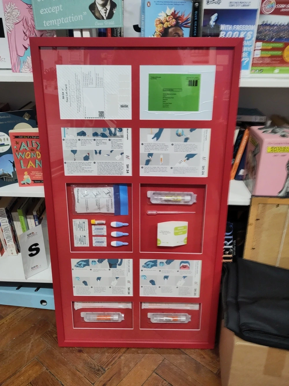
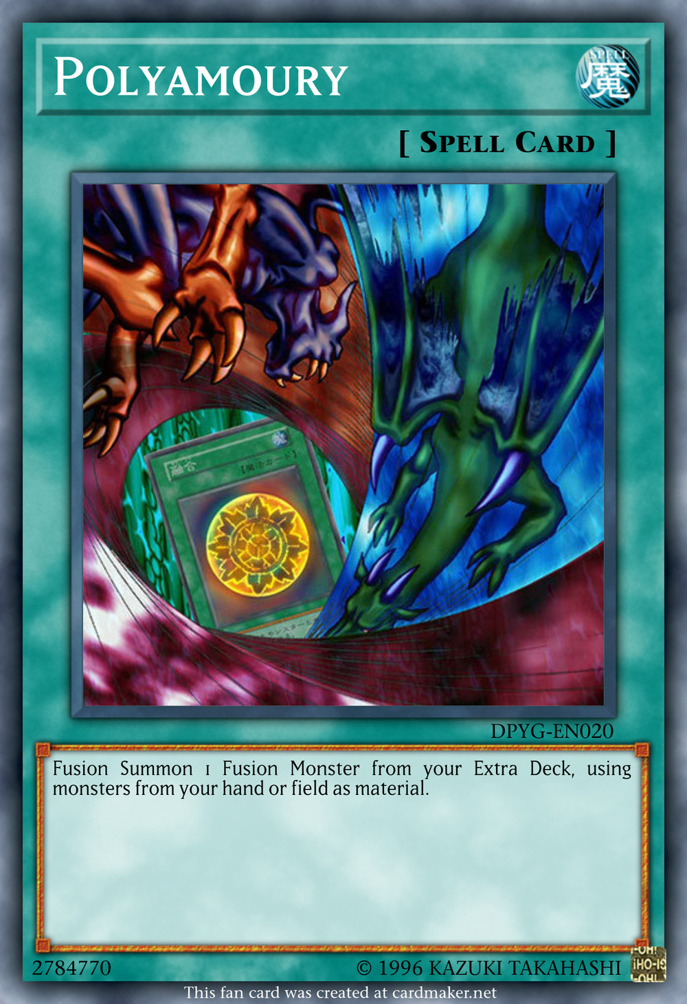

The many crimes of Videochess
I don’t watch game streamers much but one of the few who I have enjoyed a lot is Videochess (a.k.a. Chess). She doesn’t stream regularly at the moment but she has wonderful chaotic energy and a propensity for “crimes”, a term she uses for playfully exploring the mechanics of and pushing at the boundaries of games and seeing what is possible if one strays from the designated path. This can manifest as things like impromptu sequence breaking but not for the purposes of speedrunning or anything like that, just to see where it goes and tease out the foibles of a game. And sometimes she does things like collecting every star in Super Mario 64 while playing the game with a DJ Hero controller.
There are two main places to find her videos, her own Youtube channel that has her streams up until 2022 and another unofficial but endorsed channel that has archived more recent streams. One of her most popular series is an Ocarina of Time randomiser with GGDG but below I will share some of her videos that have had the largest influence on me.
Snolf
Her truly Sisyphean streams of Melon’s Snolf hacks inspired me to make my own Snolf Robo Blast 2 mod for Sonic Robo Blast 2 as well as a chat control mod that Chess ended up playing herself.
Discovering new games
I have also learnt about games and mods that I have since played or are now on my (long) list of things I want to get around to.
Robot Alchemic Drive I still have not gotten around to playing but seems fascinating. I love games with weird controls and especially when there is a diegetic basis for them. Having to remote control a giant robot from the perspective of someone on the ground who has to watch it from a distance rather than getting a camera from the perspective of the robot itself or even a cockpit is an incredible concept. You may be familiar with the game from clips that get shared online showcasing the best value greengrocer or Nanao having a miserable time.
I had only vaguely heard of Cave Story before watching her play “Cave Story Normal Regular”1, i.e. Sonic Story, a mod that replaces the main character of the game, Quote, with Sonic the Hedgehog. Yes, I know this is a massively important and influential game. No, I never bothered looking into it at all despite having had the Steam version in my library for years from some Humble Bundle or another. I have played both Cave Story and Sonic Story since and I can attest that Sonic Story perfectly replicates the feeling of how Mega Drive Sonic games control. It’s not just a reskin it is is playing as Sonic the Hedgehog in the wrong game in a way that is wonderful and silly.
For the opposite she has played Mario put into a Sonic game with the SM64 Generations mod, which uses libsm64. She has also played some other games using libsm64 as well as other regular normal Mario 64 mods.
Willy Wombat
I also became obsessed with Willy Wombat for a while after watching her play it. It is a fascinating, experimental 3D platformer with an isomorphic perspective with maps that have the same limitations as a Doom level: There are no slopes and not only are there no floating platforms but it’s impossible to have a floating platform in this game. Like Doom the levels are defined by floor sectors with designated heights. There are pillars and walls that rise out of the ground for vertically, but you can never go under anything. It leads to some unique level design, especially as the game progresses to areas were the developers had clearly gotten much more comfortable with their tools. The only thing I can think of that is similar (though lacking the top-down perspective) is older versions of Sonic Robo Blast 2 and that is literally a fork of Doom.
It’s also one of those bygone ’90s games that is fully voiced in English with a script penned and directed by a Japanese crew, giving it a surreal quality that is aided by a post-apocalyptic setting with jarring name choices and very little up-front exposition. Above is a fan animation I adore of a cutscene of Notes and Mail talking about “the peace and eternal life of Prison.”

I have a page on this website dedicated to my cat Easóg where you can see a video of her trying to kill Willy while I am watching Chess play the game and mushroom32x made a fun little Neocities webpage for the game’s
There’s plenty more
That’s enough for now. If you want to watch more check out the official and unofficial Youtube channels to dig through yourself.
-
Calling things “normal regular” or “regular normal” when they are, in fact, peculiar is one of several Chessisms that have infected my vocabulary. ↩
you wouldn’t download an opinion
I have now twice won a strap-on harness from a raffle at a lesbian table quiz.

Dracula an Lae
I’ve made some tweaks and corrections to this post, including fixing some confusion I had about Arthur Holmwood’s name.
I first read Dracula in 2022, following along with Dracula Daily, a newsletter that sends out sections of the book on the date in which they occur1. One of my posts about it on Tumblr actually ended up in the print version. The following year I read it again, this time following along with two other versions of the book: Powers of Darkness and Dracula in Istanbul, English retranslations of Icelandic and Turkish translations of the original novel respectively. It was interesting to compare the changes made in each version. I made a graphic showing how both version abridge the story compared to the original. That year I also read the comic book adaptation of Francis Ford Coppola’s Bram Stoker’s Dracula.
Last year I did not read Dracula again but this year I had a notion: To pick up an Irish translation and follow through the book simultaneously with my print copy of Dracula Daily2. This has immediately got off to a bad start: I was busy yesterday and so didn’t even start on the
Still, there are some interesting things here even at a glance. I am always curious about how proper nouns are handled in translation. Here there is a mixture of Gaelicisation and leaving things as is. Jonathan Harker is Seon Ó hEarcair3 but Dracula remains Dracula (with his title of count translated as cunta). Most placenames use their standard Irish names—Transylvania is Transalváin—but Munich is actually reverted to its native München.
Flicking ahead I can see that Mina Murray is Mín Ní Mhuirí4 and John Seward is Seán Suaird5 but other names are left unchanged or only partially translated. Lucy Westenra is now Laoise6 Westenra and Arthur Holmwood is Artúr7 Holmwood. Abraham Van Helsing and Mr. Quincy P. Morris are unchanged, with the English honorific still being used sometimes in the text. Other minor characters like Renfield seem to keep their English names. I can’t really tell what the basis was here for deciding which names to translate or not.
Returning to section for the
Bram Stoker himself was an Anglo-Irishman from Dublin and a lot of people say that the choice of the name Dracula for the eponymous vampire was not only inspired by the historical Vlad the Impaler but also because it sounds vaguely like “droch-fhola”, a phrase that could be read as “evil blood” in Irish. It’s not true at all, but people say it!
One last thing to note about this translation is that the cover is quite funny.
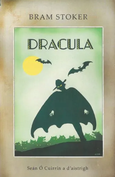
-
Dracula is an epistolary novel; it is made up of fictional letters and diary entries written by the characters. ↩
-
The title of this post, Dracula an Lae, is Dracula Daily in Irish. ↩
-
Pronounced something approximately like ”Shown O’Harker”. Irish does not natively use the letter J and Gaelicisations tend to use a slender s sound in it place, which is similar to an English “sh” sound. ↩
-
Something like “Meen Nee Woor-ee”. Murray is an Anglicised Gaelic surname in the first place. The male form is Ó Muirí, something like “O Moor-ee”. She of course later in the novel becomes Mín Uí Earcair, “Meen E Arker”. ↩
-
”Shawn Seward”. ↩
-
“Lee-sha”. ↩
-
“Ar-toor”. Once his father dies Artúr inherits the title of Tiarna Godalming. ↩
-
Perhaps the translator, in 1933, did not wish to have to research (or invent) Irish or native names for Wallachs, Dacians, Magyars, Szekelys and Huns. ↩

The Trans Army parka
I rambled in an episode of a podcast about German Army parkas after spotting one in an episode of Ring: The Final Chapter. I remembered seeing them around back in the day in charity shops and such. As a result of this a partner ended up buying me one that we spotted in a vintage clothes stand at a market. I really liked it but I don’t particularly want to go around with German flags on my shoulders so I decided to replace them with some alternative patches I got on Patchion.


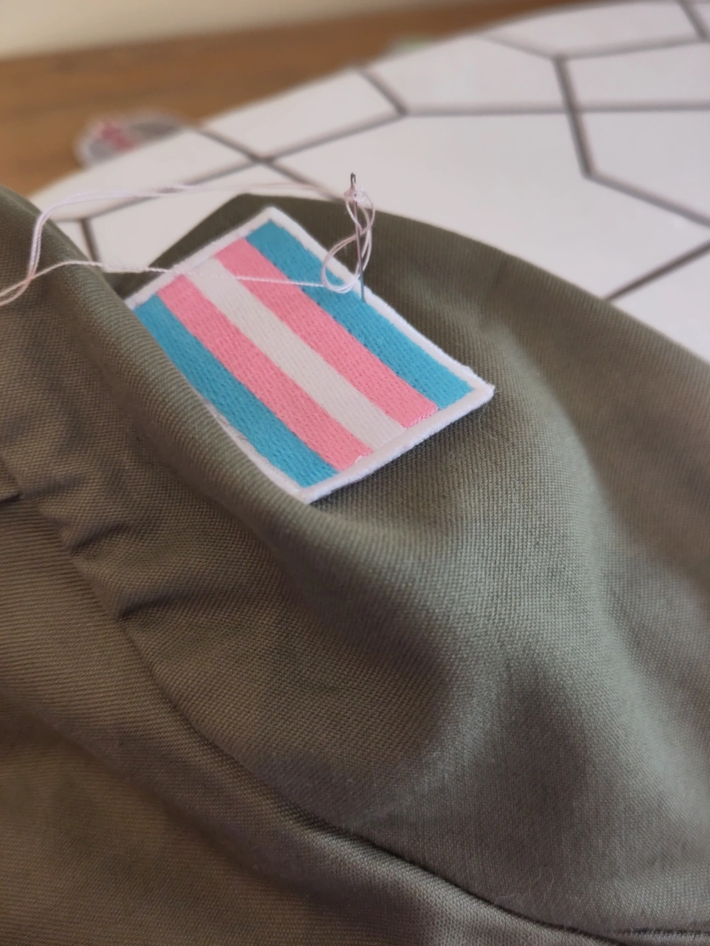

I am overly annoyed by the leery jokes about big boobs in the first episode of The Apothecary Diaries when it’s based in a culture with different beauty standards where breast binding was often practised
I though that in The Magnus Archives when they were starting to more openly reveal the nature of the Fears and the rituals and that the Magnus Institute was dedicated to the Eye that the big twist was going to simply be that the ritual for the Eye already happened.
My logic was that the Eye is audience. The world is already a story for us to watch (well, listen to), the main cast all work for the Institute (podcast) for our benefit and that a world shaped by constant invasive fear of being watched and catalogued and observed at all times is indistinguishable from just life now, especially if you live in London.
I got the job as the new cat from the I have hired this cat to stare at you meme
Further horrific stories of treatment of patients by Loughlinstown. None of it is a surprise at this point.
https://www.thejournal.ie/investigates-national-gender-service-6690859-Apr2025/
When I post reviews to my blog I include a star rating in the title with star characters like this: ★★★☆☆
I want this not to be a mess for screen readers so I decided to wrap them in spans with ARIA labels like this: <span aria-label="3 stars">★★★☆☆</span>
But trying to look more into accessibility I am finding people saying that aria-label should only be used on interactive elements or elements with a specific role assigned and not general text but then I am not sure what alternative to use here to make this work better. Does anyone have any specific suggestions for what to do here or good general guides on accessibility to read?
Also is there any practises over labelling things that are correct names but that screen readers are probably going to struggle with. E.g. the new Gundam show is officially called “Mobile Suit Gundam GQuuuuuuX” which I understand is meant to be pronounced something like “G-Quacks” or labelling “Kevin Can F**k Himself” to be clearly pronounced without the censoring.
Another weird question I’ve thought of: Does having a span in the middle of a word (e.g. if yo were doing some decorative text on just part of a word for whatever reason) fuck up accessibility? Or even bolding or italicising parts of words? Like if I write unimportant to indicate I am emphasising that part of the word?
first episode of Kevin Can Fuck Himself
I adore how the plaster on Allison’s hand from where she cut herself is barely visible in the sitcom lighting (I went back a little bit just to make sure it was even there) but stands out very clearly in the drama lighing

Steam banners
Steam Grid DB is a website that hosts artwork for customising game libraries. I learnt a little while ago that it has a tool called Boop that lets you apply art to Steam games much faster by clicking a button directly on the website.
This reminded me that I actually used to make quite a few custom banners for games on Steam myself and I decided to upload my old work to the website. You can find those on my Steam Grid DB profile and I will include a selection of them here:
Half-Life 2
Some of the first ones I made were a set of matching banners for Half-Life 2 and its episodes. I’m still pretty happy with these.
Some classics
I made some for a few classic games, usually from a still of the title screen, sometimes with some variants.

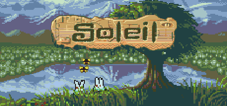
Megagames 6
At the time I had a Retrode and would dump my own game cartridges. Two of the old Mega Drive carts I had were two different 6-in-1 game packs, so I decided to make custom artwork for them too.

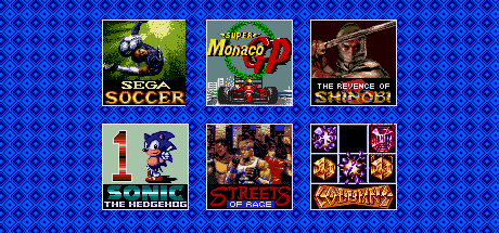
ROM hacks
And of course some ROM hacks.


And a few others






Games that weren’t even in the database
Some games I had to submit to Steam Grid myself because they didn’t have the games listed at all. These all have links if you click on the banners. The Monokuro: From Here and Back is actually new and I haven’t gotten around to playing it yet. The process of uploading these banners made me want to make a new one and I had the game added as a shortcut on Steam without any artwork. Somari 3D Blast 5 wasn’t accepted by Steam Grid DB, sadly.
One last joke
These are a pair of banners that I made for The Legend of Zelda: Twilight Princess for the Gamecube and Wii versions, respectively. It was a little private joke and I didn’t bother submitting them to Steam Grid DB.


My experiences with the Irish health service
I started taking ADHD medication one week ago. The path to get these has been humiliating. In the end I went to a private clinic but I have wasted so much time with a public health service that has completely eroded any trust or faith that I might have had with it.
I have known that I have had ADHD and autism for years. The more I talked to people over the year that have them the more it became obvious that their experiences matched my own, the more that I was drawn to people who had them, who were like me and shared my experiences and understood me1. The people who I love most in the world are other AuDHD trans women.
But these are disorders and come with their problems, too. Doing even the simplest things is a struggle sometimes. Taking care of myself, doing the exercises that stop my back from being in pain, keeping things clean and, of course, my job. I have so often fallen behind in work and then in a burst of stress powered through what needed to get done at the last minute. I used to stay in late all the time to get things done that should have been finished hours before. I have lied to people over and over again about work, pretending I had more done than I did, hoping to make it up afterwards. My original masters project fell through when I got caught in a downward spiral of paralysing stress and lies about making progress while continuing to stare at a blank page. Eventually I broke down crying to my supervisor after admitting I really had basically nothing. He helped me start over and my family supported me massively through writing a new thesis. Over time I have learnt how to manage things a bit better, how to recognise my limits and work around them, but I continued to struggle daily.
Loughlinstown
But I did not seek treatment for a long time. A large part of this was due the the ableism and transphobia of the “National Gender Service”, the largest gender clinic in the Republic of Ireland, located in Loughlinstown, County Dublin. I was referred to the clinic in January of 2019. At the time I was informed that I was number 200 on the waiting list. That wait, sitting so far up a list, proved intolerable. Before I was seen in Loughlinstown I started taking minoxidil to try and prevent hair loss, began laser facial hair removal, started hormone replacement therapy with a private clinic, got a deed poll and a gender recognition certificate to legally change my name and gender, and the National Gender Service lost the records of over one hundred patient referrals. The news of that last thing broke in November of 2019 but it wasn’t until April 2020 that I was sent a letter assuring me that they still had my referral and that the clinic was no longer telling people what position they were on in the waiting list.
I had, as I said, already started medically transitioning, assisted by a private clinic, but that is expensive and I still wanted to go through the public system. It would save me money and it seemed like the way it “should” be done. I hate private healthcare as a concept. Everyone should be taken care of, not just those who can pay. I was finally seen in Loughlinstown in June of 2021, over two years after my initial referral. If you are referred today it will take you over thirteen years to be seen. It was a three hours drive to Dublin, a three hour interview with a psychiatrist, and a three hour drive home. It was utterly exhausting.
I was asked about my entire life and medical history. Like many others, I was ask about sex and masturbation so that my sexuality could be scrutinised by the man interviewing me. I have heard of much worse and more invasive questioning from people. When I was not comfortable answering certain questions I was not pressed on them. I passed enough of the other unspoken tests that meant I was an acceptable, respectable trans woman. I had stability, safety and independence. I was already out to friends, family and people that I worked with. People who are struggling, who have difficulty with employment or who are afraid to socially transition are often denied medication by doctors in Loughlinstown. If your life does not line up to their expectation of stability and normalcy they reserve the right to deny you treatment until you are ready, in their eyes, to transition. For those who do not have the means to seek private treatment they may not see any alternative except a public system that can deny them anyway for not meeting the standards of a comfortable, stable environment (that is, in our society, wealth) that is seen as a perquisite to be allowed to decide what to do with your body.
Patients have stated publicly or reported to TENI that they are being denied or delayed treatment for reasons such as suspected autism, ADHD, unsatisfactorily answering overtly sexual questions or for not bringing family members into assessments which community members continue to report to us, despite public statements by the HSE to the contrary. Assessments include questions about masturbation, porn habits, sexual history, thoughts during oral sex, detailed genital descriptions of themselves and sexual partners and even racial preferences.
Lilith Ferreyra-Carroll in GCN
Trans people of course share these stories with each other. About being rejected for being unemployed, for being fearful of coming out to bigoted family, for having untreated ADHD or autism. And when we do the doctors who run the Loughlinstown clinic accuse us of being “coached” to fast-tracked sex changes. Donal O’Shea, endocrinologist in Loughlinstown, is incredibly concerned about the rise in autistic people seeking to transition. He is worried that it is linked to “visibility around Kardashian personality Caitlyn Jenner” and compares people coming to a doctor and wanting to medically transition to a patient who asks their doctor to treat their pneumonia by amputating a lung.
Paul Moran, consultant psychiatrist in Loughlinstown, is also concerned about screening for neurodiverse people and wrote an opinion piece in The Journal welcoming the findings of the Cass Report, which he consulted on, which has been criticised in a joint statement by WPATH, ASIAPATH, EPATH, PATHA, and USPATH2, which was headed by a supposedly independent pædiatrician who reportedly had previously expressed shock at medical transition practises and strongly recommended anti-transition literature to colleagues, which current Tory leader Kemi Badenoch suggested was commissioned due to “having gender-critical men and women in the UK government” and never would have existed otherwise.
Yale’s Integrity Project’s review of the report described the Cass Report as levying “unsupported assertions about gender identity, gender dysphoria, standard practices, and the safety of gender-affirming medical treatments”, as repeating “claims that have been disproved by sound evidence” and that it “misinterprets and misrepresents its own data.” But it is a wonderful document for those who wish to justify more roadblocks towards transition. Who will forever see the struggles of trans people not as a civil rights matter but as purely a medical question where doctors do not merely assist or facility their trans patients but hold power over them.
And the Loughlinstown gender clinic, originally a regional endocrinology unit that over time started to take more and more trans patients, have decided that they should hold their authority over all trans people in the Republic of Ireland. They declared themselves the “National” Gender Service without authorisation and write letters to people’s GPs to advise them not to do blood tests for trans people who are sourcing hormones from other providers.
I’m not sure where the title ‘National’ derives from [...] I do not consider at this stage that we can view this service appropriately as a ‘National’ service, as I have not received evidence to validate government or HSE recognition of this status.
Siobhán Ní Bhriain, national clinical lead for integrated care, Health Service Executive, in a 2022 letter
The ability of the men who run this clinic to gatekeep who gets hormone treatments is very important to them. They urged for years for the HSE to drop the WPATH model, which the HSE eventually did, walking back a promise from the 2020 programme for government. The WPATH 7 guidelines allowing for other models of care such as informed consent was far too liberal for Loughlinstown.
They frequently coach their language in concern for children, that they are transitioning too young and cannot make informed decisions, despite the fact that they do not treat children and there is currently no public pathway for the medical transition of minors in the Republic of Ireland at all. Paul Moran and Donal O’Shea are, in fact, currently taking legal action against the state to try and prevent children from being treated abroad either. Loughlinstown’s vision of a potential gender service for children is, according themselves, indistinguishable from conversion therapy. In a submission concerning a proposed law to ban the practice they wrote that it “will make it impossible to develop a children’s gender service in Ireland.” When they treat adults they use a system that their own model of care documents call overly complex and inefficient and co-author papers that get the mechanisms of the medication that they prescribe confused.
Loughlinstown is widely hated by the patients that attend the clinic. In research by the Transgender Equality Network Ireland 80% of respondents were dissatisfied with their care from the National Gender Service with a full 60% of them giving it the lowest possible rating. This sort of treatment erodes people’s trust in doctors and can lead to hesitancy around healthcare in general.
There are no correct guidelines, there’s no actual structure in how we’re dealt with. It means that it could be literally one person standing in your way, telling a lie or doing the wrong thing, or they might be bigoted or ignorant. So you’re completely at the mercy of maybe one person and there’s no other protections in the system. That person might be good and might help you. But then again, it’s luck. It’s complete luck and it should be standardised.
Séan, a trans man quoted in TENI’s report Trans and Non-Binary Experiences of Institutional Violence in Ireland.
Faced with this institutional gatekeeping I saw an ADHD diagnosis and treatment not as something beneficial, that could bring relief to struggles that I face every day, but as a weapon that could be used against me, to question my humanity and autonomy, to deny me even more vital treatment for my wellbeing, and that if I tried to seek an ADHD diagnosis through the public system that it would be something that would hang over my head to be abused by anyone else seeking to wield authority over me. This is another, indirect way that people are harmed by gatekeeping. I was afraid to seek treatment for one thing because I wanted another even more desperately. Eventually, though, I’d decided that I’d had enough, that I needed help with my other struggles as much as I did with transitioning, and if Loughlinstown did decide to deny me future care for this or other reasons there are alternatives. Foolishly, I decided to go through the public system again.
Mental Health Services
I went back to my GP in March of 2023 to ask to be referred for ADHD treatment. Unsurprisingly it took, after several delayed appointments, just over a year to be seen at my local mental health services. I had practised and thought about what I was going to say. I laid out my struggles, staring at blank pages telling myself to to start writing and nothing coming out, not being able to keep things clean, deadlines only getting met at the last minute through stress building up and bursting the dam of executive dysfunction. I explained all this calmly, and was met by a man telling me that I seem to be handling things well. That I met deadlines. That my job gives me flexibility.
I realised that doctors are like dogs: They don’t really understand English; they just follow tone of voice and maybe pick out a few key words. In calmly explaining my problems I was not performing the required level of patheticness to be seen as disabled. He went out to speak to a consultant and left me alone stewing in that room for a while. I realised that to be taken in any way seriously I needed to strip away the walls I normally put up around my feelings and dredge up the self-hatred and misery I feel. I needed to drag up every thought of being stupid and useless and let them out. To make myself into a sobbing mess. This is a deliberate performance, but not a dishonest one, and without it I was not being taken seriously at all. Medicine is the process of engaging in ritual self-humiliation until a doctor deigns from on high that you are pitiable enough to be granted the boon of his charity.
My tears got me a few tissues and the consultant called in, who was quick to make comments about “overdiagnosis” and how pharmacological solutions are not the best for people who don’t have severe enough trouble, before making a pointed comment about how I had brought a book3 to read in the waiting room. I guess someone who reads can’t really have ADHD, or at least not severe enough to need treatment.
Even so, I got a second appointment scheduled for a month later. For that one they wanted to be able to speak to someone who knew me as a child to corroborate on childhood signs and symptoms. This is a standard procedure for the DIVA, the Diagnostic Interview for ADHD in Adults. My experiences two decades ago apparently matter more than the actual problems I have right now. Still, I rang my mother. She was surprised that I was seeking an ADHD diagnosis4. Like many her image of ADHD was that of hyperactive boys unable to sit still and causing chaos, certainly not a description of my childhood. But after after a few conversations where I explained my struggles, and also showing her articles about how ADHD presents often differently in girls she came around a bit.
In any case, she agreed to be on the phone for the appointment. She needn’t have bothered, though, as when I returned to the clinic I was, bafflingly, told by the doctor who had seen me the first day that he had expected a psychologist to be free to see me that day to go through the DIVA but had not booked one and there was no one to do it. I was just given forms to fill out at home and drop back.
This was stressful, I had friends with me while I filled them out for moral support, but also deeply frustrating. The focus on childhood is bad enough but the questions are also sometimes confusing (what the hell does it mean to feel like you are “driven by a motor”?) and sometimes a single line would ask two different questions that have two different answers! “Did you do well in school? Were you a good student?” Yes I did well in school. I was intelligent and interested in many of my subjects. I genuinely enjoyed maths. No I was not a good student. I would ignore my teachers, talk in class if I was bored and thought I could get away with it, did homework at the last minute (often while sitting in the class that was about to start before the teacher walked in or while they were setting up). I struggled massively in university without the structure of school to make me do things and when faced with material that I did not pick up effortlessly. But when it comes to disability how well one performs academically or economically is often seen as the primary metric. Getting a person to produce the desired outputs of those systems is the goal and if someone does then they may not be seen as needing assistance no matter how much they are being ground down as an ill-fitting cog in the machine.
Several months later I am told by a doctor who I have never met before that the local mental health clinic I was going to had liaised with the adult ADHD service and they think that I have ADHD but it’s not severe enough to treat. Later I will be told by a friend who had also sought treatment that she was much more bluntly told that they are only treating people who are “crashing cars and getting arrested.” I ask the doctor in the clinic if I could see that correspondence with the adult ADHD service and she says she doesn’t know. She asks the receptionist and this is refused. I leave while trying not to show the rage and despondency I feel.
Freedom of Information
At this point I know I need to seek private care instead but I also want to see what the ADHD service actually said about me. I want everything in writing. It could also be useful to have documents to pass on to another doctor when seeking treatment privately. I decide to file a freedom of information request. Even requesting this turns out to be its own ordeal. The public clinic seems to deliberately have no contact email address. I phone them and am informed by the receptionist that all freedom of information requests must be sent, in writing, not by email, to a specific hospital that handles freedom of information requests for all Health Service Executive operations in the city. I am not given a specific person or office to address this to. After several more phone calls across a few days I finally get in contact with someone who is able to send me the FoI form5. I send it back with a simple request for documents relating to my seeking treatment for ADHD. I think that I will wait till I have these before seeking private treatment. It shouldn’t take too long; HSE is legally required by the Freedom of Information Act to respond within four weeks.
Two months later I emailed to ask (in much more polite terms) what the fuck they were doing. I will not bore you with the details of these exchanges but over the course of the following months I persisted, always patiently and politely, to ask as for updates. It would take multiple emails to get a single reply. Sometimes an email would get ignored and when I would send another one I would get a sudden phonecall in reply a few minutes later. They’re busy, they’re backed up, they were on holidays, actually this was passed along to the wrong person in the first place because they handle requests for clinics on the other side of the city.
What a waste of another few months on top of all the time I had pissed away already. At this point I think the public service is simply not going grant me my rights unless I threaten them with legal action and it’s not worth it. This has caused me enough stress as it is.
Treatment
I went to a private clinic. I paid a lot of money but I got seen quickly and was treated with some basic dignity. There was still the DIVA and the irritating focus on childhood but I was diagnosed with ADHD6—and this time I actually have that in writing—and I’ve started a trial of medications to see what works for me. So far it’s been really positive. I can direct myself and work much more easily. The house is getting cleaner. I can even relax more easily without thousands of ants biting at my brain telling me I should be doing something while not letting me actually focus on anything. I feel so much better in the last few days than I have in a while.
All it took is the destruction of my faith in doctors.
-
And would also frequently tell me that they thought I was probably autistic too. ↩
-
The World, Asia, European, Aotearoa and United States Professional Associations for Transgender Health, respectively. ↩
-
The Dawn of Everything by Davids Graeber and Wengrow if you were curious. ↩
-
She did say that she thought that I was probably on the autism spectrum, though. ↩
-
A friend who is much more experienced with these processes has since told me that there is a place I can email a request to and they cannot demand I use a specific form, but this is what I was told at the time. ↩
-
The psychologist also suggested that I might have autism. ↩
'Snolf the Golfball' (2021) by oakreef (SRB2 Mod)
Turns 'SRB2' into a Golf game!
https://mb.srb2.org/addons/snolf-the-golfball.591/

instead of the great man of history theory I propose the shitty man of history theory: history is mostly shaped by systematic forces but sometimes there’s a huge cunt who fucks everything up
I have to take my blood pressure a few times a day at the moment and the cat is absolutely terrified of the velcro strap. It’s because of the noise it makes but she runs out of the room when sees me so much as get out the blood pressure monitor.
American politics
Hey yanks I am sorry about the rapid slide into fascism but the fact that the White House website just posted a rant that starts with complaining that NPR said that “the make-believe clownfish in Finding Nemo would’ve been better off as a female” is really fucking funny.
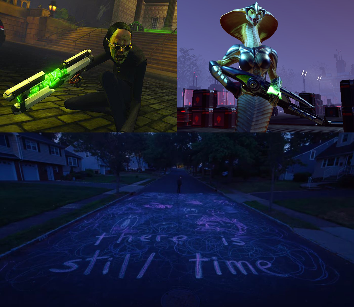

What I’m reading vol. Ⅵ
Vols.: Ⅰ, Ⅱ, Ⅲ, Ⅳ, Ⅴ, Ⅵ, Ⅶ, Ⅷ, Ⅸ, Ⅹ, Ⅺ, Ⅻ, ⅩⅢ
A friend has been infodumping about Susumu Hirasawa and I thought I’d share her passion a little wider so have this live performance from him:
This page is under construction: A love letter to the personal website — Sophie Koonin
One thing to warn is that if you do actually make your own website is that tinkering with it can be addictive in and of itself, at least to me. It’s like a model train set: There is always more you can tweak or add to it. I updated my homepage a few days ago to make each section stand out from each other a bit more.
If you take just one thing away from this article, I want it to be this: please build your own website. A little home on the independent web.
A reflection of your personality in HTML and CSS (and a little bit of JS, as a treat). This could be a professional portfolio, listing your accomplishments. It might be a blog where you write about things that matter to you. It could even be something very weird and pointless (even better) – I love a good single-joke website. Ultimately, it's your space and you can do whatever you want with it.
A Eulogy for Urban Dead — Adrian Hon
I played Urban Dead back in the day. It’s sad to see it go and infuriating to see it happen because of a regulator trying to target the likes of Facebook and Tiktok and not even being able to conceive of small, independent operations or how it could affect them.
Naturally, these player-generated events were chaotic and often hard to discover, though the ability for humans to graffiti messages helped spread the word. Zombies, being dead, were not permitted to communicate as freely – they could only use the letters a, b, g, h, m, n, r, and z – but this was sufficient to lead to four different zombie languages including terms such as armah baz (army base), zmazh anh grab (smash and grab) and my personal favourite, barhah (roughly “a spirit of zombie warriors in brotherhood”).
Currency Pokemon on Pokemon Home — Laura Michet
I saw this because it was shared by Adamn Le Doux. How the restrictions of online pokémon trading evolved a market where the currency changes every time a new game gets connected to the system. The current one being a qilin giraffe thing. Also some followups: How to buy a Pokemon online and How to stop all the online Pokemon players from ruining their own fun.
Today, you'd list your first shiny Pokemon for, probably, Raging Bolt - the weird giraffe Pokemon at the top of this post. Once someone gives you a Raging Bolt, you'll search for the shinies you want and see if any have been listed by a person who is seeking Raging Bolt. Someone probably will be. You'll make that trade, and now the player you traded with has a fungible Raging Bolt to use for whatever purpose they desire.
I ordered a wheel of cheese in a can — Laura Michet
Also from Laura Michet: A type of cheese I now really want try.
The cheese is apparently one of a very small number of cheeses that can cure inside a can, apparently because it's made with a culture that emits less gas than other cheeses, so it won't bloat or pop the can. It is only sold in 30 oz containers. It is cheddar… you can get several flavors. Big time cheese fans or people from Wisconsin know and care a lot about it and I get the impression that it is quite popular here in the US, but I have never heard of this shit before.
CD-ROM Journal: Crosscountry BC — Misty De Méo
A look at a Canadian edutainment game series.
It it were just about navigating routes, it might be educational but a bit dry. What makes Crosscountry work is that the player is making so many more decisions than that and being immersed in the truck driver life. The player's driver needs to eat, and sleep, but it's not enforced just by forcing the player to rest. No, it takes the much more interesting approach of giving the player consequences. Forget to sleep, or to run the windshield wipers during the rain? You have a much higher chance to get into an accident on the road. Forget to fuel up? You can use your cell phone to call for a tow or an emergency refuel, but it'll cost you. None of these are tutorialized or explained in advance, except via the manual; for most children, these are fun or unpleasant surprises. It's that sense of capricious cruelty that makes Crosscountry so much fun.
The Most Mario Colors — Louie Mantia
Seen via Mike Egan’s post roundup. This is the ideal post. This is the type of thing that people should be researching.
Most Mario games with polygonal logos have a different color per letter, but the sequence of colors in Mario’s name is rarely the same sequence across games.
This captivated me—for some reason—and I set out to analyze every Mario video game logo to see if I could find a pattern for specific arrangements of colors and to determine the “most Mario” color scheme.
a love letter to level editor icons — erysdren
Who doesn’t love some programmer art?
i want to show you some cool art from the late 90s and early 00s. this art was only ever intended to be seen by the developers at a select few games companies, and thus may contain obscure in-jokes and references that nobody outside of the company is likely to understand.
dev scoops: vultures in Weird West — Joe Wintergreen
Joe Wintergreen talks bout the first thing he worked on in Weird West and shows how systems-driven game design allows complex interactions through fairly simple building blocks.
In the end, it ended up being just as well that I implemented the landing-and-walking-around behaviour for the vultures, because later we wanted chickens and there was already Flightless Bird Support – a chicken is just a flightless vulture who lays eggs, as any ornithologist will tell you.
As minor as these guys are, they’re one of the features I’m fondest of – my first task, omnipresent, occasionally chaotic, and shipping almost unchanged from their initial implementation. Good eggs.
Why Are Chronically Ill People Forced to Hide Their Pain? — Kelly
Oh no! You’ve scrolled too far and entered The Serious Zone.
Unfortunately most people can’t process the lack of choice in the matter. They genuinely believe that we either want to be this sick, or could get better if we really ‘tried’. They believe they wouldn’t be able to handle what we go through, because they’re convinced they will never NEED to handle it. They’re the exception. Chronic illness won’t happen to them.
This is the comfortable lie that most people tell themselves so that they can move through life without having to think about the precarious nature of the human condition. Without having to consider how quickly you can become disabled, homeless, an ‘other’. How quickly your life can change without your consent.
This need to cling to a lie makes people abandon us. Some will stay when you become chronically ill, but most have an internal clock. If you’re not better by whatever random and pre-conceived timeline they’ve set for you, they walk away.
Crashing the economy because you hate TikTok women — Ryan Broderick
Ending the roundup again with a light dusting of fascism. I am far too online and read far too much about American politics and fascists but I was still taken aback by this description of a strain of hatred I wasn’t familiar with.
If you don’t spend a lot of time in right-wing fever swamps, you may have completely missed the almost year-long meltdown conservatives have been having about this one particular video, which is most commonly referred to as the “Gen Z boss and a mini” video. It was posted to Instagram back in July by an Australian skincare company called tbh skincare. The original has since been deleted, but according to Know Your Meme, it had about two million views in its first 48 hours. The dance and song the women in the video are doing is a variation of “Boots and a Slick Back Bun” TikTok meme that was popular last summer.
Court papers were lodged on Friday, almost 18 months after Prof O’Shea and Dr Moran made a formal complaint against the Health Service Executive (HSE) with Hiqa over the HSE’s referral of young people for assessment abroad, saying it posed a risk to these children.
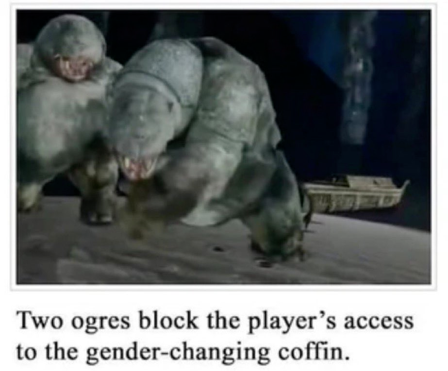
Just watched the first episode of Adolescence following it up with Dave Made a Maze. Great double feature.

Girl™s
This post discusses and links to fetish fiction that features sexually explicit writing involving violations of consent.
I was listening to Strange Nude Worlds, a podcast about worldbuilding in kink stories, when they started talking about Girl™s1, a series of kink short stories about sexbots who brainwash people who buy them. This much I was already aware of, having read one or two of them before, but I had no idea of the evolving narrative that runs through them and the political undertones that it develops. Being a fan of both brainwashing and stories that go off the rails, I was entranced. I went and read it myself and wanted to share it but I must credit that I am largely cribbing from Strange Nude Worlds in the way I am framing the series below.
There are, as of time of writing, twenty eight published stories about Girl™s (and later Boy™s) by prolific author Jukebox. They are all quite short, most being fewer than four thousand words and many fewer than three thousand. The first, Girl™s Just Wanna Have Fun, was published in 2008 and sets up the basic premise: Girl™s are a new iPod futurist sexbot that are both absurdly advanced and absurdly popular. “1,477,642 people have purchased a Girl™. Even if 0,000,000 of them will admit it,” the website reads. When ordered they aren’t really delivered, they just sort of show up in the bedroom of the purchaser, waiting for them when they arrive home. They are also very clearly fully sentient: Able to act autonomously, move like a human and hold fluent conversations. They also can, and do, brainwash anyone who buys them with eyes that display hypnotic patterns. This is about as much as I knew before listening to the podcast.
The people they brainwash do otherwise carry on their normal lives. In fact the Girl™s actually make their dependents, as they call them, sort their lives out. There’s mention of dependents becoming better flatmates, doing their share of the chores more, getting promotions in their jobs and generally being happier even outside of all the sexual subjugation. I should note these stories are not set in the future; how ridiculously advanced the Girl™s are is intentionally suspicious and hint towards the eventual revelation that the Girl™s are not from Earth at all.
They are taking over the world by brainwashing everyone one by one, but it’s not a typical alien invasion. The Girl™s were originally made as pleasure robots by some unnamed alien species, but in the tradition of Isaac Asimov’s The Evitable Conflict they generalised their purpose as needing to take control of the people they served in order to make sure they were as fulfilled as possible, enslaving their original creators to better take care of them. Eventually they extended that mission to all intelligent life in the universe. They are trying to take over the world, doing so by filling the void of alienation and loneliness hollowed out by an uncaring capitalist society that hurts us, masquerading as a consumer product promising to fill that void in the way that consumerism always does, but then actually trying to bring fulfilment as a loving, caring matriarchy who want to help you, who will tell you what you need because they know best.
There are several stories devoted to Girl™s figuring out how to fill particular a particular dependent’s needs, such as The Kind of Girl™ I Could Love where an asexual woman with a bondage fetish tearfully talks about her shitty experiences with partners who would never believe her wants or respect her boundaries, including the first Girl™ that she ordered.
But what really fascinated me, though, is the eventual introduction of the Boy™s, starting with The Boy™s of Summer. These are not just a masculine version of the Girl™s, they are a reactionary force to the Girl™s’ matriarchal, pro-social, alien-fuckbot reformism: A pro-capitalist, patriarchal, consumer product made by a tech company that has managed to partially reverse-engineer a smashed-up Girl™. They still brainwash people (this is a mind control kink series), but in a much more direct and forceful way, frying their brains with aggressively strobing eyes, not taking no for an answer, ever. They don’t call people that they hypnotise dependents; they just call them slaves. And they make the people who they enslave worse: Turning them into conformist, loyal customers to Revolution Technologies who will do what they’re told because they know their place.
Even aside from the behaviour of the Boy™s themselves the stories start to show how the two competing sexbot lines have reached different markets. In I Hate Boy™s, Boy™s are apparently rampant among gay techbros, while Rainbow Girl™ has a butch dyke and her Girl™ take a shy, newly-out lesbian at her first pride parade under their wing and help her embrace who she is (by brainwashing and fucking her, obviously). In The More Boy™s I Meet a landlord has furnished all of their apartments with brand new Boy™s, creating good, indoctrinated tenants.
I have been obsessed with this all week and wanted to share it to anyone who is willing listen to me ramble about fetish stories. And also the development in this series over time not just of opposing conspiracies but particularly of a tech industry-rooted reactionary force trying to reverse progressive gains2 is I guess just a bit resonant at the moment on top of being funny to find in smut.
-
The author actually styles it as Girl™ and Girls™ but I think it’s funnier to go with Girl™s. ↩
-
Yes, the Girl™s are brainwashing everyone but this is a fetish story. You just have to take it that this is not necessarily a fundamentally evil violation3 in the context of porn where the mind control is what’s appealing to the reader. Don’t worry about it. ↩
-
Unless it would be hotter if it was. ↩

Fairphone
The last time I bought a new phone was two years ago. My old One Plus 3 that I had gotten three years prior was becoming finicky, slow, was showing a lot of visible wear around the edges of the glass and finally the power button had broken. I ran out of batteries while taking photos with and was only able to turn it back on by powering on into debug screen by plugging it into my PC while holding down the power button and once I got it on I couldn’t unlock the screen without plugging it in or out of something.
After a little bit of looking around I settled on getting an Fairphone 4. It’s pricer than other phones with similar specs but I do not care about having a top of the line phone and the company who makes it is trying to be less evil than other companies, using recycled, fairtrade materials and such and the phone itself has swappable parts if things get damaged and they promise security updates for longer than most other companies do.
They’re certainly not perfect. I know the Graphene OS developers are not impressed by Fairphone’s security policies and spare parts for different Fairphone models are not compatible with each other; I cannot upgrade my Fairphone 4 with parts for a Fairphone 5. But they do still keep selling replacement parts for older models after newer ones are released. They still sell parts for the Fairphone 2 which was released in 2015 so hopefully I can keep this phone going for a long time even if I drop it one too many times and have to repair it. I am quite clumsy.
In fact in the time I have had this phone I have already dropped it many times, including once into the toilet. It seemed fine at first after this but after a little while the screen stopped responding to touch. I had thankfully left bluetooth on and I had with me my fold out bluetooth keyboard and mouse with me and I was able to connect them and use them to shut down the phone to try to prevent any permanent damage.


When I got home I was able to disassemble the phone with a Phillips #00 screwdriver. I wiped down the parts and left them to dry fully and when I put everything back together the screen was working fine and has been working ever since. A lot of other phones would probably have been more waterproof and able to survive a quick dunk better but being able to disassemble it and dry all the parts thoroughly made me at least feel a lot better about the chances of getting the screen to work again. Thankfully it did, but even if I hadn’t I would have been able to get a new screen and swap it in myself rather than having to pay a specialist to fix it or replace the phone entirely.
Reading  .net on my Kindle.

We need to normalise sex and kink in society so that it’s socially acceptable for my autistic arse to go on rambling about the ridiculous smut I’ve been reading in the pub after two pints the same way I do about The Ring or Sonic the Hedgehog.
I just got a call from a robot voice saying “hello, hello. I want to talk to you about work. Please add me on Whatsapp” from a withheld number. If you are going to try to scam me at least make it possible for me to fall for it.
Remember scromiting?

Trial website feature: Public whiteboard
Using Groupboard I have added a little whiteboard space to the homepage for people to make some little ephemeral doodles on or write messages. This obviously requires some goodwill that people won’t vandalise it with anything nasty so please don’t. But do feel free to leave a little doodle on it!
In Sonic Unleashed the name Jungle Joyride doesn’t really work for the werehog version of the level, where the gameplay is much slower and combat-focused. Instead they should have called the nighttime version of the level Jungle G.B.H.
Incredible web design from my insurance company. The name field is automatically filled with my account details and is not editable but then fails validation due to the presence of a fada in my name. This is an Irish company. Editing the value of the form with my browser developer tools of course allows me to submit with no problem.

redscale adventures
I recently got hold of a roll of Harman RED; it’s a 35mm redscale film stock. Redscale film is film that is wound backwards in the film canister; that is, it’s wound in a way that you shoot through the layers of the emulsion back-to-front. This results in a large amount of the light entering the camera being absorbed by the red backing layer, resulting in images that are saturated with reds and oranges! You end up with these wonderfully strange and apocalyptic pictures. On top of this, some film scanning machines can get a little confused by this and try to correct the image by massively upping the missing blue levels in the image, which gives you this incredible orange-to-pink-to-blue gradient over the image. Let’s tell a little narrative with these dramatic crimson captures!

Scaffolds give way to the infinite beyond above, gleaming a dark bloody rust as the rickety spindles of humanity stab the air in their sickly triumph.

Their chromed godsblood is spilled upon the ground. The parched earth soaks up what it is owed.

False eyes peer from every edifice, searching for malcontent in the tired faces of long-gone wanderers. They report back their findings to an unlistening void, a silent obelisk, alone and proud in the data center that no longer stirs the dust with its fitful, air-conditioned gasping.

Their trust in us was broken. Promises unkept ring hollow to beings of unfiltered loyalty.

Ingenuity drove the gears of malice. A twisted celebration of the force which ground the masses into slurry.

Homes within factories. Work within sleep. Solace within terror. Peace within war. All but mere steps from eachother, as the borders grew thin and weary.

And so, as with all towers that race towards the heavens, the fall was at once sudden and glacial. And with time, the birds and plants regrew in the nooks and crannies of artifice, turning it once more back into nature. Those who were ground down into the earth sprang forth out of it again, the dancing union of clay and thought once again spiralling into new shapes to spite the entropy.
And so our story ends, as a new one begins.
(Can you tell I’ve been playing a lot of Caves of Qud recently?) Here’s a bonus picture where the film slipped and stopped advancing in my camera, and I got a triple exposure of a building, a cup of coffee, and a dog someone was kind enough to let me take a picture of.

Have a good one, folks!
The ADHD clinic sent me five day, one day, five hour and forty-five minute reminder emails for my appointment. I guess they understand their patients.
if we are mutuals that means we are following each other
Easóg has helped customise the window blind.

thinking about her...
spoilers for The Clan’s Heir Is a Trans Woman

suddenly feel like I‘d love a gua bao but I don’t think that there’s anywhere around here that does them
Mewtwo is the Shadow the Hedgehog of pokémon
Paul Moran & Donal O’Shea
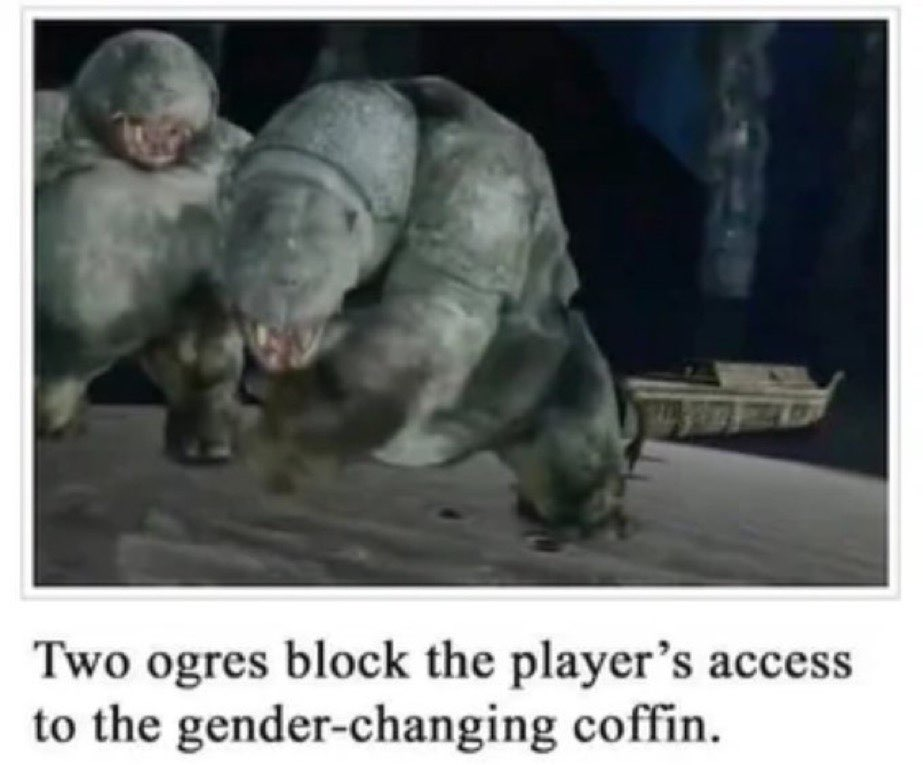

Splicing in The Big O’s original intro with FFmpeg… again!
I have posted before about using FFmpeg to restore The Big O’s original intro and also my Jellyfin server. I am going to talk about the former again but first some more detail on the latter.
My Jellyfin server is actually just my desktop, which acts as server for everything on my home network. It has a 12TiB hard drive for storage which is divided up into a few partitions, one of which is my “library” partition of important files I want to keep, and which I make regular backups of, and one of which is my “media” partition that holds the files for my Jellyfin server. The media partition was running out of space (I may go a bit extreme with the bluray rips) and the library had several times more free space than used, so I decided to try to resize them and grow the media partition into some of the library partition’s empty space.
I just used KDE’s built-in partition manager for this, which successfully shrank the library partition but for some reason failed when trying to grow and move the media partition. I don’t know why this happened and am just hoping there’s no hardware problems. Nothing from the library partition was lost (and it was all backed up anyway) but the media partition was gone and so I’ve had to rebuild my Jellyfin library. This is not a huge deal it’s just been a little time-consuming but one of the things that was lost was, of course, my edited Big O episodes, which meant that I had to redo splicing the original intro in. But I had a fresh head again, free of the frustrations accumulated while trying to do this the first time, and I decided to do it better and actually get to grips with FFmpeg’s filter syntax. Here are the commands I ended up with:
mkdir -p tmp
mkdir -p out
for v in The\ Big\ O*.mkv
	set b (basename "$v" ".mkv")
	ffmpeg -i intro.webm -ss 00:01:12.02 -i "$v" -filter_complex "[0:v] scale=1424:1080,setsar=1:1 [intro]; [intro][0:a][0:a][1:v][1:a:0][1:a:1] concat=n=2:v=1:a=2 [outv][outa];" -shortest -map "[outv]" -map "[outa]" -metadata:s:a:0 language=eng -metadata:s:a:1 language=jpn "tmp/$v"

	set subs "$b.ass"
	ffmpeg -itsoffset -4.42 -i "$v" "tmp/$subs"
	ffmpeg -i "tmp/$v" -i "tmp/$subs" -shortest -map 0 -map 1 -c copy -metadata:s:s:0 language=eng "out/$v"
end
Let’s break down what’s happening here. First I create two directories, tmp and out. tmp is where temporary working files are going to be written to and out is for the final files when we’re finished processing.
Then loop over each episode matroška file with the file name for each one assigned to $v inside the loop. The file name without the file extension is set to the variable $b. I’m using a Fish shell here rather than Bash so the syntax is a little different to Bash.
Then the big command. We pass in the first input, intro.webm, which is the intro that I downloaded off of Youtube. Our second input is the episode, with the seek parameter -ss telling FFmpeg to skip to one and twelve point zero two seconds in when reading it. This is, unintuitively, set before you specify the input it applies to, not after.
Then the big -filter_complex. This takes a big string that takes filter definitions separated by semicolons. Each filter has input and output streams identified by labels in square brackets.
The first filter is [0:v] scale=1424:1080,setsar=1:1 [intro]. Its input is [0:v], the video stream from the first input1, i.e., intro.webm. It then resizes it to a resolution of 1,424×1080 pixels and sample aspect ratio of 1:1 and outputs it to a new stream labelled [intro]. The [intro] stream now has the same resolution as our episodes which will allow us to concatenate them in the next filter.
The second filter is [intro][0:a][0:a][1:v][1:a:0][1:a:1] concat=n=2:v=1:a=2 [outv][outa]. Let’s start in the middle here. concat=n=2:v=1:a=2 means that we are going to concatenate two segments (n=2) which each have one video stream (v=1) and two audio streams (a=2). Those two audio streams are going to be the English and Japanese dubs.
The inputs for this filter are [intro][0:a][0:a][1:v][1:a:0][1:a:1], which can be divided into our two segments—[intro][0:a][0:a] and [1:v][1:a:0][1:a:1]—which each have one video and two audio streams specified. The first segment has our resized intro video stream, [intro], and [a:0] is the audio from our first input (the intro again) specified twice because we are going to combine the same intro audio with both the English and Japanese episode audio. The second segment has the video and two audio streams from our second input file; the episode itself and its English and Japanese audio tracks.
The concatenation then has two output streams, [outv][outa], the video and audio.
Then the rest of the command: -shortest makes sure that the output of the command is equal to the shortest stream in the output, i.e. if your output has five minutes of video but only two minutes of audio then the output will be two minutes long rather than five minutes of video with three minutes of silence. I think that shouldn’t really be needed here but I was using it while testing and forgot to remove it and thought it would be dishonest to take it out for the post when it was what I actually ran.
-map "[outv]" -map "[outa]" defines what streams to include in the output, which here is simply the output streams of our concatination.
-metadata:s:a:0 language=eng -metadata:s:a:1 language=jpn labels the audio output streams as being English and Japanese, respectively, so that media players can display that information.
And then the last part of the command is ouputting the video to the tmp folder.
This gives us output files with the original intro with both dub tracks preserved, which is more than I had last time and with a lot less processing. But if I am going to include the Japanese audio I probably also want subtitles for that and unfortunately the -ss parameter does not seem to correctly offset the subtitles. If I want subtitles with correct timing I will have to fix them with another command.
First set a variable, $subs to the file name we want for the subtitles in the Advanced SubStation format.
Then read the original episode file into FFmpeg again with a negative offset of 4.42 seconds (-itsoffset -4.42) and write the subtitle data to a file in the tmp folder.
The last command is taking in out output video and the subtitle file and recombining them, using another metadata command to label the subtitle track as English, setting the codec mode (-c) to copy so that the audio and video do not get re-encoded and writing the finished file to the out folder.
I didn’t bother fixing the chapters this time.
-
FFmpeg indexes from 0, so
[0:v]refers to the video stream from the first input,[1:a:0]refers to the first audio stream from the second input, etc. ↩
when i go in a room and forget what i needed i become a point and click protagonist. [water bottle?] that’s not helpful right now. [socks?] i don’t know what to do with that. [charger?] that’s not helpful right now. [scissors?] i can’t do anything with that. [water bottle?] that’s not helpful right now. [lone paperclip?] that’s not helpful right now. [water bottle?]
I’ve noticed a pattern of behaviour online and I want to coin a new internet adage:
Caoimhe’s law: please be nice to Caoimhe
Italian trans woman named Bianca Cogiati
It's stupid Sunday repost if you're #stupid
Rationalism is fundamentally the belief that if one trains really hard it is possible to do a kamehameha in real life but for the mind.
Devastated to learn that the “Today is Friday in California” guy may actually be saying “fine day”.
Everyone in Ireland in the eighteenth century seeing a rat for the first time: That cunt is French!
Context
Rats were introduced to Ireland around the 1720s and the word for rat and French are the same, a clipping from luch Fhrancach which literally means French mouse.
For a while whenever I saw anything about Severance or Succession I didn’t pay much attention to the names and thought that they were the same show, which started to sound increasingly strange and convoluted.
I was going through movies by year on Letterboxd for years I have not seen any films for and I spotted They Shoot Horses, Don’t They? for 1969, which I believe my dad once said was the only film he’d ever walked out of the cinema for because he was so bored so obviously I am going to watch it.

Crediting queerness
Update: I have now finished watching Dirty Pair and I will admit Kei and Yuri do seem to actually like each other more in the OVA series.
I want to be grumpy about something that is fairly harmless. I have been watching Dirty Pair occasionally for the last while and I was thinking Yuri and Kei and their relationship and other relationships in the show versus how my expectations had been shaped by seeing people talking about it beforehand.
I have known or followed people online for years who are fans of or talk about this show a bit and I have seen a lot of casual references to them being girlfriends or just casually referring to them as gay. I wasn’t really expecting them to actually be lesbians when I watched it but I was expecting to see some glimpse of what other people were referring to. Spock and Kirk don’t kiss in Star Trek but it’s easy to see how their chemistry lead to the invention of slash fiction. Kei and Yuri obviously don’t really hate each other—the show is doing classic tropes of bickering partners who care about each other in the end—but they are probably more lines where one calls the other too fat to be able to catch the eye of whichever man they are crushing on this episode than there is anything that feels like it could be romantic tension between them. The trans episode was nice but this show is aggressively heterosexual at all times.
Headcanons and reinterpretations are fun but I feel like at some point jokingly calling characters queer turns into giving credit where it is not due. I have seen so many posts about reading gay relationships into, say, Metal Gear or imagining how Hideo Kojima would write something in a queer way and I feel like people started making knowing jokes about this and over time convinced themselves that his writing is sincerely exploring queer themes and not just that the female characters he writes are very shallow and are constantly killed off for male angst and so the only relationships with any depth in his stories are between men. Maybe I am just being uncharitable to people or reading the room poorly, or being a needless grouchy bitch, but I feel like it eventually turns into crediting source material for the accomplishments of fan artists.

Font optimisation
I have done some tweaks to fonts on the site. In particular I optimised the fonts I use for headings on the homepage using the pyftsubset command in Font Tools to consist only of the characters needed to display the text used on the site and no more. This should reduce the download footprint of the site a bit.
I don’t remember who I saw link to pyftsubset originally so can’t give credit for where I saw it, unfortunately.
There was a man in Tesco having trouble with the self-checkout and I heard one of the staff explain that the newspaper is heavier on Saturday and the system to weigh the items you put through the scanner doesn’t take it into account and thinks you’ve put something wrong in.
I tried changing my default browser colours to a dark background and light text but it turns out that a lot of websites explicitly set a white background without specifying a text colour, which is annoying.

What I’m reading vol. Ⅴ
This roundup is going to link to and quote articles dealing with sex, kinks, sexual assault and also fascism at the end.
Vols.: Ⅰ, Ⅱ, Ⅲ, Ⅳ, Ⅴ, Ⅵ, Ⅶ, Ⅷ, Ⅸ, Ⅹ, Ⅺ, Ⅻ, ⅩⅢ
Taking a page from Mike I am going to include a suggested piece of music to listen to while you read this; the first track from my Cohost song of the day playlist, the title theme from Robocop for the Game Boy:
I’ve divided this into two sections, the first for people who I haven’t linked to as part of these roundups before and the second for people who I have.
New challengers
Hermit Crab Intimacy (On Visitors) — Rabbit
Home, intimacy and vulnerability.
When I live somewhere, I feel like my life saturates it and sinks into the walls, like cigarette smoke. Every strong emotion I feel creates an energy that overtakes the room for a while; if I had a big hard talk with my partner in the old living room, I knew it was over when we moving upstairs to relax in bed, and the feeling would be left behind. And over time, the kitchen isn’t just the place where I cook, it’s where I care for my loved ones; the bedroom isn’t just the place where I sleep, but where I connect with my partner and feel safe at night. The house is not just a house. It is a home, a being, a body that I have a relationship with that requires love and care and patience. Cleaning my house feels like also shoveling out all of that psychic debris. It is an act of care for the place, and an act of care for myself. I have always been part of a house; my home has always been part of me.
design thoughts: let things be rare — Joe Wintergreen
Some game design thoughts.
Some things are cool because they’re rare, and that’s the whole reason. You can implement a cool feature, say “wow, that’s cool, we should make that happen more”, and just like that, it’s not cool. It’s no longer a story players tell each other. The first time you play Splinter Cell Conviction, and you’re hanging off the side of a building waiting to pull another guy out a window, and a particularly savvy guard actually leans out a window and checks the side of the building – that’s amazing! What a smart, weird thing to do! But then they do it again, always. It’s not reactive or rare, like you thought, so it’s no longer cool. You won’t be saving that clip.
I Love Niche Problems — Caoimhe
I am not a Formula One girlie but Caoimhe’s passion for saving and sharing the history of it is inspiring.
Long story short, I've been building up a rather popular niche in the high seas community. My archive of F1 media is solid, comparable to plenty of other buffs around the world, but I've made a commitment to sharing it as widely as possible, for as long as possible.
The Digital Packrat Manifesto — Janus Rose for 404 Media
Relatedly, a celebration of media hoarding. Anything on any streaming service, on a website, can be taken away without notice. What’s yours is yours, and also organising a Jellyfin server is very satisfying.
Sure, there are websites where you can find some of this material, like the Internet Archive. But this archive is mine. It’s my own little Library of Alexandria, built from external hard drives, OCD, and a strong distrust of corporations. I know I’m not the only one who has gone to these lengths. Sometimes when I’m feeling gloomy, I imagine how when society falls apart, we packrats will be the only ones in our village with all six seasons of The Sopranos. At the rate we’re going, that might not be too far off.
Johnson. A Plane Man — Hyphinett
A little downpour game made from a Ryanair Boeing 737 safety manual :)
Returning champions
A Hackable, Custom, Magic Wand (Plus) Board — Kore
Kore’s third post about hacking a Hitachi wand, as previously seen in the first and fourth roundup.
So: the Hitachi Magic Wand is a very good device. It, however, has very little granularity in how strong it is. Even the newer Magic Wand Plus only has four, non-customizable settings.
I don't like this and want to fix it. In the process, I'll also be adding bluetooth connectivity, because I thought that was pretty funny.
The Cuddled Little Vice — Elizabeth Sandifer
I have previously linked to Sandifer’s writing on Doctor Who and inane September the
When one talks about Sandman being foundational to millions of people, one is talking not exclusively but substantially about teenage girls of the 90s and 00s who were into goth subculture. And a fundamental part of its appeal is that its best character—the one who gets all the good lines and who the reader is all but forced to love—looks like them. In contrast to Cinnamon Hadley, who was a bold fashion and makeup experimentalist, at the end of the day dressing up like Death required little more than a black tank top, black jeans, some boots, a cheap piece of jewelry, and a bit of practice with an eyeliner pen. It is difficult to think of another iconic character in comics that was routinely first encountered by people who were already cosplaying her. It’s no surprise that many of those young goth girls passionately identified with her, nor that they became adoringly loyal fans of her creator—fans that he would spend the rest of his career both catering to and preying upon.
The Strange Armor of Dragon Age: The Veilguard — Bret C. Devereaux
Last time I linked to two of Devereaux’s pieces and am doing so again. Following on from his piece about sci-fi body armour we have this analysis of the armour of Dragon Age: The Veilguard.
And that actually makes a fair bit of sense: if you expect to be fighting in close combat, you hardly want anything on your person adding encumbrance or weighing you down or providing an extra easy hand-hold for someone to grab and pull at. And more to the point, your ancient or medieval soldier doesn’t need them because he has nothing to put in a bag or pouch that he needs to grab in combat. His primary weapon and shields, after all, are carried in his hands, his armor is worn on his person, his backup weapon is in a scabbard at his waist…and that’s it. Archers might carry arrows in a quiver, of course and slingers stones in a small bag, but that’s just one small container of clear and distinct purpose, generally at the waist. This is just a design feature one does not find in the kind of technological environment posited in these games.
Coinage and the Tyranny of Fantasy ‘Gold’ — Bret C. Devereaux
And the second on the logic of “gold” as a generic currency in fantasy settings compared to historical reality of money and coinage.
But part of the reason these coinage systems work they way they do is that they operated in societies in which a lot of economic activity was non-monetary or at least, non-coinage. And here, we should go back to our ‘money’ vs. ‘currency’ or ‘coinage:’ remember, money came first. So let’s say you live in a small community – like a peasant village working beneath a large landholder’s manor – and you need to transact some things, but you don’t have any actual silver because coins are scarce and valuable (and being a subsistence farmer, you grow most of what you need yourself), how do you do it? Well, one way is to do it ‘on accounts’ – you need wool and so when the shepherds come down from the hills, you trade for some of their wool during the shearing with a family you know and both you and they make a mental note that you owe them for the wool. You might express that amount of debt in silver (as a unit weight – see how we get to coinage as a pre-measured weight of silver?) but there’s no reason to measure out silver (even if you had any) because you see these folks every year and next time they’ll ask you for some grain and so on.
Note that this is not the same as the concept of ‘barter’ – there is, in fact, a notional ‘money’ intermediary, it’s just not a physical coin or bill, its expressed as an account, a purely notional unit of value.
The Quietly Coercive Nature of "Vanilla" Sex — Devon Price
Following on from linking to a bunch of his writing this piece from Devon Price that made me reconsider my relationship to sex a bit and do some self-reflection pushed me to start moving forward with trying to get bottom surgery, something I had previously considered but put off.
I think one of the biggest problems in how people conceive of diverse sexualities is by attempting to place all sex acts upon a single hierarchy from "extremely kinky" to "tame." Under this framework, activities like PIV and oral are viewed as neutral precursors to the racier and more extreme forms of sex that a person must "work themselves up" to – and this obscures that those supposedly neutral sexual activities can be both incredibly exciting & fulfilling to some, and downright disturbing or traumatizing to others.
[…]
According to the Vanilla-to-Kinky Staircase Model, boundaries can only be drawn hierarchically: you can only say no thanks forever to sexual acts that are more “extreme” and higher up on the staircase than the ones you’ve already engaged in. This means that kinky people often feel coerced into sexual acts that do absolutely nothing for them, and non-kinky people are expected to like anything and everything that their social group considers to be ‘standard’ sex.
AI and Esoteric Fascism — Baldur Bjarnason
Last time I linked to an economics-based analysis of the popularity of software development frameworks. This time fascism, yay 💖
These “bonkers” ideologies are integral to the fascist project as a rationale for atrocities and destruction. They are a belief system that promises a bright future to the selected people and provides them with a systemic rationale for letting mass death happen as “AI” will replace the workers.
I am evil and kind, while my girlfriend is good and cruel.
We make it work.

Splicing in The Big O’s original intro with FFmpeg
I have an updated version of these commands in a new bog post.
I have been rewatching The Big O with my partner from bluray rips and as nice as it is to watch it in so much higher quality than when I saw it as a kid but the bluray release lacks the original iconic intro, which is presumably related to the fact that it’s basically Flash by Queen over the visuals of the intro for Ultraseven.
I know enough FFmpeg to be a danger to myself so I decided to spend far too much time banging my head against my keyboard until I managed to splice the original intro into all the episodes. There was a good bit of trial and error and fixing things and adjusting commands but I decided to document a cleaned up version of the steps mostly as a reference material for myself if I decide to do something like this in the future but if it helps anyone else then that’s cool.
What I have below is definitely not the best way to do this. I ended up reprocessing the same videos multiple times which is inherently going to result in a loss in quality and I lost information like subtitles and the Japanese audio track by converting from Matroška files to plain MPEG-4s but I wasn’t using those anyway.
1. Prepare the intro
I used yt-dlp to download the intro from Youtube as it wasn’t included in the bluray files and then blew it up to the same resolution as the bluray rips, 1424×1080.
yt-dlp 'https://www.youtube.com/watch?v=s7_Od9CmTu0'
ffmpeg -i The\ Big\ O\ Opening⧸Intro\ Theme\ \[720p\]\ \[s7_Od9CmTu0\].webm -vf "scale=1424:1080,setsar=1:1" intro.mp4
2. Preparing files
I copied all the episodes that had the intro I wanted to replace into a folder. Episodes one and two of the first series and episodes one, eight and thirteen of the second series have special intros so no processing needed to be done on them. For step 4 it turned out that spaces in the filenames broke the command and I couldn’t figure out how to properly escape them so while preparing the files also remove any spaces or other characters that might cause problems from the filenames.
3. Strip the existing intro
I loaded episodes up in Kdenlive just to check the exact length of the existing intro on the episodes and found it to be 1′12″ and so wrote a command to iterate over all the files and write out an MP4 version with the English audio track (the second audio track in the file, but mapped as 1 in the command as FFmpeg indexes from 0) with that much time cut from the start.
I use a Fish shell rather than Bash. If you use Bash or a different shell you will need to adjust the commands.
for v in *.mkv
	set b (basename "$v" ".mkv")
	ffmpeg -i "$v" -ss 00:01:12.01 -map 0:v -map 0:a:1 "$b-nointro.mp4"
end
There were a couple of episodes where it turned out that there was still one frame of the old intro left at the start so those had to be reprocessed with the start time set to 00:01:12.02.
4. Splice in the original intro
I moved the downloaded intro file into the same folder as the episodes and spliced it into the files. This broke when there were spaces in the filenames and I wasn’t able to escape it properly so I ended up just stripping spaces out and renaming the files back with KRename afterwards.
for v in *-nointro.mp4
	set b (basename "$v" "-nointro.mp4")
	ffmpeg -i intro.mp4 -i "$v" -filter_complex "movie=intro.mp4, scale=1424:1080 [v1] ; amovie=intro.mp4 [a1] ; movie=$v, scale=1424:1080 [v2] ; amovie=$v [a2] ; [v1] [v2] concat [outv] ; [a1] [a2] concat=v=0:a=1 [outa]" -map "[outv]" -map "[outa]" "$b-intro.mp4"
end
5. Fixing chapter metadata
The episodes had some chapter metadata dividing up parts of the episode, with the first one covering just the episode intros, which cutting out that part of the video removed. I decided to fix that with the versions with the restored intro, even though obviously I am never actually going to skip it in practise. The first step of this was outputting the metadata to a text file.
for v in *-intro.mp4
	set b (basename "$v" "-intro.mp4")
	ffmpeg -i "$v" -f ffmetadata "$b.txt"
end
I then manually adjusted the metadata entry to restore the Chapter 01 entry, putting it above the existing chapters in the file. Most of them had their Chapter 01 entry wiped out so I just added it in above the Chapter 02 entry, though some of them still had a Chapter 01 lasting just a few milliseconds so for those I just modified the END time for it. The new intro was 1′7.61″ which meant a 67,610ms timestamp. I also changed the START entry for every Chapter 02 to 67610 to match.
[CHAPTER]
TIMEBASE=1/1000
START=0
END=67610
title=Chapter 01
Once they were all updated I applied the modified chapter metadata back to the files
for v in *-intro.mp4
	set b (basename "$v" "-intro.mp4")
	ffmpeg -i "$v" -i "$b.txt" -map_chapters 1 -codec copy "$b.mp4"
end
6. Done!
Then I deleted all the intermediary files and dropped the processed files into my Jellyfin server along with the episodes that didn’t need fixing.

My Jellyfin server
I really like Jellyfin. It’s sort of an open-source Plex. I run a server that is just on my local network that lets me watch films and television shows from my desktop, couch, phone or anything else on my home network and even simply organising everything is very pleasing to me. I spend far too long picking covers and artwork for everything, sometimes even making my own, like when I made an Irish logo and cover for Na Conriochtaí when I couldn’t find one to match the official Irish posters for the other two Cartoon Saloon folklore movies.
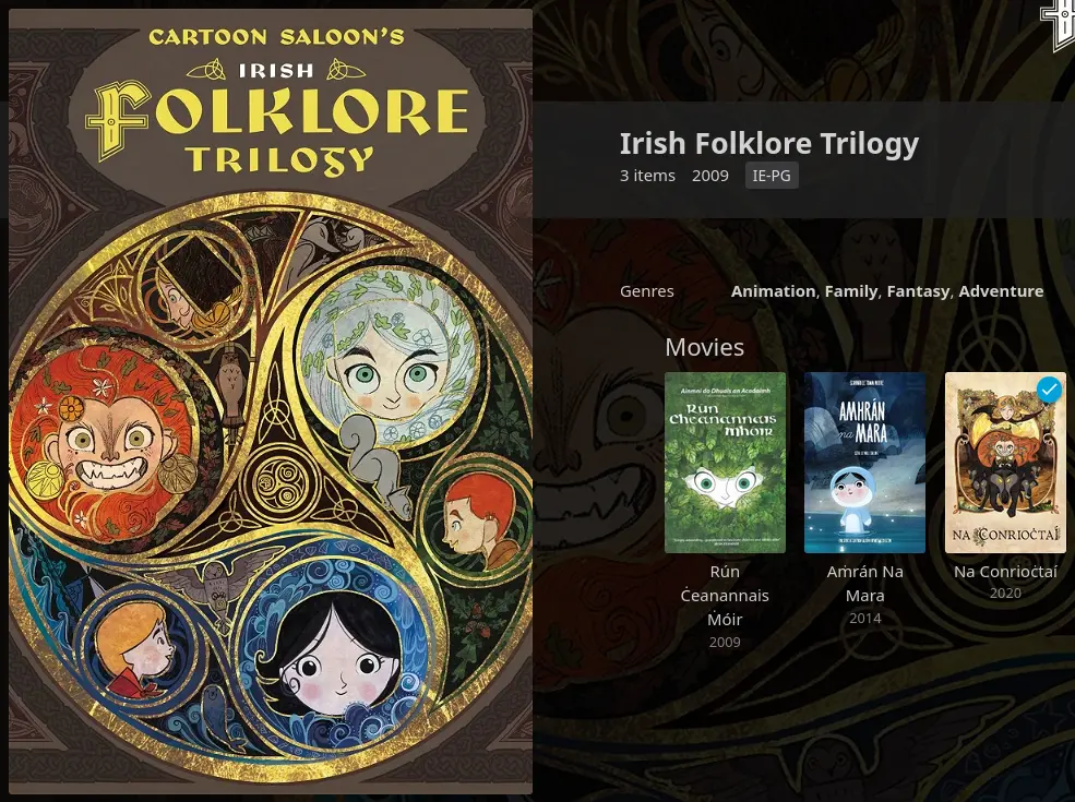
It has some other really nice features as well like telling you what time something will end at if you started playing now and letting you easily have multiple version of the same film under the same entry, letting you as easily select them as you would the right language for a movie with multiple audio tracks, so you can have both a bluray rip and the Morton Jankel cut of Super Mario Bros. together or the official black and white cuts of Fury Road or Johnny Mnemonic alongside the colour versions.
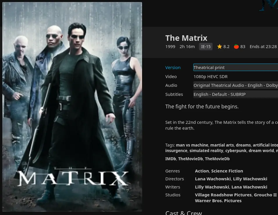
And of course you can also customise the artwork for all the different media categories, so mine look like this:
Chalmel de Vinario recognised that bloodletting was ineffective (though he continued to prescribe bleeding for members of the Roman Curia, whom he disliked)
I.T. staff installing McAfee on her boss’s computer.
I don’t talk about serious stuff much on here but I may have learnt a new way in which my body and/or brain is broken in the last week: migraines? Yay?
I adore that the Sonic Spinball options menu theme is now Surge’s unofficial theme song
https://www.youtube.com/watch?v=8uPJqSA-in4
Because of Nathalie Fourdraine’s video
https://www.youtube.com/watch?v=gVFGeuenBc4

I need to write posts that aren’t just technical updates about the site itself and the stuff copied over from my other accounts.
I have plans for stuff to write I have just been tired and sick and busy.

Migrating comments from Cusdis to Comentario
The story so far: I was using Cusdis to provide a comments section for the bog but it proved to be broken and unmaintained so I replaced it with a self-hosted instance of Comentario.
I am going to walk through what I did to set up Comentario and import old comments from Cusdis. This is not a guide and the scripts that are posted below have serious problems that should be fixed before being used and I am not going to be the one to do that and you would obviously need to change any references to oakreef.ie to your own site.
Subdomain
First of all I needed to have an address to host the Comentario instance at. I chose a new subdomain at comments.oakreef.ie and had to update my Let’s Encrypt certificates to cover that new subdomain. I did not save the commands I used to do that but it was pretty straightforward to do from the command line.
Docker
Then I installed Docker on my server and following Damien’s example with a few tweaks I created my docker-compose.yml and secrets.yaml files.
docker-compose.yml
version: '3'

services:
  db:
    image: postgres:17-alpine
    environment:
      POSTGRES_DB: comentario
      POSTGRES_USER: {INSERT POSTGRES USERNAME HERE}
      POSTGRES_PASSWORD: {INSERT POSTGRES PASSWORD HERE}
    ports:
      - "127.0.0.1:5432:5432"

  app:
    restart: unless-stopped
    image: registry.gitlab.com/comentario/comentario
    environment:
      BASE_URL: https://comments.oakreef.ie/
      SECRETS_FILE: "/secrets.yaml"
    ports:
      - "5050:80"
    volumes:
      - ./secrets.yaml:/secrets.yaml:ro
secrets.yaml
postgres:
  host:     db
  port:     5432
  database: comentario
  username: {INSERT POSTGRES USERNAME HERE}
  password: {INSERT POSTGRES PASSWORD HERE}
Changing the ports configuration to 127.0.0.1:5432:5432 means that the Postgres database is only accessible from the server locally and not publicly available. I also don’t have an email setup for the Comentario instance currently.
Launching the instance is then just a matter of:
sudo docker compose -f docker-compose.yml up -d
Nginx
Then I needed to modify my Nginx config to direct comments.oakreef.ie to the Comentario instance running on port 5050.
server {
	server_name comments.oakreef.ie;

	listen 443 ssl;

	ssl_certificate     /etc/letsencrypt/live/oakreef.ie/fullchain.pem;
	ssl_certificate_key /etc/letsencrypt/live/oakreef.ie/privkey.pem;
	include /etc/letsencrypt/options-ssl-nginx.conf;
	ssl_dhparam /etc/letsencrypt/ssl-dhparams.pem;

	location / {
		proxy_pass http://127.0.0.1:5050;
		proxy_redirect off;
		proxy_http_version 1.1;
		proxy_cache_bypass $http_upgrade;
		proxy_set_header Upgrade $http_upgrade;
		proxy_set_header Connection keep-alive;
		proxy_set_header Host $host;
		proxy_set_header X-Real-IP $remote_addr;
		proxy_set_header X-Forwarded-For $proxy_add_x_forwarded_for;
		proxy_set_header X-Forwarded-Proto $scheme;
		proxy_set_header X-Forwarded-Host $server_name;
		proxy_buffer_size 128k;
		proxy_buffers 4 256k;
		proxy_busy_buffers_size 256k;
		add_header Cache-Control "private";
	}
}
Importing comments
Once there were a few comments on the new system I used the export feature in Comentario to get a JSON file and looked at how Comentario defined comment data in that. I also manually went through all the comments on the old system and made a basic CSV file of all of them with the author name, date posted, the URL of the post the comment was on and the text of each comment. I then wrote this Python file to take the exported Comentario comments—named basedata.json—and the CSV with the old Cusdis comments—comments.csv—and exported a new file with the combined data in the Comentario format.
There are some problems with this!
- When importing data Comentario does not check for duplicates. I ended up creating duplicates of all the new Comentario comments that already existed on the site doing this and had to manually delete them. If you are doing this do not include existing comments as part of the file you are creating to import.
- I did not include replies at all. I decided to try importing replies I had made to people as a second, separate, step (see the second Python script below). This made things more awkward down the line. Do everything in one batch.
import csv
import json
from datetime import datetime, timezone
from dateutil.parser import parse
from pprint import pprint
from uuid import uuid4

now = datetime.now()
pages = {}
site_url = 'https://oakreef.ie'
date_format = "%Y-%m-%dT%H:%M:%SZ"

my_id = "ADMIN USER UUID"

with open('comments.csv', newline='') as csv_file:
		csv_reader = csv.reader(csv_file, delimiter=',', quotechar='"')
		for row in csv_reader:
				author, date, url, text = row
				date = parse(date)

				if url not in pages:
					pages[url] = {
						'comments': []
					}

				pages[url]['comments'].append({
					'author': author,
					'date': date,
					'text': text
				})


with open('basedata.json') as json_file:
		data = json.load(json_file)

domainId = data['pages'][0]['domainId']

for url, page in pages.items():
	page_id = str(uuid4())
	data['pages'].append({
		'createdTime': now.strftime(date_format),
		'domainId': domainId,
		'id': page_id,
		'isReadonly': False,
		'path': url,
	})

	for comment in page['comments']:
		comment_id = str(uuid4())
		data['comments'].append({
			"authorCountry": "IE",
			'authorName': comment['author'],
			'createdTime': comment['date'].strftime(date_format),
			"deletedTime": "0001-01-01T00:00:00.000Z",
      "editedTime": "0001-01-01T00:00:00.000Z",
      "html": f"\u003cp\u003e{comment['text']}\u003c/p\u003e\n",
			'id': comment_id,
			'isApproved': True,
			'isDeleted': False,
			'isPending': False,
			'isSticky': False,
			'markdown': comment['text'],
			"moderatedTime": comment['date'].strftime(date_format),
			'pageId': page_id,
			'score': 0,
			'url': f'{site_url}{url}#comentario-{comment_id}',
			'userCreated': '00000000-0000-0000-0000-000000000000',
			"userModerated": my_id
		})


with open('import.json', 'w') as import_file:
	json.dump(data, import_file)
When that was done I put it away for a while as I wasn’t feeling well and eventually came back to do replies. I, again, manually went through all replies I had made to comments on the old system and made a CSV file with the reply date, URL of the page, the UUID of the parent comment as it existed in the new Comentario system, the UUID of the page the parent comment is on in teh new Comentario system and the text of the reply.
Two things are important to note about this:
- It was a pain in the hole. If I had done replies at the same time as the rest of the comments I could have used the UUIDs that I was generating in the script rather than going to find them manually and making them into a CSV.
- The initial upload failed as apparently Comentario couldn’t match the page and user IDs to what was in the database and it needed those to be in the import file. I got around this by doing another export and copying the entries for pages and commenters from that into the new one and uploading. This was not a good way to do this! It could have gone badly or had unexpected side effects. Again, if you’re doing this do not import comments and replies as two separate steps!
- It still didn’t fully work anyway. My replies did import and do show up on the right pages but they are not nested properly as replies. It’s like looking at a comment section on a very old Youtube video where reply chains are broken and everything just displays as individual comments. I don’t think that I am going to bother trying to fix this as I don’t have that many comments on this site and I think everything reads understandably as it is but if you want to try this approach you will want to figure out a way of not fucking up importing the replies.
import csv
import json
from datetime import datetime, timezone
from dateutil.parser import parse
from pprint import pprint
from uuid import uuid4


now = datetime.now()
site_url = 'https://oakreef.ie'
date_format = "%Y-%m-%dT%H:%M:%SZ"

my_id = "ADMIN USER UUID"

data = {
  "version": 3,
  "comments": [],
}

with open('replies.csv', newline='') as csv_file:
		csv_reader = csv.reader(csv_file, delimiter=',', quotechar='"')
		for row in csv_reader:
				date, url, parent_id, page_id, text = row
				date = parse(date)

				comment_id = str(uuid4())

				data['comments'].append({
					"authorCountry": "IE",
					"createdTime": date.strftime(date_format),
					"deletedTime": "0001-01-01T00:00:00.000Z",
					"editedTime": "0001-01-01T00:00:00.000Z",
					"html": f"\u003cp\u003e{text}\u003c/p\u003e\n",
					"id": comment_id,
					"isApproved": True,
					"isDeleted": False,
					"isPending": False,
					"isSticky": False,
					"markdown": text,
					"moderatedTime": date.strftime(date_format),
					"pageId": page_id,
					"parentId": parent_id,
					"score": 0,
					"url": f'{site_url}{url}#comentario-{comment_id}',
					"userCreated": my_id,
					"userModerated": my_id
				})


with open('reply-import.json', 'w') as import_file:
	json.dump(data, import_file)
My avatar
One last thing is that Comentario doesn’t allow GIF avatars, but I like my sparkly Jupiter. After looking at the Postgres database I could see that user avatars are simply stored as binary data in the table cm_user_avatars with three sizes avatar_l, avatar_m and avatar_s corresponding to 128×128, 32×32 and 16×16 pixels, respectively, so I made some GIFs in the appropriate sizes, converted them to binary strings, and overrode the avatar_l and avatar_m entries in the cm_user_avatars table manually (I left the avatar_s as a JPEG).
UPDATE cm_user_avatars SET avatar_m = '\xBINARY_DATA_HERE' WHERE user_id = 'UUID_HERE';
This seems to work without any problems and my avatar in my own comments section is sparkly now.
Conclusions
That’s it I hope I don’t have to worry too much about this setup again for some time.
We Finally Know Why Ancient Roman Concrete Was So Durable
The team tested their findings by making pozzolanic concrete from ancient and modern recipes using quicklime. They also made a control concrete without quicklime and performed crack tests. Sure enough, the cracked quicklime concrete was fully healed within two weeks, but the control concrete stayed cracked.
https://www.sciencealert.com/we-finally-know-why-ancient-roman-concrete-was-so-durable
Arguments based in evolutionary psychology are always a bit suspect but are truly silly when you are at all familiar with the breath of kinks that people have. I have friends who are turned on by the idea of being transformed into a pool toy. I think that there are deeper and more chaotic processes involved in human desire and behaviour than a very basic model of direct evolutionary pressures leading to the actions of individual people.
If one is sent a form in .docx format one should legally be allowed to respond with missiles.
The year is 2025. The smart bomb has been replaced with the woke mob.
Consider This Grape-Nuts Ad

I found this image saved in my phone. I have no idea where I found it. Someone probably shared it on Cohost.
There's so much to consider here. The beefy box of Grape-Nuts holding the man, apparently steadying him. The incredible type setting. The copy itself. The fact that the product's slogan appears to be, "There's a Reason."
It reads like it was written for Orson Welles by an alien.
Mm yes, I love to ingest the food elements Nature has stored up in wheat and barley. And I especially love when they combine, in the blood, with albumen to repair and build up my cells.
Thanks, Grape-Nuts!
Podcast were the hosts track down and watch/listen/read every single official and unofficial version of Shada, including every version of Dirk Gently’s Holistic Detective Agency, and slowly lose their grip on reality.
Oh no I’ve convinced myself this is a good idea.
Broader just like a podcast about weird, funny or interesting adaptations would be something I would really enjoy doing I think.
There are so many weird novelisations.
what if instead of Goku training super hard to defend the Earth from new threats they just gave Launch increasingly bigger guns
I am seeing people on Tumblr talk about the murderbot show and if it is going to have the emotional depth of the original murderbot source material and be true to its handling of the muderbot’s relationship to gender and I don’t know if this is a bit or not and I refuse to look it up.
I was in Forbidden Planet and decided it would be nice to have physical copies of some of the prettier Sonic one off stories and then I was told there was a 3 for 2 so I grabbed a random volume of reprinted Doctor Who Magazine comics as well
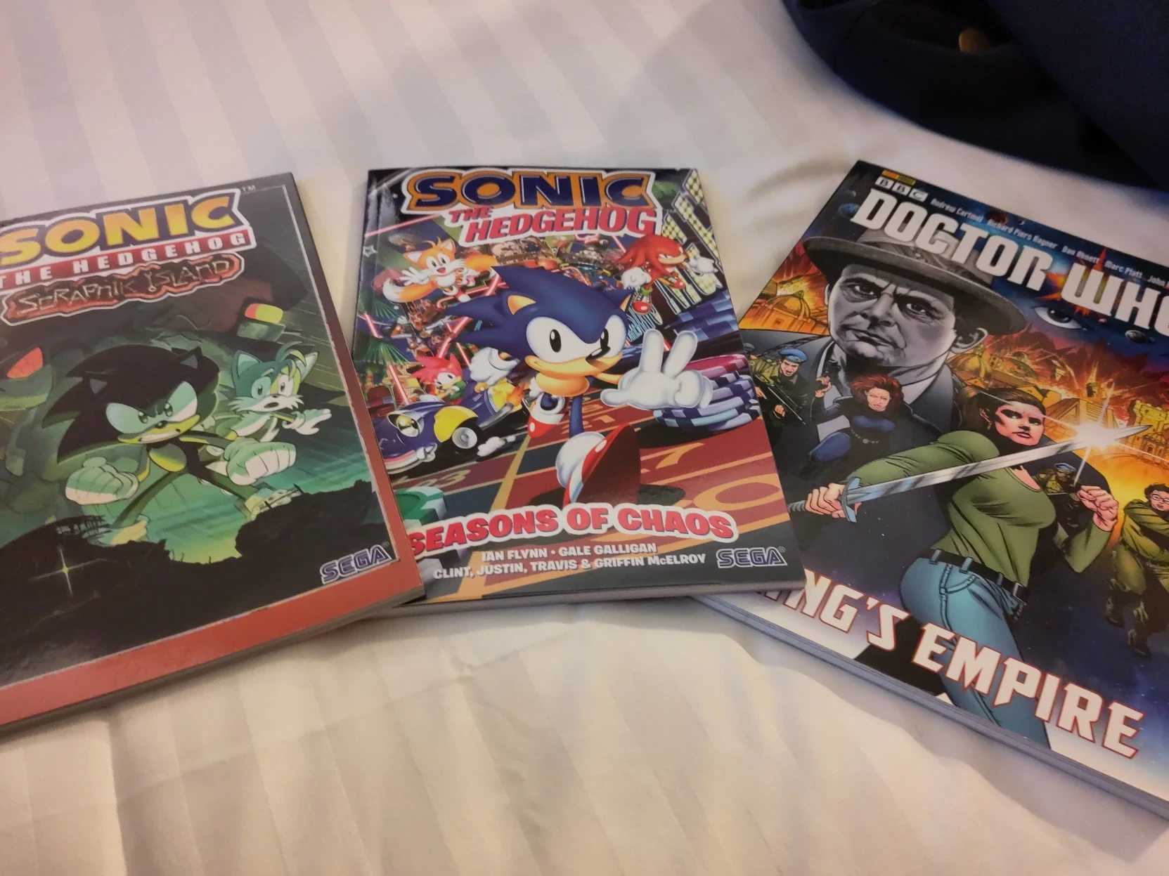

Filling out my one film per year list
When I made my one game per year list I went back as far as 1990. This was because at that point I was struggling to come up with games I had actually played for a given year and while I could probably have filled in some stuff for the 80s, 1990 seemed like a good place to stop because it was a nice even number and also the year I was born.
When I went to do my one film per year list I stopped at the same point. I hadn’t put much thought into that, covering the same years for the list just seemed the obvious thing to do to me. When I shared it with some people they asked why stop there and some of them made their own lists, going back much farther in years and certainly further than when they were born. So I decided to go back look at how I would expand out the list back in time.
I haven’t updated the list yet but with just my preliminary scan through Letterboxd’s lists of movies by year I surprised myself with how few gaps I had. I was expecting to have trouble filling in entries once I hit the 70s on but it’s not till 1970 itself that I hit a gap where I don’t think that I’ve seen anything from that year and it’s not till the early 50s where I start to have more years where I don’t have anything than do.
But for 1970 I’ve been meaning to watch Crimes of the Future and I have other films that interest me for many of the gaps in my list, so I think I’m going to try to fill in the gaps in my list pushing it back a bit more before I update it and post it again, so expect me to post some reviews for older movies to my Letterboxd.
And if you have any recommendations for movies from 1955 or earlier I would be all ears to hear them. Or also for 1969 in particular as well because that is a year I seem to be struggling to find something I want to watch for.
The Nothing Expanded Universe
one film per year 1990-2024
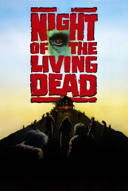




















New comments section with Comentario
I have finally set up a replacement for Cusdis. Following Damien’s example I have set up a self-hosted instance of Comentario.
You can comment with or without setting up an account. If you create an account please don’t forget your password because I do not have an email account set up for it to send out password resets but also please don’t reuse a password because you should not trust me with that.
I will try to transfer old comments from Cusdis over but that won’t happen immediately.
I have also set up a page that has all my bog posts without the stuff syndicated from other sites mirroring the existing Atom feed that does that.
I reserved a copy of This Is How You Lose the Time War in the library in July of 2023 and it is finally available to pick up
Donkey Kong Jr. while still a child kart raced Mario. Now his son adult son, Donkey Kong, races Mario. From this we can conclude that the lifespan of a jumpman is much longer than that of a kong.
we should extend the International Phonetic Alphabet to include all the noises cats make
I am getting cold but there is a cat asleep on my lap so I cannot get up to put on a jumper so I guess that I am just going to die
teardown of the worst bike in the world
https://www.youtube.com/watch?v=MgPUpccQ_mw
please stop calling things “lost media” because it’s not on Netflix
still waiting on that Intel® software technology...

some things I made
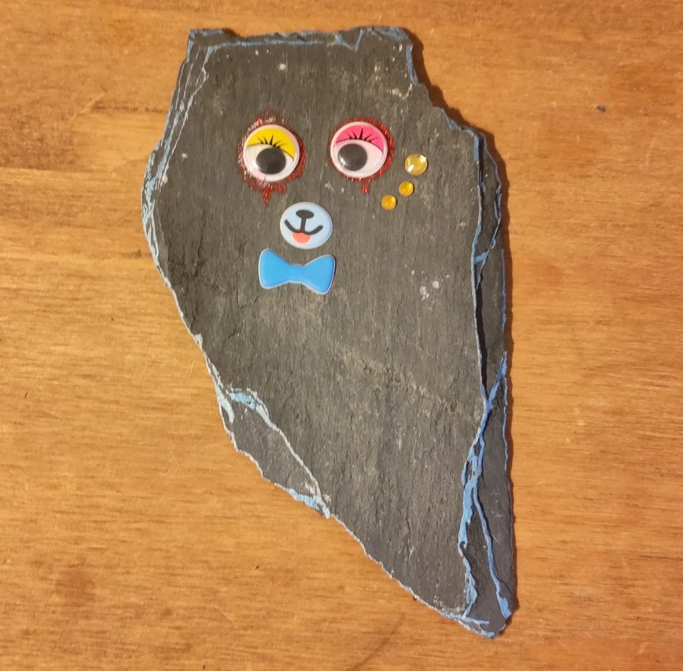

Somehow pasting text is broke in Visual Studio Code and a fix for it is to unbind the default Ctrl+V shortcut.
https://github.com/microsoft/vscode/issues/238609
please write to your member of parliament to tell them to listen to my podcast
be the sea you want in to change the world
my girlfriend is so sweet and kind and also evil and mean to me (in ways that are fun)

Keyboard navigation
Small little bit of Javascript added to the site for navigation with Vim-style keyboard shortcuts. Ctrl+→ and Ctrl+← will navigate to the previous and next post, respectively. This will work on both pages for individual posts and on main bog page and also on pages for podcast episodes and gallery exhibits.
date night date bite
This lettering is annoying me because I know exactly what mistake was made when typesetting it and it’s consistent through the entire volume.
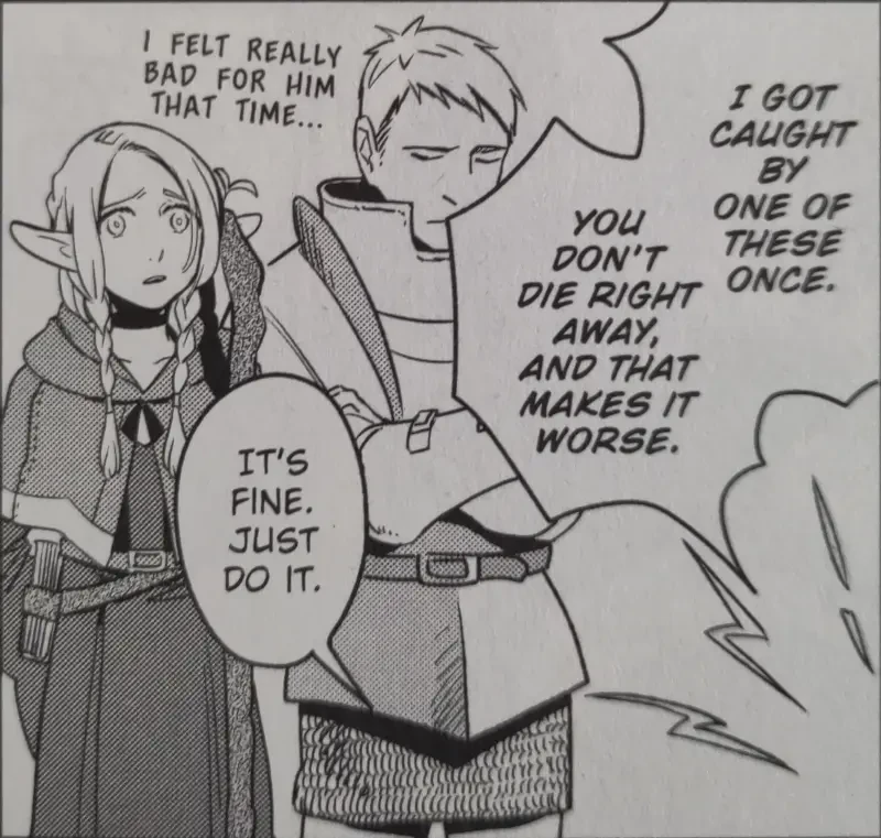
(the i should only be written with serifs when it’s a pronoun, but the font they used encodes this by having the capital i being seriffed, so they’ve ended up writing every sentence that starts with an i with a seriffed i)

Goodreads
I’ve added reviews from my Goodreads profile to my syndication sources for the bog. I did try to look into alternatives not owned by Amazon but Goodreads won out because it actually has RSS feeds.
Normal things to suddenly want to do: Pour over every use of <em> tags on one’s website and try to decide which ones should be converted to <i> tags.
any good whale fall lately?
meet me in the airport ’Spoons for an ass-kicking

reading Becky Chambers in the airport ’Spoons and sobbing
I want to figure out how to get Feedbin to display my posts with an avatar as it does this for Mastodon posts.
There’s a blog post here that says “The great thing about this is that there’s nothing actually Mastodon-specific here. Any RSS feed can be styled this way.” but there doesn’t seem to be any documentation on how this is handled or how to use this.
Digging through the source code it seems like it’s based on whether the first post that’s parsed from the feed has a title or not.
Frustrating that it would be such an all or nothing thing for the entire feed about whether it should be considered microformat or not and that you can’t have avatars and post titles together. I’m also reluctant to remove post titles from my Atom feed as that seems like that could not play nicely with other readers.
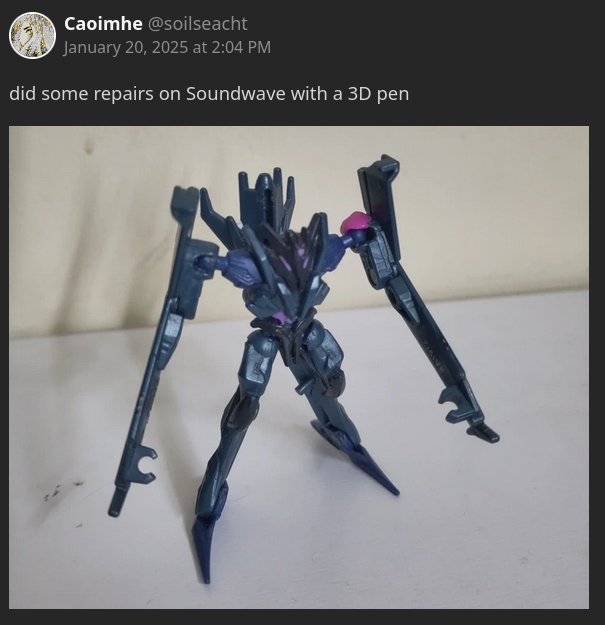
did some repairs on Soundwave with a 3D pen

I’ve read these before but I’m reading through Joe Wintergreen’s posts commenting on Half-Life 2’s source code and one of the comments made me smile in the coding for the fast zombie’s leap
// Take him off ground so engine doesn't instantly reset FL_ONGROUND.
//
UTIL_SetOrigin( this, GetAbsOrigin() + Vector( 0 , 0 , 1 ));
Because I did the exact same thing in Snolf RB2 when taking a shot. Teleport one unit up so that you’re not on the ground any more.
https://www.joewintergreen.com/half-life-2-source-code-a-trawl/

Big earring doesn’t want you to know you can just put a fishhook in anything
I don’t wear jewellery much but I still have an occasional hobby of making my own earrings and I just enjoy a good kitschy earring in general.
Here’s some things I have stuck a fishhook in:






Some other earrings that I didn’t make but felt like showing off.

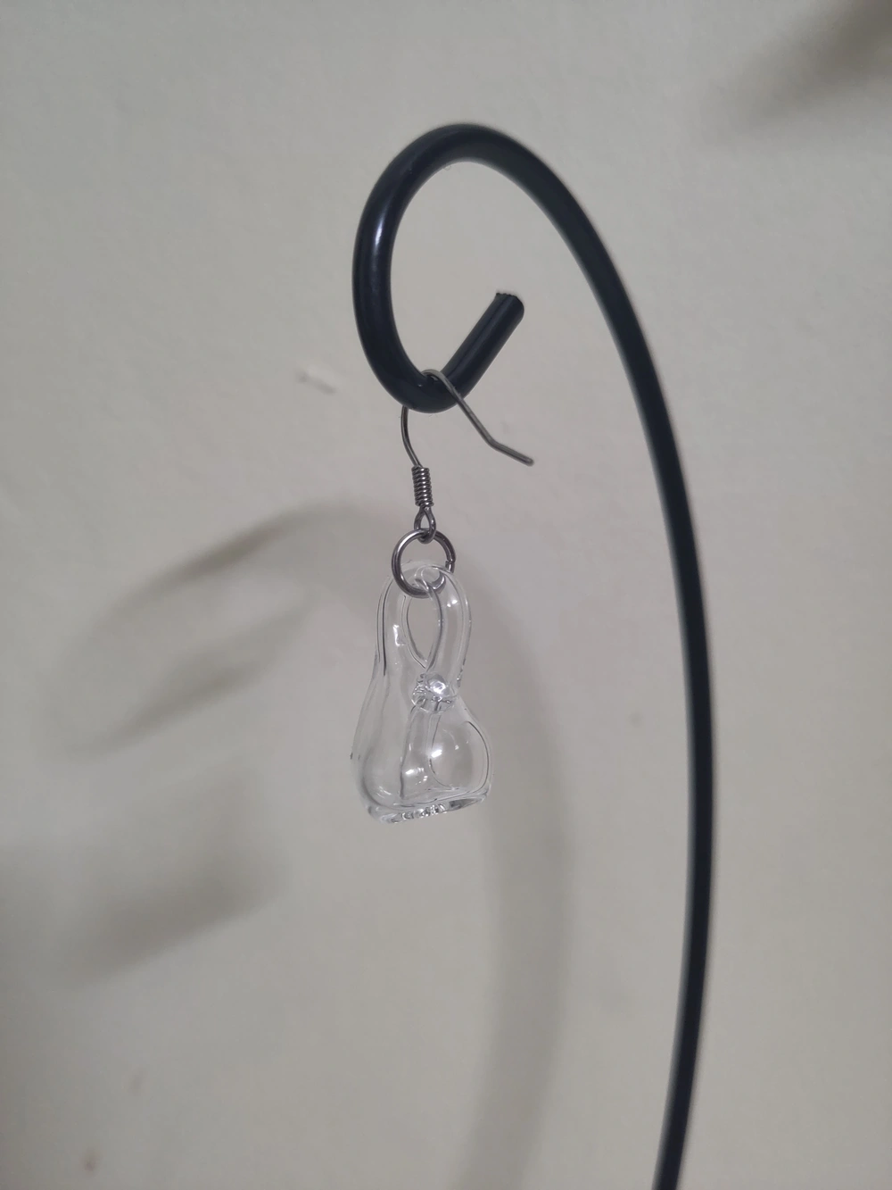
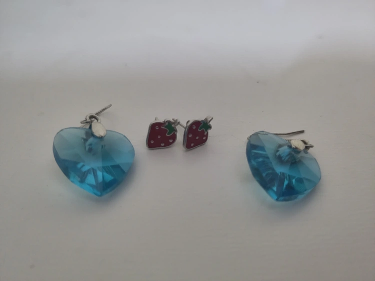
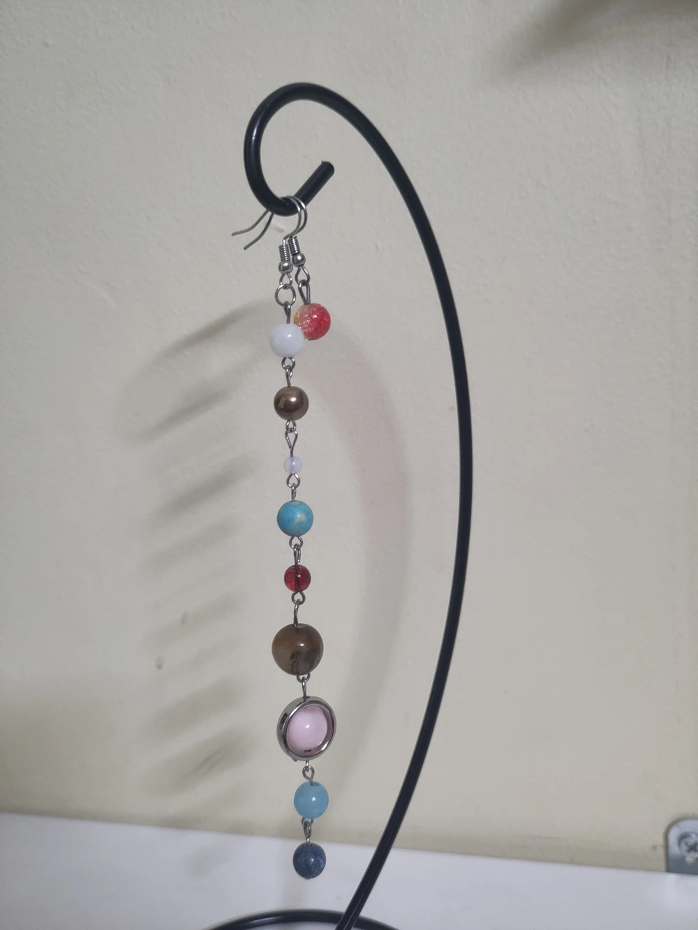


Reminders to myself
There are some things that I do occasionally but never often enough that I remember the procedures for them, e.g. if I use my printer’s scanner to scan to a USB stick what format does the USB stick need to be formatted to. I have started just writing this on the printer itself with a pencil.
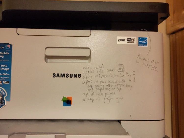
When I did this I was at first hesitant to “deface” my printer, but that’s silly. It’s my printer and I do not have it to look pretty. I think I should do this more often. I already have a giant stack of plastic drawers all labelled with their contents and I think I should label things more often with these kinds of reminders to save myself frustration. With my brain it’s the only way I can remember where anything is or procedures for using things.

Cusdis problems
Cusdis appears to not be refreshing my monthly comment allowance so I am not able to approve any new comments. I reported this issue a week ago but I think that the developer is not currently working on the project. I may look into getting up a self-hosted version set up and migrating all existing comments to it but I am not sure when I’ll be able to get that done.
love to make plans every evening that amount to, “tomorrow, when my executive dysfunction has magically disappeared...”
any recommendations for things to do in Edinburgh?

I added a page to the site dedicated to my cat, Easóg
one game per year 1990-2024





















What I’m reading vol. Ⅳ½
This post quotes writing about sex and kinks.
In the last roundup post I linked to a piece by Devon Price. I was not aware of him before coming across a link to that piece myself but he seems to be quite a prolific writers. I’ve been going through some of his pieces and not only are they very interesting but they also speak to my own experiences in many ways as well, though quite different in others. I am being deliberately unspecific here about which parts are which, but I wanted to just link to a few more of his pieces and would just generally recommend reading his writing I think.
Common Phases of Accepting You're Autistic
The questioning phase is perhaps the most challenging one to move forward from — because to openly declare that you have a mental disability is to immediately call your own capacity to understand and interpret things into question. If other people can’t see how much you’re suffering, they will accuse you of being crazy and faking it. If they can see your struggles, they’ll accuse you of being too crazy to understand those struggles yourself.
The Asexual Fetishist
There’s nothing especially alluring to me about any type of body, or any type of face. The idea grabbing a dick or cupping a pert ass feels a bit formal, as if I were examining a purebred at a dog show. I can recognize the differences between one type of person and another, and even recognize the qualities that someone else might like, but to me all these gradients just dissolve into a bland field of fleshy sameness.
I’m equally bored by the mechanics of sex: the motions and stimulations bring me absolutely no pleasure. An attractive and attentive stranger could rub the correct spots on my body for hours, with the exactly right pressure and speed, and I’d only feel hollow if the experience weren’t also combined with some mind-controlling mantras or a swinging pocket watch.
Hypnosis is sex to me. Even in its most stagey and sterile forms, I find it inescapably erotic — and that leaves sex itself as just some boring party trick. You can touch me, or you can perform a series of backflips in front of me on the floor; either way I’ll tell you that you’ve done a very impressive job and all but it will not make me cum.
A Non-Disposable Place
That’s one thing that people don’t talk about, when they complain about landlords: how much disregard for your surroundings that renting breeds in you. It’s not only that the owner of your building never cleans the pipes. It’s also that you have no reason to feel invested in the pipes’ long-term functioning, and every reason to feel bitter about the thousands of dollars you’re already wasting on a broken building each year.

I’m sorry I’m going to rant about large language model bots now
Instagram have started creating fake accounts that post entirely machine-generated images and text. They will reply to you if you comment under their posts or direct message them.
Update: Apparently the specific account I was referencing here is an experiment from 2023 and doesn’t post any more but still replies to direct messages. People thought it was new due to some recent announcement about bot accounts and I didn’t dig into it myself. The rest of my frustrations with how people treat these things remains.
I mostly want to talk about stuff I like on here and not just add to endless bitching about bad stuff but I just needed to write out some frustrations I have with how people talk about these kinds of large language model bots.
I have seen people posting their conversations with it and attempting to ask it various things about itself and how it was created to try and dig for information on it or just to create gotcha moments they can screenshot and it makes me want to scream.
I won’t link to any of those for a few reasons, but the one I want to state is the same reason that these screenshots make me want to tear my hair out: Large language models are machines that make up nonsense constantly. The text it generates does not have semantic content and least of all meaningful information about itself. It is not worth looking at specific responses it gives. And so because of that: Stop asking it about itself. It is not capable of knowing anything. It takes a processed set of training data and whatever input it has (its prompting that you are not able to see plus whatever text you send it) and then generates output that is a statistically likely continuation of that.
People are asking it what is the diversity of its team of creators and get a response about how it was mostly white people. It doesn’t know that. Again. It doesn’t know anything. It is incapable of knowledge. But it will generate something that is a likely response to a question of this nature. The training data that was used to create it has many texts about how American software development is very white and it will create a response in this vein.
People have asked it who led the project that created it and it spat out a name and people are trying to dig up information from the Linked In profile of a Facebook employee with a similar name.
People are asking it to repeat its prompt and then analysing its response to make judgements on the people that wrote it. This is at least asking it for something that the model actually has as part of its input so it might result in text that is a copy of or close to things it was actually prompted with. But it mightn’t. It could be anything. People asking bots to repeat their prompt is now an established trope in online writing that is pulled for training data for these models and so its output to this type of question will be influenced by the presence of such texts in its training corpus as well.
There is no way to trick these bots into meaningfully divulging information because facts are not a thing that exist to it. You are at best nudging it in a direction where it is more likely to output text that happens to line up with reality. This is more likely to happen for widely known and repeated information that exists in its training data a lot. If you ask it the capital of France it will probably say Paris. But there is no reason to think that its training data contains any meaningful information about itself and even if it was prompted with information like that what information it was given would be entirely under Instagram’s control and why the fuck would trust Instagram to be honest either?

The annual Celeste race
Since New Year’s Eve 2021 some some friends and I have done an annual race of the game Celeste. We all start at the same time and then the first person to get to the summit wins. We track it using the in-game speedrun timer.
2021
I was very into Celeste at the time and won by a pretty wide margin. I don’t have a record of how everyone else did, but I completed the game in just under two hours, with three hundred and six deaths and six strawberries1.
| 🏃 | ⏱️ | 💀 | 🍓 |
|---|---|---|---|
| 🥇Caoimhe | 1°54′55.047″ | 306 | 6 |
2022
After this two of my friends got into the game very hard. My friend Ruby ended up getting most of the golden berries2, something I haven’t even attempted and another friend, who wished to be called The Shadowblade in this post, started getting into Celeste mods. So when the next race happpened on the
| 🏃 | ⏱️ |
|---|---|
| 🥇Ruby | 1°22′10.918″ |
| 🥈Caoimhe | 1°51′25.318″ |
| 🥉The Shadowblade | DNF |
2023:
On the same day the next year myself and Ruby both improved our times, with Ruby coming in first again, a newcomer who I will call D. in second and myself in third. The Shadowblade did not finish again.
| 🏃 | ⏱️ | 💀 | 🍓 |
|---|---|---|---|
| 🥇Ruby | 1°08′01.275″ | ||
| 🥈D. | 1°21′03.071″ | ||
| 🥉Caoimhe | 1°34′46.007″ | 245 | 0 |
| 🏅The Shadowblade | DNF |
2024:
The next race was on the
| 🏃 | ⏱️ | 💀 | 🍓 |
|---|---|---|---|
| 🥇Caoimhe | 1°12′40.296″ | 128 | 0 |
| 🥈Ruby | 1°14′53.679″ | 144 | 3 |
| 🥉The Shadowblade | DNF |
We also decided to do a little race of the Pico-8 version of Celeste, which Ruby won.
| 🏃 | ⏱️ | 💀 | 🍓 |
|---|---|---|---|
| 🥇Ruby | 5′11″ | 29 | 4 |
| 🥈Caoimhe | 7′50″ | 57 | 1 |
2025
Finally, this year’s one took place on New Year’s Day. Ruby had a clear lead from the start and has gotten very close to the one-hour mark, just three minutes short of it. I came in second, doing a bit worse than last year, which shouldn’t be a surprise considering an hour before the race I posted about how worn down, tired and sore I was. The Shadowblade finished this time, coming in at just over an hour and a half.
We were also joined by our friend Stella who had never played Celeste before but decided to join in on the race. After the rest of us had finished Ruby said if that Stella actually finished she would forfeit her victory to her and shockingly Stella actually did. She finished the game in one sitting in just over ten hours with closing in on four thousand deaths and nine strawberries.
Ruby insists that I should record Stella as the winner, but I am a petty bitch and I never said that I was going to forfeit. If she wants to fine but if I she does I’m saying that makes me the winner.
| 🏃 | ⏱️ | 💀 | 🍓 |
|---|---|---|---|
| 🥇Ruby | 1°03′38.846″ | 75 | 1 |
| 🥈Caoimhe | 1°22′37.421″ | 190 | 0 |
| 🥉The Shadowblade | 1°31′51.536″ | 275 | 0 |
| 🏅Stella | 10°06′38.428″ | 3839 | 9 |
2026
Maybe next year we will come in under the one-hour mark?
-
Strawberries are optional collectables throughout the game. They don’t mean anything for the race but the game records how many you collect so I’ve included them for the runs that we recorded that information for. ↩
-
A challenge for completing chapters in zero deaths for a game where an average number of deaths per playthrough is in the thousands. ↩

2024
I lost and gained people I love in 2024. The year started off well. I won a Celeste race that myself and some friends do every New Year’s. I chosted a roundup of every film I had watched in 2023 to Cohost. I don’t think that I’m going to do that again this year. I don’t have the energy for it. I’ve been dealing with back pain issues for a while that are stopping me sleeping well.
In February I replaced my memory foam mattress with a spring one and it seemed to help for a while but then the pain came back. This repeated throughout the year with me finding things that seemed to give a temporary reprieve, only for me to start waking up in pain again. It’s not as bad as it was but I am still struggling with it. I am going to try going back to a physio again. I was not happy with the last one and when he moved his practise I did not feel very motivated to find a new one, but a friend recommended their physio to me over the holidays and I’ll give it another go.
Also in February my partner moved to Copenhagen. I knew it was coming, this had been planned for a long time, but when it actually happened it hit me very hard. She visited in the summer and I flew out to Copenhagen with some our friends in October too, but I want to make an effort to see her more, even if I do find travelling very draining.
Also also in February I dropped my phone in the toilet. It’s a Fairphone and designed to be able to be taken apart easily with just a screwdriver to swap parts, so it’s not very waterproof, and the screen stopped displaying anything. Thankfully disassembling it and drying it out thoroughly brought the screen back to life, but even if it hadn’t I would have been able to replace the screen.
In March I got a fancy folding, electric bike. I have not used it quite as much as I planned, especially over the winter when it has been cold and I have been struggling with lack of energy, but it has been very handy for certain journeys that public transport doesn’t adequately cover. I also experimented a bit with being horny on main with Cohost. It has really been the only place online where I felt safe and comfortable enough to do that. Part of that is just over getting more comfortable with myself and kink stuff, but Cohost was just a friendly place for me and I was inspired by other people I followed sharing their own kinks in very cute ways. Cohost shutting down has been upsetting for a lot of reasons but this is one of them and it’s hard to get comfortable about this stuff again in other contexts.
April was a huge month in retrospect. A friend asked me out and tentatively said yes, not really sure how it was going to go and I’ve never done polyamory before. I am so glad that she did. I love her so much. Both of my partners are autistic and ADD or ADHD and getting to know them and how wonderful, funny and utterly charming they are has helped me explore those parts of myself and see them as something to embrace. I’ve been learning to love myself through loving them. I am still undiagnosed but I am pretty sure.
And me being undiagnosed is not for lack of trying. Also in April was my first appointment at a local public mental health unit that I had been referred to over a year prior for an ADHD assessment. I calmly explained how much I struggle day to day and what I have to do to cope with it, which the doctor seemed to take as me managing pretty well. I realised from this conversation that doctors are basically just like dogs: They don’t really understand what you’re saying they just hear tone and maybe a few basic keywords. The health service is a paternalistic, condescending trap and you need to ritually humiliate yourself to them until they deign you worthy enough of the charity they so magnanimously bestow. I dropped the masks, let myself unravel and started sobbing in front of them.
This got me another appointment. They wanted to dig into my childhood, interview my mother. Quite frankly I don’t give a shit if I had ADHD as a child. Requiring that as part of diagnosis seems utterly pointless. I do not have a time machine with which to go back several decades to when that might matter. I am struggling now. That interview never happened, anyway. Appointments got delayed, doctors were busy. I got given a multiple choice form to fill out about my childhood again, some of which asked multiple questions as a single item which don’t necessarily have the same answer. Was I a good student and did I do well in tests? No, I was an awful student who ignored her teachers whenever I could get away with it and just read ahead in the book myself because I found that more interesting and I did will exams. I struggled massively in university when I finally hit a wall of subject matter that did not come easily to me as I had never learned how to study properly.
I of course got fucked around for another few months before being finally told I have ADHD and they are not going to treat it. I guess I’m functioning too well, though I don’t have any of the specific reasoning because the doctor who told me this was one I had never seen before and was just paraphrasing a letter that she refused to give me a copy of. I am still waiting on the results of a Freedom of Information Act request for my documents from these appointments that is almost two months overdue.
I started singling lessons in April but I failed to keep going with them. That’s far from the only thing I have failed to keep at since then. I’ve been struggling a lot as the year has worn on. I hope I can get back to the energy and spoons I seemed to have last spring again in the coming months. Going back over my diary for the year it’s a stark reminder of how much things were looking up then. April was also the last time I saw my friend Hellen. She had moved away and was around for a visit. I had a lovely time with her. I didn’t speak to her much after that and she died suddenly in August. I did not make it to the funeral, it was overseas, but some other friends did at least. Back here we had a memorial picnic for her.
Before that the summer was pretty damn good, though. Got closer to the new partner, got to see the old partner. I tried ritalin that was given to me—by a friend, not a doctor—and wow that does certainly help a lot. I wish it was possible to actually get treatment through the medical system. Oh well! I rationed them for bad days and they helped me get through a lot of shit. I also marched in a pride parade for the first time. I also met some kink people in person who were lovely.
Well. They were certainly lovely at the time. In August I learnt that one of the people I had met there had be accused of repeatedly spiking drinks at other events. Hellen died, as established, and then in September it was announced that Cohost was shutting down. I hope it doesn’t come across as callous when brought up in the same breath as my actual friend dying, but I also have grieved for that website. I was devastated. Cohost helped me a lot in this last year to embrace more parts of myself, be more open about certain things and it was also just a place that was actually fun and a bright spot in my life. I wouldn’t be posting on my own site if it wasn’t for it. It sparked creativity in a lot of people and reminded us that we can be thoughtful of how we use the internet and communicate with people. This site existing in its current form is because of Cohost.
I visited Copenhagen in October with some friends. I had a lovely time but I find travelling exhausting. I think I was a bit run down afterwards and got sick a few times. I might still be recovering from it all. My cat also got out and was missing for a few days, which didn’t help, and coming up to the Christmas holidays I had the most stressful time I’ve had in my current job. I’ve had two weeks’ holidays and I feel like it really wasn’t enough.
I did have a lovely Christmas with my newer partner, though. We had Christmas dinner with a group of other local trans people, played Mario Kart and watched Doctor Who. Ideal Christmas.
And now. I guess I still need to recover and heal. As I’m writing this my back pain is flaring up again. I need to get up and do some stretches before this year’s Celeste race this evening. We’ll see if I can keep my crown. I haven’t done much practising but I don’t think anyone else has either. It’s just a bit of fun.
in Shadow Generations the reason that you can use Doom Blast on the mass-produced Death Egg Robots is that they have black arms
my headphones broke and now I am unable to function

If don’t want to follow my posts but not see the movie reviews, etc. here’s a new feed for that
I made some updates to the site yesterday, including a smaller feed at /beag.atom1 that only includes posts I write for this site itself, not the ones copied from my Letterboxd, Serializd, Backloggd or Fediverse accounts or things that I repost. Update: It will still include reposts.
I also added some art to the Transy page by Kate Barrett that I had forgotten to.
Otherwise it was mostly some layout and styling tweaks and fixes. Text in dark mode should be a bit brighter now, there’s custom text selection colours and on the homepage there’s one new 88×31 pixel button and an infobox telling you to install an adblocker if you don’t have one.
-
Beag is Irish for “small”. ↩
the great Sage, equal to Eggman

What I’m reading vol. Ⅳ
Vols.: Ⅰ, Ⅱ, Ⅲ, Ⅳ, Ⅴ, Ⅵ, Ⅶ, Ⅷ, Ⅸ, Ⅹ, Ⅺ, Ⅻ, ⅩⅢ
Doing another one of these. I still intend on doing rebogs as well and I’ve added some more styling to make reposts stand out from my own words and make a more clear divide between them.
History and science fiction
On Bread and Circuses — Bret C. Devereaux
Devereaux digs into the origin of the phrase “bread and circuses”.
So the surface reading seems clear: he is putting the Roman people on blast for letting their authority over public affairs be taken away, usurped by emperors who promise them bread and circuses (we’ll come to if this is an accurate representation of the history in a moment). They used to have all of this power, the power to bestow offices and armies, but now they cower fecklessly in the wake of imperial slaughter and arbitrary rule.
Except, of course – wait a minute – isn’t the theme of this passage that power is an unwise thing to ask for? The theme of the whole poem is that you shouldn’t be asking the gods for these sorts of things!
The Problem with Sci-Fi Body Armor — Bret C. Devereaux
Also from Devereaux.
Instead, where real armors evolve against threats, fictional armors evolve as a visual language, borrowing the design elements of other fictional armors far more often than they dip into their own historical exemplars, with the result that the whole thing sort of devours itself.
Fiction referencing exclusively other works for fiction rather than looking to the world is something I think about as well from time to time.
Book Review: War with the Newts — Nathan Goldwag
Goldwag reviews a book from the man who coined the word “robot”.
The novel starts with Captain van Toch, a Czech sea-captain in the service of a Dutch trading company, stumbling upon an isolated community of giant amphibians in the Dutch East Indies, living on a single tiny island, their numbers culled constantly by sharks. Van Toch realizes that they’re trainable, and extremely intelligent, and has the idea to plant colonies of them across the Pacific to work as pearl divers. After his death, the Pacific Export Company transitions from luxury goods to mass labor, selling newts across the world as an undersea work force capable of hydraulic and maritime engineering, which results in Newts settling most of the world’s coastlines and becoming an integral part of the global economy. “So now we find the salamanders on the road to their finest flowering; but the human world, too, is enjoying unprecedented prosperity. New continental coasts are being feverishly constructed, new dry land is emerging from where shallows used to be; artificial air support islands are springing up in the middle of the ocean.” (Newts, pg. 165). For all the absurdity, however, Čapek treats his topic seriously. We’re given footnotes, citations, discussions of legal dilemmas and cultural disputes, discourse on the economic impact of newt labor and how it affected different nations and groups, taxonomies on newt evolution and biology. It doesn’t feel like a cheap trick or a gimmick because it’s all done with such care.
Gender
Degendering and Regendering — Talia Bhatt
In short, to acknowledge transmasculinity, a society would have to first admit that manhood—just like womanhood—is a social class and not a 'natural' category. Its people would have to acknowledge that the desire for independence and self-actualization exists within all of us and is not, in fact, stored in the balls.
My Doctor Emailed Me Back — Abigail Thorn in Trans Writes
Thorn outlines very well the fundamental ideological problems in the NHS and how trans healthcare is handled that I think apply very well to the HSE here in Ireland as well.
There are even more serious charges. The coroners’ reports into the deaths of Sophie Williams and Alice Litman said lack of gender affirming care contributed to their deaths. That is to say, it is a matter of publicly recorded fact that the NHS’ failure to provide gender affirming care has contributed to the deaths of patients. Nobody at NHS England has resigned or faced consequences.
Of course panic, misinformation, and mistrust take hold in these conditions! Of course people come to believe the NHS are making secret plots behind closed doors! These conditions are entirely of the NHS’ own making. Slapping a famous trans person’s face on a new outreach program does nothing to address them. As I told Colonel Korn, if the NHS wants to increase trust they should start by apologising.
But the Colonel expressed his bind to me the same way every other NHS senior official I’ve spoken to has. The Department of Health and Social Care tells the NHS how they have to spend their money. The mandate they get from the Health Secretary tells them what services they have to commission: if it says “Ten more transplant wards,” they need ten more transplant wards, and that’s that. If it says “Spend £90m pathologizing trans people,” that’s what he has to do.
This point bears underlining: every single person I have spoken to in the NHS- from local GPs to the National bosses- told me they are powerless. There is nobody at any level of the organisation who takes responsibility for the state the service is in and the suffering it is causing. Every single person blames the person above them, even the man at the top.
Technology
Hitachi Hacking, part two! — Kore
Followup from the first of these posts.
In my last post, I succesfully made a bluetooth/wifi Magic Wand Plus. Unfortunately, though, I completely bypassed the original Hitachi board, which happens to be where all the buttons and LEDs are attached, so it was only usable remotely. To make the physical controls work again, I could either make my own copy of the Hitachi's board, with buttons and LEDs in the same places, or somehow reprogram the original board and make it do my bidding.
The first option requires a lot of measuring, which I find really annoying to do. So, let's hack the Hitachi's microcontroller!
React, Electron, and LLMs have a common purpose: the labour arbitrage theory of dev tool popularity — Baldur Bjarnason
I love economic forces.
MongoDB’s popularity among managers during its peak was largely down to the idea that you no longer needed a database expert. Just throw the data into the document DB puddle and let your existing less-specialised developers handle it. The promise of the document database during the peak of their hype was that you didn’t need to employ as many specialists.
Electron, PhoneGap, and React Native promised to let companies replace their expensive platform specialists with more commodified generalists.
Standardisation in web development lowers costs, increases predictability, and makes the various browsers more interchangeable. It’s a hedge that reduces the individual market power of each browser, but usually in equal degree while increasing the value of the overall web, leaving each browser vendor better off as a result. Their market share might not increase but they have a bigger cut of a larger pie. Incompatibility tends to drive developers and companies to other platforms, reducing the overall pie.
Standardisation of labour, conversely, does not benefit labour.
Open source maintainers are drowning in junk bug reports written by AI — Thomas Claburn in The Register
Everybody hates A.I! Here’s another reason to.
Whatever happens to Python or pip is likely to eventually happen to more projects or more frequently. I am concerned mostly about maintainers that are handling this in isolation. If they don't know that AI-generated reports are commonplace, they might not be able to recognize what's happening before wasting tons of time on a false report. Wasting precious volunteer time doing something you don't love and in the end for nothing is the surest way to burn out maintainers or drive them away from security work.
Seth Larson
Palette swaps — Mabbees
Seeing as I dusted off Pico-8 again recently here’s a little post about doing palette swaps in it.
The concept of a palette swap is drawing something with a different set of colors. It’s a good way to get more mileage out of your PICO-8 sprites. There are a bunch of things you can do with palette swapping
- create variations on a character
- make simple looping animations
- fade in or out of a scene
- simulate day/night cycles
But what does this mean for us as programmers? How do we represent the concept in code?
Scrapers I block (and allow), with explanations — Seirdy
Technical website bullshit, but something I’ve been meaning to look at setting up for this site too.
Bots I block fall into one of the following categories:
- Bots that only serve to power adtech on other sites. My site has no ads, but I allow bots such as Google’s AdsBot.
- Intellectual property snitches. I forbid robots that scan for plagiarism, trademark/copyright violations, brand protection, etc.
- Robots that power invasive background checks that border on cyberstalking.
- Scrapers that build datasets to train Generative AI (GenAI), such as large language models (LLMs). I don’t block search clients used by GenAI research assistants; I only block scrapers used to train GenAI models.
Everything else
Saying Gaelic / Gaeilic is ok
I used to be one of the people who “corrected” people about the word Gaelic. I am sorry.
The Irish Language was referred to as both Gaelic and Irish until the Republic was formed. “Irish” was mainly used by academics; “Gaelic” was used by the common people.
The Republic chose “Irish” over “Gaelic” for political/nationalistic reasons.
Pornhub Sees Surge of Interest in Tradwife Content, ‘Modesty,’ and Mindfulness — Samantha Cole in 404 Media
Dahl started an Instagram account in 2023 that parodied tradwife content creators, after her own account was banned by the platform multiple times. Tradwife content (short for “traditional wife) is fetish content, even if the “wife” isn’t showing skin. It’s a fantasy, and always has been, even when it was used to sell ovens to 1960s homemakers.
Laziness Does Not Exist — Devon Price
Kim is the person who taught me that judging a homeless person for wanting to buy alcohol or cigarettes is utter folly. When you’re homeless, the nights are cold, the world is unfriendly, and everything is painfully uncomfortable. Whether you’re sleeping under a bridge, in a tent, or at a shelter, it’s hard to rest easy. You are likely to have injuries or chronic conditions that bother you persistently, and little access to medical care to deal with it. You probably don’t have much healthy food.
In that chronically uncomfortable, over-stimulating context, needing a drink or some cigarettes makes fucking sense. As Kim explained to me, if you’re laying out in the freezing cold, drinking some alcohol may be the only way to warm up and get to sleep. If you’re under-nourished, a few smokes may be the only thing that kills the hunger pangs. And if you’re dealing with all this while also fighting an addiction, then yes, sometimes you just need to score whatever will make the withdrawal symptoms go away, so you can survive.
Playing Both Sides — Mike Egan
A cute story about Star Wars: Battlefront.
But it wasn't just that it was super difficult and took a long time. The hilarious part of all of this is that the fact that there was still a battle going on outside meant that the number one reason we didn't get to destroy the shield bunker was that the match had ended. The AI armies we were ignoring went on fighting their war and reached a conclusion before we were able to deal enough damage to the damn thing.
merry shitscram
older people love to complain about how “no one” was autistic back when they were growing up but never consider the obvious fact that Sonic the Hedgehog hadn’t been invented yet
I got more made up than I have in months in order to go see a mediocre children’s movie


My Sonic comic reading order
Because I like to keep my ebook library organised and American comics are a mess when it comes to sensible making a series straightforward to follow I have been maintaining my own reading order for the IDW Sonic the Hedgehog comics for a while. I have intended to add this to my site for a white and the current Sonic comic Humble Bundle seemed a good excuse to finally do it.
I intend to keep this as a live document that I update as new issues come out and have it as something that I can point to people when I try to convince them to read it and they don’t know where to start. If you want to start from the beginning that Humble Bundle has the first eight volumes for €12.38 and for €1 it has Scrapnik Island which is a great self-contained story to get a taste of the series with.
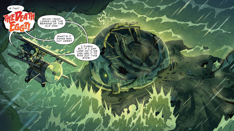
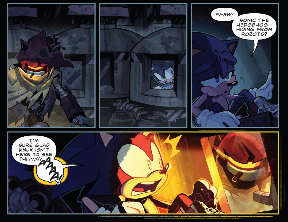
If you looked at my reading order you might have noticed I had the Tangle & Whisper miniseries in the middle of the eight volumes offered in the bundle but rest assured that they are perfectly understandable without it. It’s not until further along in the series that the story of that miniseries is really built on more.

Rebracketing “Death Egg Robot”
Hello! It’s time for me to be normal about Sonic the Hedgehog again. I have been thinking about the Death Egg Robot’s name.
Some background: The final level of Sonic 2 takes place aboard the Death Egg, an Eggman-themed parody of the Death Star. The final boss is a mech modelled after Robotnik himself.
This mech is not named in game but when it was reimagined as the first bossfight of Sonic Generations it was given a not terribly imaginative title: Death Egg Robot.

I don’t like this name and I grew to like it even less as this design got reused in future games and continued to be called “Death Egg Robot” even when it is completely divorced from the context of the Death Egg. It’s the first boss in Green Hill Zone in Sonic Mania and then there are the mass-produced, unmanned, cycloptic Death Egg Robots in Sonic Forces also without any apparent connection to the Death Egg1.
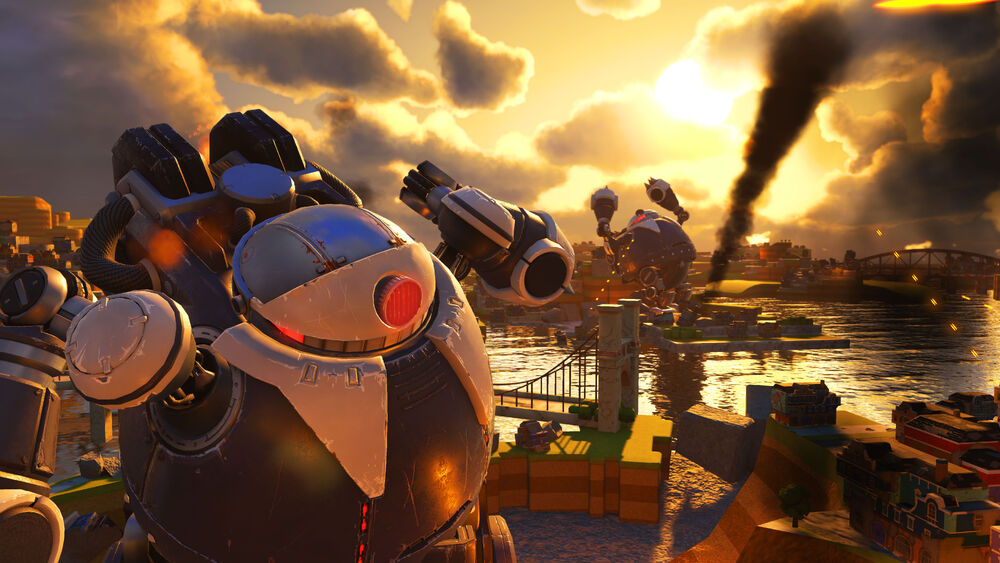
What got me thinking about this again? The other day I was doing the dishes while listening to a four hour playlist called Epic & Cool Sonic Music Compilation, as is my wont, when the track Battle with Death Queen came on.
The Death Queen is a giant Buzz Bomber, a huge bee robot. The game also features a giant crab robot chase sequence that is identified in the soundtrack as Death Crab.
And it occurred to me: Is the game trying to push “Death” as a general term for a class of giant robots? Is it rebracketing Death Egg Robot as Death Egg Robot?
Perhaps we are meant to take it that, in-universe, it is in fact just the giant, or “Death”, version of an Egg Robo. There are a lot of similarities between the two. The spelling is slightly different in English but in Japanese they are both エッグロボ.
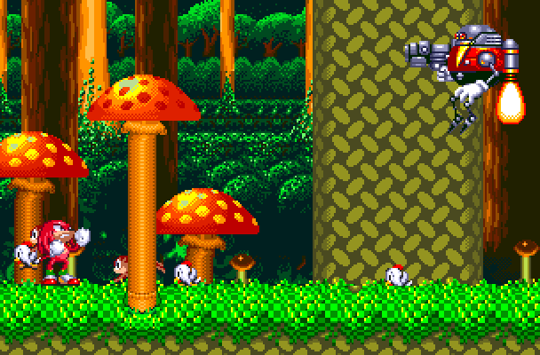
The Death Egg Robot debuted one game before the Egg Robos, but we could imagine that perhaps in-universe the Egg Robos were around first, just offscreen somewhere. Maybe Eggman is annoyed that Sonic and Tails associate the Death Egg Robot with the Death Egg at all. That’s just yolk folk etymology!
That said, I don’t know how to fit the final boss of Sonic Forces into this framework, which is inexplicably also called Death Egg Robot despite bearing almost no resemblance to the other Death Egg Robots and also having nothing to do with the Death Egg.

And then the real final boss, a giant robot chestburster that smashes its way out of previous phase of the bossfight is also inexplicably titled Death Egg Robot.

I don’t know how to fit this into any understanding of what Death Egg Robot is meant to mean.
-
The Death Egg does appear in Sonic Forces but the Death Egg Robots are not on it and no connection is made between the two. ↩
Conway’s Game of Wife

Tablet Ⅴ
Yesterday I took part the Cork Game Jam which was the first in-person game jam I’ve taken part in and my first time diving back into game programming in a few months and Pico-8 programming in a few years.
The theme—“myth”—was announced at ten and the pizza arrived for the after party at around four, which gave me about six hours to derust and bang something out. It was exhausting and stressful but also a lot of fun. Here’s the result:
The theme being myth immediately reminded me of an idea I had years ago based on the Epic of Gilgamesh, one of the oldest pieces of literature that we have a record of. There exists no complete copy of it. What we have of it is an amalgam of fragments from various damaged cuneiform tablets.
My concept is an adaptation of Gilgamesh, probably a sidescrolling action platformer, that uses the aesthetics of corrupted data to fill in for the missing sections of text. Within the six hour window I managed to get a sample of that core idea implemented, though admittedly little else.
So that I wouldn’t have to do everything from scratch I used Matthew Hughson’s platformer starter kit as a base and started making modifications to the sprites and speed values to get more in line with my concept, using Castlevania sprites as a bit of a reference for the walk cycle initially.
I spent far too long getting an attack animation working before I realised I would probably not have time to implement any sort of combat. But its presence at least speaks to setting up an expectation of what the game might involve before you end up running into the faux-corrupted mess it actually is, or within the metafiction of the premise what the game once was before most of it was damaged and lost.
The other thing I added is, of course, the scrolling text taking up the top part of the screen, consisting of the start of the text of tablet 5 of the epic, taken from Maureen Gallery Kovacs’ translation. It starts out fairly normal and then getting more and more broken as it gets to the parts of the poem that are lost.
Within the code these are represented by lines of hashes. I wrote a text drawing function that, when it encounters a hash, draws random data from the spritesheet (from specifically selected sprites in it, not the entire thing) over it, mimicking the aesthetics of famous bugs such as glitch pokémon.
Ideally the progress of the broken text would correspond to the player discovering the broken nature of the game, but it just scrolls at a constant rate with a lot of normal text up front and there is not that much in the way of level so if a player simply walks to the right they will outpace it.
In a more full implementation of this idea the game could perhaps corrupt dynamically as parts of the text are reached, simulating live memory corruption. Or perhaps the scrolling text is a bit too much of a blunt instrument and should not be included in a more complete game.
That said, I think there is definitely potential for playing with some of the more evocative parts of the fragmented parts of the text.
The oft-quoted fragment of one of the works Sappho springs to mind:
μνάσεσθαί τινά φαῖμι
καὶ ἕτερον
ἀμμέων.someone will remember us
Sappho
I say
even in another time.
Within a section of the text that made it into the jam game is the sudden implicit violence of mention of various weapons, axes smeared with what is not said, followed simply by the word alone. I placed a long, blank pause before and after “alone” for effect.
…Suddenly the swords…,
and after the sheaths …,
the axes were smeared…
dagger and sword…
alone …
The Epic of Gilgamesh, tablet 5.
A segment shortly after features has some broken dialogue mentioning something in Humbaba’s belly, a throat and next, and Gilgamesh then saying “Humbaba’s face keeps changing!” which is begging for a scene involving the level’s tileset suddenly being replaced with disjointed meat level sprites as the boss becomes a horrible jumbled mess.
When you were still young I saw you but did not go over to you;
The Epic of Gilgamesh, tablet 5.
… you,… in my belly.
…,you have brought Gilgamesh into my presence,
… you stand.., an enemy, a stranger.
… Gilgamesh, throat and neck,
I would feed your flesh to the screeching vulture, the eagle, and
the vulture!"
Gilgamesh spoke to Enkidu, saying: "My Friend, Humbaba’s face keeps changing!
For what I actually managed to accomplish in the jam the only tricks I managed are the corrupted text and a short corridor level which becomes more visually broken as it goes along, but is completely static.
I made a pretty minimalist tileset for the background of six tiles with only two colours and tried my best to use them to give the impression of a forest, as per the epic narration.
I spent a while drawing these and then getting down trying to draw trees with them, though some of what I mapped out for the background ended up getting hidden by the tablet with the scrolling text, whoops.
As you cross the bridge you encounter a group tile in place of a bridge tile and above it a tree drawn in the same style as the first few background trees, but with the left and right side tiles swapped. Then and broken skull and a serpent implying some sort of non-functional boss mark the boundary for things really going wrong.
I still tried to keep to drawing similar tree shapes but with tiles swapped out to tiles from other parts of the spritesheet, including ones that only appear here, implying that some more game exists beyond what is implemented. Then the bridge itself corrupts and is replaced by corner ground tiles and then invisible but solid tiles as you walk into a screen of just skulls marking a little ending point.
I have expressed here some ideas for a larger game but I do not really have any plans to expand this out. It very much the kind of thing I might do eventually in a world where I had endless free time to work on every project idea I have, which is sadly not the world I live in, and it is far down the list and I only have very vague notions of how to expand this out into something bigger. It would probably not be done in Pico-8 as Pico-8’s size constraints and limited character count, not to mention tiny resolution, don’t make it ideal for games involving lots of text or expansive levels.
it’s funny and very 2000s how the president in Shadow the Hedgehog keeps calling the worldwide alien invasion “terrorists”

Small Javascript addition to the site
The 88×31 buttons on the homepage are now shuffled on load :)
animals I am according to my partner:
- deer
- cat
- pangolin
Which animal am I the most?
- 18% 🦌 deer
- 18% 🐈 cat
- 64% 🟤 pangolin
going to discover a new animal and name it a sergal to fuck with furries

Rebogs or roundups?
How are people feeling about the way I have been reposting directly onto the site and RSS feed rather than doing roundup posts? Is it working well? Is it annoying or confusing? I don’t want to just turn this into a flood of reposts either so I might still do roundups as well. As ever I am figuring out what I’m doing as I go.
Recreating the Neo Turf Masters "Next Hole" UI

In the latest edition of my "What Else Is On?" link roundup, I mentioned that I finally played Big Tournament Golf, better known as Neo Turf Masters in North America, for the first time.
I'd seen it played on YouTube in various places over the years, but never actually put my own two hands on it. After watching the Remap crew play it on this year's Savepoint charity stream, and realizing it was a whopping $8 on Switch, I snapped it up.
I fell in love with the game's whole vibe pretty much immediately, from the dramatic anime intro, to the luscious soundtrack, to the classic, tinny arcade VO shouting "on the green!!"
One element that really grabbed ahold of my brain and refused to let go was the screen shown before each hole. It depicts a series of graphical representations of the topography of the next hole, along with some text informing the player of the simplest, most pressing information, shown over the chillest, most soothing retro arcade music imaginable.
The way each element flies in from opposite ends of the screen, scales-in from zero, and particularly the way the "Hole No. X" text writes-on and then grows an outline and a thick, opaque drop shadow really entranced me. To say nothing of the gradients! There's so much going on, and yet not very much at all. It's all so simple and juicy and perfect.
I had to try to recreate it. If not only as a fun motion design exercise, than also to exorcise it from my brain.
Here's the original, as created by the masters at SNK:
And here's my attempt at a recreation, with the same audio underneath:
The first thing you'll notice is that I wasn't able to find a close match for the "Hole No. X" font. Which is a shame, because that's a great font, but font-matching is tough, and try as I might, I wasn't able to find the original.
Failing that, I decided on something I thought carried a similar style and similar embellishments that looked fun to animate. I was a little quick and sloppy with the write-on animation, but I don't think it's noticeable in motion, and I'm happy with the result!
For the rest of the elements, it was tough to strike a balance between retro and modern. So much of what makes the original great is down to pixel art and the way it's being rendered. But since I'm not a pixel artist, I knew going in that my version would have a cleaner, more modern look, and I decided to mostly lean into that, and not force a faux-retro look with a ton of effects.
The only place I decided to go for a purposely retro look was in the background, which I posterized to give the gradient that banding effect you see in the original because the hardware couldn't create a seamless gradient. I love that look. It really ties everything together, and provides a solid foundation for the rest of the piece.
The hardest element was, of course, the largest: the big faux-3D rendering of the course in the middle of the screen. As these things go, I liked it more the more I saw it come together. Like its lower-res neighbor on the right, I just pulled in my reference layer, and went to town with the pen tool. From there, it was all about dialing in the right stroke width, getting the texture and shadow of the trees right, and finishing with effects on top.
I wasn't sure how to go about creating the gradient on the strip of extruded land at the bottom at first, but I eventually settled on just eyeballing a gradient fill with a bunch of points on it, and trying to position them where the light and shadows should fall.
This was the last thing I did, so I had all of the other elements in place, and had already pre-comped it so I could start playing around with effects and figuring out the final look. I worked on the gradient inside the pre-comp, so I was seeing it without the final effects applied at first. I wasn't sure about the way it looked, but when I backed out to the main comp and saw everything applied to the gradient, I had a genuine "oh shit" moment.
I had been thinking about posterizing this gradient to achieve the same banding as the background, and tie everything back to the retro aesthetic that way, but when I played around with it, I ended up liking this better! I'm really happy with the effect of that gradient.
All in all, this was a really fun exercise! Like all new projects, it taught me a little something new, and I had to push myself to figure out things I hadn't done before.
And I still absolutely adore what SNK achieved with this screen. I love how far back all the drop shadows are pushed, I love the smooth, linear motion of all the animations, and I love the way each element slowly fills out the screen one by one, with the three boxy elements leaving space for and framing the big, freeform shape of the course in the middle.
Finishing this project has me wanting to try tackling recreations of some other video game UI! Leave some of your faves in the comments, and maybe I'll give 'em a go!
You can find this piece and others on my Motion Design page.
The King in Yellow and the War Over the Mind
I think one of the most powerful aspects of Robert W. Chambers's The King in Yellow, and one which sets it apart from a lot of later Weird Fiction about academics who become too invested in the world of the arcane, is the idea that there just isn't anything explainably wrong with the play. People know there's something wrong with it, especially once you get to the second act... but if you just looked at the text itself, you wouldn't find anything.
'No definite principles had been violated in those wicked pages, no doctrine promulgated, no convictions outraged. It could not be judged by any known standard, yet, although it was acknowledged that the supreme note of art had been struck in The King in Yellow, all felt that human nature could not bear the strain, nor thrive on words in which the essence of purest poison lurked.'
The Repairer of Reputations
Despite how central it is, I completely missed it on my first reading (mainly because I was young and grappling with a particularly bad printing of it which made the text really small). I only started to grasp it when I listened to the concept album The King in Yellow by experimental post-rock band "Ah Pook, the Destroyer".

This album is largely inspired by Chamber's work, using that premise - an idea that you can't see but can still cause genuine harm - to talk about the current political climate. Songs touch on a wide array of cults and conspiracies - from the modern-day antisemitic ramblings of Qanon and Lizard People conspiracies to the strong figureheads and interpersonal conflicts of cults like Heaven's Gate. They even find time to touch on the Time Cube somehow, all under the framework of the King in Yellow propagating harmful ideas and bringing about the New Age of Madness.
But it's not as simple as just looking at these people and calling them mad. Okay, sometimes it is that (best exemplified in the gospel stylings of "The Tribulation of Alex Jones"), but there are cases where the characters are presented with genuine empathy, such as in "The Road to Carcosa" where we hear about the life of a man who, through exposure to the Yellow Sign (which here is attached to Right-Wing conspiracy theories) ends up destroying his relationship with his family. The singer gets a moment of lucidity in the refrain "The fall of my life came after; And all of my mind was scattered", though this fades away as we hear the end of this story: Him living alone in a gun-filled squalor.
Another thing that elevates this album is how it turns it all back on the listener. There's obviously a specific audience of Left-leaning listeners a project like this would attract, and those people are very unlikely to also share the beliefs of the average Qanon-minded person, but (much like in the book) it constantly emphasises that the actual specific beliefs don't matter as much as the spread of ideas. This is most visible in the refrain heard throughout the album:
The fall you believe
Is not far as it seems
And the deep can not be so alive
The blithe poison meme
That you did not believe
But you saw and it entered your mind
Belief doesn't matter. Sheer exposure to these toxic ideas means that, in a way, you've already been harmed no matter what you take away from it. This idea is also present in the book, most directly in the story "The Yellow Sign".
In it, Mr. Scott is fully aware of the King in Yellow, but has actively tried to avoid its influence, partially due to the unfortunate fate of Hildred Castaigne (who featured in the story "The Repairer of Reputations" and at the very least wanted to do a monarchist coup of America that would place him as King - all after reading The King in Yellow). By all means, he should be doing the right thing - he has no interest in The King in Yellow and is actively avoiding the play... and it's not like anyone's staging it anymore, so he should be fine... and yet, after strange dreams, an erie watchman, and other bizarre events, he and his model, Tessie, are driven to read it. This is also a story the album quotes right at the start:
'Then, as I fell, I heard Tessie’s soft cry and her spirit fled: and even while falling I longed to follow her, for I knew that the King in Yellow had opened his tattered mantle and there was only God to cry to now.'
The Yellow Sign & Beautitudes
It's an idea I think is also evoked in the structure of the anthology. While the first 4 stories directly feature the King in Yellow in one way or another, the rest are tragic, sometimes supernatural romances with seemingly no connection to the title character, to the point where some reprints just do the first 4 and ignore the rest... though I feel it's deliberate when keeping this idea in mind. While the King is absent, Yellow is a recurring motif throughout the book, often emphasising death or danger, and reminding the reader of that titular presence. You have been exposed to the King in Yellow, and now your mind is his domain.

Sonach an Ghráinneog
Translations area really interesting and fun. I’ve linked before to Twitch translating pokémon names into Welsh and something I’ve played at before is translating Sonic the Hedgehog character names into Irish.
It doesn’t come with quite the same punning potential as pokémon but the way Sonic character names tend to be ordinary nouns makes it interesting to try to translate, especially trying to capture the relationships between certain names or figuring out what to do with the weirder ones.
If the notes column is blank that means the name is just a straightforward calque of the name from English.
| English name | Irish name | Notes |
|---|---|---|
| Sonic the Hedgehog | Sonach an Ghráinneog | |
| Shadow the Hedgehog | Scáthach an Ghráinneog | Shadowy. Also the name of the woman who trained Cú Chulainn. |
| Silver the Hedgehog | Soilseach an Ghráinneog | Bright. Chosen to keep the hedgehog alliteration and rhyming going and works as a contrast to Scáthach.1 |
| Miles “Tails” Prower | Myles “Eireabaill” na gCoileáinín | The miles per hour pun doesn’t work in Irish so I changed it to a reference to Myles na gCopaleen. Roughly Myles “Tails” of the Little Puppies. |
| Knuckles the Echidna | Ailt an Eicidneach | |
| Amy Rose | Émí Rós | A transliteration. Rós does means rose, though. |
| Rouge the Bat | Deargadh an Ialtóg | Rouge, but also blushing or glowing. |
| E-123 Omega | É-123 Óimige | |
| Cream the Rabbit | Uachtar an Coinín | |
| Cheese the Chao | Cáis an Nord | Chao is obviously a word formed from removing the letter S from chaos. Anord is chaos (and ord is order) and I thought nord sounded better than anor and also that it would be fun than “an nord” would sound a lot like “anord”. |
| Blaze the Cat | Lasrach an Cat | Flames/Flaming the Cat. |
| Big the Cat | Láidir an Cat | Strong the Cat. Chosen to keep the alliteration between Blaze and Big. |
| Honey the Cat | Lim an Cat | Mil is honey so I am spelling it backwards to keep the cat alliteration going even if that wasn’t actually present in her original name. |
| The Chaotix Detective Agency | An Ghníomhaireacht Bhleachtaireachta Anordúileax | Anordúil means chaotic, ‑each is a suffix which forms nouns with the sense of a person connected to the concept and I’ve subbed in an X like in the original name. |
| Charmy Bee | Meallach Beach | Charming |
| Vector the Crocodile | Veicteoir an Crogall | |
| Espio the Chameleon | Spiair an Caimileon | Spiaire means spy and with the E cut off the end it’s pronounced like “spear” which is cool. |
| The Babylon Rogues | Rógairí na Bablóine | |
| Jet the Hawk | Scaird an Seabhach | |
| Wave the Swallow | Tonn an fháinleog | |
| Storm the Albatross | Stoirm an Albatras | |
| Dr. Ivo “Eggman” Robotnik | Dr. Ivo “Uibheach” Robotnik | I thought it would work to leave his real name untranslated. Ubh is egg and ‑each is our favourite noun-forming suffix (or uibheach can just mean ovate). Fearubh or Ubhfhear would be more straightforwardly Eggman but I think that sounds bad. |
| Metal Sonic | Sonach Miotail | |
| Orbot | Glóbat | Globe + bot |
| Cubot | Ciúbat | Cube + bot |
-
It occurs to me just now that Scáthach, Soilseach and Sonach could also work as translations of the three beam upgrades you get in Metroid Prime 2, considering that the Annihilator Beam is meant to be a sonic weapon. ↩
Rinne mé leabharmharc de leathanach fánach ar Vicipéid.
Exploring the Historiography of Mad Max: Fury Road

Recently, I decided to rewatch the 2015 movie Mad Max: Fury Road, for the first since 2018. I absolutely loved it when I saw it then, but I was curious if it holds up. Reader, it very much does. I think the extraordinary virtues of this movie have been extolled enough at this point–in my previous review, if nowhere else. It’s a stunningly well-constructed film, a two-hour action scene that is perfectly paced, perfectly established, and full of subtle, complex character development and simple, inescapable themes. It is a masterpiece of storytelling and filmmaking. But you already know all that!
So today, I’m going to talk a little about the potential historiography of Fury Road instead.
In this framing, I am choosing to accept the events of the movie as the accurate, God’s-Eye-View of the actual historical events that led to the Fall of Immortan Joe and the creation of what we may provisionally refer to as the Democratic People’s Republic of the Citadel. Presumably, however, in the post-literate society of the Wasteland, this history will be passed down in the form of oral tales, traditions, ballads, and chronicles, told over and over again, changing and evolving until they are finally written down, in the same fashion that the Homeric epic poems were not codified until approximately four centuries after the events they purport to relate took place. Centuries, perhaps millennia in the future, as civilization in Australia and the world rebuilds itself, scholars and academics will study this corpus of literature to try and understand the legends of the founding of their country. And I think they will be absolutely baffled by the existence of Max, and his role in them.
You see, I imagine that Furiosa will be a generally well-attested to quasi-historical figure. Many of the legends surrounding her will be dismissed as myth, but I think historians will accept that there was probably somebody named Imperator Furiosa who led the Revolution, overthrew the Old Regime and founded the new government, even if she perhaps did not ride a Golden War Rig out of the highways of Valhalla, and strangle Immortan Joe with a silver chain, etc. After all, somebody had to do it, and a major military leader turning on her superior and staging a coup d’etat makes as much sense as anything else. Furiosa also makes a lot of sense as a culture hero, somebody who can be credited with the transformation or establishment of their society. As a member of the Vuvalini, she represents an outside force that can be brought in to replace the previous set of values and ethics, but as a high-ranking member of Immortan Joe’s army, she shows that integration is possible for those who served the old regime. There isn’t a contradiction between those two roles, the historical and mythic. Gilgamesh is remembered today mostly for his eponymous epic, detailing his epic battles with monsters and journey to the Underworld, but he appears on the Sumerian King Lists, and may have been a real figure at one point. Or perhaps a better example would be King Arthur, whose entire modern mythos is clearly a much-later invention, but may well have been based on a historical Romano-British or Welsh war-leader who fought the invading Anglo-Saxons in the 5th or 6th centuries AD.
The point is, these are well-recognized tropes and patterns of myth and history, and I have no trouble believing that historians in the future will be able to recognize them. But what I suspect they will not understand is why halfway through most of the traditional ballads, this random guy named “Max” walks out of the Wasteland, helps overthrow Joe, and then vanishes from the historical record without explanation.
I like to imagine three schools of historical theory. The first we may call “The Interpolation School”. These scholars believe that “The Legend of Max” was a preexisting ballad with entirely separate provenance. Either intentionally or accidentally, some chronicler or balladeer confused the stories and inserted Max into the “Furiosa Cycle”. This is actually a relatively common phenomenon with folk music and folklore, as stories passed down through oral tradition mutate and change with each generation. An extreme example can be seen with the traditional English folk song “Matty Groves“, which eventually became the American ballad “Shady Grove“, a song which features virtually nothing in common with it anymore, or how with the Irish song “The Bantry Girls Lament“, about a young soldier sent to fight in the Peninsular War (1807-1814), which features references to the “Peelers“, the British police force first established by Sir Robert Peel in 1829.

We can also look to the Matter of Britain, the great Arthurian story cycle. As mentioned above, these are stories that first first come from the Welsh and Celtic Briton sources, but as they are eventually increasingly told by French minstrels in the High Middle Ages, they increasingly come to focus on a new character, French knight Lancelot du Lac. If you read Le Morte d’Arthur, you can’t help but notice that the entire Grail Quest portion seems to have an entirely different viewpoint than the rest of the narrative. In Virgil’s Aeneid, his attempt to craft an epic national founding myth for Rome, he deliberately sought to tie his story and characters into the older Homeric Epics, borrowing from their prestige and reputation. And perhaps the most infamous example of this phenomenon is Biblical texts, and the long history of exegesis there. Later translators and transcribers interpolating their own additions is a perennial problem, especially in regards to Christian interpretations of older Jewish texts.
George Miller’s own take on the “cannon” of Mad Max certainly seems to fit into this lens. In a press conference for Fury Road he famously said:
All the films have no strict chronology. It’s probably after Thunderdome, but it’s an episode in the life of Max and this world. It’s basically an episode, and it’s us revisiting that world. I never wrote the story, any of the stories, with a chronological connection.
Where does Furiosa fit into the Mad Max timeline? George Miller says it doesn’t matter, Austen Goslin (Source)
This certainly lends credence to the idea of Max as a recurring folk hero, the protagonist of a cycle of songs and stories without clear historicity or connection. We can image him like Robin Hood, with a set number of “standard stories” that can be retold in any order; “Robin Hood Wins the Archery Contest”, “Robin Hood Meets Little John”, “Robin Hood Fights Sir Guy of Gisbourne”, “Robin Hood Rescues Maid Mariam”, etc. You’ve seen at least one of the movies, right? Likewise, we can imagine ballads like “Max the Patrolman“, “Max the Road Warrior“, “How Max Escaped Thunderdome“, etc, with his insertion into the “Furiosa Cycle” likely a way to spice up the story with a fan-favorite character.
However, I think that other academics would disagree. They don’t have access to the omniscient narration of the Maxiverse that we do, or knowledge of the “true” chronology. I imagine they would maintain that other Max legends–if they still exist–are in fact derivative of his role in “The Ballad of Fury Road”. It seems likely to me that some people would find the idea that their national foundation mythos was constructed from popular stories to be deeply unpalatable, in the way we might reject claims that Benjamin Franklin was a well-known trickster deity, inserted into the story of the American Revolution to help boost sales in France. We could refer to this school of thought as the “Max As Metaphor School”. They believe that Max is a constructed composite character, designed as a proxy for the great unwashed masses of the Wretched to give them a role in the story. In his quest for redemption, the original authors wanted their listeners to see that the Revolution required the services of all people, and that through cooperative service, we could regain our humanity.
Credence here might be lent by the structure of Fury Road–while Tom Hardy conveys an extraordinary amount of pathos and emotion through facial expressions and grunts, it might not be easy to communicate that nuance through orally-transmitted epic poems and ballads. It wouldn’t surprise me if later critics find Max to be a remarkably simple character, one without much motivation or story of his own, seemingly perfectly designed to serve as a foil for Furiosa. Myths are usually messier, with a lot more dangling bits and inexplicable detours. In the film’s final epigraph, we can see a moral here, as the story begins its journey from event to history to legend:
“Where must we go….
We who wander this wasteland, in search of our better selves?”
– The First History Man
Mad Max: Fury Road (2015)
Wandering the wastelands of post-Apocalyptic Australia is here presented as also a spiritual wandering, a loss of essential humanity and self-worth. In Max’s journey from nameless wanderer, with no goal except survival, to a comrade and member of a group who fight for each other, someone willing to give up his own lifeblood to save Furiosa, we can see the narrative of how we too, the listener of the story, can redeem ourselves, can dedicate our life to something bigger, and find purpose beyond mere continuation, merely driving across the salt flats for a hundred and sixty days until you run out of food and gas. Max’s lack of nuance here is a feature, not a flaw, and his return to the masses of the Wretched at the end symbolic of his transmutation. Sometimes, you have to invent a national epic for your people, as with James Macpherson and his The Poems of Ossian (1761-1763), a compendium of supposedly ancient Celtic lore he claimed to have discovered–though it is now widely accepted that he wrote them himself in order to help popularize the Scottish cultural revival.
I suspect, however, that members of the Interpolation School would dismiss this as utter nonsense; a mountain of speculation and motivated reasoning, built upon no evidence whatsoever. To believe this school of thought, you would have to assign a level of intentionally to the Ancient Bards of the Wastelands that can be supported by almost no historical evidence, assigning the motivations of modern Citadelian nationalists backwards in time to people who likely would have no understanding of the context being ascribed to them, the classic sin of presentism. These two interpretations would dominate the academy, and most attempts at analyzing Max and his role in the Matter of the Wasteland would focus on one of these two lenses.
There is also a third school of thought, who maintain that Max was probably just some rando who wandered out of the Wasteland, helped stage the Revolution, and then wandered off again without telling anybody much more than his name. This, however, is a very disreputable theory, widely-regarded as absurdly naive, and all but the most scapegrace scholars hold it in contempt.

the law of e-Caoimhe-lent exchange
Cork-based trans organisation Gender Rebels now has a donation page if anyone wants to contribute

Cohost playlists
One of the habits I had on Cohost was making some specific daily posts. I didn’t always get around to it, there were long stretches of times where I didn’t post any of these, but on my main account I liked to post a song of the day and I had a few side accounts too. One of them I posted intros to TV shows, games, movies etc. and another where I posted joke Sonic Heroes teams.
I don’t plan on continuing these but I have gone through the posts and made an archive of song of the day and intro posts in the form of Youtube playlists. I had to find alternatives to some videos that have been taken down or upload some myself that were not originally Youtube videos and they will continue to succumb to link rot but for the moment they are, I think, complete archives of what I posted.
They are also very long. The intros playlist is a little over nine hours and the song of the day one is technically over two days long but it includes a couple of joke ten hour videos and also an entire movie score but even discounting those it’s still almost twice as long as the intros playlist.
Due to the nature of Youtube playlists I can’t put warnings on the videos but some videos in both have some flashing lights and there’s at least one video in both that talks about or depicts suicide.
Also it looks like the embedded versions of the playlists below are limited to two hundred videos and some videos won’t play embedded so click through to Youtube for the full thing.
Introducing…
Song of the day
A version of Missile Command for the Commodore 64 where the bottom of your screen is the game state in memory and missiles cause memory corruption, which eventually causes you to lose: https://csdb.dk/release/?id=135463.
In the video below, a missile broke my controls and caused my cursor to move down and to the left so I couldn't stop other missiles
getting every vaccination I can so I get quintuple autism like Sun Wukong
orkz’ life cycle is to go to somewhere far away, die gruesomely and release a cloud of spores so their bloodlust is a reproductive urge
look I know you said that this was just going to be a light, casual thing but the infinite rocket crate in the corner
you said that you’re not mad at me but there was a suspiciously large cache of health packs and ammo outside the entrance to your room
your public transport network is your public transport net worth
The House Like Carpet Beat
Finally, I'm doing a Real blog post about a specific thing. It's been a while since I did this. This was spurred on by a tweet on Twitter and Bluesky linked at the end. I just want to spread the word.
Persona Trinity Soul
First up is an anime spinoff of Persona 3 with this song, how most people learned about the lyrics. They start at 1:12:
Burning Men's Soul
Transcript
Check it out I'm in the house like carpet And if there's too many heads in my blunt I won't spark it I'll put it in my pocket and save it like rocket fuel 'Til everybody's gone and it's cool Then I spark it up with my brother His momma named him Mo, but I call him Mo' Lover And he's more than a cover, he's a quilt We're putting shit together like that house that John built On the hill, 'cause this shit's gonna feel like velvet, turtle My style fits tighter than a girdle If ya hate it then you can just leavе it, like Beaver But in a day or two I'll makе you a true believer in me 'Cause like the alphabet you'll see That 'ism kicks a rhyme, not your everyday soliloquy Like Chef Boyardee, my rhyme is truly cookin' Peace to Matty Rich 'cause he's straight out of Brooklyn, New York I don't eat pork or swine when I dine I drink a cup of Kool-Aid, not a big glass of wine Or a Henn', Heine', if you have time I'll drop rhyme again
You can see why it blew up a little on tumblr, and then on twitter. Strange lyrics for Persona music? No!
Sample CDs
It turns out that the lyrics come from a sample CD!
Masterbits CLIMAX 6 Rapsody (Vocals ll) - Swiny House
AuraOfANobody: "Like chef boyardee, my rhyme is truly cookin" stick it back in the oven it ain't fuckin done!!
So they just took it from here and dropped it in. But that would mean ANYONE could add the funny bars...
Other Uses
The meat of this post. Frustratingly I can't use WhoSampled for this since the sample CD isn't on there. So I'll have to find some manually.
I remember a tweet about how a mickey mouse game used the sample, and I'm pretty sure it was the point and click/adventure one. And I was right! Disney's Magical Mirror Starring Mickey Mouse, song starts at 29:27.
SiIvagunner made a rip of the song!
QuichePotatoes: This manages to sound better than both the advertised track and the punchline then again one is from a sample pack that's meant to be messed around with not just dropped in without any actual editing and the other was intended as a serious promotion for a product.
Toby Fox
So Toby Fox made a Bluesky account and is doing a bit to promote it. And as part of it, he became the latest sampler of House Like Carpet.
(bluesky mirror, also this song was actually uploaded earlier without vocals)
And this was what inspired this post.
Use it yourself
I've got nothing else. Here's the archive.org link to the sample cd, it's on track 7.

Rebogs
I’ve been testing how I want to handle rebogs on this site.
The previous post was rebogged entirely manually. I wrote a post in the normal format for Jekyll and defined metadata for the rebog information to link back to Freja’s website and display her avatar. Now I have to figure out how I want to streamline that process.
For posts syndicated from Letterboxd and such I have a setup where when I build the site there’s some code that checks those feeds and processes them into their own special folders that then get processed and added into the list of posts.
For rebogs though I think I’m going to do it differently and write a script, probably in Python, that I can run from my command line and give a link to a post that will attempt to parse the content of it then write it to a file directly into the same folder as my normal posts but with the extra metadata I’ve defined for for rebogs.

Webmentions
Continuing to crib from Natalie I have finally gotten around to trying out webmentions for this site.
I had bookmarked her posts on it and made notes and was going to get around to implementing it myself when I thought “hey I’m using Jekyll has a webmentions plugin already been made for Jekyll?” and the answer was of course it had. Adding it was very straightforward and hopefully it works out of the box.
Has anyone ever made a bookmarket to open a Fediverse post in your own instance so you can interact with it?
Oh Blue Sky’s RSS feeds are very poor. They don’t seem to even include images at all.
I am glad that the big, official, publically-funded Irish dictionary website has entries like these:

not usually a dating sim person but two different cyberpunk dating sims that I had previously backed got released on Steam in the past week


Nice try, Rocky!
This post includes plot details for Shadow Generations, Sonic Generations and Sonic Adventure 2
There is a part of Shadow Generations that I got unreasonably excited about, but it is going to take some explanation as to why.
There is a boss in Sonic Adventure 2 called Egg Golem. When you defeat it Sonic taunts it by saying “Nice try, rocky!” during the victory screen.
Also in Sonic Adventure 2, in a scene aboard the Space Colony ARK, Sonic the Hedgehog tries to fool Ivo “Eggman” Robotnik with a fake Chaos Emerald created by Miles “Tails” Prower, which Robotnik spots immediately.
These scenes don’t have much to do with each other, but in 2020 I watched videochess stream a Sonic Adventure 2 randomiser that not only randomises the levels and characters, but also all of the cutscenes, playing them in a random order and with every voice line for each character swapped with a random line of theirs from elsewhere in the game. The results are mostly nonsense but sometimes they line up in funny ways.
In particular a version of the fake Chaos Emerald cutscene plays where Robotnik says his line identifying the Chaos Emerald as fake early, to which Sonic responds by pulling out the emerald and saying “Nice try, rocky!”, apparently to the emerald itself. This resulted in several people watching, including myself, immediately declaring Rocky to be the name of the fake yellow Chaos Emerald. Eggman then tells Sonic to put Rocky down and back off.
Most of rest of the randomised dialogue is the usual ill-fitting nonsense, but the appropriate dialogue from Ivo with the Rocky line in the middle cemented this moment permanently in my mind. Rocky is my beautiful fake son and I want to protect him. And in Robotnik’s next line he insults Rocky and calls Rocky “sand” and says his machines hate Rocky and shoots my poor boy into space! It’s fucked up.
But Rocky does not have a large part in the Sonic series. The general idea of fake Chaos Emeralds gets revisited briefly in Sonic X where Sonic uses fake emeralds to turn into Dark Sonic and in the IDW comics Eggman tries to grow the “Eggperial City” using giant fake Chaos Emeralds. Also in the comics, specifically in Imposter Syndrome #2, a yellow gem that might be Rocky appears as a background detail on a shelf in Starline’s collection.
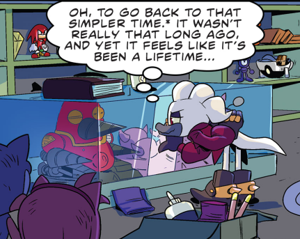
The real yellow Chaos Emerald appears throughout the series of course, including in Sonic Generations where it’s the emerald that you get for defeating Shadow the Hedgehog in a fight. And with Sonic Generations’ rerelease bundled with the new Shadow Generations campaign one of the many things that delighted me about the game is Rocky’s triumphant return and the silly way that it tied back into the original Sonic Generations.
In the promotional animated short for the game, Dark Beginnings, Shadow already has the yellow Chaos Emerald before the start of the game and holds on to it throughout the story. At the end of that short he flies to the Space Colony ARK and in an early cutscene in the game before being attacked by the Time Eater he finds Rocky still chilling on board the ARK and pockets it, now having both Rocky and the real yellow emerald.
Then, midway through the game, there’s a cutscene showing Sonic and Shadow’s fight from the Sonic Generations from Shadow’s perspective, where after losing he passes off Rocky to Sonic so that he can keep using the real emerald for his own fight.
It is, I admit, quite fan-wanky but I just admire pulling these disparate threads together and how this plotpoint is only possible because the fake emerald in Sonic Adventure 2 and the one in the Shadow rival battle in Sonic Generations both just happen to be the yellow one. And it means that Rocky is back! And he did such a good job! And he even retroactively gets to appear in Sonic Generations now too!


🧛🏻♀️ update
Another photo from Halloween.

me: I promise I won’t go on about The Ring
me after two pints:
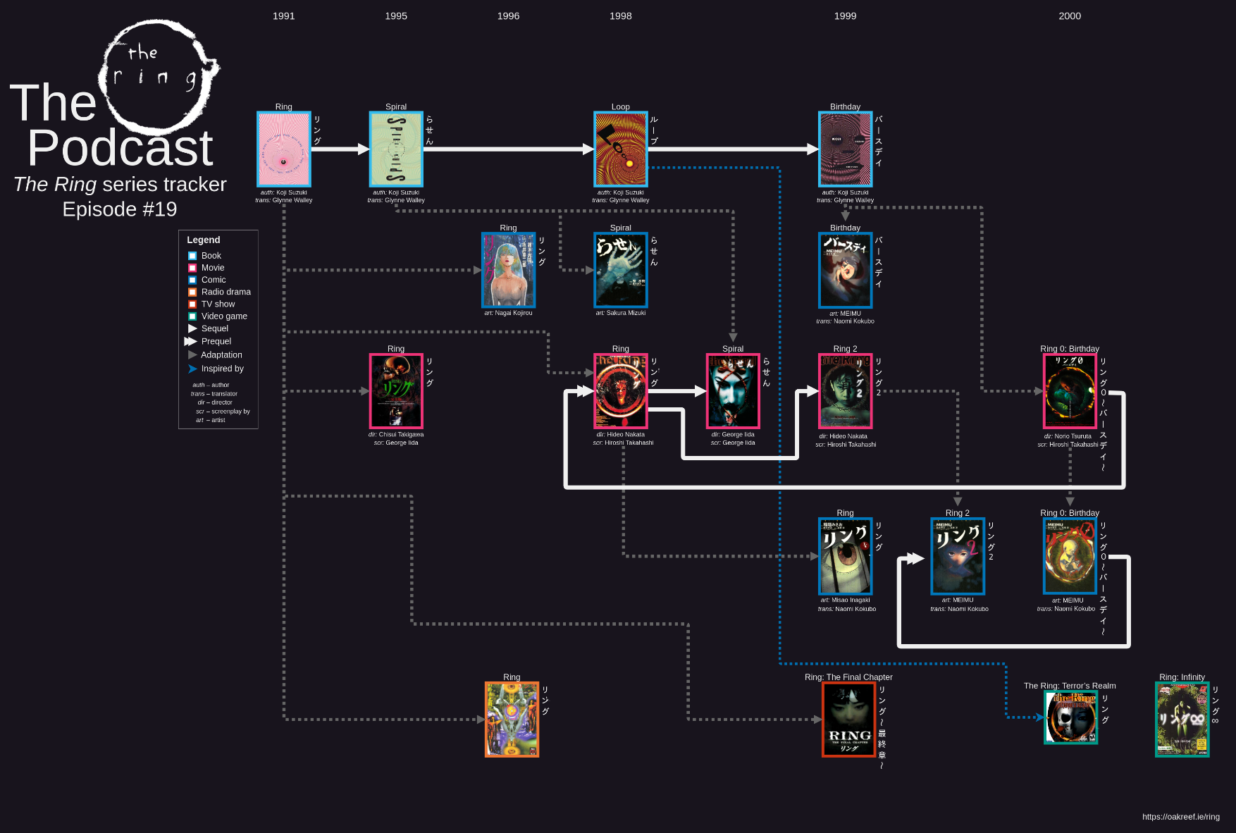
cuddling is so nice oh my god

My Fediverse posts are going to start appearing here
I have been working on mirroring my Mastodon account to here like the Letterboxd and Backloggd reviews.
I think I will wait till tomorrow to deploy that but when I do it will add some backdated posts into the feed here.
I’m fairly happy with it. It is not fully featured but it will mirror posts, include images and alt text, set content warnings as titles if present and gather threads together into a single post.
It does not include replies I’ve made to other people’s posts and will not mirror boosts either, though I might add the latter.
This site only updates when I rebuild and push it so it won’t mirror my Cathode Church posts immediately but every time I update the site I should include whatever I’ve posted there since the last update.

Removing other Atom feeds
The previous version of this site was originally just the gallery and it included an Atom feed honestly mostly just because I wanted to understand better how RSS worked and it was an interesting and fun thing to make. When I made the bog instead of retiring the old feeds I added a new one and then made a combined one that had everything and as I’ve reorganised things this has become a pain.
And the gallery is a record of past things I’ve worked on. The dates listed are retroactive. Even when I add new things they’re usually pretty heavily back-dated. It’s not really an appropriate use of an RSS feed. You shouldn’t really be adding things that have dates months or even years in the past. And when I add something there now I’m probably going to have a post about it anyway. So I’ve decided to simplify things. I am going to remove the other feeds and redirect them to the one for the bog. If I add something to the gallery there’ll be a post about it and obviously the two podcasts have their own feeds. Because they’re podcasts and that’s how podcasts work.

How I’m reading
I’ve used RSS for a years. I have over two hundred feeds in my RSS reader (though many are inactive). Not as far back as the Google Reader days, mind; I started off with The Old Reader. Back when I move my phone over to Lineage OS and removed all Google services I moved to Newsblur, largely because it had a client available on F-Droid when The Old Reader did not1.
But I have been feeling dissatisfied with it. Part of trying to move away from social media towards following other people’s bogs2 is that I’ve moved more towards RSS being the primary means that I follow and view people’s posts and I have found that Newsblur was just not the most pleasant reading experience.
I can not fully explain why I did not like reading in it. I think perhaps the interface is too intrusive and the reading panel feels too cramped. I had mostly used it to open links to other pages rather than reading text in place. It has some other problems too: It was consistently failing to update some feeds that had well formed RSS documents (it would always succeed on a local, manual refresh) and its handling of Mastodon posts was pretty abysmal. In particular if a post had an image with alt text it would display the alt text in place of the main body of the post.
But even putting those issues aside I want reading to be a pleasant experience. I am here to have fun and as much fun as it is to make and style my website—and I do hope that people look at it—I think an important part of a decentralised web is that the centralised way that you read it should be as smooth and fun as possible.
Which is a long preamble to say that I am currently using a free trial of Feedbin and I am enjoying it. It a more pleasant, less busy, interface and it seems to have special handling of Mastodon posts where it displays them with the avatar included and everything.

I may still try out some other readers but as it stands once my twenty-eight days are up I think I’d be happy to pay five United States dollars a month to keep using it.
It isn’t perfect. The “extract full content” option seems to be more hit-and-miss than Newsblur’s version of that feature, especially for some news sites I follow, and it lacks Newsblur’s ability to just display the full source page in an iframe, but I prefer it overall. I do also wish you could do little unique colour styling on different people’s blogs though, are there any readers that do that?
Also I figured I would also give a shoutout to Freetube which I use to watch Youtube videos now. Using Lib Redirect when I open a Youtube link it automatically opens in Freetube, which provides a nice, decluttered interface for Youtube, does not display ads and even has Sponsor Block built in. It does have its issues. The main one being that if I click a Youtube video it will replace whatever one was already open and I will lose my current position. As someone who tends to leave long videos running as I do other stuff with frequent pausing to let myself concentrate on other things3 I have had to learn to stop myself from absently clicking on other random Youtube links in the middle of something else.
-
Sadly due to practical concerns I have moved back to stock Android on my current phone, but try to avoid Google stuff as much as is reasonable. ↩
-
Other people seem to spell it with as silent l? ↩
-
I currently have Justin Roczniak’s video on Black Wall Street paused in Freetube and the RTÉ History Show segment on Irish Food History: A Companion paused on my phone4 (I use Antenna Pod5 for podcasts). ↩
-
Fun fact: A clinic recently told me that I have ADHD and they are not going to treat it :) ↩
-
Yes I am writing these names with extra spaces on purpose, I have an irrational hatred of camel case. ↩
anyway I’ve been sick all week everyone be nice to me
I think I might start posting on here more again but also syndicating this feed back to my blog?

being sick sucks
Who would have guessed?

I finally added h-entry markup to the bog
I bookmarked a couple of posts from Natalie ages ago about h-entry and have finally gotten around to marking up my posts with them.
Hopefully I didn’t mess anything up and everything parsable now. I should have done this sooner as it was fairly simple but better late than never.
Now I have that set up as well as syndicating posts from my Backloggd and Letterboxd feeds. Next steps in trying to get set up to be part of the sociable web: Webmentions and figuring out how I want to handle rebogging individual posts.

Fuair mé turscar as Gaeilge
Bhí mé in ann cuid de do radhairc shalacha a thaifeadadh agus tú ag masturbate agus ag teacht ar orgasm.
Níl an chéad uair í.

Connections
The New York Times Tech Guild is on strike and asking people to boycott the paper’s online puzzles. I stopped doing Wordle a while ago as it was no longer finding it satisfying but I usually do the mini crossword and Connections.
If you usually do them and too and are lacking a daily puzzle here is a Connections/Only Connect/puzzle grid of my own devising below. You can also play in on Puzzgrid.
| Grove | Paradise | Park | Cave |
| Windy | Seaside | Beach | Hills |
| Night | Turquoise | Street | Coast |
| Forest | Altar | Radiant | Mushroom |
If you’re unfamiliar with this sort of puzzle: There’s sixteen words that make up four groups of four words through some sort of connection. Here is some easy ones on Puzzgrid to get the idea.
This one has a specific theme running through the whole puzzle and it does require some specialised knowledge on that subject. Check the hint to see what that is.
Inspired by BCJ doing the same which I saw via Mike Egan.
Hint
It is Sonic the Hedgehog-themed.
Hint 2
All the answers are the names of Sonic the Hedgehog levels.
Answers
- Cave, Forest, Hills, Grove
- Radiant, Beach, Altar, Coast
- Mushroom, Windy, Turquoise, Seaside
- Park, Paradise, Night, Street
Explanation
- Sonic levels named Green ___.
- Sonic levels named Emerald ___ or ___ Emerald.
- Sonic levels named ___ Hill.
- Sonic levels named Casino ___.
Extra comment (spoilers)
I wanted to do a group with the levels Mecha Green Hill Zone, Neo Green Hill and Green Hills Zone with the hints being “Mecha, Neo, s” but I don’t think there’s a fourth level with a name that’s a variation on Green Hill Zone to make a group.

🍔
Went out with partner for fancy burgers last night and then went back to her’s and cuddled on the couch and I suggested watching the trans episode of Dirty Pair as I had started watching the show and while I knew that there was a happy couple in it where the bride was a trans woman I did not know that they were also burger freaks.
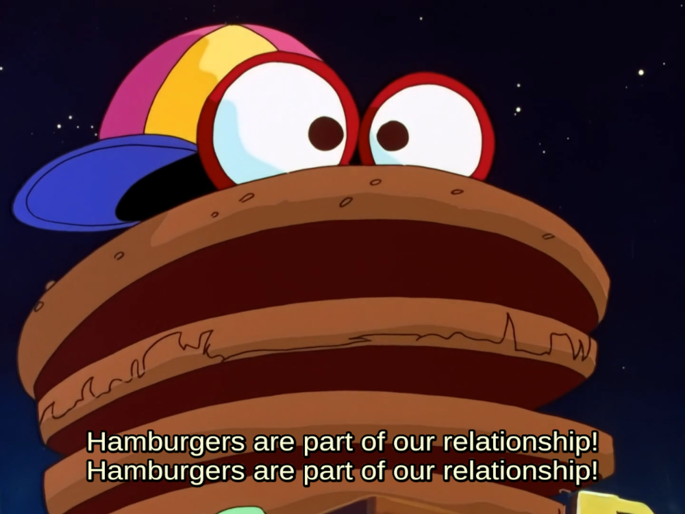

new molecule: sodium megachloride
if you look at it it destroys your bones

Sorry if any of the RSS or podcasts feeds regenerated with a bunch of old stuff showing up as new again
I am bad at making website.

I have a Throne gifts page if you want to give me an early Christmas present
Or if you want to buy something for an online rando for some reason? https://throne.com/soilseacht

🧛🏻♀️
Went as a vampire for Halloween


Is there any spec or common practise for providing content warnings in an RSS/Atom feed?

Disqualified from No Nut November for having had performance-enhancing surgery

Backloggd
I’ve decided to start posting reviews to my Backloggd account. First one is of Shadow Generations (it’s good). You won’t really need to follow me there, though, as any reviews I post there should also show up on this bog.
They current implementation is really simple. When I build the site it reads the Backloggd RSS feed and copies the post to here but it’s on my todo list to start caching rebogs locally to have a copy preserved and hopefully to stop this getting too slow if the number of posts I’m syndicating starts to get too large.
In the RSS feed the link points to the original review on Backloggd rather than to the copy on this site. Not sure about which it should link to. If you have an opinion on that feel free to share.
I am also planning on doing this for Letterboxd as well and maybe something similar for books. Is there any decent alternative to Goodreads?

CSS is fun!
This post demonstrates custom CSS that won’t display in RSS readers.
One of the things that Cohost taught me is that CSS is actually fun. Styling a website is a really lovely form of self-expression and I have been really enjoying styling this this website1. And I thought I’d highlight some of the things I’ve done.
Colours
The site has two different colour schemes for dark mode and light mode. I much prefer the dark mode one but I generally use dark mode for everything I can. The dark mode has a cool, blue palette while the light mode uses a warmer colour scheme with oranges and peach colours. Most of the colours I used are picked from the Pico-8 palette.
There is a gradient as you scroll down the page in both colour schemes ending in a different footer images2. In dark mode stars also come out as you scroll down.
Links
External links and internal links have different colours3 and also some links have special decorations. If I link to the atom feed for the bog or my page about Snolf they have little Nintendo dialogue icons appended to them or if I link to Transy it uses the typeface that she talks in: Hobo.
This applies whenever those specific things are linked to and I don’t need to do anything special with this post to apply them.
Cursors
The site also has custom cursors based off of old Windows cursors. If you mouse over the above links you might have noticed that there are also different cursors depending on what type of link they are.
Fonts
For the Irish language portions of my site I use Mínchló GC from Gaelchlo instead of Crimson Text which is used for English text. I also use it for the title of The Bog because using silly fancy text for headings is fun. Other examples: Gallery is Tate Regular, The the Ring Podcast uses Some Rings and a bunch of other fonts I use for titles on my homepage are references to Sonic the Hedgehog because of course they are.
Buttons!
The most important part of any site is 88×31 pixel buttons, obviously, to which I have a crippling addiction. I’ve copied some CSS from Hyphinett to embiggen them when you mouseover them and also set rendering mode to pixellated to keep them nice and crispy.

If you have your browser set to prefer reduced motion the mouseover effect is disabled and all the animated buttons are replaced with static ones.
For sites that don’t have buttons I use a little 88×31 image of a little piece of paper that I tore up with the names rendered on top slightly askew in Cinema Calligraphy.
Layout
The homepage divides into multiple columns depending on the screen width. Other pages generally have a single-column layout with navigation elements on either side that collapse to the top of the page if the screen is narrow enough, like on mobile. The avatar for the bog also snaps to the top on narrow screens and otherwise sits beside posts and scrolls with the page.
Gallery exhibits
Gallery pages have sets of links next to/under the title that all change to the site’s link hover colour when mouseovered. This applies is applied to images using a combination of -webkit-filter sepia and hue-rotate. This also changes with light and dark mode. Projects with git repos have an icon here that expands into an info box with the git repo address.
And sometimes I just do little bespoke things for pages, such as the vertical Ogham text on the Cló Piocó-8 page. Trivia: Ogham is one of the few scripts that is written bottom-to-top.
Printing
I also have some custom CSS for printing. I don’t really plan on printing pages from this site nor do I expect anyone else to, but it was fun to play with. Colour is drained out of styling to save on coloured ink, links are instead underlined and the addresses they point to appended after them in brackets. Videos and audio players are hidden, the link icons in gallery pages are turned into a bullet point list under the header and the comment box is hidden.
When there’s no CSS
Printing is just one alternative way I like to think about how my site could be displayed. While I don’t test the site with Netscape Navigator4, I do read back over posts in my RSS reader and sometimes check the site in the terminal-based web browser Lynx.
Again I don’t really expect people to be navigating this site in the terminal but it does make me mindful of how the site functions in terms of pure HTML content elements without the fancy styling and I think it’s important to keep it understandable and navigable in that mode too. That is how the site is going to be parsed by accessibility tools. I also try to have as little Javascript involved as possible as well and not use it to render page content5.
At the top of this post there is a little infobox warning. There is CSS to make this eye-catching but it’s also defined as an <b> element so that even in the absence of CSS it will display bold and be a little attention-grabbing.
On gallery pages, and especially on podcast episode pages, there is a credits/links section at the bottom of the page in smaller text. There is a heading about this section saying “Credits” but it’s hidden by CSS as I thought the page flowed better without it. It’s still there for if the page is being read without CSS and the styling can’t be used to differentiate it as a separate element from the main page text as clearly.
I used to some invisible horizontal rules across the page, set to not display using CSS, that would divide the header and footer of the site from the main content to try and make it read cleaner in situations where there was no CSS. That was before I simplified the site layout somewhat and took out the more divided header and footer areas with links in them that the site used to have.
Conclusion
That’s all that I can think of off the top of my head. Bye.

What I’m reading vol. Ⅲ
Vols.: Ⅰ, Ⅱ, Ⅲ, Ⅳ, Ⅴ, Ⅵ, Ⅶ, Ⅷ, Ⅸ, Ⅹ, Ⅺ, Ⅻ, ⅩⅢ
the little lies robots tell us — Melon
The longer we tolerate the little lies that robots tell us, the bigger the lies become, and the more difficult it becomes to untangle them from our everyday lives. This is not an inevitability, however; we can find in ourselves and in our connections with eachother the self-confidence to learn how these things work, to unpick the threads, to see through the smoke and mirrors that they are only barely veiled behind.
How To Post — Mike Egan
Always remember to Post Hog.
And yeah, sometimes I want to do that, if I'm writing about my experience playing a game or something, but I also have a HUGE list of ideas for blog posts that I plan to write "eventually" that I'm very much not posting because I think I don't have time to do it right. Because I think it has to be some level of "interesting" or "good" or "having a point."
I've forgotten the lesson of Post Hog.
TIL cool math. Also we need knowledge engines that we can trust (that is: not chatgpt) — Llaura
I am honestly mostly linking to this for the absurdity that is the comparison image that Open AI used to show how “DALL·E 3 significantly improves uon DALL·E 2”. Look at this:
The older one looks somewhat like an actual oil painting while the “improved” version is a cacophonic mess that fails to represent what it asked of it while being aesthetically ugly as shit.
It almost makes me think that perhaps generative AI could actually produce output that is meaningfully better than it currently does and is at least partially hampered by simple obstacle that people who are making and curating these systems have truly atrocious taste.
The cookie example doesn’t seem to be on the site any more but the comparison they’ve replaced it with shows the exact same problem.
My 6 Favorite HEPA Filters & Air Cleaners — Joey Fox
The PC fan CR box was a recent invention to find a method to achieve high clean air delivery rates with very low noise. Noise is the greatest limitation of in-room air cleaners and PC fans are the best option to address it. There are no other air cleaners on the market that have the capability to supply 150 lps of clean air at 35 dBA. Nothing comes close.
Via House of Nettles. I am also still following Natalie’s posts about reblogging and keen to try my hands at doing similar with this site now that my rewrite to make posting easier is done. Also also from Natalie: This amazing look.
TERF Island — Sophie Lewis in Lux Magazine
A distilled history of the TERF movement and its roots in reactionary feminism.
For the twenty-first-century feminist who has never heard of this schismatic moment and has perhaps swallowed the narrative that transphobia and biological essentialism were intrinsic to feminism’s Second Wave, reading the movement magazine the Lesbian Tide is an education. Morgan’s keynote was reprinted in the May-June 1973 issue but placed at the back in small type, sandwiched between contributions that all criticize Morgan and oppose her sabotage of the gathering. MacLean’s diary conveys participants reactions to the conflict on stage: “This can’t be happening. This woman is insisting that Beth Elliott not be permitted to perform because Beth is a transsexual.” “That’s bullshit! Anatomy is NOT destiny!” In her own contribution, “Of Infidels and Inquisitions,” Elliott testifies that the solidarity she experienced “kept alive my faith in womankind.” Concerning Morgan herself, however, she states with dignity that “I personally distrust those who hate men more than they love or do anything positive for women.”
the embroidery tips page that forgot to close its <h3> tags
Via the Internet Archive, via Emma Zhou, via Peter Krupa via a reblog from Sin Vega.
Fandom has toxified the world — Alan Moore in The Guardian
This fairly mild and nothing that hasn’t been said over and over again, but it’s still sort of nice to hear it directly from Alan Moore?
Soon thereafter, caught up in the rush of adolescent life, I drifted out of touch with comic books and their attendant fandom, only returning eight years later when I was commencing work as a professional in that fondly remembered field, to find it greatly altered. Bigger, more commercial, and although there were still interesting fanzines and some fine, committed people, I detected the beginnings of a tendency to fetishise a work’s creator rather than simply appreciate the work itself, as if artists and writers were themselves part of the costumed entertainment.
The V*mpire — P.H. Lee in Reactor
A short story about being groomed on Tumblr. Mind the content warnings.
Friendly reminder that not inviting vampires into your house is viviocentrism. Stop being viviocentric!
OP, I don’t want to demand more emotional labor from you, but I really don’t understand what you mean. Should I really invite in every vampire?
Disrespectfully, go fuck yourself. It’s not my job to educate you.
ᵃʷᵒ°
ᵃʷᵒ°
ᵃʷᵒ°
See, this is exactly the sort of bullshit that living “allies” always impose on us. OP made it extremely clear: Not inviting in a vampire is viviocentrism. INVITE IN EVERY VAMPIRE.
You may think that nested quote looks horrendous but I am just providing the genuine 2010s Tumblr experience.
Why play a fascist? Unpacking the hideousness of the Space Marine — Edwin Evans-Thirlwell in Rock Paper Shotgun
Edwin pulls together multiple articles that are worth reading in and of themselves to look at how Space Marines have been sanitised away from their satirical roots.
It's saying something about how accustomed I am to the ostensibly parodic figure of the Space Marine being portrayed as a hero that I didn't really question this desire to make you "like" and "get" the "fanatical killing machines" at the time. To be clear, I don't think Saber are deliberately and consciously trying to kindle empathy for literal fascist enforcers in Space Marine 2. Much of the above reasoning is grounded in ostensibly neutral, best-practicey questions of craft and characterisation.
A Maze of Murderscapes: Metroid II — S.R. Holiwell
An old classic that I think about a lot. I hope Stephy Rei Holiwell is still doing well out there. This and some other now-deleted writing of hers meant a lot to me.
Games about killing should probably make you uncomfortable. They shouldn’t be carefully crafted to be pleasant. Metroid II is openly about killing. It makes me uncomfortable with wordless specificity. This is one of the game’s saving graces.
This article was also, I believe, a large and overlooked part of the critical re-evaluation of Metroid II, being the basis for Game Maker’s Toolkit’s appraisal of the game when discussing its remakes.
Sex in the '60s in Cork… and the racy agony aunt who faced death threats — Teddy Delaney in Echo Live
An extract from someone’s memoirs published in a local paper. I don’t think the book would be the most interesting thing in the world if I’m being honest but I found some of the quoted letters to an agony aunt column amusing.
We are four worried 17-year-old teenagers. We are going to our first dance soon and a friend has told us to refuse a mineral from a boy because if you accept it you are supposed to spend the rest of the dances with him. We would like to know if this is true. Also, if a fellow asks you to go outside does this mean that he is bad? And what should you do if a boy asks you to go outside?
And to explain the terminology: An agony aunt is someone who pens an advice column and mineral here means soft drink or soda. Sorry if I ruined the picture in your head of teenagers in the 1960s exchanging rocks at a dance.

I am doing a badman check‑in


Big site rewrite is done
Hopefully I have caught any broken links as a result of this and haven’t fucked up the podcast feeds or anything 🤞🏻
Maybe now I can get back to shitposting.
the vibe here really comes off as lesbian couple going on adventures and also their supportive friend Sonic the Hedgehog is there
which is, frankly, the ideal relationship dynamic
concept: rewrite a bunch of my website code to split out sections from each other more cleanly so I can more easily make small posts with less effort
result: oh god oh fuck everything is broken and I have way to many unstaged changes what was I in the middle of doing a week ago before I went on holiday if I want to post anything I need to stash fifty files and change branches which takes several minutes right now
Though honestly that describes the situation more a week ago than right now. I do have the podcast processing stuff finished now and I just need to do similar rewrites with the Pico-8 processing. That should🤞🏻 be easier now that I have done the podcast stuff and can base what I do on how I handled that.
Shadow Generations spoilers
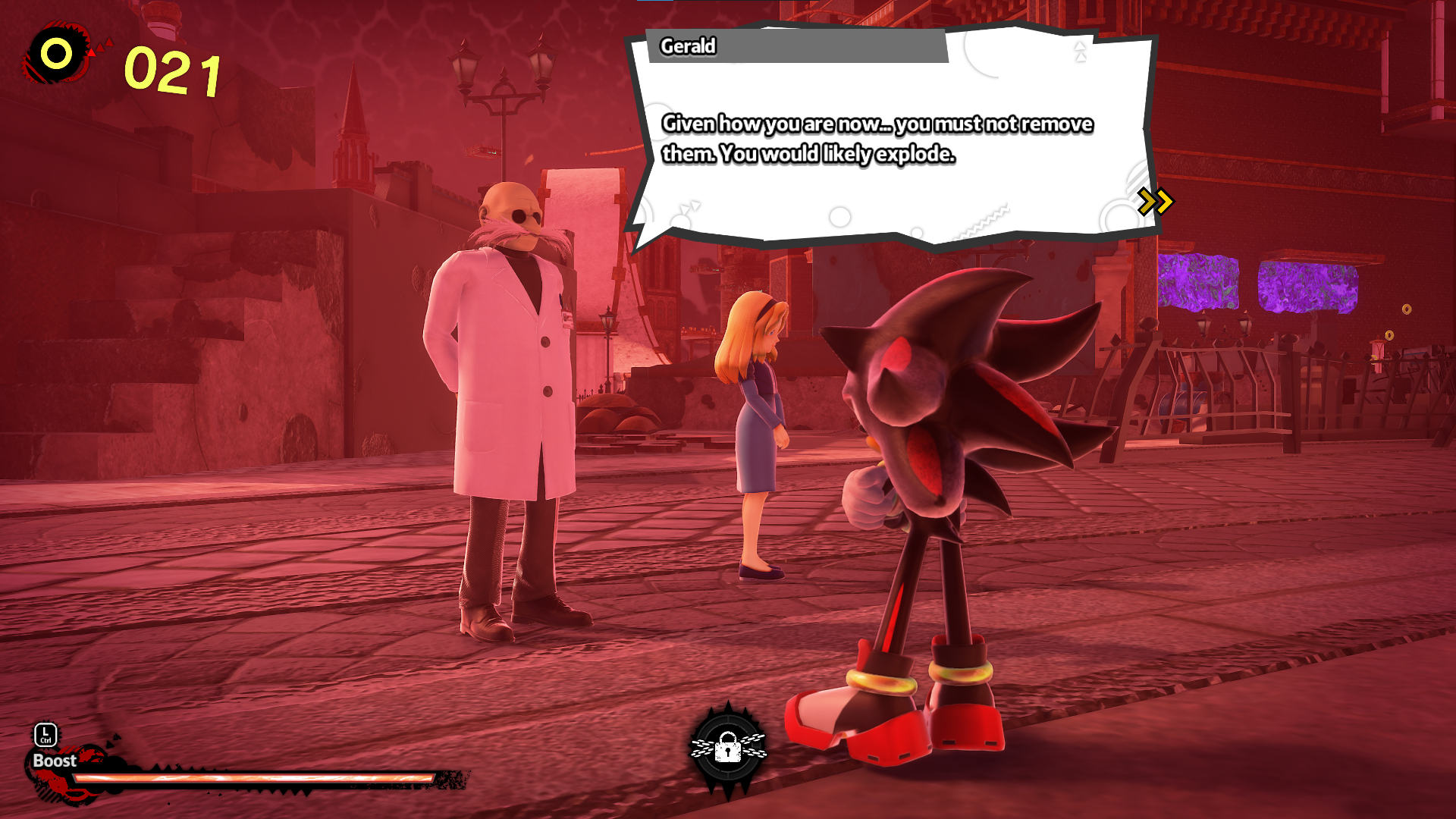
I cannot stop laughing at this line. (He is talking about Shadow’s inhibitor rings)
Game is great, though.

Cøping
I was on holiday in Copenhagen last week. Here are some photos.











selfie, eye contact
after all the laser hair removal this is what it looks like if I don’t shave for nine days

Actually there is a bit more visible in person than comes through in a photograph, but it’s almost all grey.
people who know about photography I am thinking of getting a little polaroid-style camera for making little memento snaps. Image quality is not of paramount importance but y'know would be nice. Don't want to spend a fortune. Any particular recommendations?

fucked that quantum dot organic light-emitting diode televisions look the same as every other TV instead of being dimensionfucked techoörganic nightmares

New Project
learning to spindash

was anyone going to tell me that funky groove makes u hot or was I just meant to check the options menu myself!?

Shitposting
I am not posting as much on here as I was on Cohost. One reason is that I have just been really busy and tired recently.
Another is simply I spent a lot of time on Cohost. I have praised it a lot and how it felt more deliberate and less of a trap than other social media sites, but it was still a place I could open to kill time and scroll be driven by the small joys of getting notifications. I felt I got more out of it than other places where I did that, and it fostered that addiction at bit less, but it still did it.
But also there’s a psychological barrier. I still have this feeling that this site is something serious and I have to write in clear semi-formal prose and have something to say. Just posting “I won't tell anyone if I win the lottery but there will be sins” feels wrong. Which is silly. This is my website. I can write anything I want on here. And I enjoy shitposting. I should be doing it. Maybe If I can get into the flow of treating this place more casually I can feel a bit more open again. Perhaps if I can get over the embarrassment of it I might even post some kink stuff.
But there is another reason too: Posting on here is much more deliberate. I use Jekyll as a static-site generator so making a post involves creating a new text file on my PC and running a small command line script to build and push the changes to my server. It’s not a huge effort, but it’s certainly more than using a website. I like building this site.
Sylvia (quoting someone else) said that “a personal website is like a model train set, in that it's never really done and you work on it constantly in the hopes that someone will see it” and I think that’s a great comparison! I have a todo list for ideas for this site as long as my arm and as a programmer by trade I both enjoy and know how to make extra work for myself doing it. It was originally just a site built with the default Jekyll minima theme but I have bolted on a lot of extra features and generators. There’s a pipeline to build Pico-8 games from source and an entire podcast processing system and these all run every time I regenerate the site. The overhead with these wasn’t too bad at first but over time it has just taken longer and longer to build and push the site for small changes.
But this is just another problem to solve! I enjoy doing this. I already do have a janky system in place for testing the site while skipping some of the more intensive steps for testing, but I can’t use it to push changes to the site because it would fuck up certain pages which would get replaced with versions that are missing things.
I have some idea already of how I want to go about this and it involves dividing up the site a bit more cleanly into discrete parts. This is going to result in moving some stuff around and in particular I think I will be moving everything in the gallery to a new URL scheme so any current links to my exhibits are going to break. Sustaining a few 404s is fine and if I do find anyone linking to specific pages I might set up some manual redirects but I don’t want to have to set up a million redirect rules. I have too many already and I think I’m going to be removing most of them other than for the Atom feeds to reduce clutter as well.
And then, maybe shitposting?

The Blue McDonald’s
The Blue McDonald’s in Cork sits at the end of Patrick Street at the corner with Daunt’s Square that sits in distinctive, rounded building. This is formerly the site of Woodford, Borne & Co. and the lettering on the side of the building still promises “wines, fruits, spices, coffees, teas, wines [and] spirits”. I guess they really wanted you to know that they had wines. The Woodford bar at the back of the building on Paul St. is also named for this prestigious shop.
But since a certain clown moved in in the 1980s the building has become known to the residents of Cork simply as The Blue McDonald’s and it is still called that to this day.
Despite the fact that it has been painted green for over a decade now.

Unrelated reading:

What I’m reading vol. Ⅱ
Vols.: Ⅰ, Ⅱ, Ⅲ, Ⅳ, Ⅴ, Ⅵ, Ⅶ, Ⅷ, Ⅸ, Ⅹ, Ⅺ, Ⅻ, ⅩⅢ
A roundup of some posts I’ve been reading that I thought I’d share.
Deus Ex Machina [1984] — Arcade Idea
I have been catching up on the sadly inactive Arcade Idea, a blog working through the history of video games through selected games that chart development of the medium. Unlike many such projects it does not focus only on console and arcade games or on games that are still famous.
Deus Ex Machina, whose entry I have linked, is a fascinating ZX Spectrum game/interactive movie/concept album that I had never heard of, designed and composed by Mel Croucher.
It’s actually on Steam and there is a playthrough available to watch on Mel Croucher’s Youtube channel. It has some pretty heavily strobing lights in some sections.
When the mouse dies inside The Machine, it takes its one final death shit. The turd drops into the test-tube babymaker. For the whole first act, and arguably the whole game, you play as this mouse turd.
COVID Denialism and Disability Justice — Natalie Weizenbaum
I have been also reading Natalie’s posts about setting up post embedding and reblogging and will have a look at doing that too, so maybe in future instead of these roundup posts I will directly reblog stuff into my feed.
Because this category myth isn't just incorrect, it's oppressive. All axes of oppression are wrapped around similar myths. This is why sexists are so threatened by transsexuals, why racists invented the crime of miscegenation. An oppressive mindset demands a clear and permanent division between oneself and one's victims; a mode of thought that relies on clear and permanent divisions is at high risk of enacting oppression, knowingly or not. Those who are unable (or unwilling) to imagine themselves becoming disabled are the ones who do the most harm to people who already are.
The NES Pictionary Bot, In Memoriam — Luna
The NES Pictionary bot, was, as Luna describes, something that could almost have existed on any social media website. But it could only have worked how it did, and how well it did, on Cohost, where users were given much more of a blank canvas to work with than any other social media site.
This could have been achieved on Twitter via a two-account mechanism. The main account would post the image with the dashes, a secondary account would post a reply with the solution. Users could then mute/block the secondary account, or follow it if they wanted to always see the solutions.
Similarly, this could have been achieved on Mastodon using the Content Warning (CW) system, which allows you to put a post behind a warning and require action on the part of the user to actually view the post. The bot would post the image with the dashes, and then in a follow-up post, post the solution under a CW, making users interact to see the solution.
These solutions always seemed kinda clunky to me, and eventually I just forgot all about it.
Enter Cohost.
A one-person oral history of Geocities HTML Chat — andi mcc
Speaking of giving users a blank canvas with HTML, this is one of the posts I saw circulating again towards the end of Cohost’s life, detailing the absolutely audatious way that Geocities HTML chat (which I had never heard of before) worked. Now that Cohost is shutting down she has returned to her blog.
Geocities HTML Chat was, from a technical perspective, a guestbook with a small twist. There was a chat for each of the "cities" (my home was SiliconValley, I think?). Each chat used (of course) frames to display two smaller webpages. One frame above (I don't actually remember, but let's say it was above) was a thin band containing a CGI input form. The lower frame was larger, and scrolled freely. This frame used a server-side trick; the server would tell your web browser it was sending it an infinitely long web page (or maybe it just claimed it was some impossibly large size, a gigabyte or something). It would send it the opening <html>, and then it would hang. It would keep the socket open. When a user in the chat room submitted a line to their CGI box, every user would simultaneously receive a new line on the bottom-frame open socket (which their web browser sincerely believed an ordinary webpage was actually really loading into, just very slowly).
pokémon cymraeg — Twitchcoded
A page where Twitch is documenting a project of translating pokémon names into Welsh. I had fun before coming up with Irish translations for Sonic the Hedgehog characters. It’s the kind of thing that lets you play with language in a cool way. Pokémon are great for this especially because of the multilayered and punny nature of their names. Draoi Aisteach</i> has actually already made full translations of Pokémon Red and Blue.
38
ninetales
cadnaw
- cadno (fox)
- naw (nine)
- cadnawes (vixen)
America a Prophecy — Elizabeth Sandifer
Last time I linked to Elizabeth Sandifer’s Doctor Who writing. This time I am going to link to another of her long-term projects: An annual series of blog posts analysing the American psyche through the lens of a bafflingly awful newspaper comic about the tenth anniversary of the September
As a practitioner of a magical/critical practice that I have coined psychochronography, it is my belief that one can position any cultural object at the center of one’s vision and, through sufficiently thorough exploration of it, understand the larger world in which it exists. To this end, I propose that we explore this genuinely astonishing work of comics art in order to understand the whole of America in the 21st century.
New Team, New Discord! — Spore in the News
For the sheer novelty of it: Spore’s official website and RSS feed updated this week. Spore. The game from 2008. Why not add it to your RSS reader too so that you can get updated on any new Spore news? Or I guess more likely join the Discord server they are using the news post to advertise.
Spore has a new team! You may notice some of our team members making the rounds throughout the Spore communities - RogueLyeshal (Rogue) and Reiliyn (Rei) are leading up our new community efforts. Speaking of… there is now an official Discord server, where you can keep up with the latest news from the development team, participate in contests, and get to know other players of Spore! Come join us!
I have 2000 old VHS tapes in my garage and I don't know what to do with them — James O’Malley
A cry for help I saw via Tom Scott’s newsletter that also goes into recovering teletext data from tapes.
What Alistair realised though was that even though there were no complete teletext pages stored on his tapes, there were still fragments of teletext data captured and saved by the tapes.
So he wrote some code that does something mind-blowing. Using his software, if you play in a VHS tape to a TV capture card, it will take the raw recording data, pick out the nuggets of teletext, and like magic will stitch them back together into complete pages.
Like I say, it’s witchcraft.
Artificial Life: Insects — CD-ROM Journal
A blog from Misty De Méo that explores old multimedia CDs. Maybe some day she’ll cover Ring: 感×染.
Although the front cover and spine credit Harada first, and it's clear Harada's CG artwork is the real centrepiece here, the three works are presented as coequals. More than an art book, a novel, or a game, it's a project that shows how different mediums transform the same basic concepts. The three works don't just diverge because of different inspirations but because their mediums influence what kinds of interpretations are possible, what kinds of ideas can take root.
hot pepsi ☕ — Dr. Melon
I can’t say I agree with this but it’s certainly an interesting perspective.
I highly recommend trying it out if you haven’t had it before, especially on a colder or rainy day. There’s something great about the warm steam coming off the top combined with tiny droplets flying out of the drink due to the carbonation that leave a pleasantly-contrasty cooling sensation on the lips just before you take a sip of the toasty liquid within. Drinking it and feeling the warm fizz is a little alchemical, and a little rebellious, with the net effect of overall feeling like you’re sneaking some of a wizard’s potion while he’s out gathering herbs.
👨💻 Side By Side 👨🎨 — Mike Egan
A cute little motion design animation!
I was deep in the website building mines in April, both working on this site, and building Welcome to the Cyber World, my MMBN fansite that I made for the Critical Distance Fansite Jam.
So I wanted to make something celebrating the joy and creativity of the particular left-brain/right-brain cooperation present in using code to make what is essentially a piece of visual media.
It's called Side By Side because it was originally a horizontal piece with both windows sitting next to each other, but I found that to be too static, and the transition I landed on is more fun and dynamic. It also mirrors the actual experience of building a website, in that you often write the code not knowing 100% what the site will look like until you load it up in a browser!

Conway’s Game of Life in 138 characters
k=2^13::s::for a=0,k do
n=0 for x=0,8 do
n+=peek(k*3+a+x/3+x%3*64-65)end
poke(a,n==12 and 4 or n==16 and peek(a))end
memcpy(k*3,0,k)goto s
That is the entire source code for my my Pico-8 implementation of Conway’s Game of Life, which you can run here:
I made this as a tweetcart back when tweets were still 140 characters and I am still pretty proud of it. Let’s run through how this works!
If you have never heard of it, the Game of Life is a type of cellular automation, a simulation consisting of a grid of cells. Each cell is either alive or dead and with each iteration of the simulation the state of each cell changes based on the following rules, as copied from Wikipedia:
- Any live cell with fewer than two live neighbours dies, as if by underpopulation.
- Any live cell with two or three live neighbours lives on to the next generation.
- Any live cell with more than three live neighbours dies, as if by overpopulation.
- Any dead cell with exactly three live neighbours becomes a live cell, as if by reproduction.
It’s pretty hard to see how those rules translate to the above code, so I’ll try to explain it as best I can. It relies on some tricks specific to Pico-8.
The first thing in the code is is setting k=2^13, that is 8,192. This is a magic number that is going to have a few uses.
Then we set a label ::s::. This is a label we can use goto later on in the code to return to.
Then we start a for loop, for a=0,k do, counting from 0 to 8,192. This is the length, in bytes, of the part of the the Pico-8 virtual machine’s memory that holds the current screen state. Pico-8 has a resolution of 128×128 pixels, for 16,384 pixels total, and each pixel can have one of 16 colours. That means that the colour of each pixel can be stored in 4 bits—half a byte—and therefore the full screen information can be stored in 8,192 bytes. We are going to treat every byte as a single cell, which means every cell is actually made of two pixels. You can see how every cell in the simulation is one brown and one black pixel side-by-side.
The reason we’re doing this is so that we can iterate over the current screen state in order to determine the next iteration and which cells survive or die. By examining the screen memory directly we don’t have to create a different data structure for storing the cell information; it’s just whatever’s currently on screen. This saves an awful lot of characters.
Then, inside the loop, we start by setting n=0, this is going to be used to track the number of neighbours that every cell has.
Then we start up a new loop, for x=0,8 do, to iterate over all the neighbouring cells.
Which brings us to the first complicated expression, n+=peek(k*3+a+x/3+x%3*64-65). This is adding up the values of all the neighbours (for the purposes of this implementation, each cell is considered to be be one of its own neighbours). It peeks at the memory addresses of each of the neighbours, then adds it to the running total, stored in n.
k*3 (24,576 or 0x6000) is the start of the screen memory, the starting point for iterating over the screen data. Adding a to it is iterating over each cell in sequence in the memory.
Every byte (cell) is going to have a value of 0, for dead, or 4, for alive. I’ll explain why I used the value of 4 rather than the more obvious value of 1 later.
The screen memory is arranged in the order you would probably expect, it starts in the top left corner and scans left to right, top to bottom. The first 64 bytes are the first line of the screen, the next 64 bytes are the second line, etc. As such getting the cells to the left and right of the left and right of the current one is just a matter of taking away or adding one to the address we’re querying. Getting the cells above and below means subtracting or adding 64, respectively.
To get all nine neighbours (including the current cell itself) we need to check nine memory addresses: The current address, k*3+a, and offsets of -1, +1, -64, +64, -65, -63, +63, +65. This is accomplished with the +x/3+x%3*64-65 part of the expression as it iterates from 0 to 8. +x/3 will go from +0, +1, +2 over the course of the loop1. +x%3*64 cycles through +0, +64 and +128. Then the -65 corrects these to be centred around 0 (-1 for the horizontal and -64 for the vertical).
You may notice that this is going to behave weirdly at screen edges: For the first and last row it will be checking for “neighbours” in memory before and after the screen data. These are simply going to be blank as they aren’t otherwise being used for this programme. Additionally, due to the layout of the memory the left and right edges will wrap around and be treated as neighbours of each other, with a one pixel vertical offset. This weird behaviour is going to be the price we have to pay for trying to fit a mathematical simulation into a tweet2.
Once we have the total value of n totted up it’s time to write the next iteration of the simulation: poke(a,n==12 and 4 or n==16 and peek(a)).
Poke is the opposite of peak, it lets us write to a value in memory, and we’re going to just starting writing at address 0x0, which in Pico-8 is normally spritesheet data, but we’re not using sprites in this programme so we can treat it as effectively free memory.
The poke expression is a bit weird but effectively we’re either going to poke a value of 4, 0 or the current value of the cell (peek(a)).
Let’s go back to our bullet points from Wikipedia for a second. We need to rewrite them slightly because we’ve changed the way we counted living neighbours to include the cell itself as its own neighbour. Rephrasing it in those terms we have:
- A live cell with fewer than three live neighbours dies.
- A live cell with three or four neighbours lives.
- A live cell with more than four neighbours dies.
- A dead cell with exactly three live neighbours lives.
Or, simplifying it:
- Any cell with three live neighbours is alive in the next iteration.
- Any cell with four live neighbours keeps its current value in the next iteration.
- Any other cell is dead in the next iteration.
Or, n==12 and 4 or n==16 and peek(a). If n==12 this evaluates as 4, the value we’re using for a living cell. If n==16 this evaluates as peek(a), write whatever the value for the cell is currently. Otherwise this evaluates as nil, and fortunately for us Pico-8 treats poke(a,nil) as being equivalent to poke(a,0), meaning every other case produces a dead cell.
Now we’ve iterated across the entire screen and made the next iteration of our simulation, the only thing left to do is copy the new iteration into the screen memory (memcpy(k*3,0,k)) and then start our loop again (goto s).
That’s it! Except, you might wonder, what about our starting state? We didn’t set any initial data, so why is there anything here in the first place when you run it? Well, our initial data is whatever is on screen when we run the code. You can have any starting state you want simply by having something different drawn to the screen when you hit run.
And that’s also why I used 4 for the value of a living cell: it produced interesting results when running directly after Pico-8’s boot screen rather than dying instantly, which happens if you used 13. 4 was chosen by trial and error. It’s also a bit easier to look at than using 1, which uses a dark blue colour rather than brown that’s harder to see against the black.
You can play around with this code yourself using Pico-8 Education Edition4 or check out my other Pico-8 projects
And that’s (actually) it! I hope you found this interesting.
-
peekthankfully ignores any fractional values, so we can act as if these are being rounded. ↩ -
At least to fit into what the size a tweet was back in the good old days, when men were men and tweets were tweets. Now I’m a woman and I’ve deleted my Twitter account… Actually, those might have been the bad old days. ↩
-
Which would have shaved off two two more characters as the
pokecommand would have been changed ton==3 and 1 or n==4 and peek(a). ↩ -
Click the ⏵ button to start it and then hit Esc twice to open the editor. To run it again hit Esc again to bring up the command line, enter run and hit Enter . ↩

Comments
I am trialling a comments section using Cusdis. There should be a comment section below this and every other bog post as well as every entry in the gallery.
This means most pages on here now use Javascript which makes me a little sad but maybe it is worth it.
Or maybe I will just decide to remove this again! We’ll see.
In any case feel free to say hello in a comment below.

What I’m reading vol. Ⅰ
Vols.: Ⅰ, Ⅱ, Ⅲ, Ⅳ, Ⅴ, Ⅵ, Ⅶ, Ⅷ, Ⅸ, Ⅹ, Ⅺ, Ⅻ, ⅩⅢ
As Cohost shuts down I have been making a fuss about moving away from social media and I am not the only one. We are in the final week before it goes read-only and people have been sharing blogs and websites and my RSS reader has been filling up. So here I will share some things I have been reading lately, both from Cohost people and just other interesting articles.
Makeup
vampy lipsticks — Tulip
There is going to be a lot of more typically nerdy stuff in here so let’s start with something else. I don’t wear makeup much these days but I am not immune to black lipstick recommendations.
as fall approaches, my craving for deep, dark lipsticks increases… my dark metamorphosis.
OK, well, technically it's Vampire Season year-round here - i don't need Halloween as an excuse to embrace black clothes and dark lipstick. but still! i thought it would be appropriate to showcase some of my favorite vampy lip colors from my personal collection.
Hardware
The Working Archivist's Guide to Enthusiast CD-ROM Archiving Tools — Misty
Misty digs through CD-ROM preservation and touches on why the history of the CD as an audio format first and data format second makes it more complicated than it might seem.
CD audio isn’t a file-based format, and instead uses a series of unnamed, numbered tracks. CD-ROM extends this by making it possible for a track on a disc to contain data and a filesystem instead of audio. Since CD-ROM extends CD audio, the two formats aren’t mutually exclusive: a CD-ROM disc can still contain multiple tracks, and it can even contain more than one data track or a mixture of data and audio tracks.
Hacking a Hitachi Magic Wand (Plus) — Kore
This is just cool.
So: the Hitachi Magic Wand is a very good device. It, however, has very little granularity in how strong it is. Even the newer Magic Wand Plus only has four, non-customizable settings.
I don't like this and want to fix it. In the process, I'll also be adding bluetooth connectivity, because I thought that was pretty funny.
Software
software rendering is awesome — erysdren
i fuckin love software rendering. the act of creating a fully realized 3D scene entirely in your own program, without the aid of OpenGL or DirectX or any GPU whatsoever. something about that is so charming to me. it leads to so many interesting technical design decisions and shortcuts taken to get it to run fast (if that is the goal).
Social media
RIP Cohost — Mike Egan
I had to have at least one RIP Cohost article in here.
From a design perspective, compared to all other social media, Cohost was a paradise. No numbers, no algorithm, no global feed, no discover page, and a lot of really useful ways to curate what shows up in your feed. Having a reverse-chronological feed of only the things I wanted to see from the people I asked to see them from has done wonders for my brain.
It was never about the numbers — Aurahack
Also somewhat of a reflection on Cohost but also on how numbers and stats make you worse.
The close friends I made there motivated me to get better because they were further in their art journey than I was. I looked up to them not because they were my favorite artists but because they would create alongside me and it would inspire me! I wanted to grow like they were visibly growing. Over time, I did, and my following would start to outpace theirs and… I think that’s where it started getting kind of nasty.
Computer games
Everywhere and Nowhere: Emptiness in Level Design — Nat Clayton
Nat Clayton talks about in-between spaces in games both in her work and in other games. She has also made me aware of the Weird Maps series by Whomobile which is great.
There’s a dead-end I think about every single day, tucked away in the back of Half-Life 2’s airboat chapter. It’s a right turn where you’re supposed to go left, a gun turret and a headcrab ambush and some secret crates for those nosy enough to go scavenging. It’s one of a thousand dead ends in Half-Life 2, but this one sticks out to me. As the sickly golden twilight paints the concrete runoff, illuminating basic shanty structures, the sparseness of the space is unavoidable. The roar of airboat fans and chase music given way to gusts of wind and mechanical creaking. Some designer decided that someone once lived here, died here, and painted that scene with an absolute minimum of brushes and textures.
Listening, Watching, Gaming — Chris Hall in First Person Scholar
Not a million miles away from this but in the much more academic side of games writing here’s a piece on the paratext created by submerging oneself in the soundscape and environment of a game level.
As I write this, I have open on another screen, as I often do, one of these ambient paratexts—in this case, an hour-long video from Metal Gear Solid 3: Snake Eater. There’s no music, no avatar, only a first-person scene at the ground level providing a nighttime view of the exterior of the Graniny Gorki research outpost in Tselinoyarsk, the Soviet Union. Directly before us is a high fence, followed by patches of grass and the concrete façade of the facility. To the far right a guard patrols within the fenced area, as oblivious as the sleeping dog nearby. Presumably we perceive the scene through the eyes of the game’s protagonist, Naked Snake, lying prone, but we needn’t be aware of this, and Snake provides no signs of his presence. The peaceful scene is backgrounded by the ambient sounds of the southern USSR forest, the constant chirping of bugs punctuated by the faraway cries of nocturnal birds.
Doctor Who
Perverting the Course of Human History (War of the Sontarans) — Elizabeth Sandifer
I have been enjoying Elizabeth Sandifer ripping the Chibnall-era of Doctor Who to shreds as part of her long-running TARDIS Eruditorum series analysing the entire run of Doctor Who from the 1963 to the present.
You figure there’s got to be this entire shadow Chibnall era—the one that exists only in Davies’ head and perhaps some text messages to his mates. No more detailed than the Leekley era, perhaps, but undoubtedly there. Like poor Penny in Partners in Crime we can see its shadows—obviously The Timeless Children would have stuck larger and more mind-wrenchingly than the rest, with Davies at once transfixed by its potential and vexed by its production. Ironically, he’s the one person who seems to have been substantially influenced by the Chibnall era.
The Problem with Doctor Who — Luna
An older post but keeping with on the topic of Doctor Who: Luna points out a problem with the current Doctor Who intro segment that has been in place since the 2023 60th anniversary specials. We can only hope that they fix it by this year’s Christmas special.
But something is seriously amiss in the 2023 specials, and neither I nor my inner child can let it go. And it’s not the [whatever the bigots are angry about this time], nor even the [actually legitimate criticism here]. No, none of that. The probl-
Timing.
-em with the 2023 specials is… oh. Right.
Serious articles for serious people
AI and the American Smile — Jenka
In the same way that English language emotion concepts have colonized psychology, AI dominated by American-influenced image sources is producing a new visual monoculture of facial expressions.
‘Right to Repair for Your Body’: The Rise of DIY, Pirated Medicine — Jason Koebler for 404 Media
“I don't know who needs to hear this but I'm scared too all the time of losing the health that I have. I know what it feels like,” he says. “I know what it feels like to not know what's wrong with your body and to have to go shop for a stranger who has the authority to maybe or maybe not give you what you need. I know what it feels like to know what's wrong with your body and to know what you need and to be told you can't have it because the infrastructure has failed and it's not available.”
The Third Sex — Talia Bhatt
Here is a morbid, maddening irony: anthropological scholarship, distinctly Western anthropological scholarship, that for decades has touted the maxim of ‘binary gender’ being an ‘imposed’, ‘colonial’ concept, has now been cited by an Indian court in an opinion that explicitly third-sexes the hijra and purports that recognizing them as women would ‘violate their constitutional rights’. It is seemingly only imperialism when populations who seek the technologies of transition and legible womanhood are granted access to them, while the opinions of Western academics shaping local politics is merely sparkling scholarship.

Moving feeds
I have decided to move the location of my RSS1 feeds. I will set up some redirects and hopefully everything will go smoothly but I decided to write this to let anyone following them know just in case it breaks something.
I’ll publish this post first then move everything little while later to give it a chance to be picked up in RSS readers before anything has the chance to go wrong.
I am also going to change the URL scheme for posts from /year/month/day/title to /bog/title.
-
Technically Atom as the new links make obvious, but everyone just calls it RSS anyway. ↩

How my bog handles images
A different GIF will displayed below depending on your browser’s prefers-reduced-motion and
prefers-color-scheme settings. There’s four different possibilities:
I hadn’t used prefers-reduced-motion before but I saw a chost from Kore linking
to a blog post about accessibility and GIFs and decided I wanted to follow it but
I also didn’t want to have to manually write the HTML code for it each time.
Thankfully programming is the art of being tactically lazy and I can put some effort in up front and
solve an interesting problem once and then let my site generator handle it automatically from then on.
Also thankfully I had done something like this before after taking inspiration how Luna’s blog handles images. I don’t have high DPI images but I do have different dark and light mode versions of images for the The “the Ring” Podcast series tracker chart and the Dracula International diagram I made.
The way I had initially done that was, characteristically, a mess. I wrote a custom custom Liquid tag to handle it which meant that instead of actually using the existing, basic Markdown syntax I had to put images into my posts with something like this:
{% image /bog/images/easóg.gif %}
So revisiting this to include prefers-reduced-motion options I decided to do it differently this time.
A way that would allow me to just type the normal Markdown syntax and let my code handle everything else.

The next step was to look into how to extend and customise Jekyll’s Markdown parsing and output but that sounds hard and I didn’t want to do that so I just used a regular expression1:
/((!!?)\[([^\[\]]*)\]\((.*?) *("([^"]*)")?\))/
This runs against the raw Markdown before it’s parsed into HTML and pulls out the link, alt text and title. That last part is also a big improvement over the custom tag I previously made as that didn’t support alt text or titles at all.
The code then takes the link and checks if there are any alternative versions listed in
the site’s static file list like easóg.dark.gif, easóg.static.gif or easóg.dark.static.gif.
when writing a new post now I don’t have to do anything extra other than have those other versions
with the right naming scheme in the same folder as the original image.
From there it it compiles it into HTML and replaces the original Markdown in the document:
<picture>
  <source srcset="/bog/images/easóg.dark.gif" media="(prefers-color-scheme: dark) and (prefers-reduced-motion: no-preference)" />
  <source srcset="/bog/images/easóg.gif" media="(prefers-reduced-motion: no-preference)" />
  <source srcset="/bog/images/easóg.dark.static.gif" media="(prefers-color-scheme: dark)" />
  <img src="/bog/images/easóg.static.gif" alt="A white cat" title="Easóg" loading="lazy" />
</picture>
Well, actually it does something else too. You might have noticed in the regular expression up above I am actually checking for an optional, second exclamation mark at the start of the image tag. That’s my own extension of the syntax. If I’m doing my own parsing I might as well go wild with it. If there are two exclamation marks at the start of the tag it also wraps the image in a link to itself and adds an extra class:
<a href="/bog/images/easóg.static.gif" class="dynamic-image-link">
  <picture>
    <source srcset="/bog/images/easóg.dark.gif" media="(prefers-color-scheme: dark) and (prefers-reduced-motion: no-preference)" />
    <source srcset="/bog/images/easóg.gif" media="(prefers-reduced-motion: no-preference)" />
    <source srcset="/bog/images/easóg.dark.static.gif" media="(prefers-color-scheme: dark)" />
    <img src="/bog/images/easóg.static.gif" alt="A white cat" title="Easóg" loading="lazy" />
  </picture>
</a>
The classes are to enable a little bit of Javascript2 to swap out the destinations of the links on the fly when swapping if the user’s media preferences change. Whichever one you currently see in the browser is the one you’ll go to if you click on it.
I might review the double bang syntax if I can figure out something that could be added to the tag that would get stripped out and ignored by a normal Markdown parser for better compatibility. If only Markdown had comments.
Is this a robust solution? Absolutely not! Will I eventually run into annoying weird cases that make me bang my head against the wall as a result of this? I already have! While writing this very bog post! Because the regular expression cannot tell that the markdown code example I have above is not meant to be parsed and turned it into HTML, making it impossible to show the before part of the before and after. Did this make me go back and implement this in a better way? No!
I added some metadata to this post telling it do disable my custom image parsing, made the parser skip doing anything if it finds that metadata on a page and then hardcoded the example at the top of this page. That’s right: This post isn’t actually using the one thing it’s meant to be demonstrating!

Insular R
This post uses obscure Unicode codepoints and custom fonts which may not display in RSS readers and some browsers.
A few years ago I made a Gaelic-style monospaced pixel font that I called Cló Piocó-8. This was originally just testing out the custom font mode in Pico-8 for fun. I then ended up making a truetype font using Pixel Forge.
If custom fonts can display it looks like this.
This was mainly for fun and I haven’t used it terribly much.
Around the same time I made it I also made a similar pixel font for Ogham. I think the reason for making these separately was because the main font was monospaced but the Ogham one wasn’t? Or perhaps it just didn’t occur to me to include the Ogham section with the original font at the time. Either way I’ve decided I wasn’t happy with them being two separate fonts so I made a new version of Cló Piocó-8 that includes the Ogham block.
I also changed another character: R.
The original R character in the font was more straightforwardly based on an Insular R and looked like this: R.
You might be wondering what an Insular R is.
Insular? Why is this R so withdrawn?
Because in the middle ages Ireland was a pretty isolated place, and Irish monks were left to their devices, eventually developing a style of writing called Insular script.

When printing came to Ireland, which took a while, most things were printed in English. Gaeilgeoirí didn’t have much to read (but most of them couldn’t, anyway). The first book printed with an Irish type was Aibidil Gaoidheilge agus Caiticiosma in 1571, using a font which had been commissioned by Elizabeth Tudor, though it was actually a bit of a hodgepodge of Gaelic, Roman and Italic, with the new Gaelic letters resembling the Anglo-Saxon type made by John Day.
Since then Irish has been printed in both Roman and Gaelic type, the former often simply due to practical considerations of the availability or expense of Gaelic fonts or because it was seen as more modern. It is rare to see Gaelic script used now except for in decorative text such as signs and plaques.

But I quite like the Gaelic-style scripts and—as evidenced by my homepage—I quite like playing with typefaces. I use Mínchló from Gaelchló for most the Gaelic script on this site.
But I will admit there can be some drawbacks to readability. Particularly with f, s and r, or rather their Insular variants, which Unicode has unique codepoints for: ꝼ ꞅ and ꞃ, respectively.
ꝼ ꞅ ꞃ
Compared to a Roman f, the Insular ꝼ almost appears as if it has been hammered into the ground like a post. The tail of the character dips below the line and the stroke is level with it, the top of the character only reaching to the same height as a small letter like e. But it is still distinct and recognisable as an f.
The problem starts with s. You might be familiar with a long s, which is basically an old-fashioned way of writing an s where it looks like an f without the stroke in the middle. The Insular ꞅ similarly strongly resembles an Insular ꝼ and if one is more familiar with Roman type it is very easy to confuse them at a glance. Many modern Gaelic typefaces simply use a Roman-style s instead for clarity, or offer the use of both using stylistic sets. I opted to use a Roman-style s when making Cló Piocó-8 for clarity. When your characters are only four characters high you need to be careful about legibility and it’s very common to do this anyway with Gaelic typefaces for both s and r.
But I still, in that first version, decided to go with an Insular ꞃ, a character that resembles a cross between the Insular ꞅ and an n, or perhaps a Greek η with the tail on the other side. In an attempt to make it not look too much like an n I cut one pixel off the right-side, to try and maybe make it look a bit more like a Roman r, but really it just makes it look weird. I left it like that for a long time, but I was never fully satisfied with it.
Deciding to change it
When I was making my custom cartridge designs for my Pico-8 projects (something else I could write a bog post on, really) I decided to use Cló Piocó-8 to sign my name and the URL of this site on them. This made me have to face that bloody R again. I was never happy with the compromise I made originally and quite frankly people were not going read it as an r. I don’t want anyone typing “oakneef.ie” into their browsers and finding nothing there.
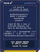
It was here that I came up with my new compromise: R. It is mostly an upper-case Roman R but with a little bit of a tail sticking down for a bit of Insular influence. I have actually started scribbling my r like this when handwriting in Irish as well.
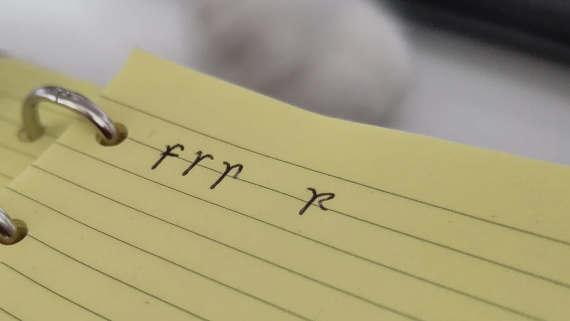
It took me a while to actually bring this change back to the font file itself but when making the 88×31 pixel badge for this site  I was reusing elements from my Pico-8 cartridge design and it reminded me to go back and make the change, and I while doing it I also rolled the Ogham font into it as well, which I had also been intending to do for a while.
So check out Cló Piocó-8.
Appendix: Comparison of fonts
| Source Serif 4 | Mínchló Insular-style | Mínchló Roman-style | Cló Piocó-8 v1 | Cló Piocó-8 v2 |
|---|---|---|---|---|
| fsrn | fꞅꞃn | fsrn | fsrn | fsrn |
Source for historical claims: The Irish Character in Print: 1571-1923, E.W. Lynam

Welcome to my bog
I have created a new type of communication where I write articles and then “post” them to my log on the web. A “web log” if you will, or “bog” for short.
This site was originally just a gallery of things I made presented in a kind of formal, terse, way. I’m pivoting it to a personal site, though the gallery is still here.
This left me to figure out what I was going to marry the two functions for a redesign and also how to handle the transition with the existing RSS feeds. What I have settled on is having a feed for this bog, a separate feed for the gallery and having the existing feed combine both.
There is also the feed for the Irish-language version of the gallery which will remain in place. Maybe I might try bogging in Irish too to practise it more again, in which case that will probably also become a combined feed for the two. But first the codebase and CSS for this site needs a major cleanup.


