Insular R
This post uses obscure Unicode codepoints and custom fonts which may not display in RSS readers and some browsers.
A few years ago I made a Gaelic-style monospaced pixel font that I called Cló Piocó-8. This was originally just testing out the custom font mode in Pico-8 for fun. I then ended up making a truetype font using Pixel Forge.
If custom fonts can display it looks like this.
This was mainly for fun and I haven’t used it terribly much.
Around the same time I made it I also made a similar pixel font for Ogham. I think the reason for making these separately was because the main font was monospaced but the Ogham one wasn’t? Or perhaps it just didn’t occur to me to include the Ogham section with the original font at the time. Either way I’ve decided I wasn’t happy with them being two separate fonts so I made a new version of Cló Piocó-8 that includes the Ogham block.
I also changed another character: R.
The original R character in the font was more straightforwardly based on an Insular R and looked like this: R.
You might be wondering what an Insular R is.
Insular? Why is this R so withdrawn?
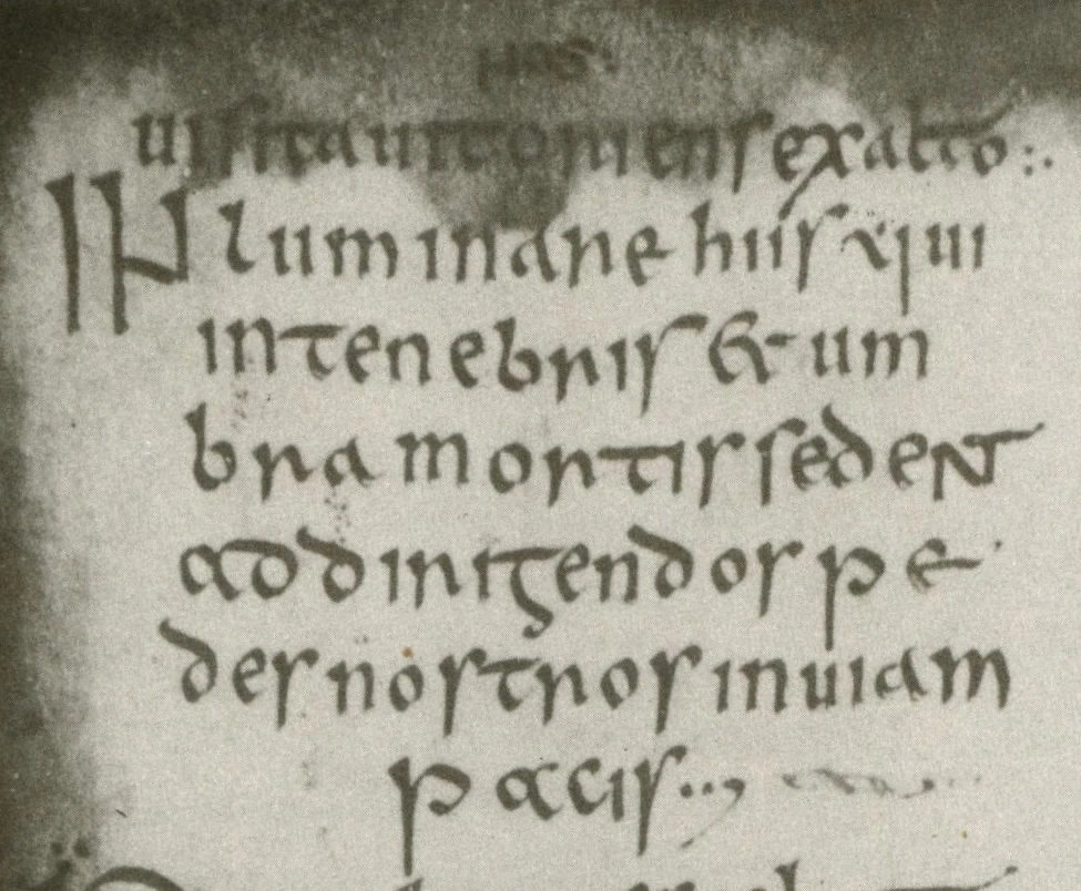
Because in the middle ages Ireland was a pretty isolated place, and Irish monks were left to their devices, eventually developing a style of writing called Insular script.

When printing came to Ireland, which took a while, most things were printed in English. Gaeilgeoirí didn’t have much to read (but most of them couldn’t, anyway). The first book printed with an Irish type was Aibidil Gaoidheilge agus Caiticiosma in 1571, using a font which had been commissioned by Elizabeth Tudor, though it was actually a bit of a hodgepodge of Gaelic, Roman and Italic, with the new Gaelic letters resembling the Anglo-Saxon type made by John Day.
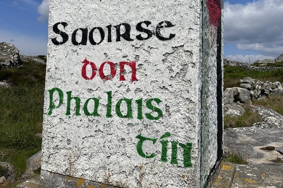
Since then Irish has been printed in both Roman and Gaelic type, the former often simply due to practical considerations of the availability or expense of Gaelic fonts or because it was seen as more modern. It is rare to see Gaelic script used now except for in decorative text such as signs and plaques.

But I quite like the Gaelic-style scripts and—as evidenced by my homepage—I quite like playing with typefaces. I use Mínchló from Gaelchló for most the Gaelic script on this site.
But I will admit there can be some drawbacks to readability. Particularly with f, s and r, or rather their Insular variants, which Unicode has unique codepoints for: ꝼ ꞅ and ꞃ, respectively.
ꝼ ꞅ ꞃ
Compared to a Roman f, the Insular ꝼ almost appears as if it has been hammered into the ground like a post. The tail of the character dips below the line and the stroke is level with it, the top of the character only reaching to the same height as a small letter like e. But it is still distinct and recognisable as an f.
The problem starts with s. You might be familiar with a long s, which is basically an old-fashioned way of writing an s where it looks like an f without the stroke in the middle. The Insular ꞅ similarly strongly resembles an Insular ꝼ and if one is more familiar with Roman type it is very easy to confuse them at a glance. Many modern Gaelic typefaces simply use a Roman-style s instead for clarity, or offer the use of both using stylistic sets. I opted to use a Roman-style s when making Cló Piocó-8 for clarity. When your characters are only four characters high you need to be careful about legibility and it’s very common to do this anyway with Gaelic typefaces for both s and r.
But I still, in that first version, decided to go with an Insular ꞃ, a character that resembles a cross between the Insular ꞅ and an n, or perhaps a Greek η with the tail on the other side. In an attempt to make it not look too much like an n I cut one pixel off the right-side, to try and maybe make it look a bit more like a Roman r, but really it just makes it look weird. I left it like that for a long time, but I was never fully satisfied with it.
Deciding to change it
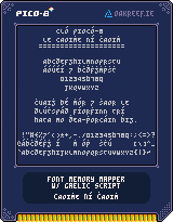
When I was making my custom cartridge designs for my Pico-8 projects (something else I could write a bog post on, really) I decided to use Cló Piocó-8 to sign my name and the URL of this site on them. This made me have to face that bloody R again. I was never happy with the compromise I made originally and quite frankly people were not going read it as an r. I don’t want anyone typing “oakneef.ie” into their browsers and finding nothing there.

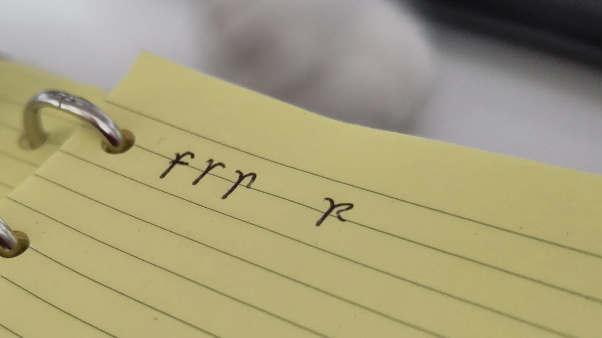
It was here that I came up with my new compromise: R. It is mostly an upper-case Roman R but with a little bit of a tail sticking down for a bit of Insular influence. I have actually started scribbling my r like this when handwriting in Irish as well.

It took me a while to actually bring this change back to the font file itself but when making the 88×31 pixel badge for this site  I was reusing elements from my Pico-8 cartridge design and it reminded me to go back and make the change, and I while doing it I also rolled the Ogham font into it as well, which I had also been intending to do for a while.
So check out Cló Piocó-8.
Appendix: Comparison of fonts
| Source Serif 4 | Mínchló Insular-style | Mínchló Roman-style | Cló Piocó-8 v1 | Cló Piocó-8 v2 |
|---|---|---|---|---|
| fsrn | fꞅꞃn | fsrn | fsrn | fsrn |
Source for historical claims: The Irish Character in Print: 1571-1923, E.W. Lynam