Recreating the Neo Turf Masters "Next Hole" UI

In the latest edition of my "What Else Is On?" link roundup, I mentioned that I finally played Big Tournament Golf, better known as Neo Turf Masters in North America, for the first time.
I'd seen it played on YouTube in various places over the years, but never actually put my own two hands on it. After watching the Remap crew play it on this year's Savepoint charity stream, and realizing it was a whopping $8 on Switch, I snapped it up.
I fell in love with the game's whole vibe pretty much immediately, from the dramatic anime intro, to the luscious soundtrack, to the classic, tinny arcade VO shouting "on the green!!"
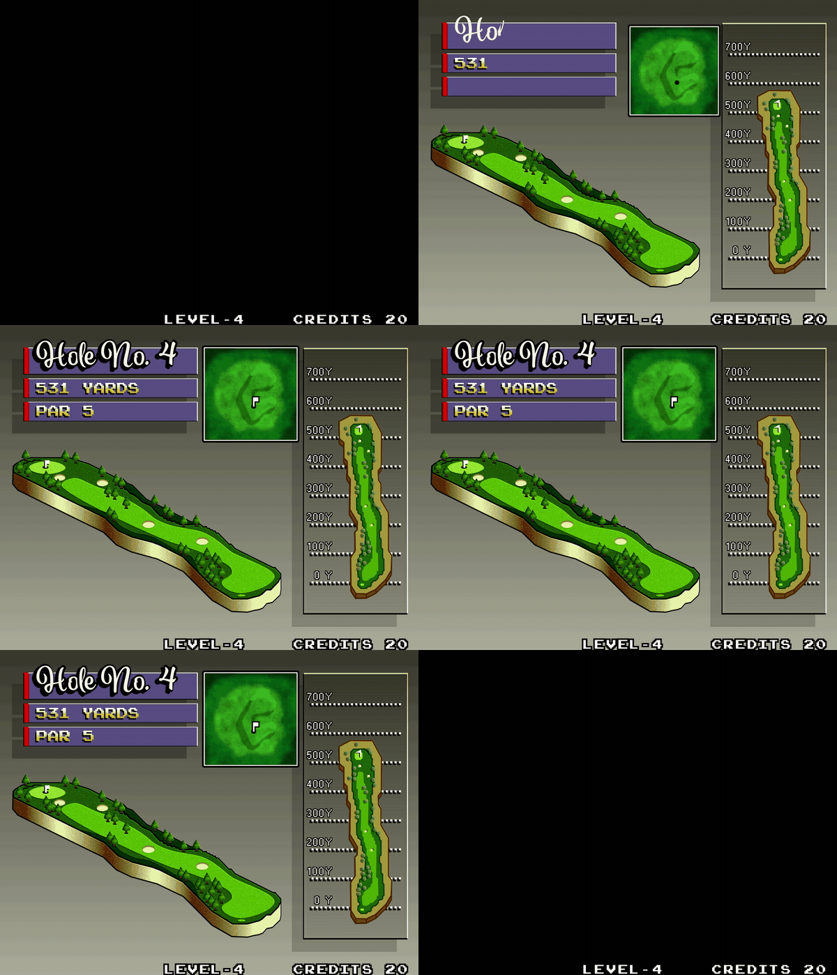
One element that really grabbed ahold of my brain and refused to let go was the screen shown before each hole. It depicts a series of graphical representations of the topography of the next hole, along with some text informing the player of the simplest, most pressing information, shown over the chillest, most soothing retro arcade music imaginable.
The way each element flies in from opposite ends of the screen, scales-in from zero, and particularly the way the "Hole No. X" text writes-on and then grows an outline and a thick, opaque drop shadow really entranced me. To say nothing of the gradients! There's so much going on, and yet not very much at all. It's all so simple and juicy and perfect.
I had to try to recreate it. If not only as a fun motion design exercise, than also to exorcise it from my brain.
Here's the original, as created by the masters at SNK:
And here's my attempt at a recreation, with the same audio underneath:
The first thing you'll notice is that I wasn't able to find a close match for the "Hole No. X" font. Which is a shame, because that's a great font, but font-matching is tough, and try as I might, I wasn't able to find the original.
Failing that, I decided on something I thought carried a similar style and similar embellishments that looked fun to animate. I was a little quick and sloppy with the write-on animation, but I don't think it's noticeable in motion, and I'm happy with the result!
For the rest of the elements, it was tough to strike a balance between retro and modern. So much of what makes the original great is down to pixel art and the way it's being rendered. But since I'm not a pixel artist, I knew going in that my version would have a cleaner, more modern look, and I decided to mostly lean into that, and not force a faux-retro look with a ton of effects.
The only place I decided to go for a purposely retro look was in the background, which I posterized to give the gradient that banding effect you see in the original because the hardware couldn't create a seamless gradient. I love that look. It really ties everything together, and provides a solid foundation for the rest of the piece.
The hardest element was, of course, the largest: the big faux-3D rendering of the course in the middle of the screen. As these things go, I liked it more the more I saw it come together. Like its lower-res neighbor on the right, I just pulled in my reference layer, and went to town with the pen tool. From there, it was all about dialing in the right stroke width, getting the texture and shadow of the trees right, and finishing with effects on top.
I wasn't sure how to go about creating the gradient on the strip of extruded land at the bottom at first, but I eventually settled on just eyeballing a gradient fill with a bunch of points on it, and trying to position them where the light and shadows should fall.
This was the last thing I did, so I had all of the other elements in place, and had already pre-comped it so I could start playing around with effects and figuring out the final look. I worked on the gradient inside the pre-comp, so I was seeing it without the final effects applied at first. I wasn't sure about the way it looked, but when I backed out to the main comp and saw everything applied to the gradient, I had a genuine "oh shit" moment.
I had been thinking about posterizing this gradient to achieve the same banding as the background, and tie everything back to the retro aesthetic that way, but when I played around with it, I ended up liking this better! I'm really happy with the effect of that gradient.
All in all, this was a really fun exercise! Like all new projects, it taught me a little something new, and I had to push myself to figure out things I hadn't done before.
And I still absolutely adore what SNK achieved with this screen. I love how far back all the drop shadows are pushed, I love the smooth, linear motion of all the animations, and I love the way each element slowly fills out the screen one by one, with the three boxy elements leaving space for and framing the big, freeform shape of the course in the middle.
Finishing this project has me wanting to try tackling recreations of some other video game UI! Leave some of your faves in the comments, and maybe I'll give 'em a go!
You can find this piece and others on my Motion Design page.