Vols.: Ⅰ, Ⅱ, Ⅲ, Ⅳ, Ⅴ, Ⅵ, Ⅶ, Ⅷ, Ⅸ, Ⅹ, Ⅺ, Ⅻ, ⅩⅢ, ⅩⅣ
Your musical entertainment:
A look at how creative decisions and compromises get made on a movie set.
You see, there’s a scene in that movie that tormented me, that kept me up at night, and that lately has had me interrogating a wide variety of seemingly devoted, and certainly well-compensated, filmmaking professionals. That’s because the bird in Charlie’s Angels is, I believe, the wrongest bird in the history of cinema—and one of the weirdest and most inexplicable flubs in any movie I can remember. It is elaborately, even ornately wrong. It has haunted not just me but, as I’d later learn, the birding community at large for almost a quarter of a century.
My clone recently discovered Worst Girl Games and has been having a time of it. When I played it I actually didn’t click with Heaven Will Be Mine nearly as much as We Know the Devil but Caoimhe’s words on it are making me want to revisit it.
Heaven Will Be Mine is short and sweet. A full playthough is roughly five hours. Within that time, it packs a narrative of the trans struggle for identity and recognition, the search for meaning in a perpetually hostile world, the never-ending quest of humans' self-discovery and exploration, and of course cool mechs beating each other up.
Cute little list and led me to this fun interview from Bad Games Hall of Fame with Rebecca “Burger” Heineman and to revisit this interview with Megumi, the programmer of Virtual Lab that I had read before.
Not gonna lie I did NOT realise how long Maddy Thorson had been doing Trans-People-Can-Double-Jump Platformers before making this list. Like, I thought that Celeste was primarily her drawing from the twitchy platformer style of Super Meat Boy but as it turns out, lmao nope Not only does Jumper predate Meat Boy by sevaral years, but the lead character, Ogmo, went on to appear as a playable character in Super Meat Boy, acknowledging the influence that game had taken from Thorson's work. Like, I fully had the order of cause and effect completely wrong here.
I swear that I am not going to keep linking to blogs by lifeforms that have been bred for thousands of years to sustain themselves solely on ever-more incomprehensible Doctor Who criticism but I needed to share the chips–soufflé spectrum model of media analysis with the world.
Note how chips becomes synecdoche for an ordinary life, an inescapable pillar of the daily grind as fundamental as work, home, sleep, and commuting. Chips is what the rest of us do.
There’s an inescapable class element to this. Science fiction is often accused, with some justice, of being a middle-class genre; even when it’s militaristic our focus tends to be on the officer class. A good deal of the value of Rose in the first place is that, as a working-class soap opera type of character, she does not at first seem to belong on Doctor Who. Indeed, often that’s part of her quality: in her first episode it’s her experience in her school’s gymnastics team, silver medal, swinging on a chain, that saves the day with straightforward physicality where the Doctor’s talk of Shadow Proclamations and anti-plastic failed to hold sway. Then she’s befriending the lowly mechanics and servant girls who turn out to be key to their respective stories.
A nice little piece laying out some interest aspects of the Transformers series through the lens of a particular run of comics including the historically weird handling of gender and how later IDW comics corrected that.
When James Roberts began writing the fan favorite series More Than Meets the Eye, he wanted to explore the subject of Transformer romance. And if Furman said that there aren't any women on Cybertron, then, well… I guess he's been left no choice but to declare it the robot yaoi planet! His hands were simply tied, folks.
Look. If Bret Devereaux is going to keep writing articles analysing the practicalities of speculative fiction tropes I am going to keep linking to them.
Complicating this picture further are spare parts. Without the ability to manufacture bespoke spare pairs at scale, keeping these vehicles in operation is going to be very difficult. So we ought to expect to see, alongside an emphasis on fuel efficiency, a preference for robust, easy-to-maintain platforms that use widely available civilian vehicle components, rather than hard to source or scavange military components. After all, asking your local junk mechanic to service the AGT1500 gas turbine engine in an Abrams MBT is going to be a pretty big ask, compared to finding the parts to fix the engine of yet another Toyota pickup.
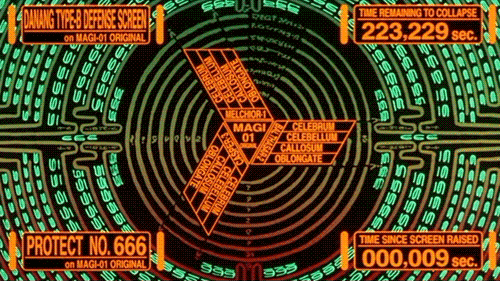
Damn now I want a vector-based display again.
Everyone who works with interfaces should be looking at these and asking themselves why interfaces don’t look like this. Where did we go so wrong? Where’s the big fuckup where we ended up with like, windows 95 instead of this shit? This is something I have devoted untold and definitely irresponsible brain space to. And honestly, the best answer I have is very simple, but I think also a kind of interesting look at how our tools shape the designs we make.
Wijers doing an extremely important job 🫡
When I watch TV and movies, I sometimes notice web addresses. I’ll usually note them down, and look them up later to see if they’re registered. In most cases, they’re registered by the studio or network or whatever and just redirect to their site. AMC, for example, keeps www.savewalterwhite.com up from Breaking Bad (now 12 years after the series ended, as of the time of writing), and www.cometlist.net up from Halt and Catch Fire.
Technology
Quite an old one but recently linked to by Tina. What if your scanned just randomly changed numbers around in the scanned image? What multiple models of scanners from the largest manufacturer in the world did that for years without being fixed? There is also an accompanying video.
In this article I present in which way scanners / copiers of the Xerox WorkCentre Line randomly alter written numbers in pages that are scanned. This is not an OCR problem (as we switched off OCR on purpose), it is a lot worse – patches of the pixel data are randomly replaced in a very subtle and dangerous way: The scanned images look correct at first glance, even though numbers may actually be incorrect. Without a fuss, this may cause scenarios like:
- Incorrect invoices
- Construction plans with incorrect numbers (as will be shown later in the article) even though they look right
- Other incorrect construction plans, for example for bridges (danger of life may be the result!)
- Incorrect metering of medicine, even worse, I think.
First of a series of posts on this blog dealing with the hell that is trying to use Linux while blind.
Linux claims to support blind users here. It even ships the tools. But using them? Getting speech or braille output when you need it most? That’s a punishing mess of driver quirks, missing defaults, audio stack failures, and layers of modern regression hidden under the surface.
Anubis is a piece of software that has become popular for helping block unfriendly crawlers that have been overloading a lot of sites to grab data for neural network training without care for the damage they are doing to the web. It also has an cartoon character mascot that has proven useful for weeding people who like being dismissive pricks.
At some level, I use the presence of the Anubis mascot as a "shopping cart test". If you either pay me for the unbranded version or leave the character intact, I'm going to take any bug reports more seriously. It's a positive sign that you are willing to invest in the project's success and help make sure that people developing vital infrastructure are not neglected.
Technology ∩ Capitalism
Seen via a post by Fabio Manganiello going further into Bell’s treatment of people compared to what companies and academia both demand of them now, shared by Xerz and boosted by Jennifer Glauche which also inspired the next post by Elilla.
Reportedly, Kelly and others would hand people problems and then check in a few years later. Most founders and executives I know balk at this idea. After all, "what's stopping someone from just slacking off?" Kelly would contend that's the wrong question to ask. The right question is, "Why would you expect information theory from someone who needs a babysitter?"
On the empty promises and dehumanisation of Google.
It's the little things that bugged me, how people would eat the free candy or have a bowl of cereal and just leave trash and dirty dishes everywhere for the cleaning ladies (contractors) to deal with; more than that the way nobody looked at them or said “thank you”. We Brazilians have a social class for that, a social code underlying that studied invisibility, I knew what this was: these were maids. Servants. The women in my family, my friends at school. The “campus” was pretty open and my then-wife visited it a few times; it creeped the Fuck out of her, the distinction between people and non-people.


