
the polycule fursona designer has turned me into a pangolin

the polycule fursona designer has turned me into a pangolin
Just wanted to highlight the cool artwork on the website homepage whiteboard at the moment. Thanks to whoever drew it!
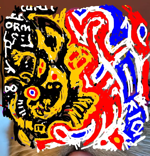
I was intending on having some friends over the other day for a small party and give them each a small Christmas present but I ended up being too ill to host. I had one present that I was going to give to Caoimhe³ early too (the rest to be saved for Christmas Day), selected mostly as an excuse to show off in front of other people because it’s the one thing I made for them myself: A pair of belt and boot chains in the nonbinary flag colours.
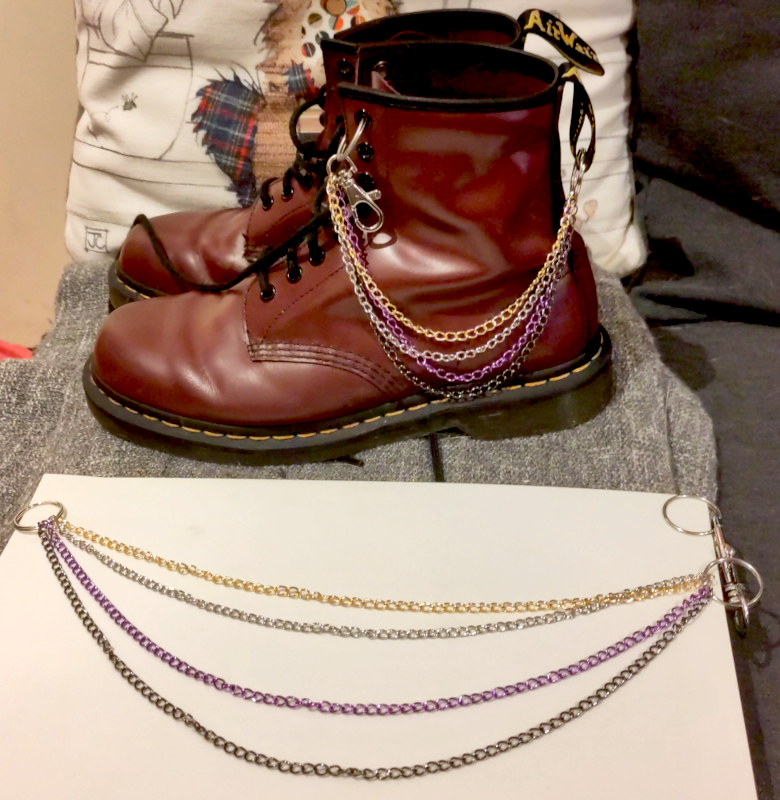
I was inspired by these chains from Renders Renderings and seeing as they were all out of stock I decided to fashion my own. I made mine with thinner chains and I am a little worried that they might be too delicate but I had trouble sourcing small lengths of coloured chains in larger sizes and thought it would look better to get ones that came the in right colour rather than trying to spraypaint them. If they end up breaking I still have some more chain so I might try and fashion something that is less likely to be caught on things or be subjected to force.
Caoimhe came over the day that party was meant to happen anyway to look after me a little and I gave them to her then and she seems very pleased with them. I love my nonbinary girlfriend :)


I posted a diorama I made for Caoimhe³ yesterday. I like to make little things for partners sometimes.
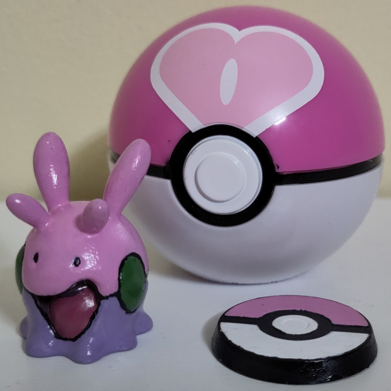
My other partner has a strong fondness for the pokémon goomy and I have learnt that your partner identifying with an extremely marketable pokémon makes putting together silly little gifts pretty easy. A couple of years ago I got a little 3D-printed goomy figurine from an Etsy shop (that doesn’t seem to sell it any more), painted it myself and and paired it with a love ball from a more official toy as a gift for her.
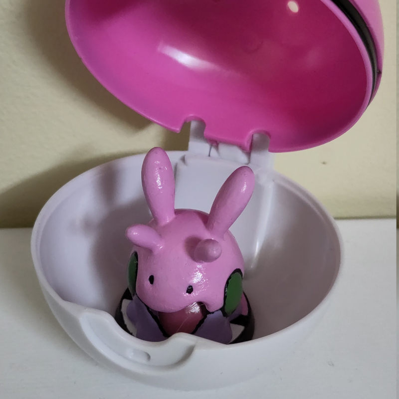
She has also been, more recently, getting back into Magic: The Gathering and had put together a ooze deck which she used my printer to make proxies for. While I was doing that for her I threw in some little custom cards for the deck.
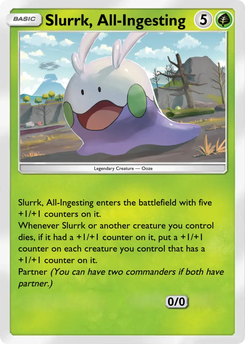
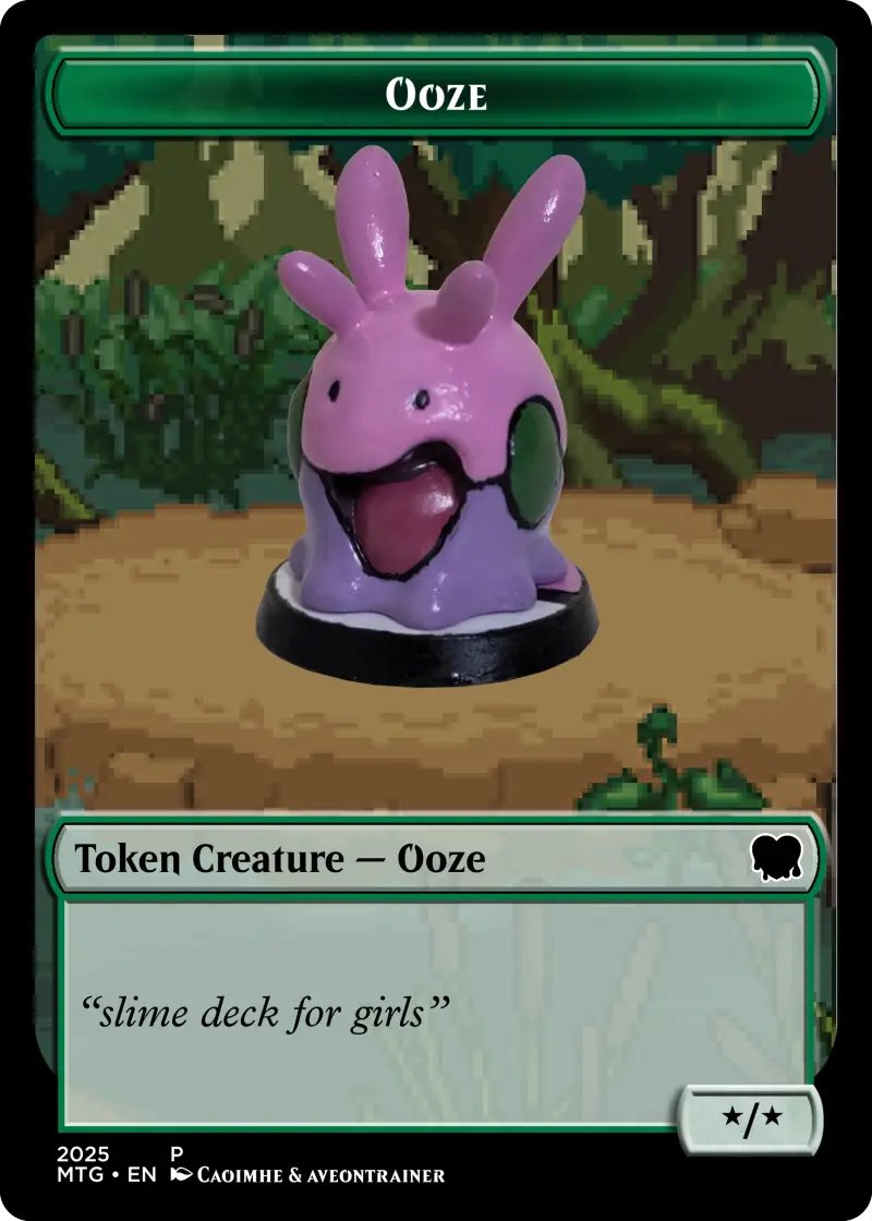
For the Slurrk card I used Poké Card Generator to fill in the basic rules then made more modifications in GIMP. For the token card I used Card Conjurer and put a photo of the goomy figurine over a swamp background made by Aveontrainer.
Caoimhe³ has a Toyota GT86 named Takumi that she is taking out for a track day tomorrow. I gave her a little something today to commemorate it.
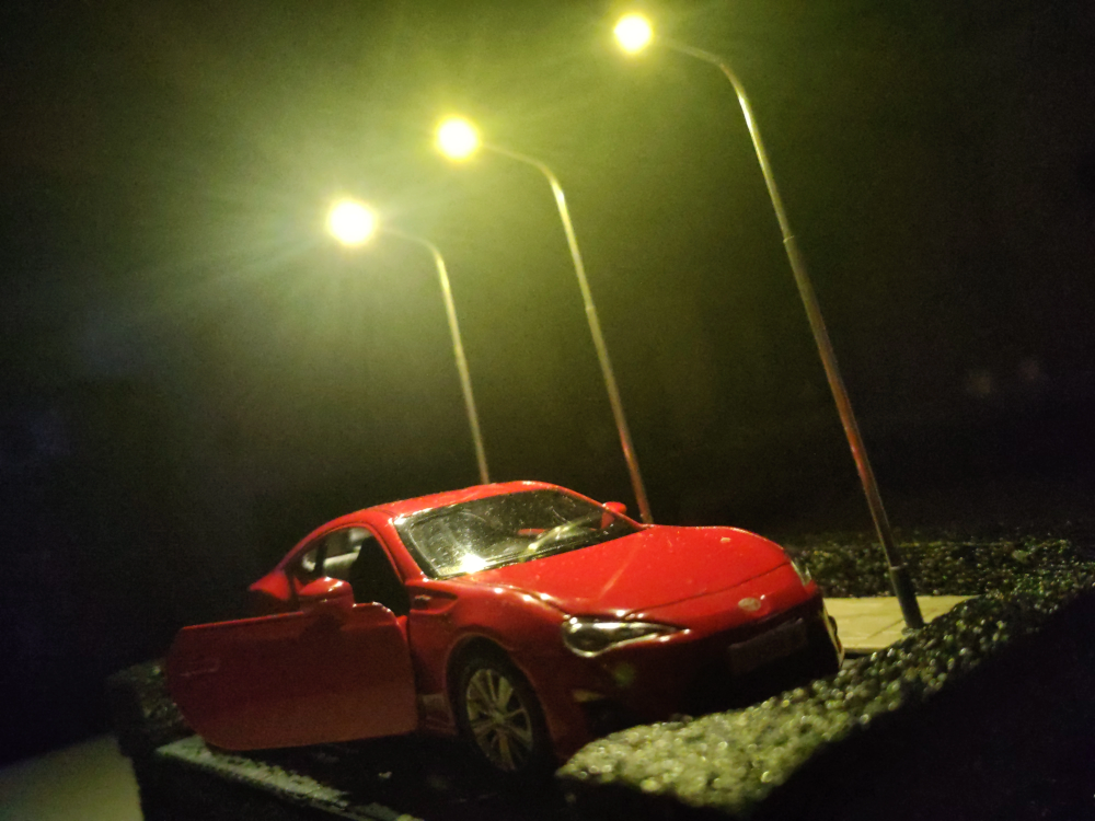
I got a 1:36 scale model car online and originally simply intended to give that to her as a gift, but the idea of making a small diorama for it struck me and I threw this together yesterday in a fit of anxious hyperfocus. The construction was a mess and I was surprised with how well it turned out in the end.
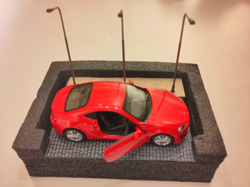
Pretty much everything that you can see other than the car and the foam it’s mounted in came from a local model shop.
The cobblestones were originally a uniform grey but I painted them with some watered down black paint to sink into the crevices and then heavily drybrushed grey over them to give a little bit of depth. The footpath could have perhaps done with similar treatment but I didn’t think any of the paints I currently had were very suited.
The streetlamps, perhaps a bit out of scale with the car as well as not being mounted particularly straight, are powered by 3V from two AA batteries, which are mounted in a battery holder with a power switch that I cut from a length of fairy lights and sloppily soldered to the lamposts. It’s rough and I think the connections are liable to break if it needs to be taken out for a battery change, but it works and the switch to turn the lights on and off is accessible through a discreet hole cut in the side of the foam.
The foam itself is just something I found thrown with some other miscellaneous rubbish in the press under the stairs while looking for something to mount this on and ended up being almost perfectly shaped to hold the segment of road as well as having depth enough to hide the battery pack. I didn’t even have to cut it other than the hole for the lightswitch.
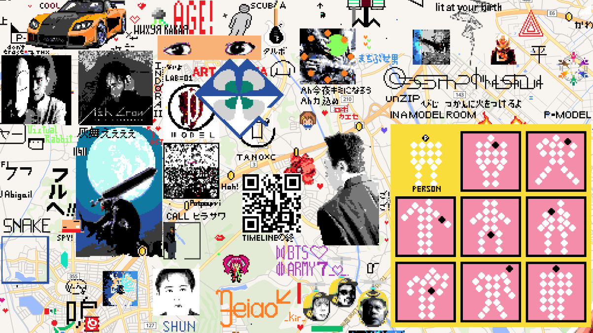
I am probably going to wind down using Wplace. It was fun to mess around with for a few days, flex my pixel art muscles, see what other people are drawing, see how the canvas evolves, but it’s very much a flash in the pan thing that most people are going to move on again from quickly, myself included. I have dotted down a few more things on the map, this time putting some larger pieces of other people’s art in a few places rather than my own pixel designs.
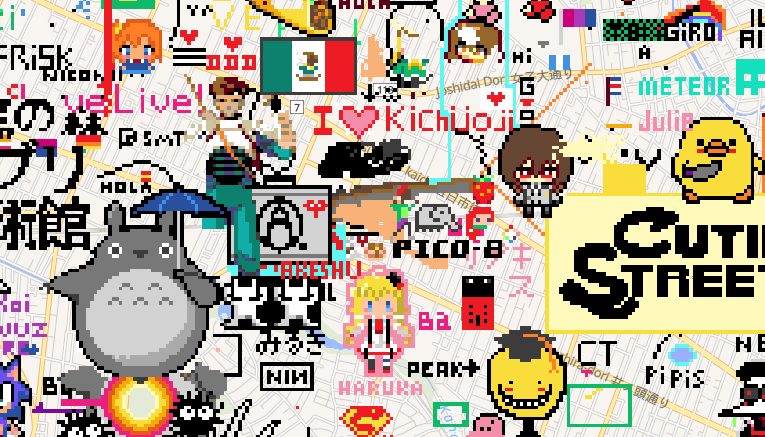
I put down the Pico-8 logo and a few characters near the Pico Pico Café in Kichijōji, Tokyo. This is a busy area and it has quickly been drawn over again, but all of this is ephemeral.
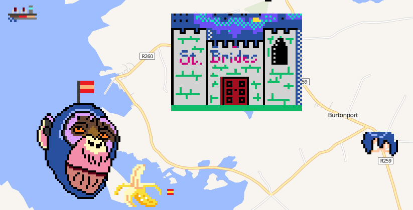
One of my past brief obsessions was St. Bride’s a strange mock-Victorian girl’s school holiday destination in Ailt an Chorráin, Donegal that in the 1980s promised a total disconnect from modern society and modern technology. They advertised that they had no electricity and did not believe in such things and also published a series of text adventure games for the ZX Spectrum. That is a rabbit to save for a future post, perhaps. I planted a shrunk-down recreation of the title screen of the game The Secret of St. Bride’s in the village where the school was based.
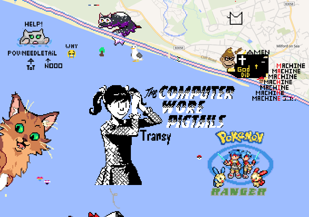
I started using the Blue Marble user script for these which helped with planning out size and position for these larger drawings a lot, as well as speeding up the actual drawing. I dropped a little art of Transy east of Bournemouth. It’s modified from a comic panel but this is the art from this lot that I can probably take the most credit as being “mine”.
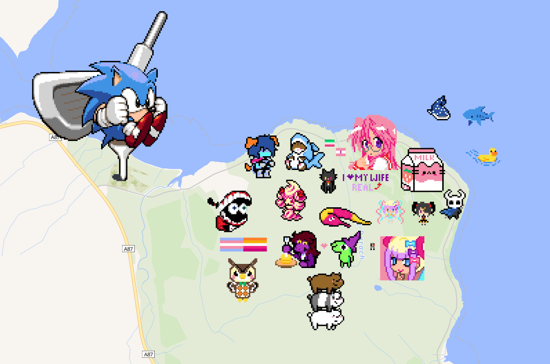
I also draw the character select art for Snolf that I originally commissioned from Mars Gainsboro and decided to arbitrary place them on the Isle of Skye Golf Club.
Finally, I also contributed my pixels to my friend Ruby’s big rendition of the art for the P-Model album In a Model Room in Tsukuba, a hotbed for artwork of Susumu Hirasawa. She contributed to helping draw my art a lot as well.
I have some more Wplace art in a new post.
I’ve been spending a bit too much time fucking around on Wplace but it’s been nice to flex my pixel art muscles a tiny bit again. One of the first things I added to the map was a dusted-off pokémon trainer sprite I made a few years ago when playing the ROM hack Pokémon Crystal Clear.

I used the Crystal player sprite as a base for this with the arm of the youngster sprite from the first generation games. I put this down near where I grew up, a pretty rural place. It can be quite isolating to grow up weird or queer in a place like that and it warmed my heart to see someone else had already drawn a few pride flags there including a trans one. I don’t know who drew that but I hope they are doing okay.
I also saw a few local GAA club flags and didn’t think much of it but checking back over a few days it quickly became apparent that some cunt was drawing these to cover over pride flags. This put me in a foul mood but over the next few days the ever-growing retaliatory pride flags made them give up and there is a big, unmolested rainbow heart in the middle of the village now.
After that I set my sights on a few landmarks. These took a few revisions but I’m really happy with how they turned out.


Large collaborative art projects Wplace are cool but it can be frustrating when they do them right on top of cities that are already crowded for space. Still, with a bit of silent negotiation I was able to put these down close to where they are on the map.
I do have one other gripe with Wplace: The gamified system and slow drip of pixels back is unfortunately very effective and leading me back into bad habits of sitting at my desk refreshing webpages that I have been trying to break. At least the ability to get larger charges over time, as much as it plays into those systems designed to be addictive, does give you more room over time to step away from it and not feel like you are wasting your chances to draw something.
The other little unique doodle I’ve done is one of Sadako Yamamura, which I wasn’t entirely happy with but a friend said was really good so I will take that compliment.

I have been dotting some variously-sized Eggbugs and some other small things around as well as contributing to a few larger pieces of art and fixing vandalism here and there. It’s been a fun little time waster.

I was going to sign off saying that I didn’t yet have another project I planned on drawing but while writing this I had a brainwave.

I’ll be filling this in as my paint refreshes.
Flexing my pixel art doodle muscles again on WPlace has been nice
Picmix is a website for making GIF collages. If you’ve seen square GIFs of anime characters drowning in glitter and surrounded by rapidly animating icons and text it was probably made with Picmix. The typical aesthetic leans extremely girly and overloaded; the digital equivalent of a scrapbook page covered in magazine cutouts, glitter and stickers. It is very charming (though sadly the current front page of the site seems to be flooded with AI art).
Last year on Cohost (RIP) Freja asked me what my favourite planet was and my reply was “♃”. This is mostly just vibes and associations with fictional characters that I have great fondness for: Lita Kino from Sailor Moon1, Jupiter from We Know the Devil, and it would be nice to round this out with a third example but actually it’s only those two2. But also the planet is cool and I like the astrological symbol.
But thinking on those vibes, that loose collection of associations that still resulted in an immediately clear preference it made me want to make something to tie together these Jupiters: The planet, the Sailor and the Devil-knower. And even though I had never actually used Picmix before that type of silly, sparkly, collage seemed like just the thing.
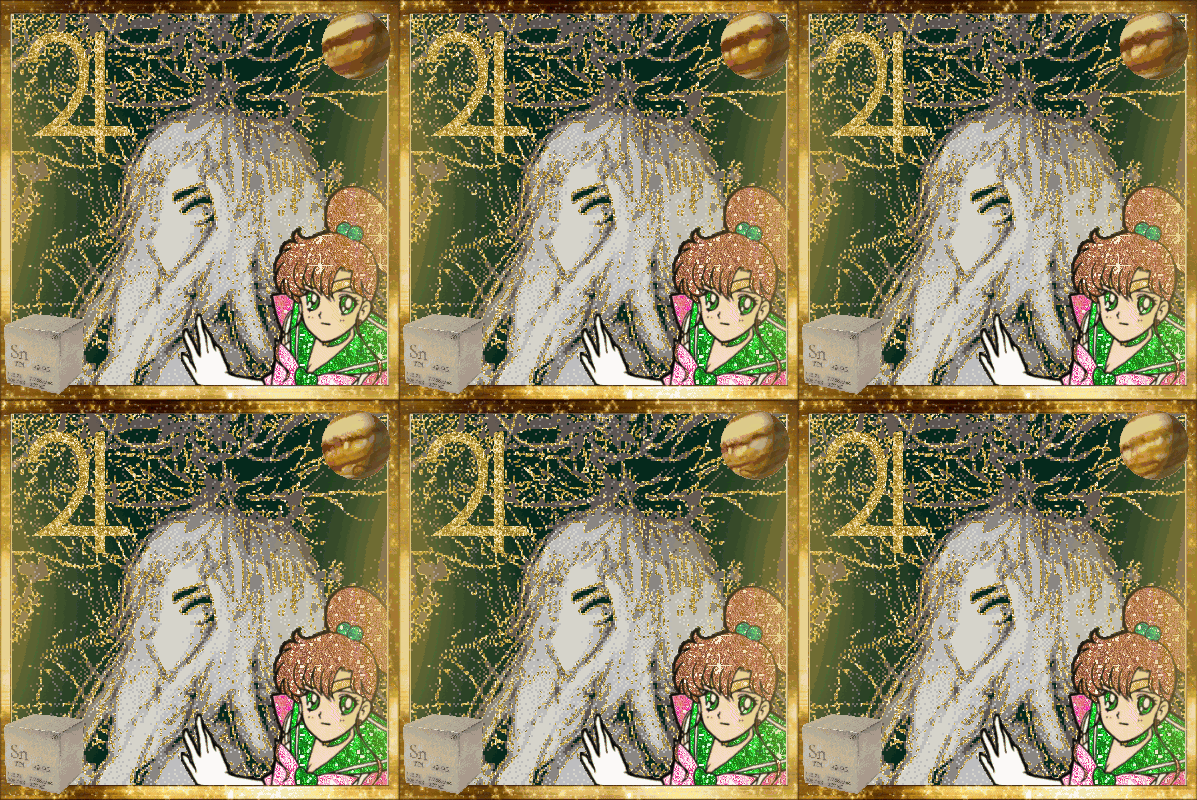
The Sailor Jupiter, rotating planet and glow around the edges were pulled from Picmix but I actually put it together using Aseprite. This is an artisanal GIF collage. The central Jupiter picture (that I also use as an avatar now) was made by putting the cover art for We Know the Devil through Luna Pic’s glitteriser. The little tin sample cube is because tin is the planetary metal associated with Jupiter in alchemy. I actually have a similar cube of copper in my house next to a replica Ea-nāṣir complaint tablet that I have on my wall. Perhaps I should get a tin one as well.
A little while later I decided to make a similar collage for Blaze the Cat, my favourite Sonic the Hedgehog character.
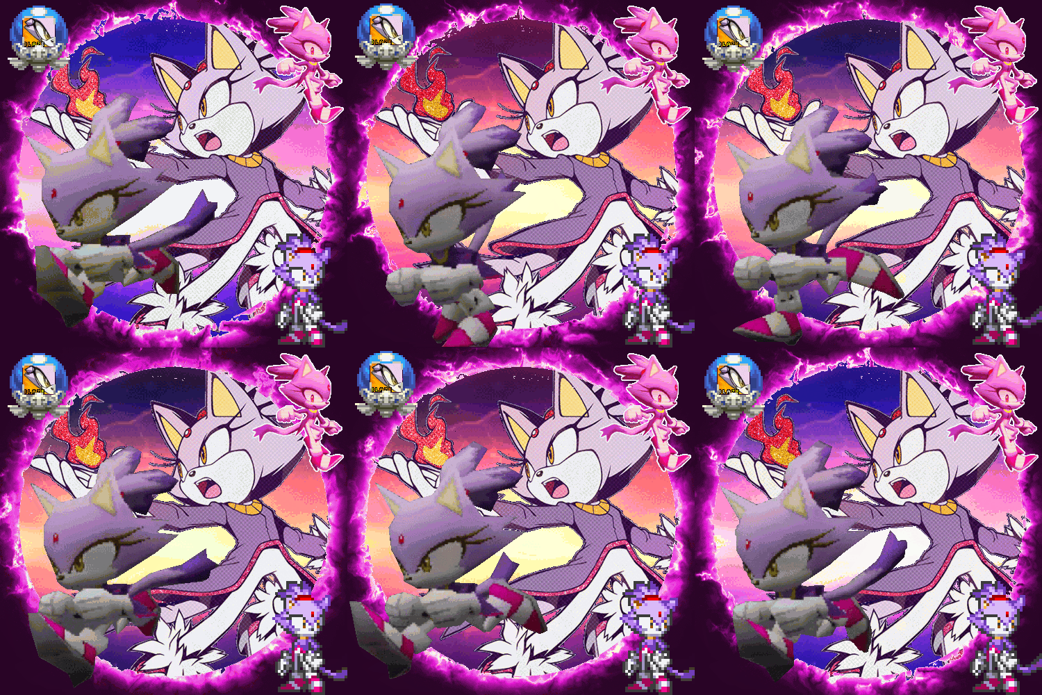
This one pulls from Picmix, The Spriters’ Resource and a GIF of Blaze running that I do not know the original source of that I cut the background out of frame-by-frame.
I never returned to making these but it was a lot of fun and perhaps the urge will strike me again at some point.
And let me know if there’s any other Jovian women that I should check out.
I have no idea what original names of any of the characters are outside of Usagi/Serena. The part of Sailor Moon that matters to me is the English dub that I watched growing up. ↩
Apparently there is a female villain in Pokémon Diamond and Pearl named Commander Jupiter and maybe I could get obsessed with her and add her to the list but also I don’t particularly want to play those games. ↩
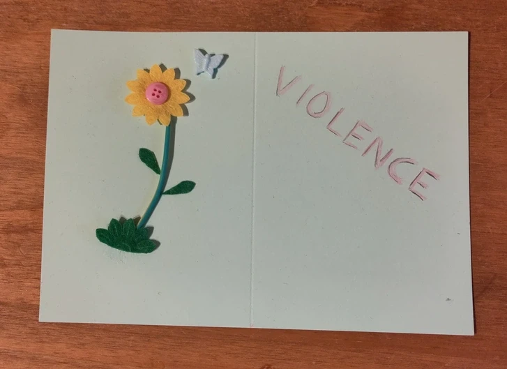
some things I made

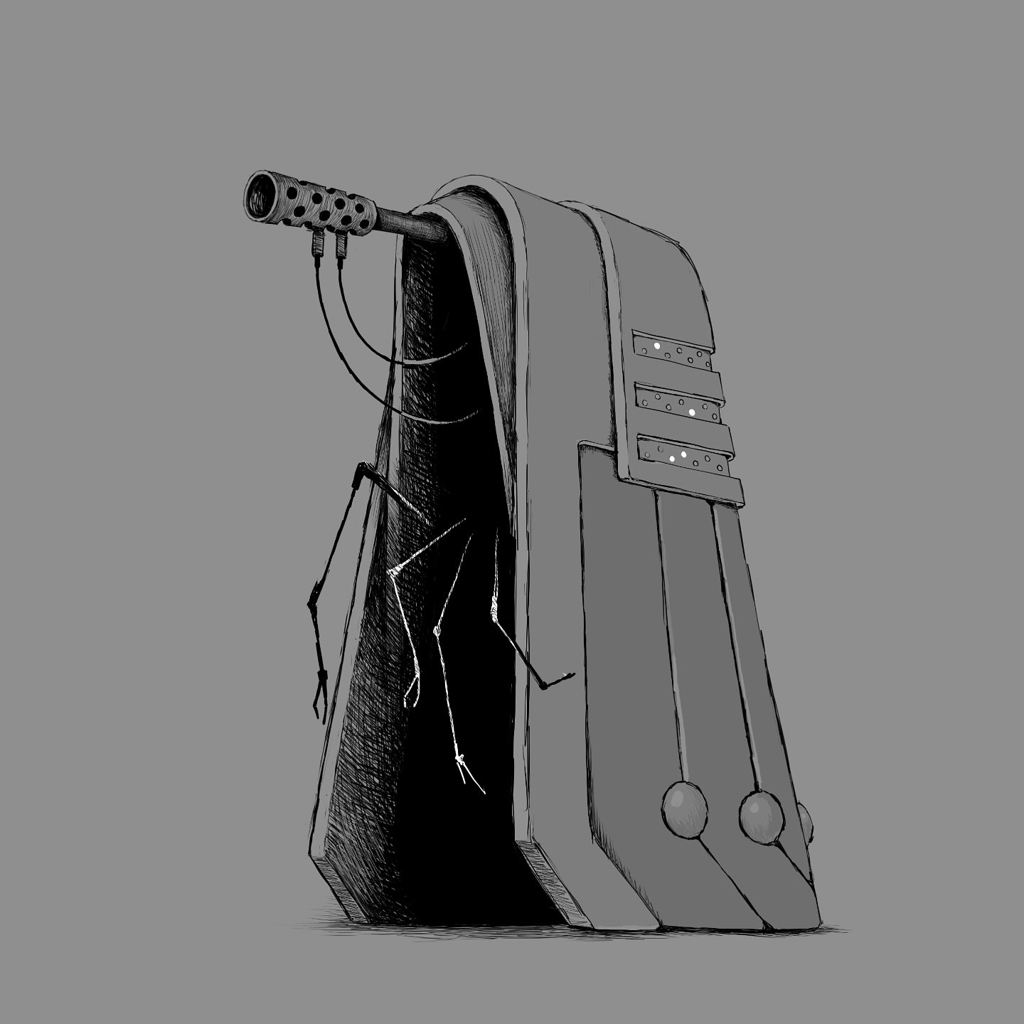
Had a wobbly day so I redesigned the Daleks. I've leaned into the dogmatic, pious aspect of them by implying robes. The eye stalk is now a gun and the plunger has been swapped for an arrangement of arachnoid arms. Hopefully it's a little more unsettling than the originals.
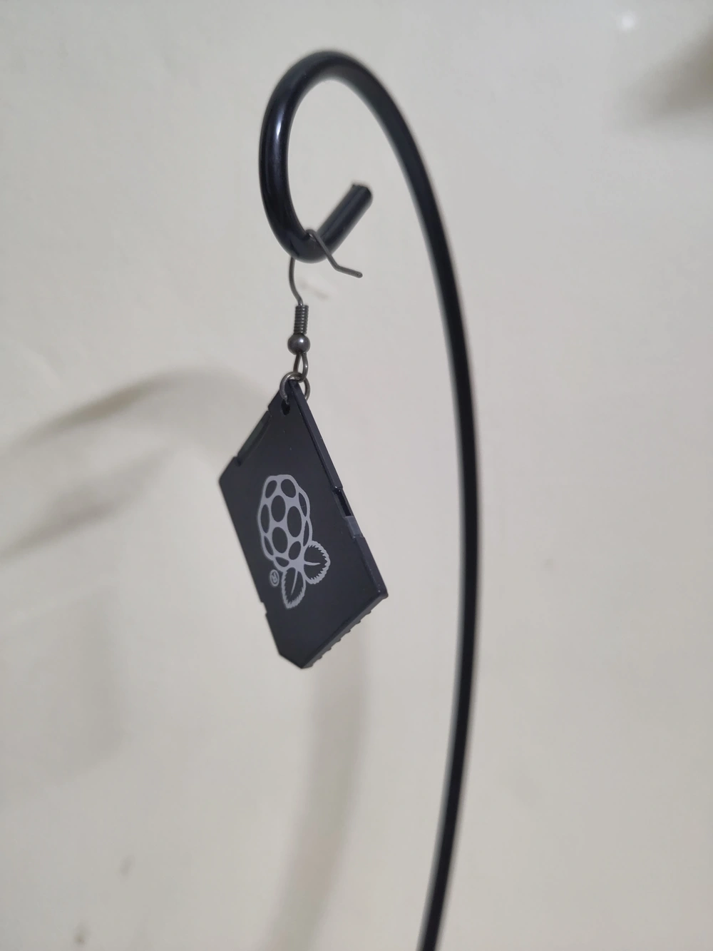
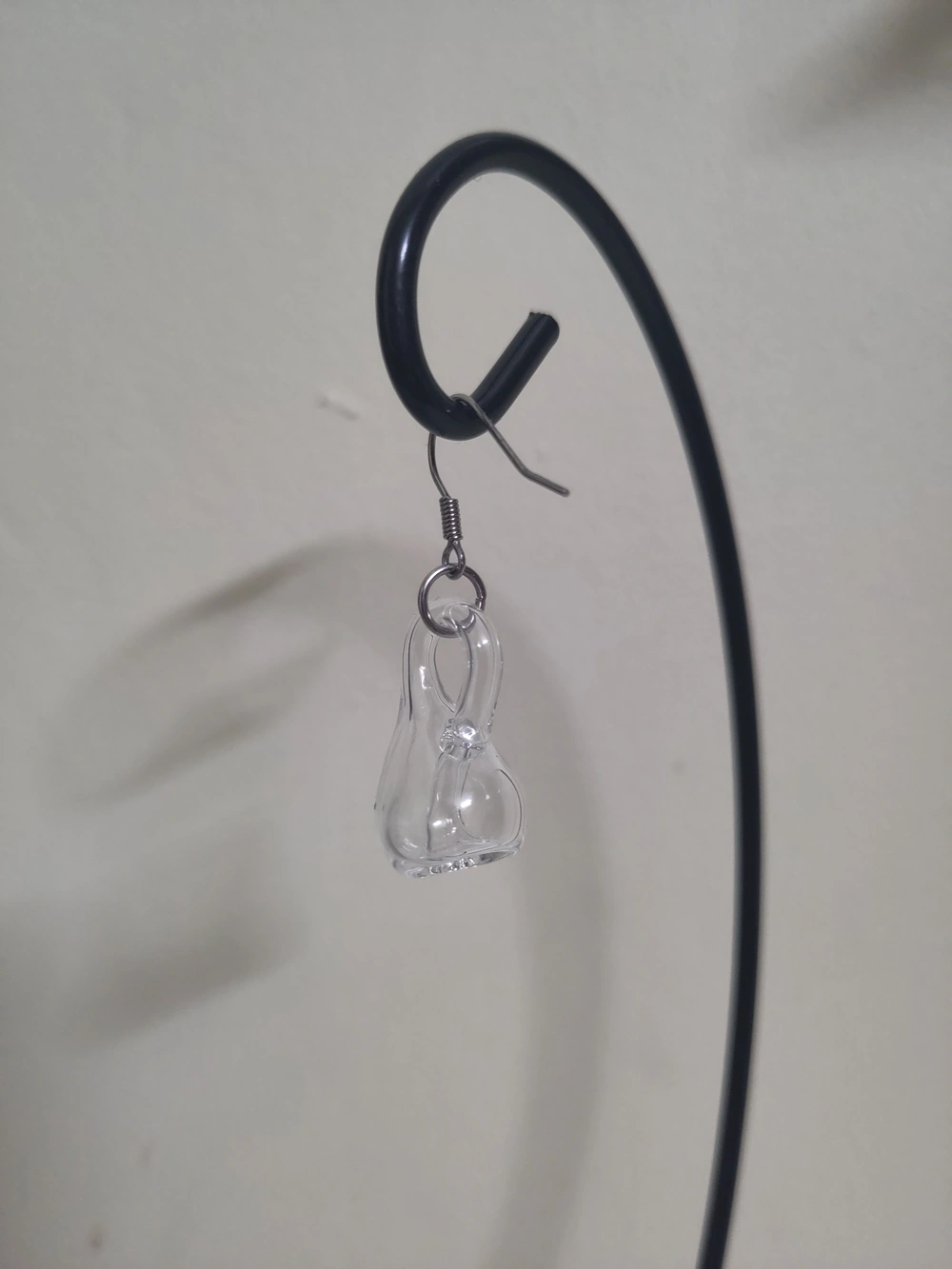
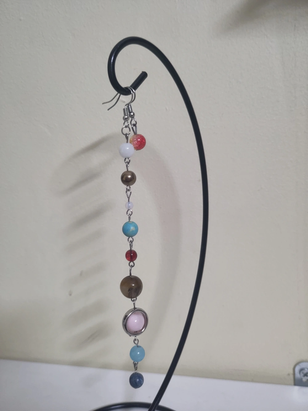
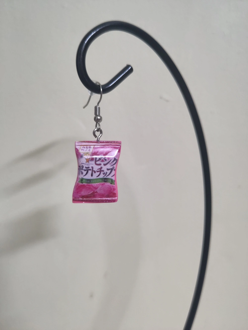
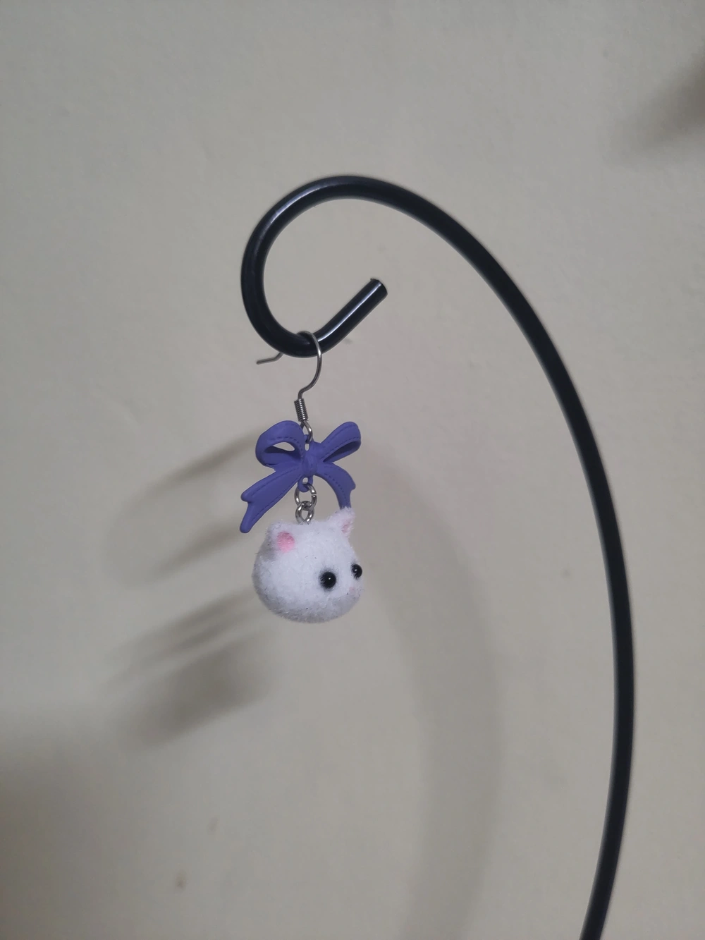
I don’t wear jewellery much but I still have an occasional hobby of making my own earrings and I just enjoy a good kitschy earring in general.
Here’s some things I have stuck a fishhook in:
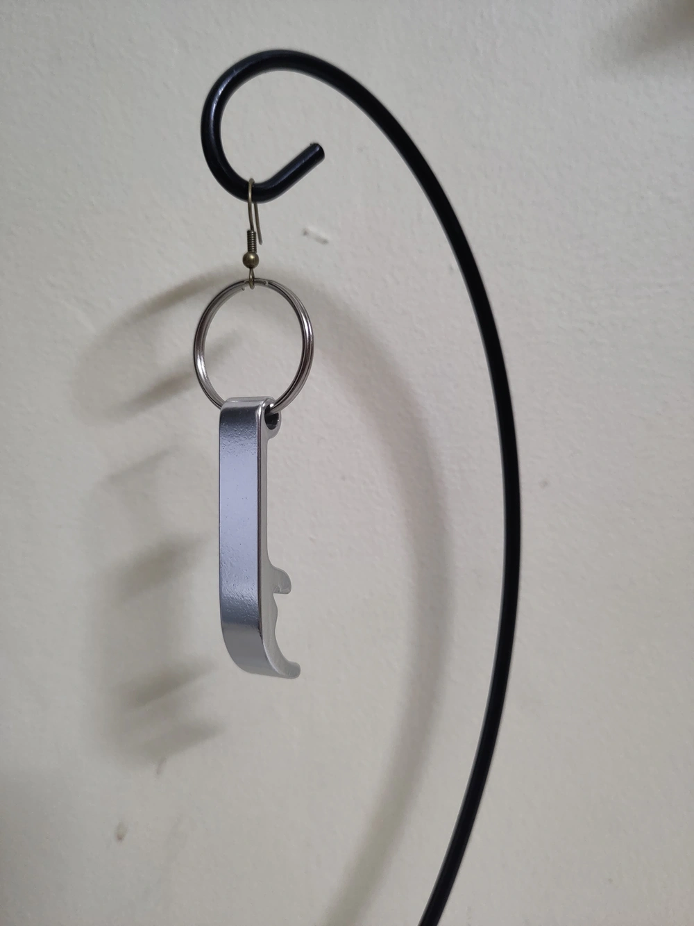
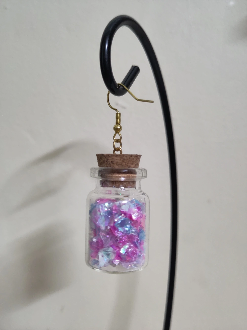
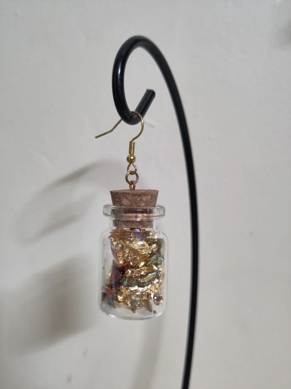
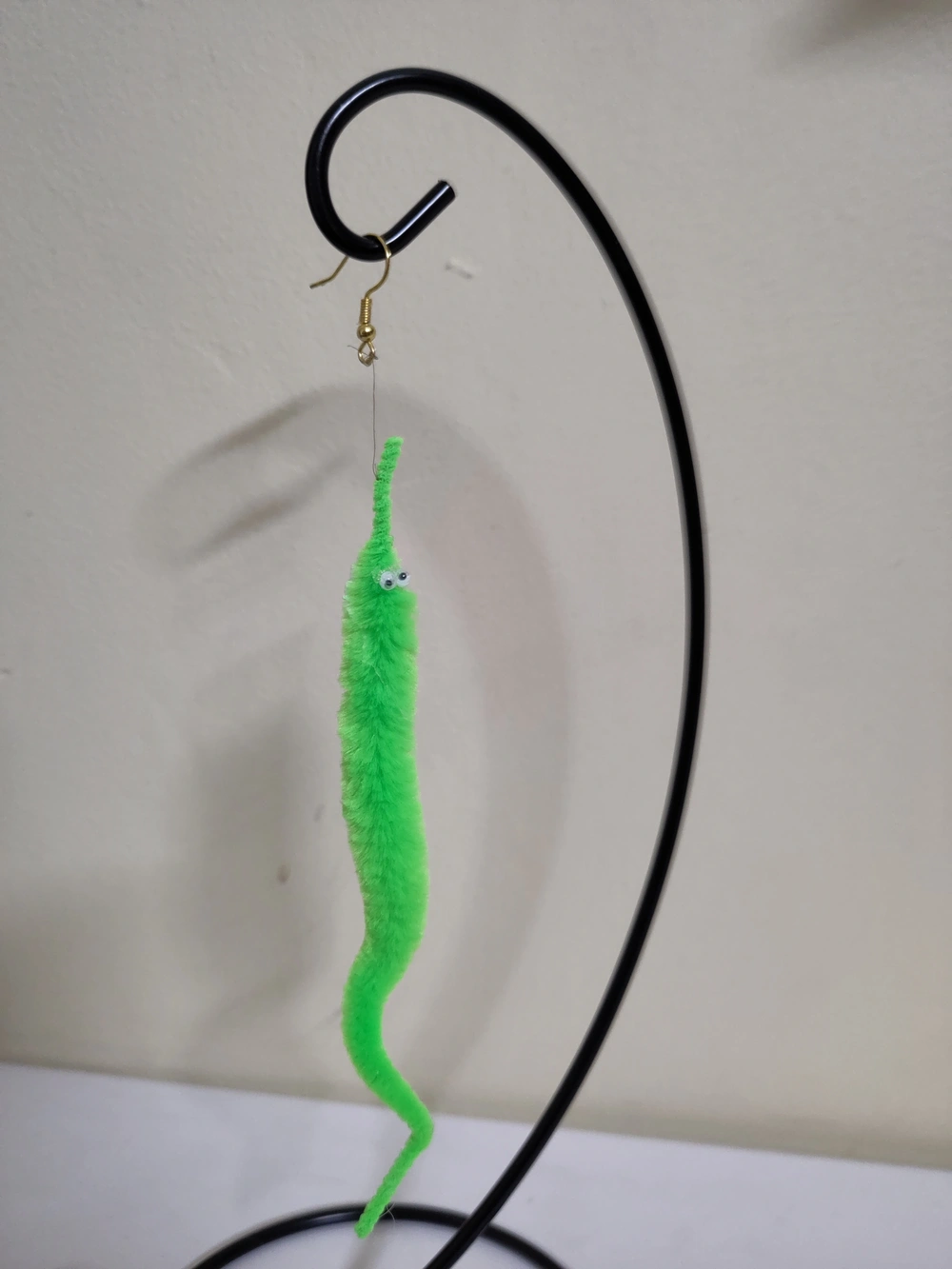
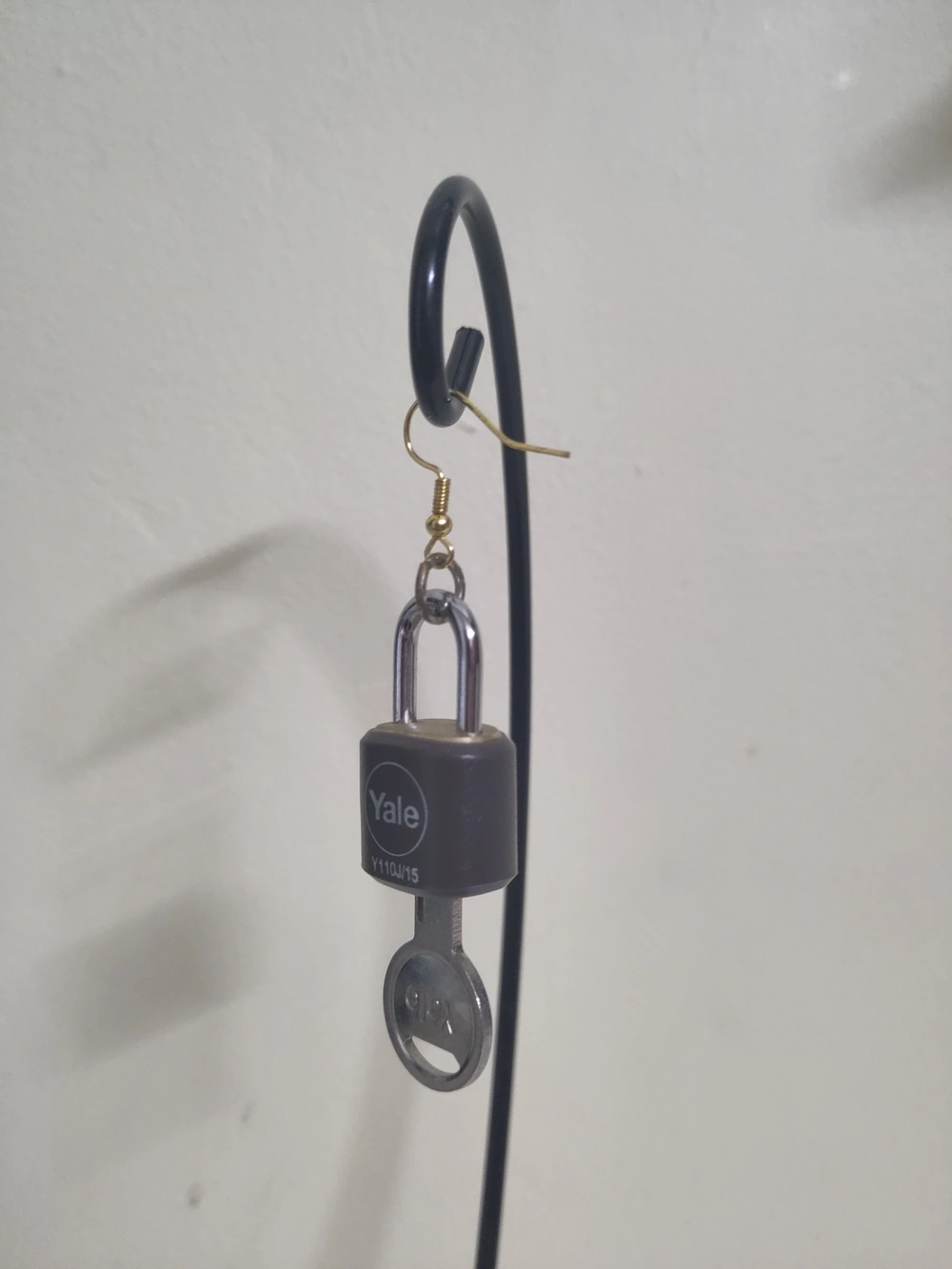
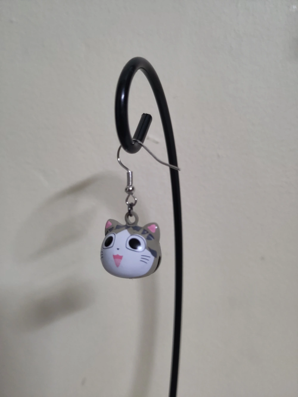
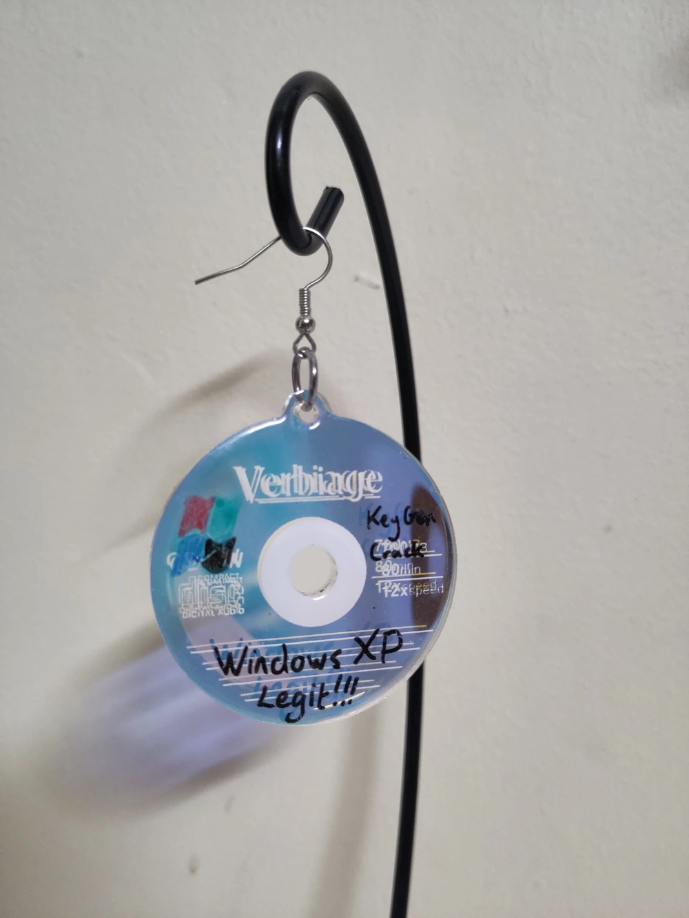
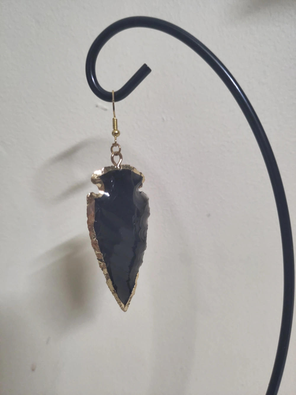
Some other earrings that I didn’t make but felt like showing off.
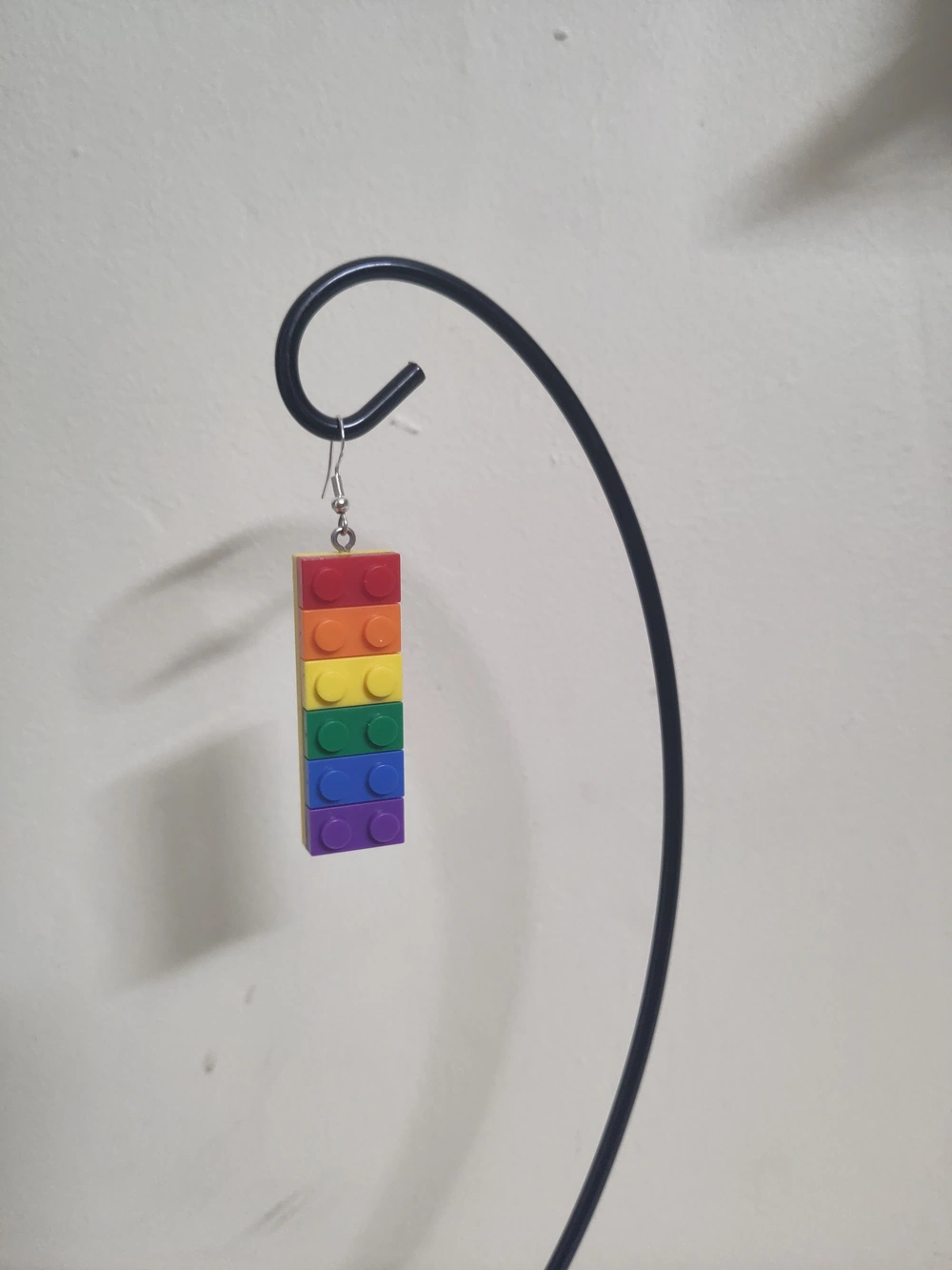
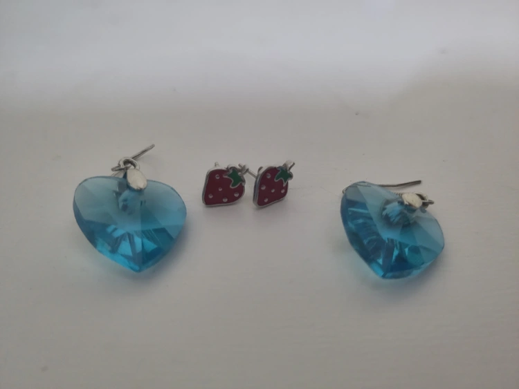

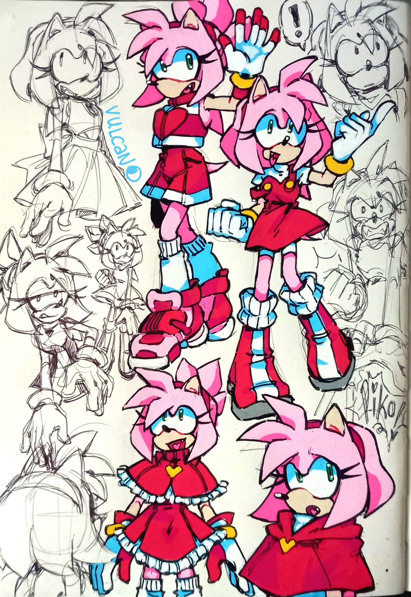
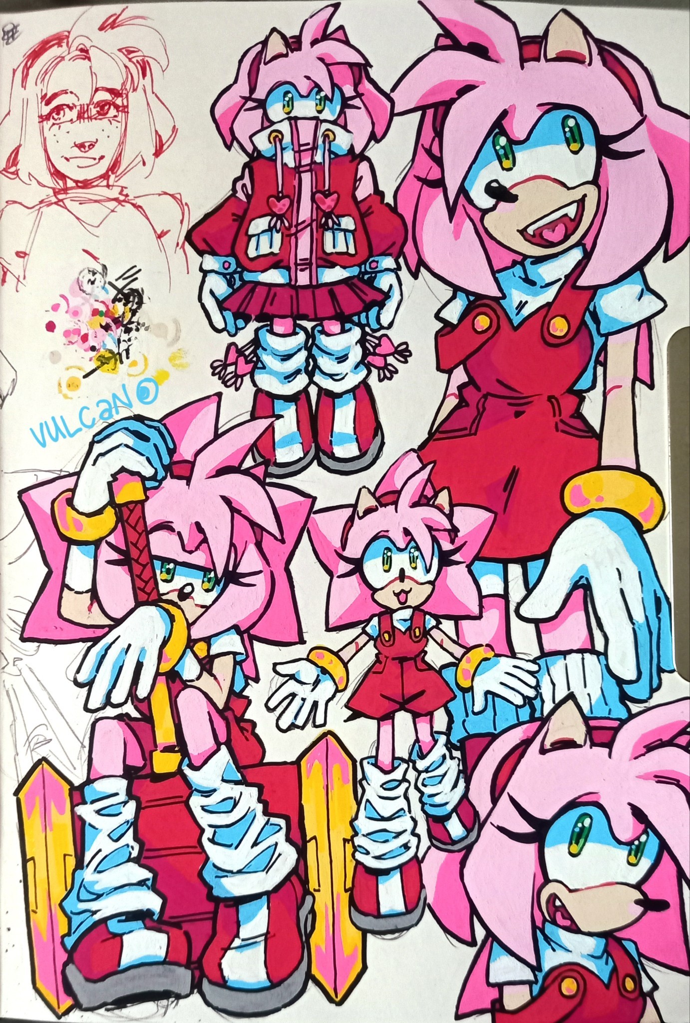
i love her dearly

In the latest edition of my "What Else Is On?" link roundup, I mentioned that I finally played Big Tournament Golf, better known as Neo Turf Masters in North America, for the first time.
I'd seen it played on YouTube in various places over the years, but never actually put my own two hands on it. After watching the Remap crew play it on this year's Savepoint charity stream, and realizing it was a whopping $8 on Switch, I snapped it up.
I fell in love with the game's whole vibe pretty much immediately, from the dramatic anime intro, to the luscious soundtrack, to the classic, tinny arcade VO shouting "on the green!!"
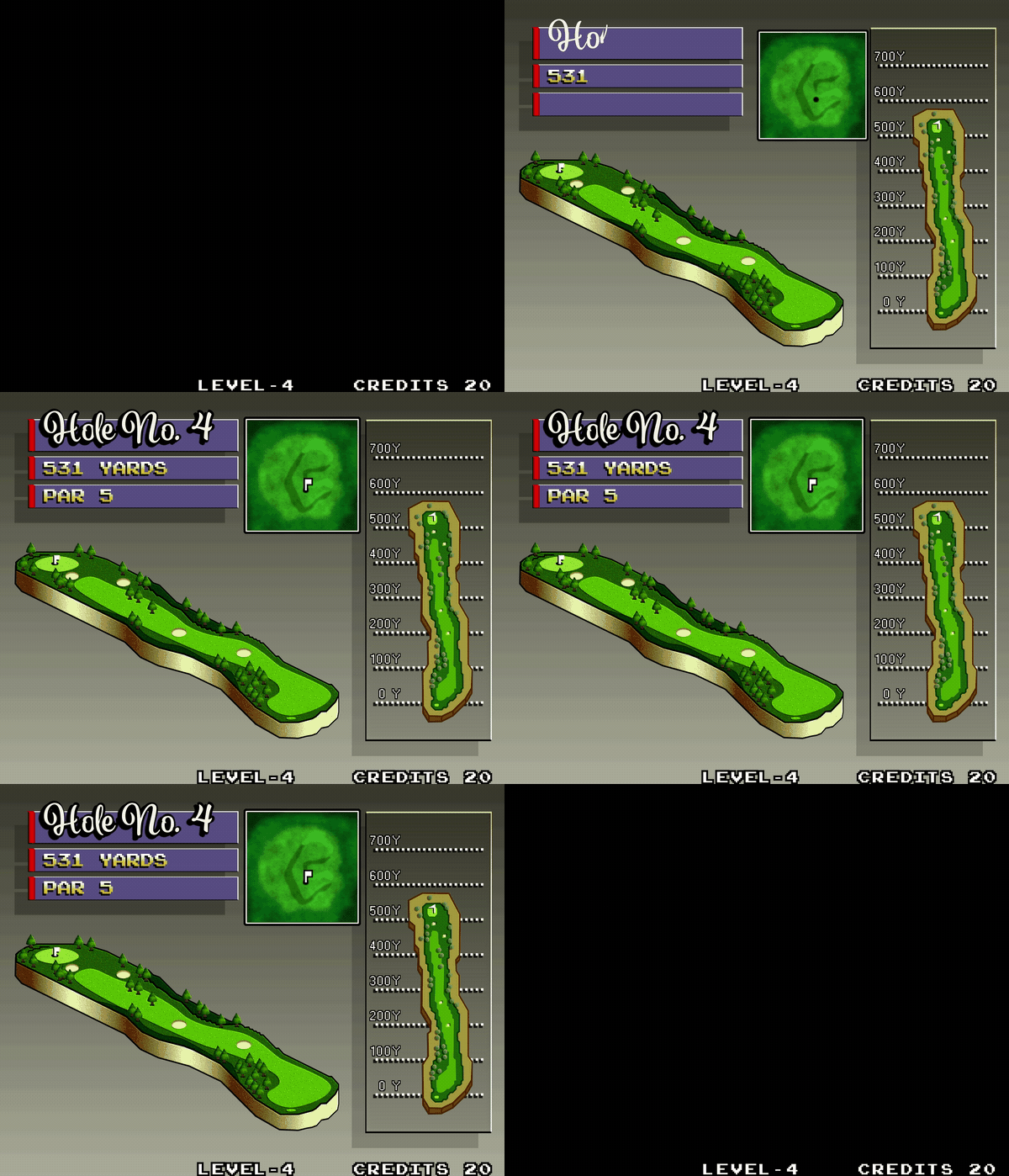
One element that really grabbed ahold of my brain and refused to let go was the screen shown before each hole. It depicts a series of graphical representations of the topography of the next hole, along with some text informing the player of the simplest, most pressing information, shown over the chillest, most soothing retro arcade music imaginable.
The way each element flies in from opposite ends of the screen, scales-in from zero, and particularly the way the "Hole No. X" text writes-on and then grows an outline and a thick, opaque drop shadow really entranced me. To say nothing of the gradients! There's so much going on, and yet not very much at all. It's all so simple and juicy and perfect.
I had to try to recreate it. If not only as a fun motion design exercise, than also to exorcise it from my brain.
Here's the original, as created by the masters at SNK:
And here's my attempt at a recreation, with the same audio underneath:
The first thing you'll notice is that I wasn't able to find a close match for the "Hole No. X" font. Which is a shame, because that's a great font, but font-matching is tough, and try as I might, I wasn't able to find the original.
Failing that, I decided on something I thought carried a similar style and similar embellishments that looked fun to animate. I was a little quick and sloppy with the write-on animation, but I don't think it's noticeable in motion, and I'm happy with the result!
For the rest of the elements, it was tough to strike a balance between retro and modern. So much of what makes the original great is down to pixel art and the way it's being rendered. But since I'm not a pixel artist, I knew going in that my version would have a cleaner, more modern look, and I decided to mostly lean into that, and not force a faux-retro look with a ton of effects.
The only place I decided to go for a purposely retro look was in the background, which I posterized to give the gradient that banding effect you see in the original because the hardware couldn't create a seamless gradient. I love that look. It really ties everything together, and provides a solid foundation for the rest of the piece.
The hardest element was, of course, the largest: the big faux-3D rendering of the course in the middle of the screen. As these things go, I liked it more the more I saw it come together. Like its lower-res neighbor on the right, I just pulled in my reference layer, and went to town with the pen tool. From there, it was all about dialing in the right stroke width, getting the texture and shadow of the trees right, and finishing with effects on top.
I wasn't sure how to go about creating the gradient on the strip of extruded land at the bottom at first, but I eventually settled on just eyeballing a gradient fill with a bunch of points on it, and trying to position them where the light and shadows should fall.
This was the last thing I did, so I had all of the other elements in place, and had already pre-comped it so I could start playing around with effects and figuring out the final look. I worked on the gradient inside the pre-comp, so I was seeing it without the final effects applied at first. I wasn't sure about the way it looked, but when I backed out to the main comp and saw everything applied to the gradient, I had a genuine "oh shit" moment.
I had been thinking about posterizing this gradient to achieve the same banding as the background, and tie everything back to the retro aesthetic that way, but when I played around with it, I ended up liking this better! I'm really happy with the effect of that gradient.
All in all, this was a really fun exercise! Like all new projects, it taught me a little something new, and I had to push myself to figure out things I hadn't done before.
And I still absolutely adore what SNK achieved with this screen. I love how far back all the drop shadows are pushed, I love the smooth, linear motion of all the animations, and I love the way each element slowly fills out the screen one by one, with the three boxy elements leaving space for and framing the big, freeform shape of the course in the middle.
Finishing this project has me wanting to try tackling recreations of some other video game UI! Leave some of your faves in the comments, and maybe I'll give 'em a go!
You can find this piece and others on my Motion Design page.
A deck of cards produced by a workshop led by Alisha Doody, exploring housing from a queer perspective.
It was part of the Bí Linn: An Aisteach exhibition.

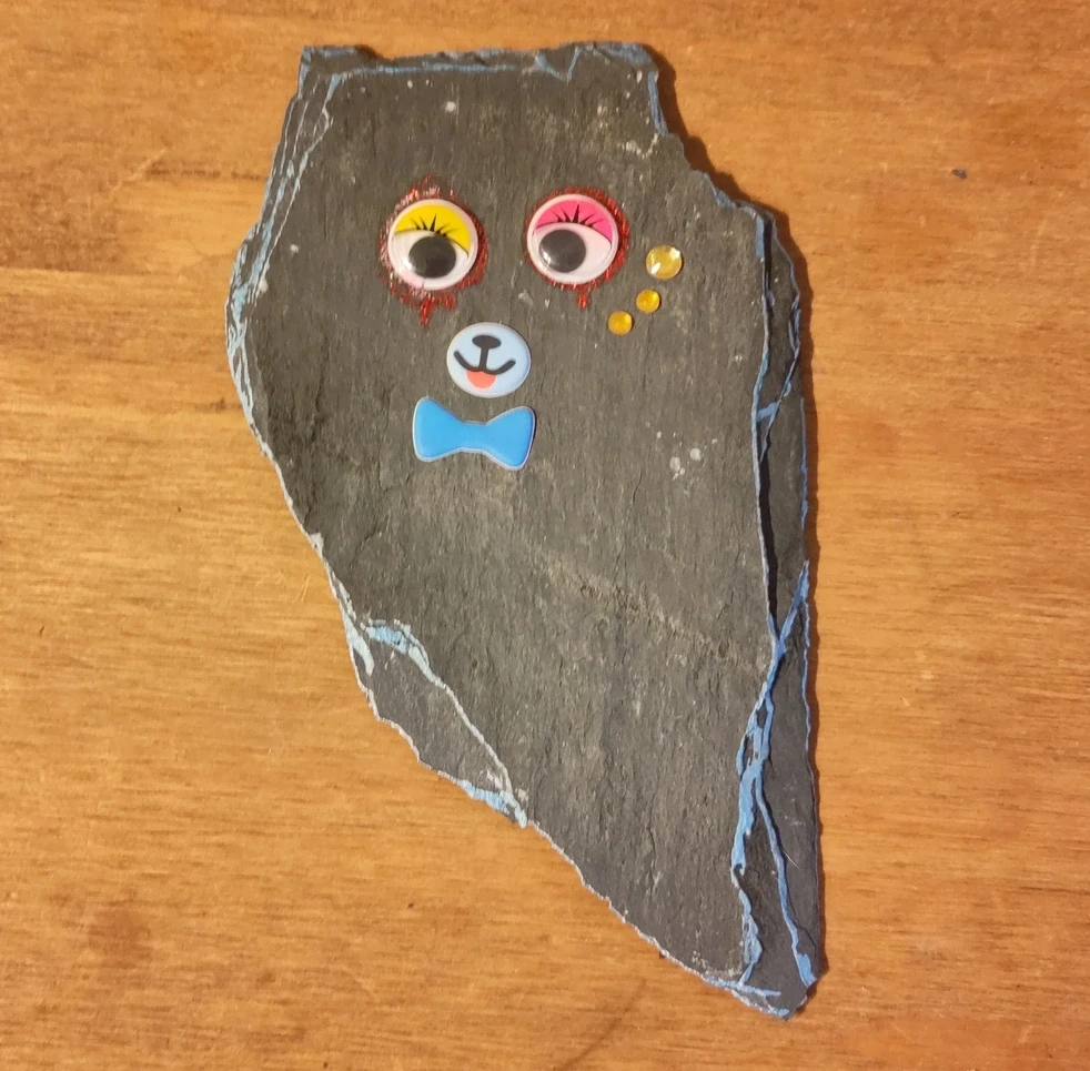
Does framing a printer test pattern and a page printed completely black count as art?
Well the cat seems to like it.


A printable, paper, three-dimensional, spiralling, periodic table of the elements.
The column groups of a typical periodic table are preserved, but the elements form a single, continious line along the entire structure in order of increasing atomic number from hydrogen to oganesson.
It is available in PDF, SVG and PNG formats. Print it out and glue it together.

The flower was inspired by Ian Taylor’s Mendeleev flower.
Element data from GoodmanSciences.
Colours, with modification, from Paul Tol’s colour palettes.
Devastating social commentary.

Two pieces of coloured card with a simple cutout.

A set of mementos.