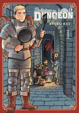
Delicious in Dungeon vol. 1 ★★★☆☆

I picked this up on a whim when I saw it in a bookshop that I have a gift voucher for. I’ve watched the show before and enjoyed it so what I’m mostly interested in here is how it works as a comic in comparison to that.
And I do think there’s a lot here that works better on page. Something I’ve never liked in anime is quick cutaways in the middle of dialogue for asides or inner monologue. I think these work better in a comic panel where it’s just a little bit of extra annotation on the page but is almost universally awkward in a show where it’s cut into the middle of dialogue and messes with the flow of conversation. Dungeon Meshi isn’t the worst offender but it’s still not great.
The diagrams that pop up when people are going on a bit of a monologue also work a lot better when you can take time to sit on them, and especially the panels where the meals are shown off after cooking. The extra details of listing out the ingredients and nutritional information really adds to it (and as for the show’s version of that, I am a hater when it comes to overly shiny anime food, shit looks like it’s made of plastic half the time).
That said, the actual cooking sequences do benefit from getting to be animated. Those little montages of methodical preparation are satisfying. The actors in the show are also really good. I am fully just hearing the actors from the show in my head as I read. Except Falin. I never liked her voice. Sorry. (I watched it in English, mostly).
Then there are some issues I take with how they’ve lettered this in English. They have used a comic font with a seriffed I on the uppercase and a sans serif I on the lowercase. This is a standard way of encoding a comic font but the serif I is only meant to be used for the pronoun I and acronyms but they have clearly just typeset it by typing in the sentences normally, so any sentence that starts with I has it seriffed when it shouldn’t be. They also use a different font for asides which doesn’t have a seriffed I.
And then the onomatopoeias are awkward. It seems like some of them have been redrawn but most of them they have just scribbled in a transliteration followed by an attempt at an English approximation in brackets under it. Maybe that’s the standard way to do it?—I don’t read much manga—and I don’t know what would be the ideal approach would be but this way strikes me an awkward middle-ground that clutters the page and slows down my reading.
I think I will just wait for the show to come out and watch it as it does rather than continue reading this, though.
